Posts Tagged ‘Australian cyanotypes’
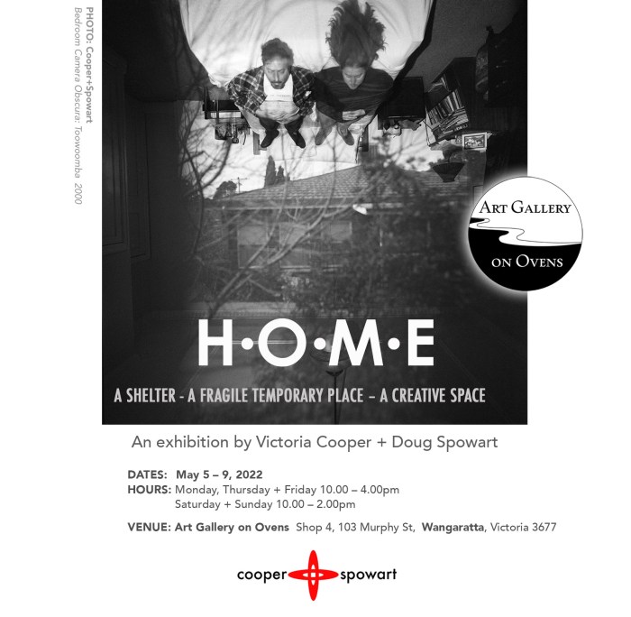
HOME: Our exhibition at GALLERY ON OVENS
.
WE NOW LIVE IN BENALLA in north-eastern Victoria, and to celebrate we held an exhibition at GALLERY on OVENS in May 2022.
.
A STATEMENT ABOUT THE EXHIBITION
Great writers, artists and philosophers have considered the physical, psychological, emotional and political place we call HOME. We reflect and are inspired by their work as we consider our personal perceptions of home personal within the broader human condition.
We have been artists and collaborators for over three decades. Our HOME has been: a house in a suburb or town, our car, a friends place, an artists in residence, a studio, a library, a campsite, a motel room. Whether stable or temporary the places we have inhabited – their architecture, history, social condition or collected objects have evoked our creative and questioning thoughts about perceptions of existence.
For us all these places we call HOME are spaces where we can contemplate, re-invent, conceive, originate, initiate new ideas for the future. We use the broad palette of our arts practice including – Camera obscuras, Cyanotype printing, Pinhole photography, Projections, Light painting and Nocturne light and the resolved artworks are presented as wall-images, artists books and photobooks.
.

COOPER+SPOWART – Home exhibition montage
.
.
In this post we report on the exhibition and the works it contained relating to the concept of HOME …
.
PREPARATION

Gallery on Ovens installation planning
.

Selecting work and preparing work
.
THE INSTALL


.
THE EXHIBITION

Table view of artists’ books

Gallery on Ovens window

Exhibition duo

Cyanotype wall

Looking at books with Maggie
.
THE DE MOUNT

The de Install
.
DOWNLOAD A “HOME” CATALOGUE – “CLICK” HERE

Catalogue Book Cover
.
.
.
.
Images and texts ©Cooper+Spowart 2022
.
.
.
Father’s Day: A remembrance in an art project
Father’s Day 2020 – Thinking of our Dads
In 2010 artist, and then gallerist, Julie Barratt put out a call for artworks that asked artists to respond about their Fathers and their passing.
The request from Julie Barratt is as follows:
This project was borne out of the recent sudden death of my father, a handkerchief, some emotive words written by a sibling on his death and the traumatic aftermath of a death processed according to particular societal and cultural mores. Interested artists and Individuals are invited to create an artwork on a handkerchief (any handkerchief not necessarily a man’s) based around death/grief/bereavement.
We reflected on our connection with our Fathers and created artworks using the cyanotype process.
Doug’s Hankie
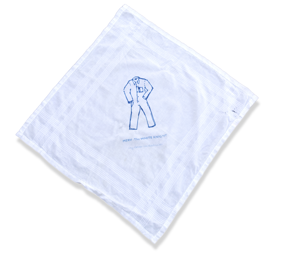
The WHITE KNIGHT – for Merv by Doug Spowart
MERV: The White Knight
My father was an electrician for around sixty years. He always wore King Gee white overalls—even when we went on holidays.
Ever ready to help someone in need he would dash off at a moment’s notice—even when the family organised an outing on the weekend we would always fit in another job along the way.
Over the years he helped many an electrically troubled soul so we, his family, dubbed him the nickname – “The white knight”.
Victoria’s Hankie
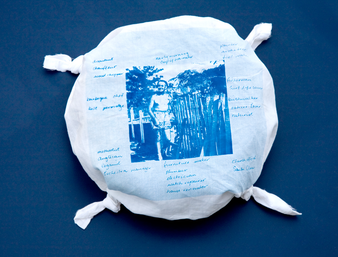
Dad’ll do it – for Reg by Victoria Cooper
Dad’ll do it
I remember that he always tied knots in his hankie to keep it in place on his head and to soak up the sweat when he was working on things around the home. He had lived in this home (in the photo) for most of his life except for the time he was in Papua New Guinea for WW2 and shorter periods of time in other places. Over the years he adapted and renovated this home to suit the changing needs of the family.
.
.
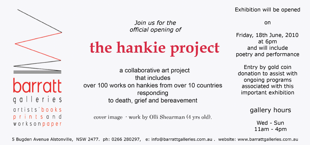
Barratt Gallery Invite
.
The exhibition was shown at Barratt Gallery at Alstonville and Napier Gallery Melbourne
.


A post about the exhibition can be found HERE
.
.
.
.
.
.
BEAUTIFUL FRUIT – Tilley Wood+Linda Spowart
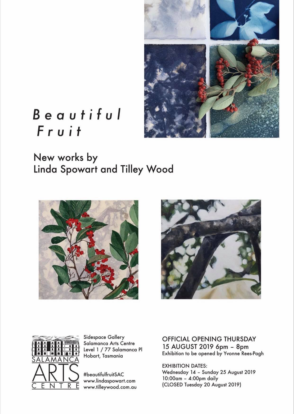
Beautiful Fruit Invite
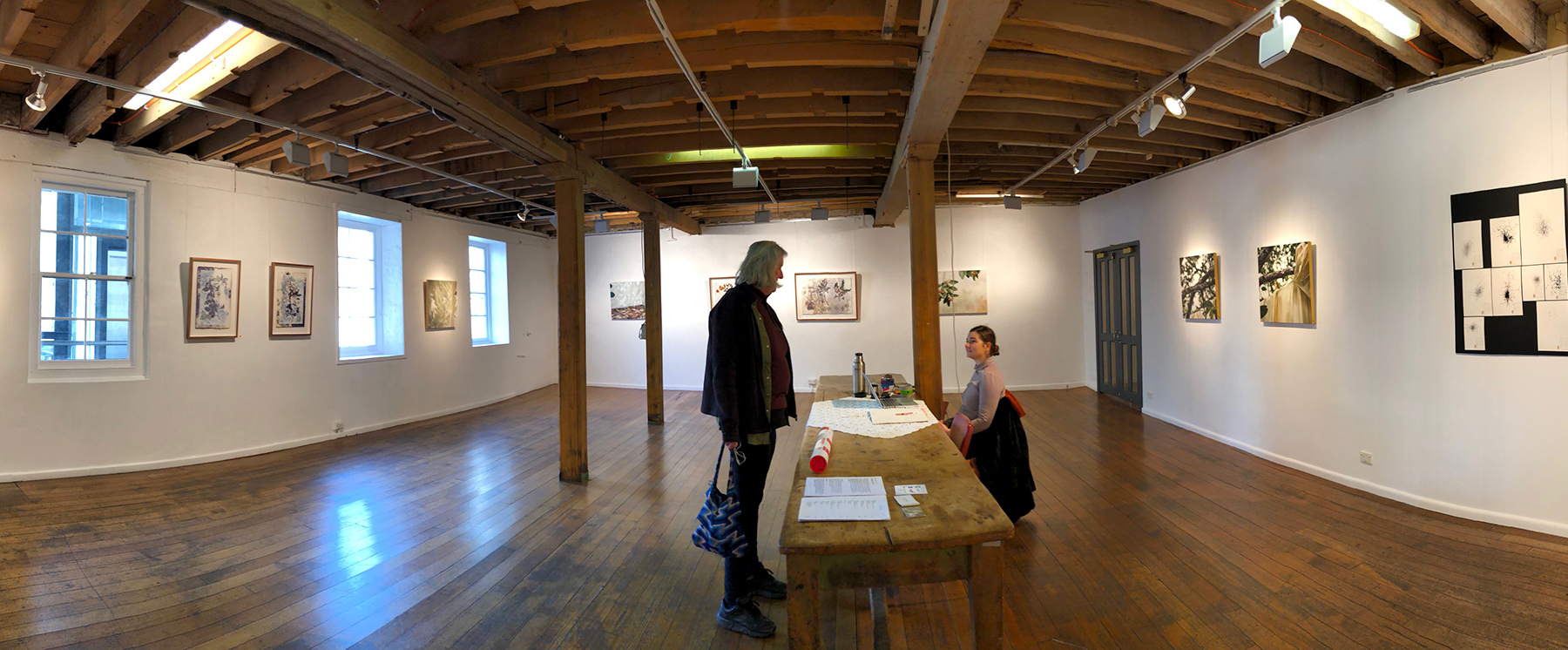
Beautiful Fruit installation in the Sidespace Gallery at Salamanca ………. PHOTO: Doug Spowart
.
A Fruitful Place – a review by Victoria Cooper
Place, of course, as opposed to the more generalized ‘site’ or ‘land,’ is a specific collaboration between nature and people, constantly altered and inevitably defined by narratives from the contact zones.[1]
This exhibition is the result of a collaborative interaction between the artists, the cotoneaster tree and its environment. The intent was to create visual responses to observations of the tree and its rhythms over time that forms:
… a dedication to and recording of this tree. Its life is multifaceted, one that connects to and affects the space and people around it. Its vital and variable presence is what they are drawn to and present here. This exhibition is the fruit of the artists and subject together.
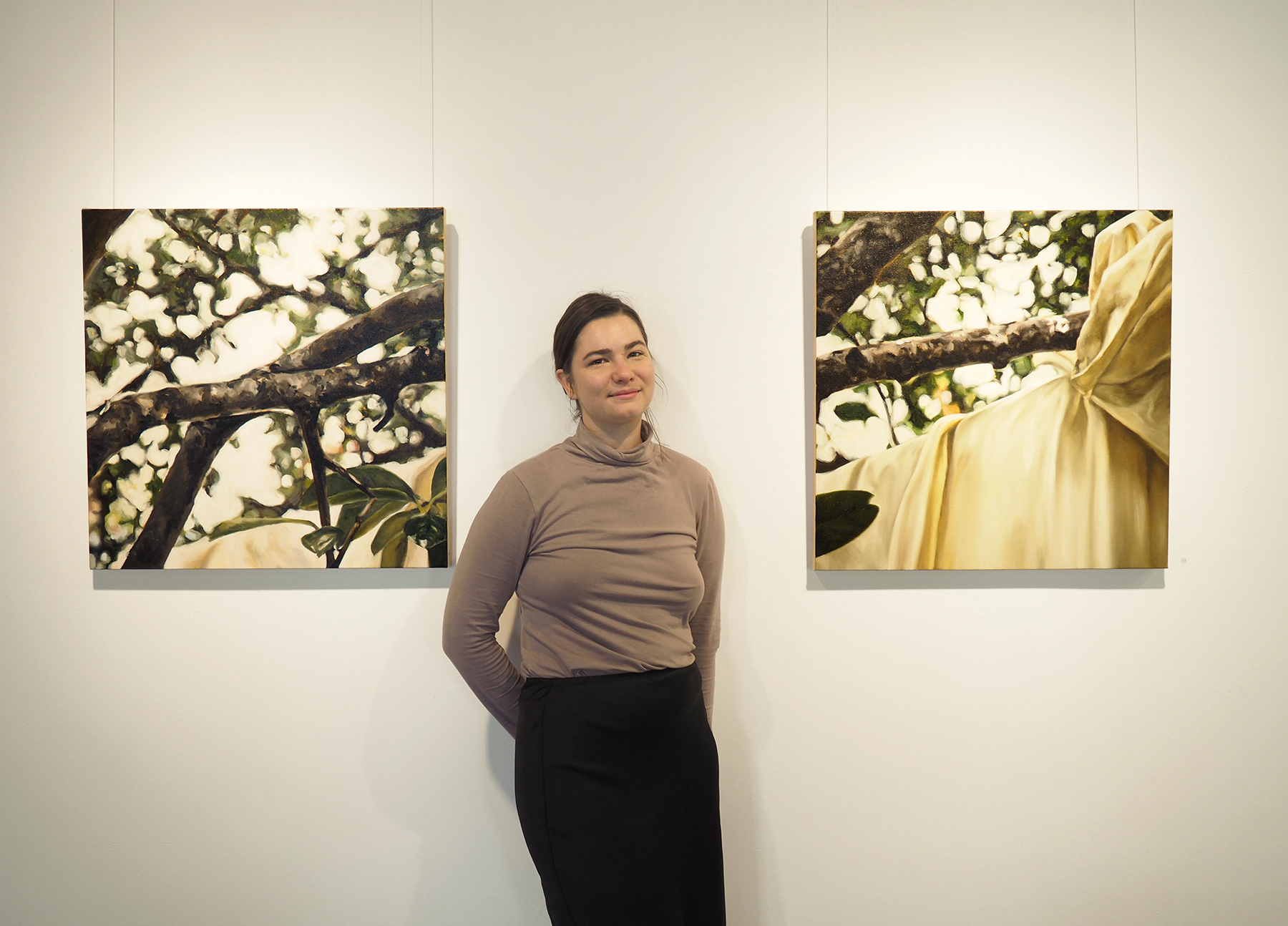
Tilley Wood artist with light 4 + light 5, 2019 Oil on canvas ………. PHOTO: Doug Spowart
.
Although Linda and Tilley approached the project from two different perspectives both were influenced by the phenomena of light and wind to define the tree, its form and movement. Tilley’s paintings of the tree evoked a poetic place illuminated by memory. Linda’s prints were layered using cyanotype photograms[2] or inks in contact with parts of the tree and its surroundings, then over printed with gesso and drawings were full of detail referencing the visual language of botanical illustration and empirical scientific evidence gathering.
.
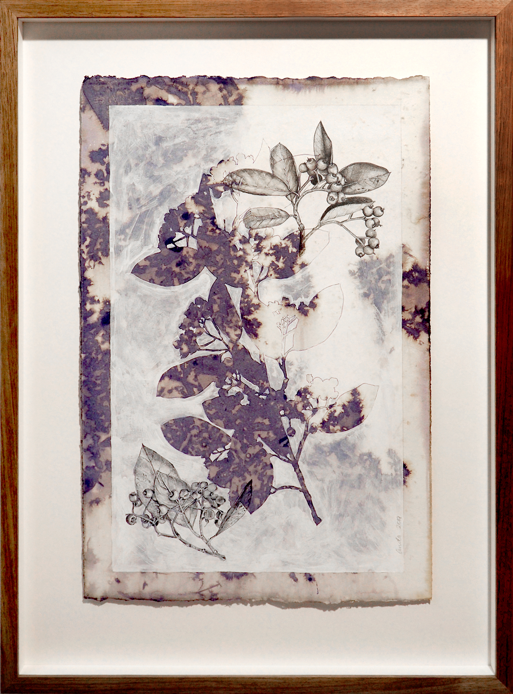
Debris 1 Linda Spowart 2019Ink, gesso and graphite on cotton ………. PHOTO: Doug Spowart
.
As part of their investigation, the artists individually and collaboratively created through direct contact with parts of the tree: leaves, fruit and branches, they made more cyanotype photograms. These prints were more like impressions, rather than the detailed recording of scientific photographs. On one wall at the entrance to the main gallery there was an impressive installation of these blue prints creating a feeling for the tree’s blue shadowy and dappled light space.
.
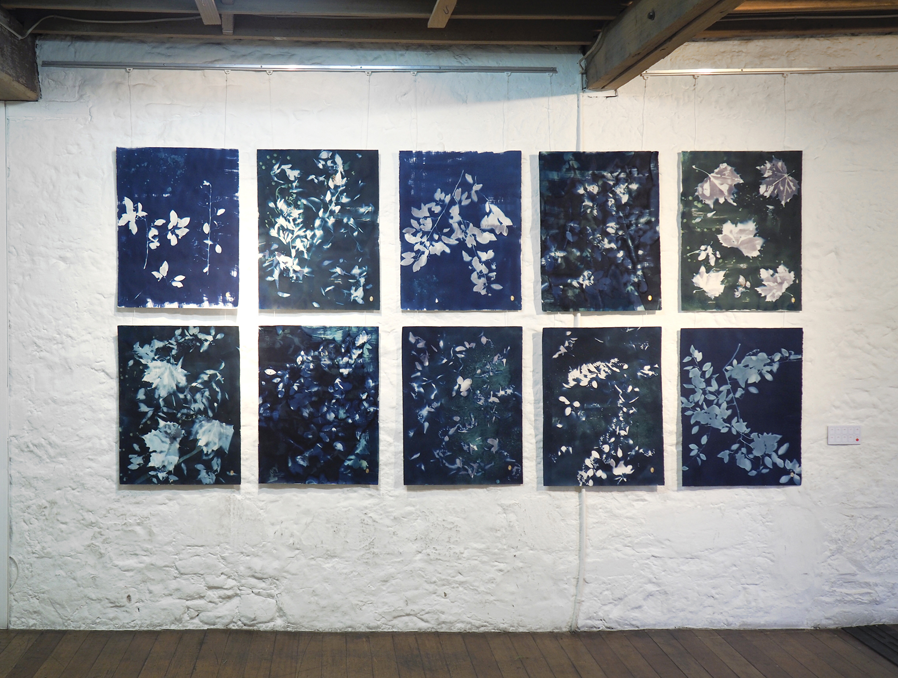
Beautiful Fruit Nos. 3-13 Tilley Wood+Linda Spowart 2019 Wet Cyanotype & gold leaf on cotton
.
The cotoneaster tree was both subject and collaborator in this exhibition. As part of their investigations, the artists attached drawing devices to branches of the tree in order that it would self record its movement without the intervention of the artists’ hand. This is an important methodology for many artists as it opens up an inclusive space where the agency or ‘voice’ of objects and other life-forms as collaborators can present new and surprising perspectives. Australian artist, Cameron Robbins[3], presented the drawings that were formed through devices attached to a windmill to record the movement of the wind around Museum of Old and New Art (MONA), Hobart, Tasmania. Robbins intent was
… to connect to landscape, and to the greater dynamic of the whole climate system; how patterns move through a particular location. For me, that’s the most direct way to access the greater energies and forces around us.’ Cameron Robbins[4]
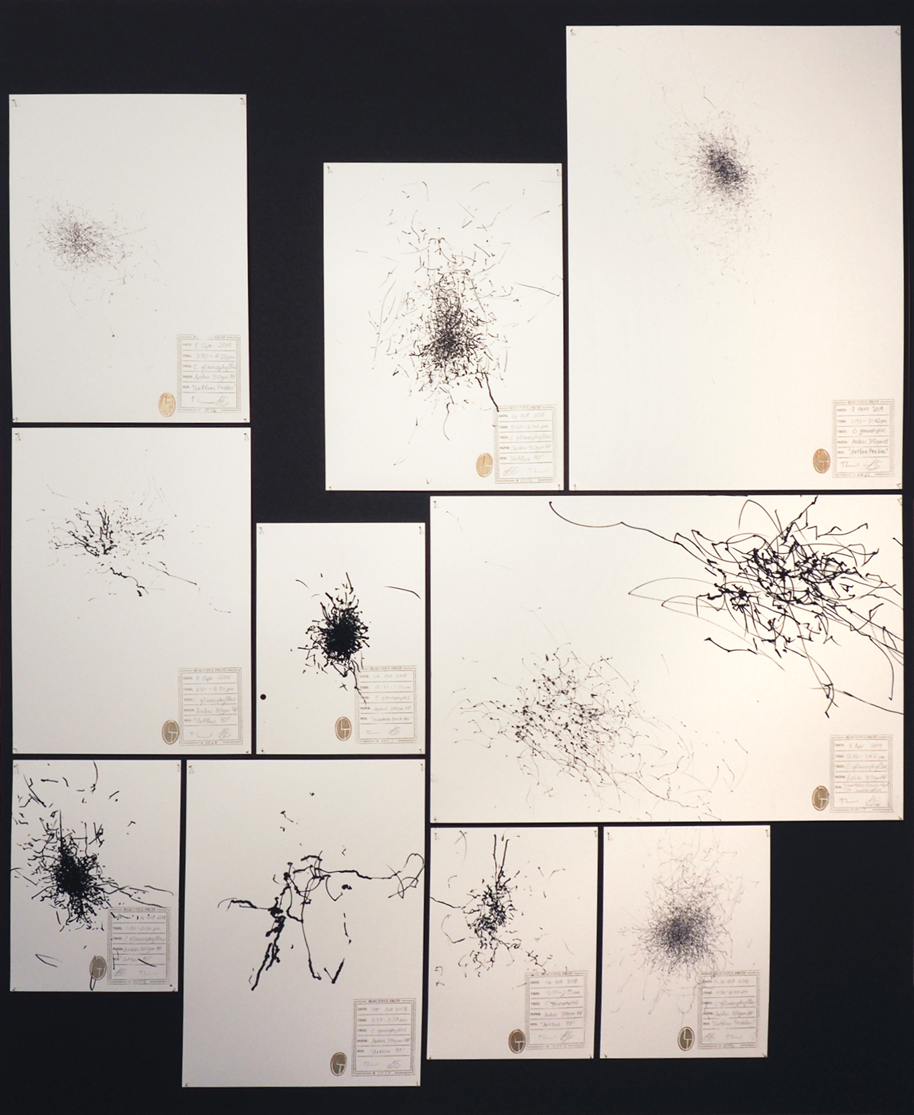
Tree Drawings #0001- #0026 ………. PHOTO: Doug Spowart
Art when made in collaboration with both human and non-human entities involves a corporeal, sensate empathy that evolves over time spent in contact within their space and place. These are dynamic contact zones where human and nature interaction can stimulate the development of alternative views and knowledge to bring fresh ways of understanding the changing world we share with Others. Both Tilley and Linda have engaged with the Place that is the tree, not to objectify or imitate, but to wonder, imagine, transform and be transformed.
Dr Victoria Cooper
.
.
NOTES:
[1] Stuart, M & Lippard, L 2010, Michelle Stuart, Sculptural Objects: Journeys In & Out of the Studio, Charta, Milano, page 11.
[2] The Cyanotype process was developed by Sir John Herschel in the 1840’s and at this time 19 th century botanist Anna Atkins used the process to document her plant specimens. The process: water colour paper or cloth is coated with a chemical made by the light sensitive combination of potassium ferricyanide and ferric ammonium citrate. After drying, objects placed on the material and then exposed in sunlight. Ultra-violet light is required and exposure times may be 8-10 minutes although times may vary depending on the time of year – or day. Many photographer also expose enlarged contact negatives of photographs onto the cyanotype emulsion.
[3] Cameron Robbins, Field Lines, MONA see https://mona.net.au/museum/exhibitions/past-exhibitions/cameron-robbins-field-lines
[4] ibid. an in-text quote from the article by the curators, Nicole Durling and Olivier Varenne
.
.
.
.
.
.
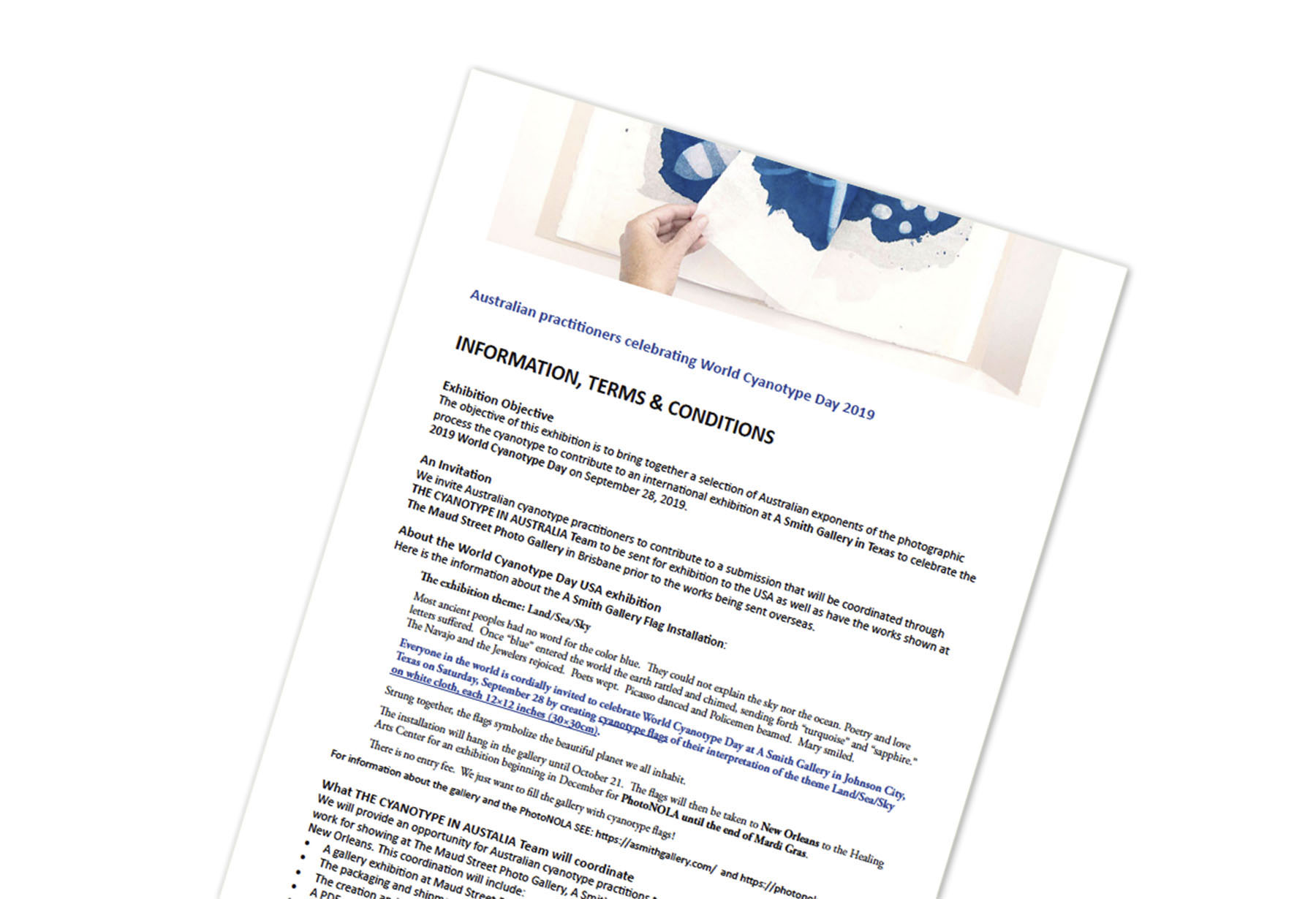
MAKING BLUEPRINTS TODAY–Our World Cyanotype Day Australian Submission
.
Making cyanotypes in Tasmania
We created some cyanotypes yesterday to contribute to the Australian World Cyanotype Day (WCD) travelling exhibition. Setting up a coating studio inside a friend’s house in Cygnet Tasmania we exposed the sensitised material on the front veranda and washed-out on the shadow side of the house. It all sounds rather an impromptu affair and in some ways it is, as travelling artists we have encountered these challenges before making-do with the site-specific needs of each art-making opportunity.
But what is difficult in Tasmania right now is the weather. We’ve been ready for weeks to make cyanotypes and yet the pervading conditions have been overcast or scattered heavy clouds between sunny gaps, rain or fog. And as cyanotypes work best with clear, bright and directly overhead sunlight it has been difficult. Added to this mid-winter’s low angle of sunlight at 43°south means exposure times have to be extended 3-4 times that commonly achievable up the east coast of Australia.
Making cyanotypes is a process that takes place over time. Chemicals are mixed, the substrate coated with a brush. On this occasion we were printing on cloth and due to the ‘flow-through’ the material we coated a few sheets sitting on top of each other. These super wet sheets then needs to dry. Cloth takes quite a while to dry due to the large amount of chemical absorbed in the fibers although drying can be accelerated by using a blow heater or hair dryer.
.
Coating the material…
.
.
Next a series of test exposures may need to take place to know, in the specific sunlight conditions you may be working in. After exposure the material is washed-out in running water – we add a little citric acid. And for an accurate density check the sheet needs to be dried a little. Then you can make your first exposure. At the moment in Tassie we’ve been working with 15 minute exposures!!
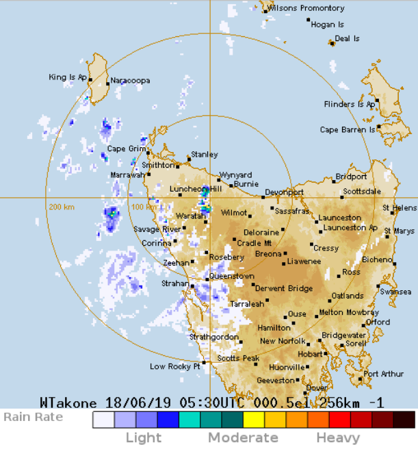
BOM – looking for gaps between the clouds
All this means that you may start out with sunny skies, do your tests and then start you exposure and the clouds come in – the Bureau of Meteorology website is regularly monitored to make sure that you have an adequate time over which to work.
.
Making the exposure…
.


Washing out after exposure…
.
.
Finally it’s hung up to dry …
.
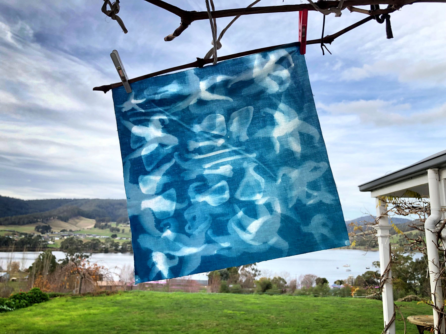
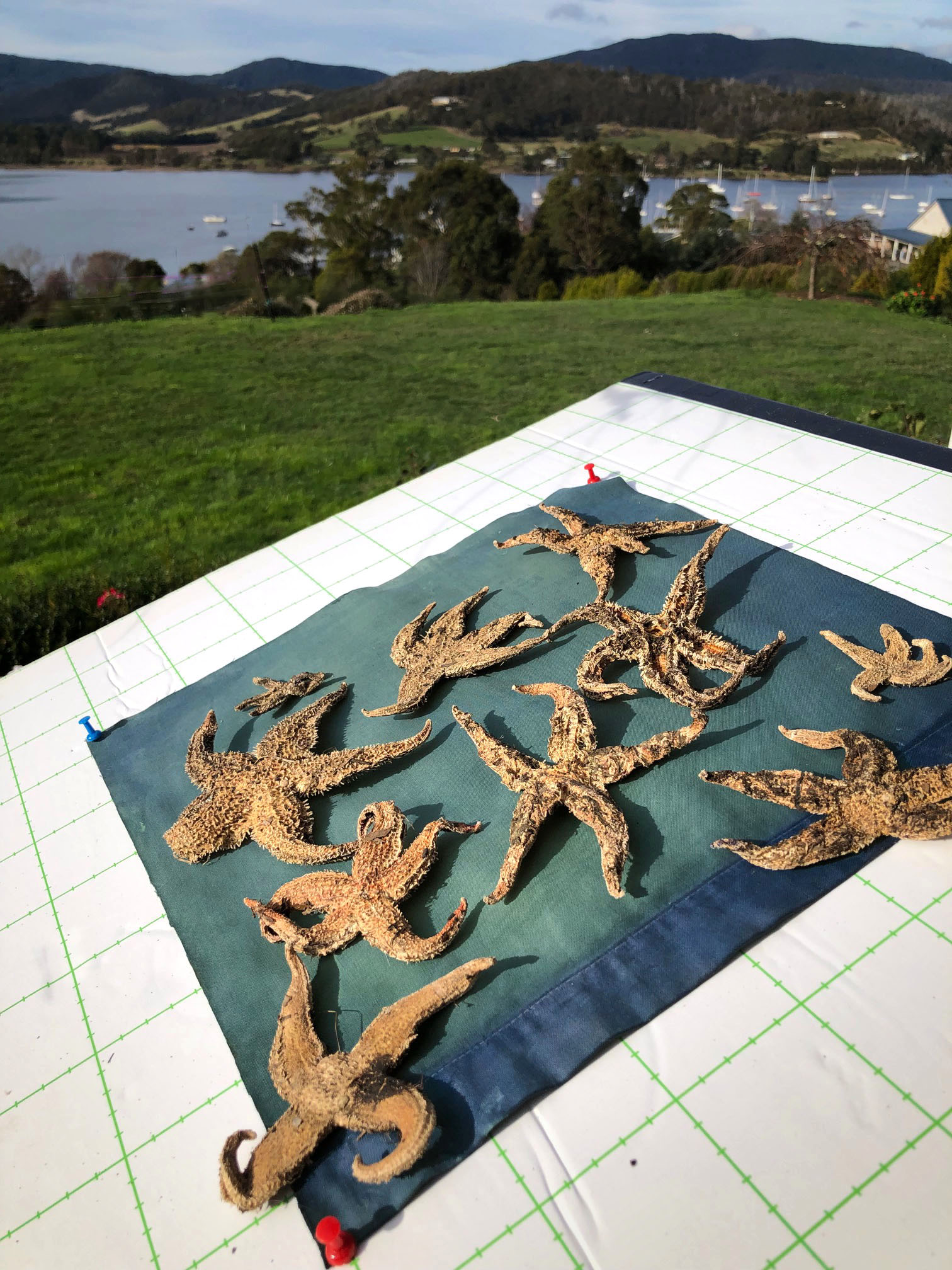
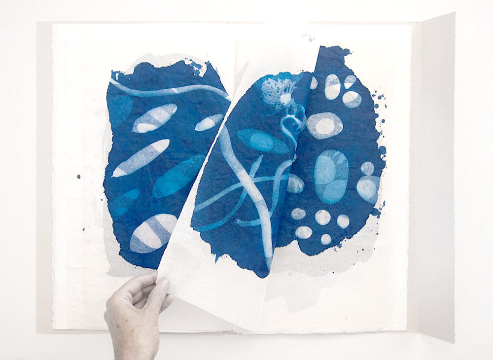
10 starfish that are an invasive species with 8 bones of a Tasmanian wallaby by Victoria Cooper
Vicky’s work is a response to contemporary land and sea issues in Tasmania. The image is a double-sided cyanotype – shown here is the transparency of the work with the blending of the two images.
.
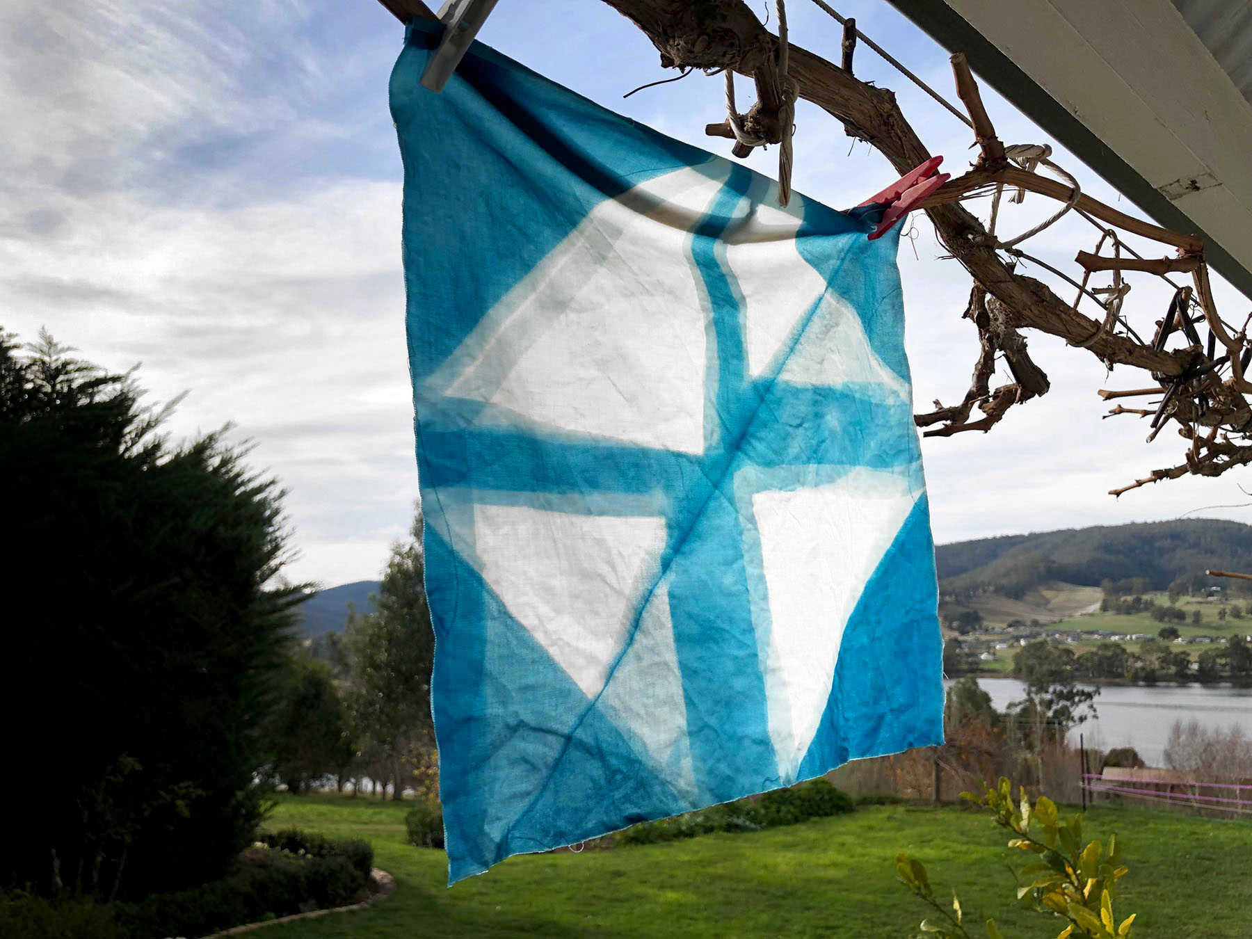
Swatches of blue: a colour of Tasmania by Doug Spowart
Doug’s cyanotype continued his experiments in direct light-strike on cyanotype sensitised materials. On this occasion the folding and refolding over the duration of the exposure creates a pattern of different blue densities. These emulate, like colour swatches, the different hues and tints of blue in the Tasmanian landscape. This is also a double-sided cyanotype that in this photo is still quite wet and yet to dry down.
Both cyanotypes have been made on linen material and are about 30 centimetres square. The linen was purchased at a local charity shop as second-hand white pillowslips. The A Smith Gallery presentation of these fabric squares has them pegged to lines running across the gallery ceiling where they appear like flags.
.
In The Maud Street Photo Gallery
.
The cyanotypes that we have made will be included in an exhibition of Australian cyanotypers at The Maud Street Photo Gallery in Brisbane during August 2-15. The exhibition is being co-curated by The Cyanotype in Australia team Gail Neumann and us (Vicky+Doug), and will bring together works from all over the country. It is a follow-up exhibition to the WCD exhibition ‘In Anna’s Garden’ curated by Stephanie Richter, Gillian Jones and us at Monash Gallery of Art last year.
.
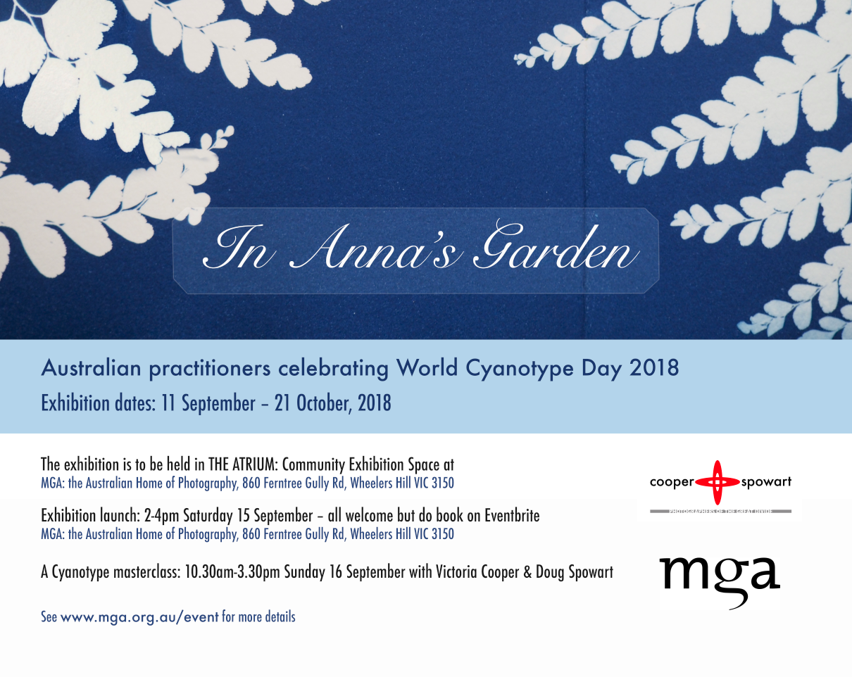
In Anna’s Garden
.
This year’s show is entitled ‘Land/Sea/Sky’ and the show at The Maud Street Photo Gallery is just the beginning as the works will be forwarded to the A Smith Gallery in Johnson City Texas for showing on World Cyanotype Day along with other works from across the world. At the end of the A Smith Gallery show the works will be sent on for exhibition in New Orleans at the PhotoNOLA Festival.
Participants in the exhibition will make a contribution to the costs of the Maud show as well as courier delivery to the U.S.A. and back home to Australia.
AN INVITATION TO ALL AUSTRALIAN CYANOTYPERS
An invitation has gone out through various networks inviting cyanotype makers to participate in the Australian WCD Travelling exhibition. If you make cyanotypes please consider being a contributor to the show. If know someone who does please let them know about the exhibition and pass on to them the AUST_WCD_SUBMISSION.
.
For information about The Cyanotype in Australia and to join the the group’s FACEBOOK page: CLICK HERE
.
To Download a PDF copy of the catalogue for the MGA exhibition click the link: In_Anna’s_Garden-CATALOGUE-FINAL-INT
.
,
LIBRIS ARTISTS’ BOOK AWARD – Cooper+Spowart Finalists
The artists’ book TIDAL by Cooper+Spowart
Our artists’ book TIDAL is now on show as a FINALIST in the 2018 LIBRIS ARTISTS’ BOOK AWARD at Artspace Mackay, Queensland, Australia.
We are excited to be finalists in this Award exhibition. The awards were announced on May 26 – details of the winning works and a download of the exhibition catalogue are available at the bottom of this post.
ABOUT OUR ARTISTS’ BOOK – TIDAL :
TIDAL is a montage of fragmented imprints made from the solid reality of found objects swept up by the tide–beautiful castaways from the ocean.
These objects as image elements, no longer in their original form, are woven together as if a poem, song or dance. In many ways TIDAL relates to a ‘desire for that melancholy wonder that is the blue of distance’ from Rebecca Solnit’s A field guide to getting lost. Or just simply it could be about the artist and their art.
It is book of double-sided cyanotype prints, when held to the light, allow for the montage of the images front and back, thus merging and unfolding the space and time of the page and the book. Reading becomes the blending of the fragments through the spatial divide of the turning page.
The video that follows gives a basic view of the TIDAL book:
ABOUT THE TIDAL BOOK PROJECT:


This project began with the collection of beach detritus at low tide after the super moon at Wooli, north coast New South Wales.
We worked collaboratively in the intense heat of Christmas Day 2016 to hand coat the cyanotype emulsion on ricepaper, expose the ‘found objects’ to the paper in the sun, and then wash-out in running water with a dash of lemon juice to create the double-sided cyanotype folios.
Over the next year we developed the structural form of the book, and finally returned to finish it at Wooli, as this state, over Christmas in 2017.
The double-sided cyanotype prints, when held to the light, allow for the montage of the images front and back, thus merging and unfolding the space and time of the page and the book. Reading becomes the blending of the fragments through the spatial divide of the turning page.
THE BOOK:
A unique state book of 6 double-sided cyanotype images on rice paper.
Book size 49.5x30x1 cm
The text was written by Victoria Cooper and includes a quote by Rebecca Solnit.
Folders and text:
Canson Stonehenge and Arches paper with rice-paper collage elements.
Garamond font family in pigmented inks on Arches paper.
This book is another work created in an ongoing series relating to the locality of Wooli and we acknowledge the support provided by Dr Felicity Rea
BOOK TEXT:
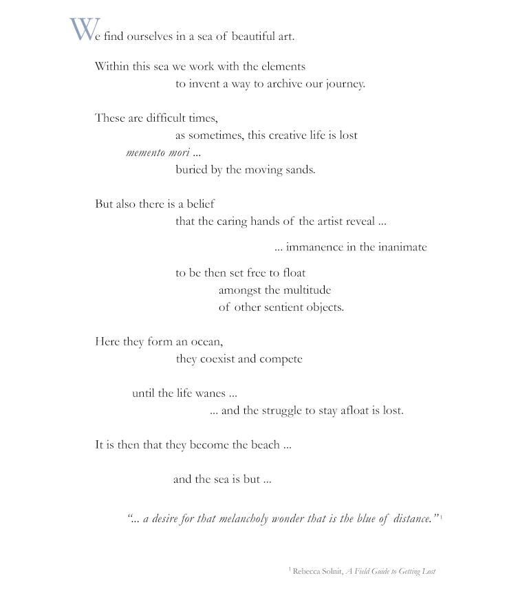
Frontpiece: TIDAL
OTHER INFORMATION INCLUDING THE WINNING BOOKS:
Category 1. Dalrymple Bay Coal Terminal National Artists’ Book Award
Winner: Clyde McGill for his work ‘Witness’
Category 2. Dalrymple Bay Coal Terminal Altered Book Award
Michelle Vine for her work ‘Contested Biography I (quadrat)’
Category 3. Mackay Regional Council Regional Artists’ Book Award
Jamian Stayt for his work ‘Tagged’
Category 4. Artspace Mackay Foundation Tertiary Artists’ Book Award
Jenna Lee for her work ‘A plant in the wrong place’
LIBRIS CATALOGUE
CLICK THE LINK BELOW TO DOWNLOAD A COPY OF THE CATALOGUE
Libris_Awards_2018_Catalogue_of_Entries_brochureA4
SEE OUR POST ABOUT THE 2016 LIBRIS AWARDS HERE
.
.
.
.
.
National Works on Paper submission – not shortlisted
NWOP-banner
.
As an artist there is a need for affirmation and justification for one’s life in the activity and practice of artmaking. Artists prepare and curate their work in gallery exhibitions to present work – and then there are awards and competitions. Each year, as the call for entries comes around, we like many artists around the country, look at recent work and consider its appropriateness for specific awards.
There are of course thoughts of winning an award but perhaps more importantly is the opportunity to be shortlisted for exhibition and considered for purchase or collection. Equally important for us is the opportunity to connect with fellow artists in the curated exhibition that represent the judge’s opinion of what constitutes the most relevant works based on the competition’s criteria.
This year I submitted to the National Works on Paper Award an artists’ book that I had made during our Skopelos Works on Paper workshop in Greece last year. The book is an exploration of the idea of a montage of light capturing the performance of reading a book. Simultaneously the reader, the location where the reading took place and the page-turning action of reading is imaged in light sensitive cyanotype on the watercolour pages of the book.
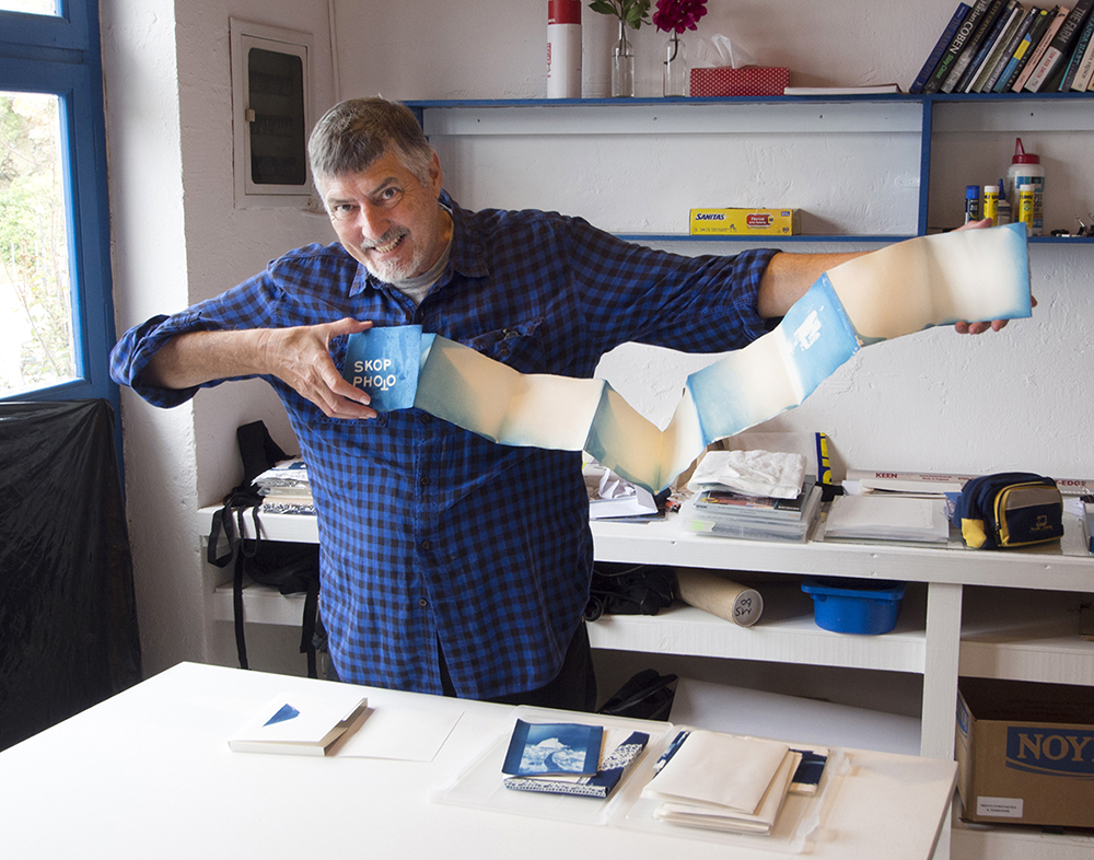
Doug Spowart opens SKOP PHOTO after its creation in Greece PHOTO: Victoria Cooper
.
Here’s an image of the book:
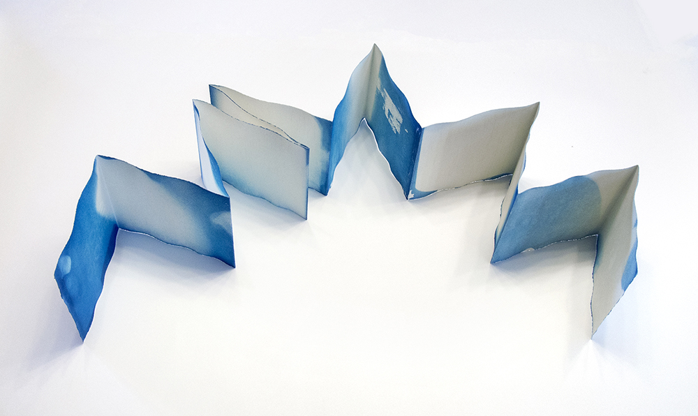
SKOP PHOTO artists’ book by Doug Spowart
.
Other images of SKOP PHOTO folder, cover and details


ARTIST’S STATEMENT: SKOP PHOTO an artists’ book by Doug Spowart
This book is created using the cyanotype (sun print) process as part of the author’s ongoing investigation on the ontology of reading.
The book was folded into a concertina form to eventually allow for a variety of potential readings; either extended or page after page. The author then coated the light sensitive cyanotype emulsion onto the pages of the book.
The pages were slowly turned and extended over several minutes allowing the sunlight of the Greek island of Skopelos to strike the emulsion as author performed reading.
After washing in a bath of water, an image of the Aegean light was formed in Prussian blue on the pages of the book. Alternatively, where the light had not fallen on the page – there seemed to be no image formed. But this apparent absence was a “shadow” – a kind portrait of the artist reading the book in its moment of creation.
Today I received an email advising that my submission was not shortlisted..
.
Not a big problem for me as only 1 in 16 artworks were accepted for the 2018 awards and those names on the list are a fine group of artists.
.
If you are interested the 2018 National Works on Paper finalists were:
Raymond Arnold, Peter Atkins, Alec Baker, Martin Bell, Ray Besserdin, Solomon Booth, David Bosun, Godwin Bradbeer, Kate Briscoe, Jane Brown, Jon Campbell, Susanna Castleden, Danica Chappell, Hua Cun Chen, Sam Cranstoun, Lesley Duxbury, Robert Fielding, David Frazer, Ian Friend, Dana Harris, Katherine Hattam, Pei Pei He, Kendal Heyes, Mark Hislop, Deanna Hitti, Anna Hoyle, Natalya Hughes, Alana Hunt, Locust Jones, Jennifer Joseph, Noŋgirrŋa Marawili, Brian Martin, Georgie Mattingley, Mish Meijers, Viv Miller, Helen Mueller, John Nixon, Open Spatial Workshop, Elena Papanikolakis, Louise Paramor, Hubert Pareroultja, Jemima Parker, Riley Payne, Dan Price, Lisa Reid, Louise Rippert, Cameron Robbins, Brian Robinson, Elissa Sampson, Emily Sandrussi, Geoff Sargeant, Jo Scicluna, Liz Shreeve, William Smeets, Kylie Stillman, TextaQueen, James Tylor and Laura Wills, Trent Walter, Rosie Weiss, Mumu Mike Williams, Puna Yanima, Yvonne Zago, Tianli Zu.
Exhibition details at the Mornington Peninsula Regional Art Gallery:
The opening event and award presentations will take place on Saturday 21 July from 4-6pm. An electronic invitation will be sent to you closer to the date.
Now I’m looking forward to 2020
In the meantime I’ll be pursuing some more cyanotype documentations of the act of reading – maybe during our upcoming Bundanon Artists Residency in June…
.
.
,
