Archive for the ‘Reviews’ Category
THE ‘OURS FOR THE MAKING’ PROJECT
..
.
“… this project keeps growing with wisdom, connection and
heart with every place (and places) that are present
and all who share in it.”
Sound artist Bree Marchbank.
.
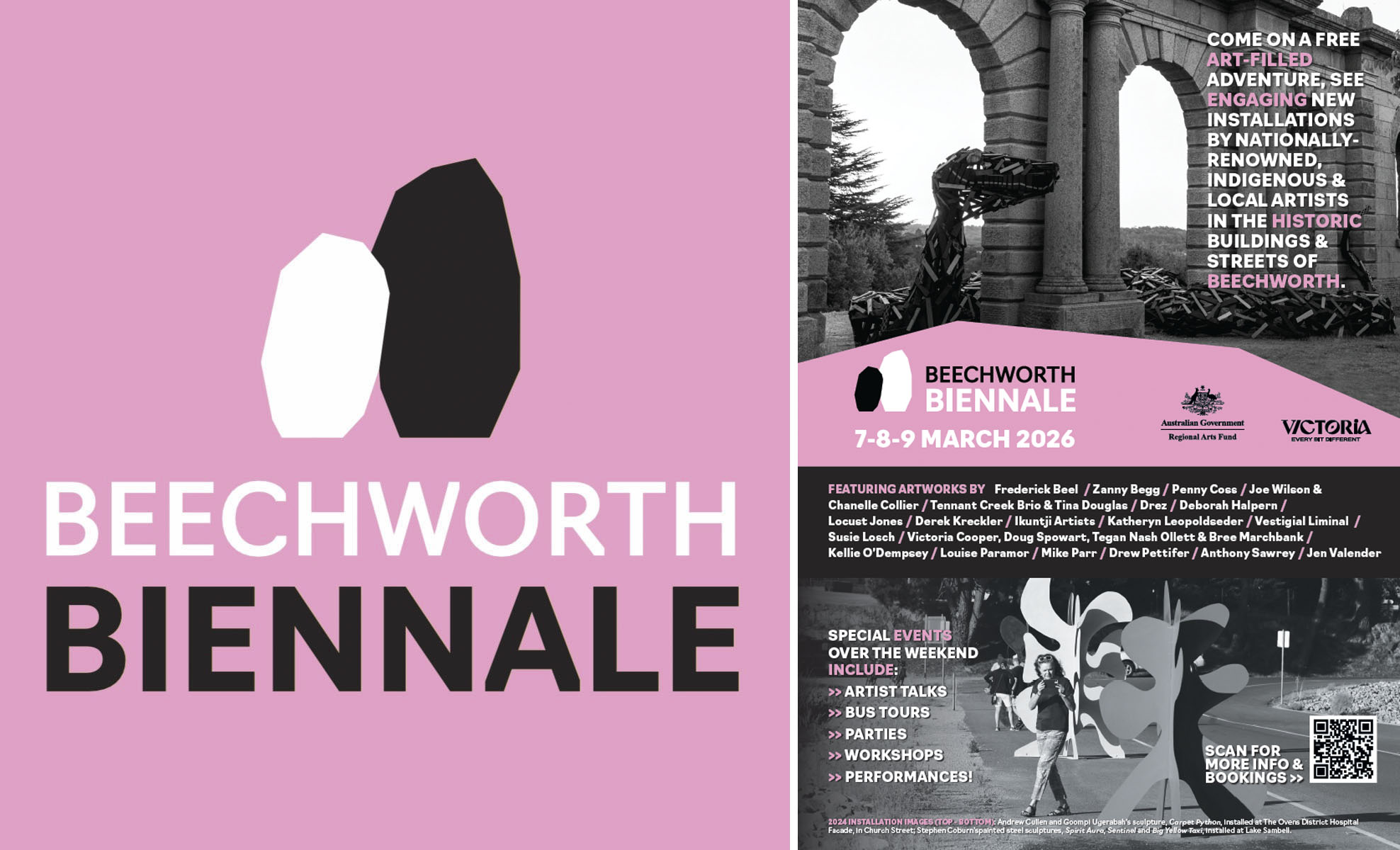
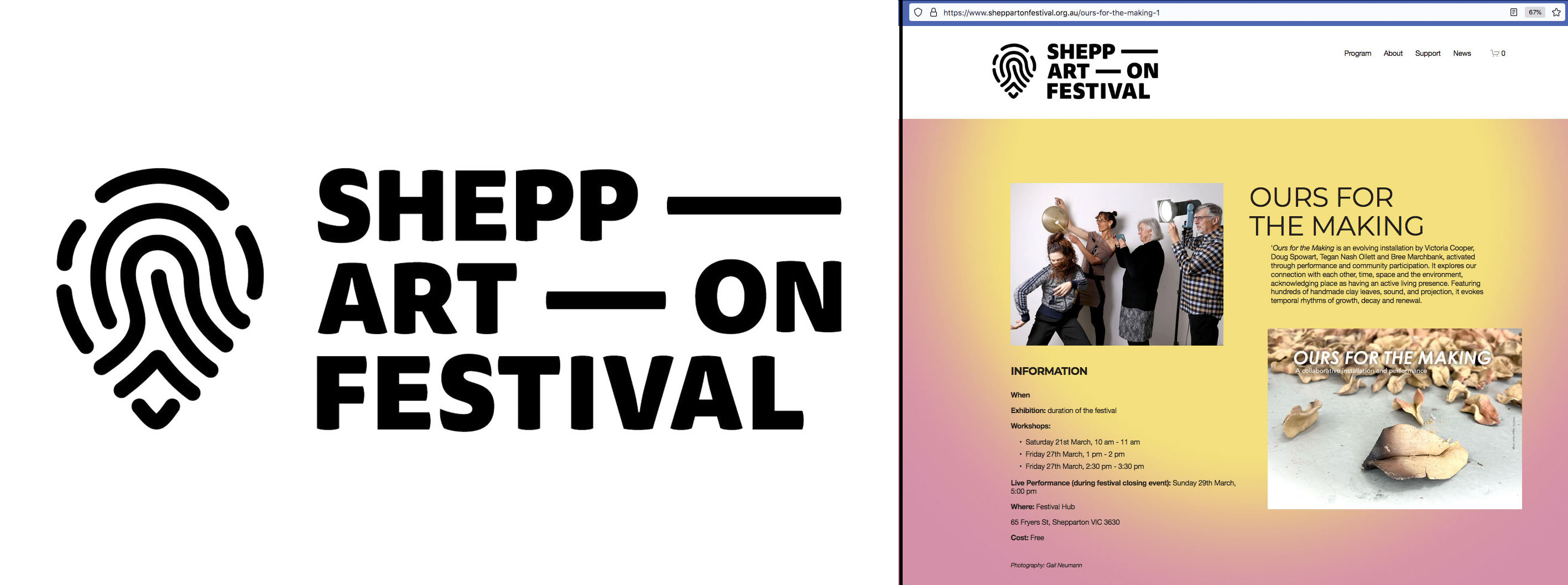
In March 2026 the Ours for the Making project was presented at two venues: the first, for Beechworth Biennale on the 7–9 of March and the second, at the Shepparton Arts Festival Hub 20–29 March. The following text is edited from project documents written by Tegan Nash Ollett with contributions from team members Bree Marchbank, Victoria Cooper and Doug Spowart.
.
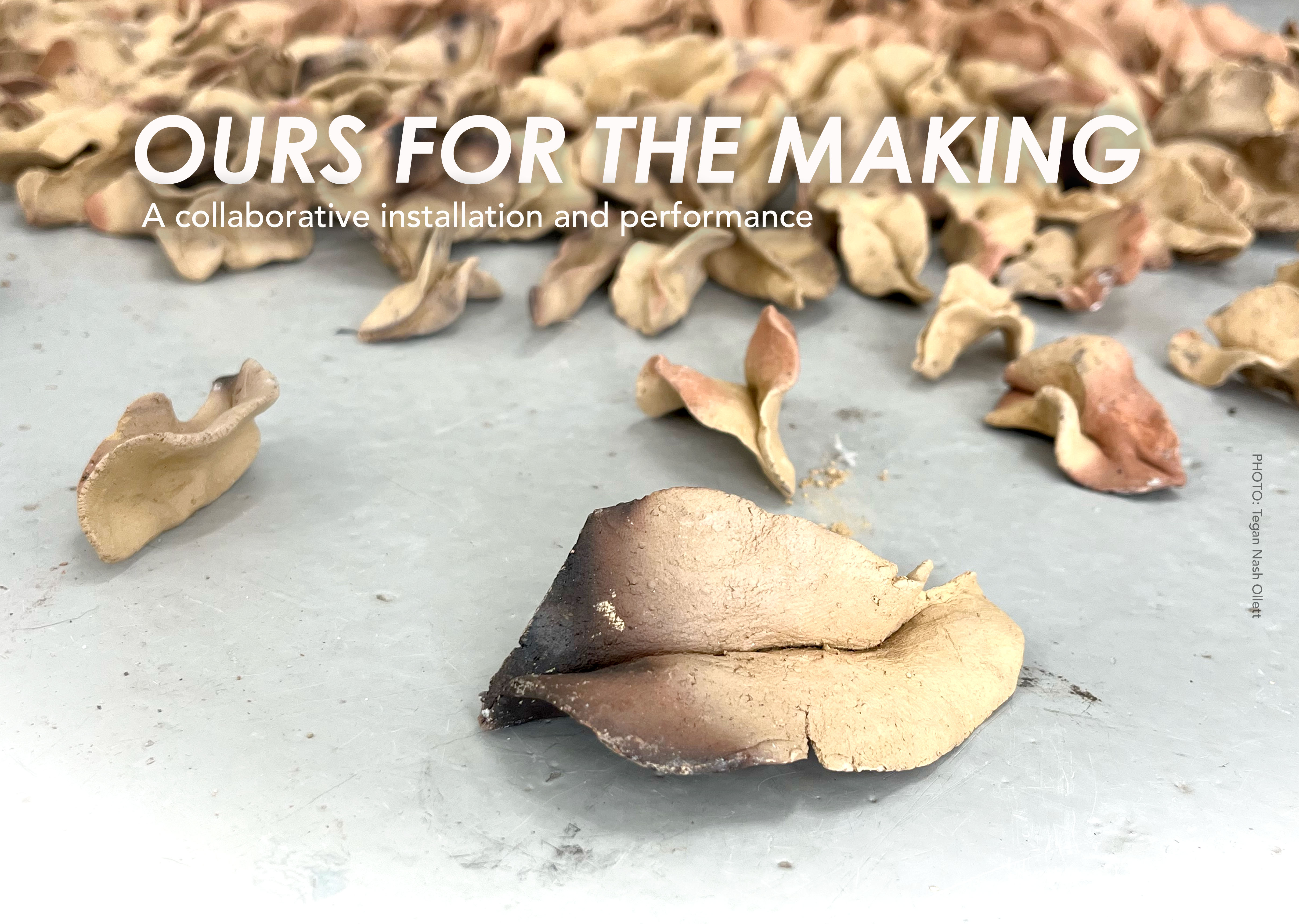
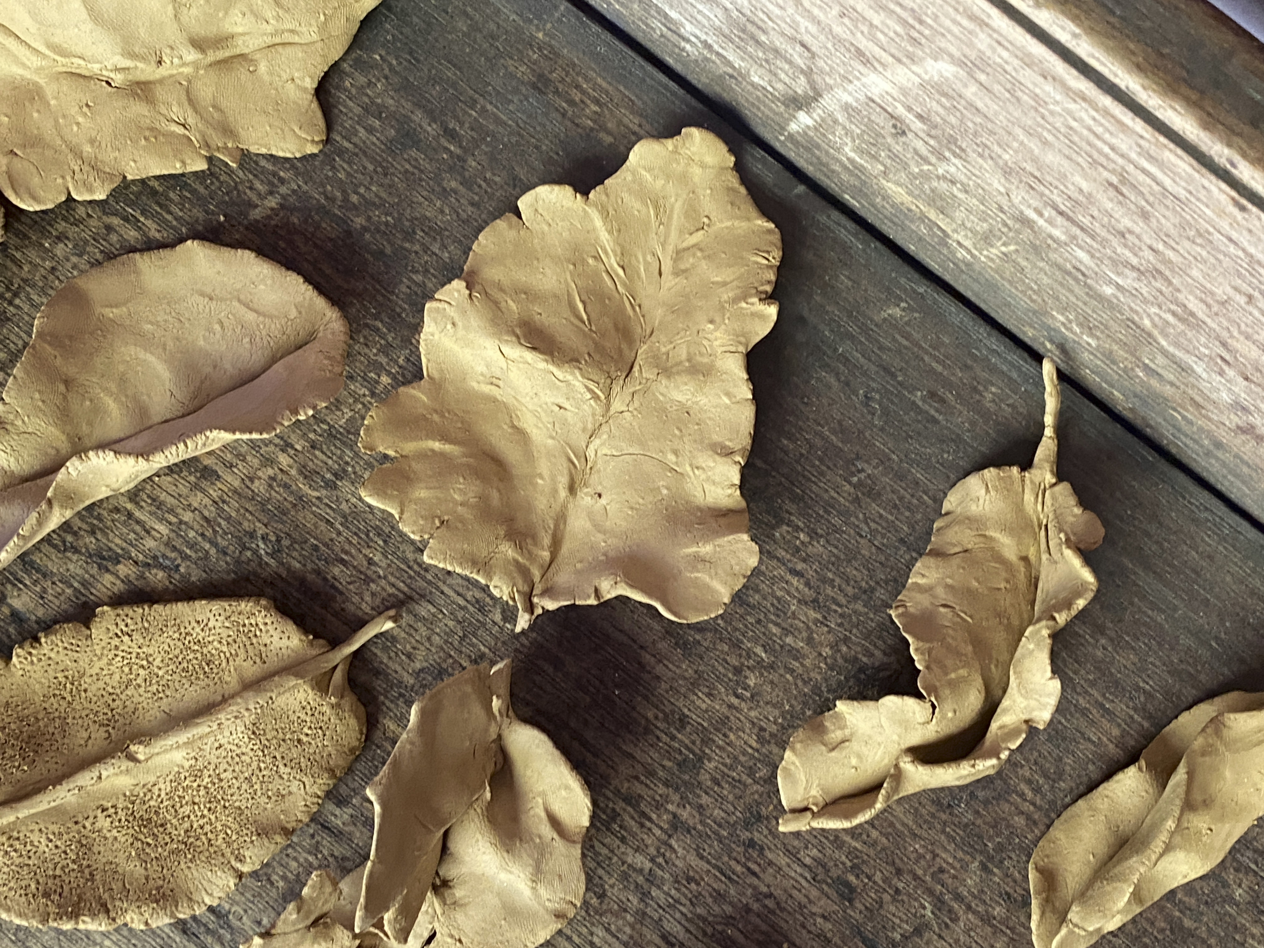
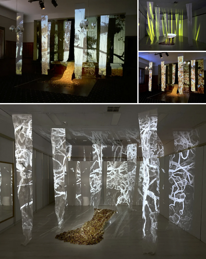
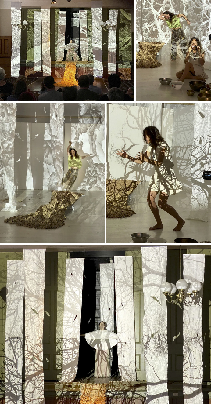
Ours for the Making is an evolving installation activated through performance and community participation in clay leaf-making sessions. The project was presented as an audio/visual installation. In the final day of each showing was concluded with an improvised live performance. It explores our connection with each other, time, space and the environment. It also acknowledges place as having an active living presence. Featuring hundreds of handmade clay leaves, sound, and visual projections the work is intended to evoke temporal rhythms of growth, decay and renewal that mirror the life histories embedded in natural materials.
.
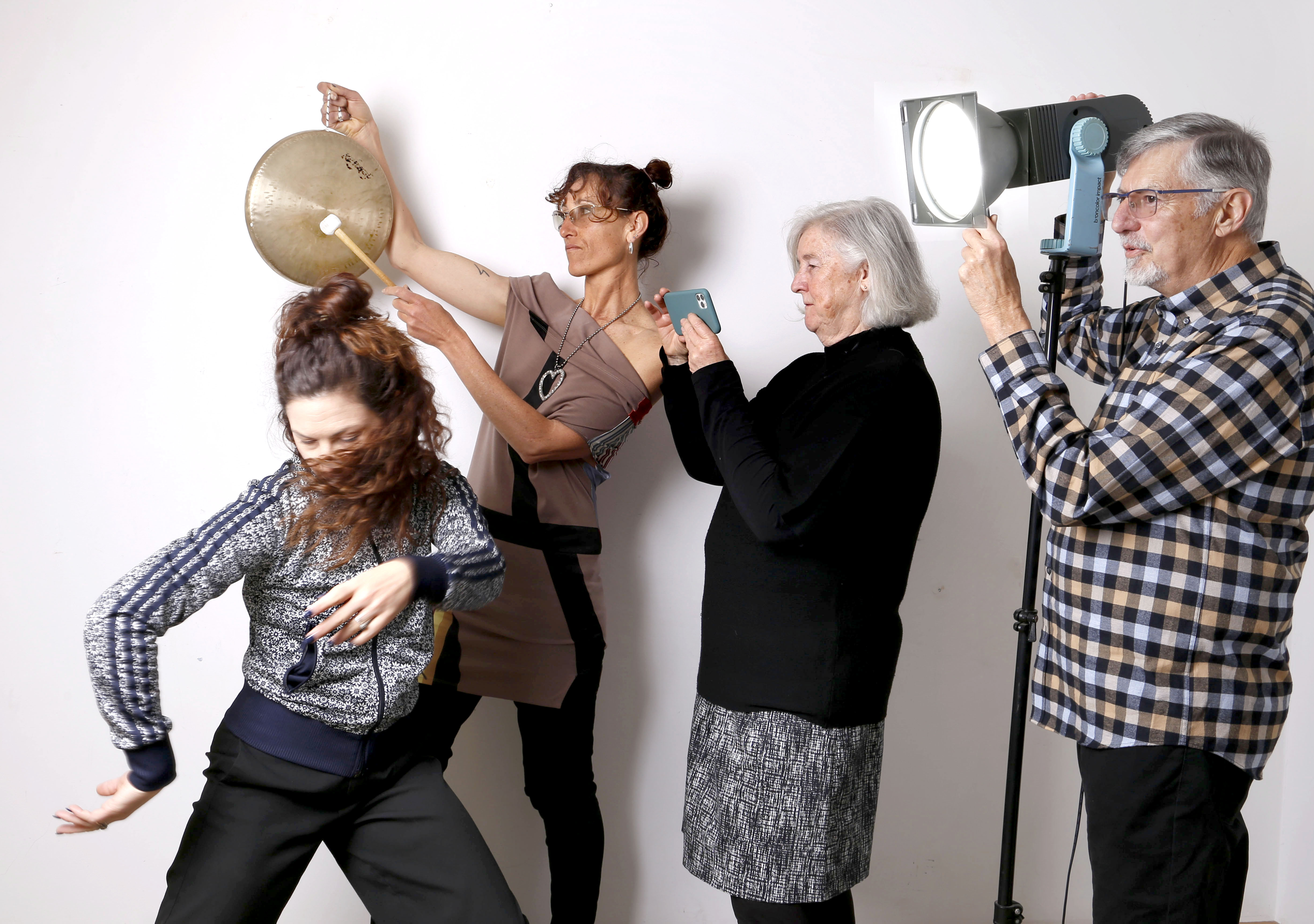
Tegan Nash Ollett, Bree Marchbank, Cooper+Spowart PHOTO: Gail Neumann
.
THE ARTISTS
The Ours for the Making is a newly formed collective with each of the artists having a long-standing commitment to exploring place as an active, living presence. All four artists live and work in Benalla. Tegan Nash Ollett’s work in performance and community engagement foregrounds artistic practice as a connective, transformative process. Bree Marchbank’s sound works draw from environmental listening and experimental composition while Victoria Cooper and Doug Spowart’s photographic, artists book and site-responsive practices examine how landscapes accumulate memory.
Separately, the four artists have received awards and featured in festivals and galleries across Australia, however, each share a strong interest and connection to regional contexts and communities through their work.
.
.
THE CORE INSPIRATION FOR THE PROJECT
Over many years Tegan has work with communities in a process that engages participants in conversation while they worked by hand with potter’s clay to form leaf shapes. She found that people gathering together in this way shared their lived experiences, community’s histories and other personal reflections. Through these sessions the conversations were metaphorically embedded into the leaf objects they made. For her “making is a conduit for connection” and she believes “that through this process, knowledge is not transmitted hierarchically but shared laterally – through material, gesture, and collective experience”.
Following the leaf-making sessions Tegan fires the clay with wood in a fire-pit. Variations in the colour of the clay and occasional ‘blush’ marks and the maker’s fingerprints on the ceramic leaves evidence the story of their making.
Later the ceramic leaves are incorporated into the existing body of leaves created by the Artist (Tegan), allowing the installation’s evolution, with design considerations to reference a response to site. They are the muse for the artists in the development of the full audio-visual installation. The leaves are the centrepiece of the artwork.
.
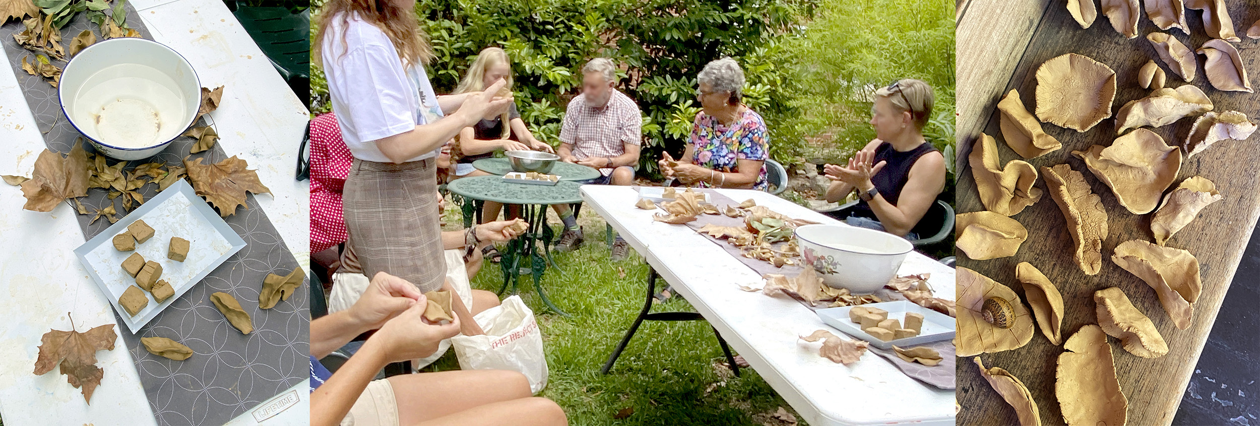
A communal clay leaf-making sessions taking place at The Old Priory
.
.
.
VIDEO PROJECTION IMAGES+SOUND
Through initial team discussions, five themes/concepts arose as evocative and powerful connections for the leaves with the project. Each of the five themes evoked different expressions of being with/and in Nature. Cooper+Spowart drew from their lived experience traversing landscapes and walking. From this they created visual narratives – montages, for projection, as pathways through each of the five themes.
These five videos were then passed on to Bree who crafted her sound-works to respond to the visual montages. As Bree states she “approaches sound creation as ritual and collaboration, using improvisation to explore the life cycle of a leaf and our connection to place”.
Viewing of these video works in the installation is enhanced by the fragmentation of the image as it passes over the different suspended ‘veils’ they are, in themselves, individual performative elements, Acts, adding depth and filling the space with imagery.
Together the experience of each animated projection montage with the sound work is deeply layered and form individual elements – Acts, within the installation.
SEE: Bree, Victoria and Doug’s Artist Statements at the end of the Post for deeper insights on process and meaning
THE FIVE VIDEOS
Act of Fire
Act of Paralysis: Burnt Banksia
Act of Transformation: Decay and renewal
Act of Fragility: Sunrise
Act of Intimacy: Walking the path
THE INSTALLATION
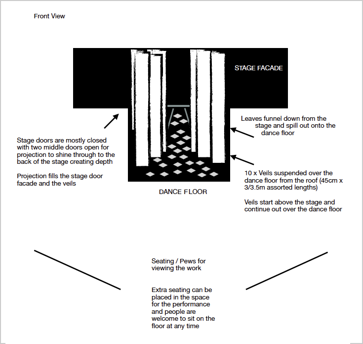
Tegan’s draft install plan (Detail)
.
.
.
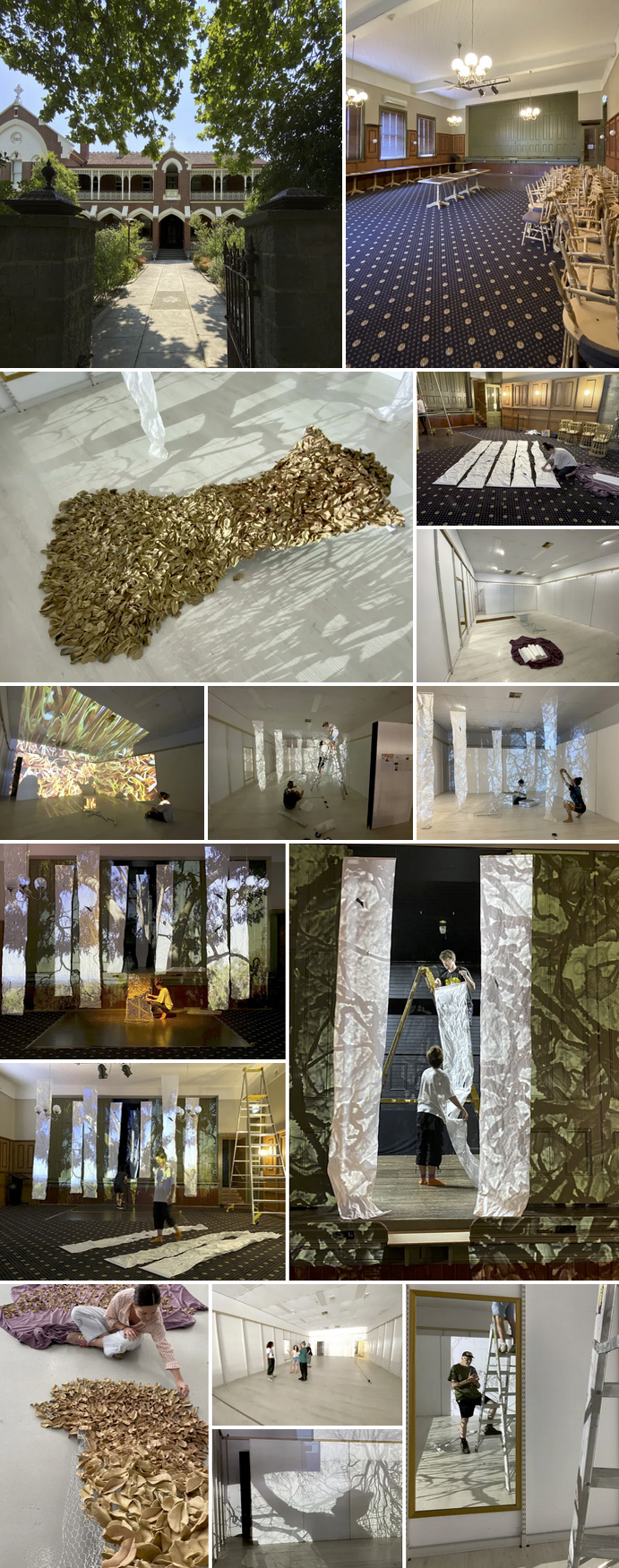
In the installation a flow of clay leaves is both architectural and organic. Suspended above are rice-paper veils that catch image projection’s light, shadow, and act like memory skins. The rice paper has been intentionally torn and crumpled to add texture and visual light play. The grouping of leaves suggests concepts of ritual and offering, acknowledging its close relationship to nature, while the veils evoke garments, shrouds, and thresholds.
The sound and image projection animate the space slowly, asking viewers to linger rather than consume. The overall installation invites contemplation of time, care, and the residue of human gesture where gathering becomes an act of devotion and what remains has both material and memory.
.
THE PERFORMANCE
 ..
..
The one-off live performance is a unique opportunity for attendees to experience the Ours for the Making installation, highlighting the work’s themes through movement, sound and performance. The performance is improvised and features movement by Tegan. Bree activates her instrument’s and sings, at times harmonising with Tegan. In this live performance both respond, through movement and sound, to the sonic and visual rhythms of growth, decay and renewal.
SEE: Tegan’s Artist Statement at the end of the Post for deeper insights on process and meaning
.
This YouTube video of the Beechworth Biennale performance by Cooper+Spowart is from a stationary camera position. Its run time is 40 minutes and is best viewed on a larger screen device.
.
.
VICTORIA+DOUG’S REFLECTION ON THE PROJECT
In 2025 we connected with Tegan and her practice in performance and dance. Each month she leads a free ranging improvisation space for community engagement at Benalla Art Gallery called Fresh Juice. At one of these sessions Tegan witnessed Victoria’s exploration of the materiality of rice paper through her crumpling and ripping the sheet then moving it through the air and identified the performative nature of the act.
In a later conversation we learned about her many years of working with community engaging them in conversation while working with clay making leaf shapes. She mentioned that what she had seen at Fresh Juice had inspired her to discuss a collaborative project with us using rice paper, her ceramic leaves and a movement performance.
.
.
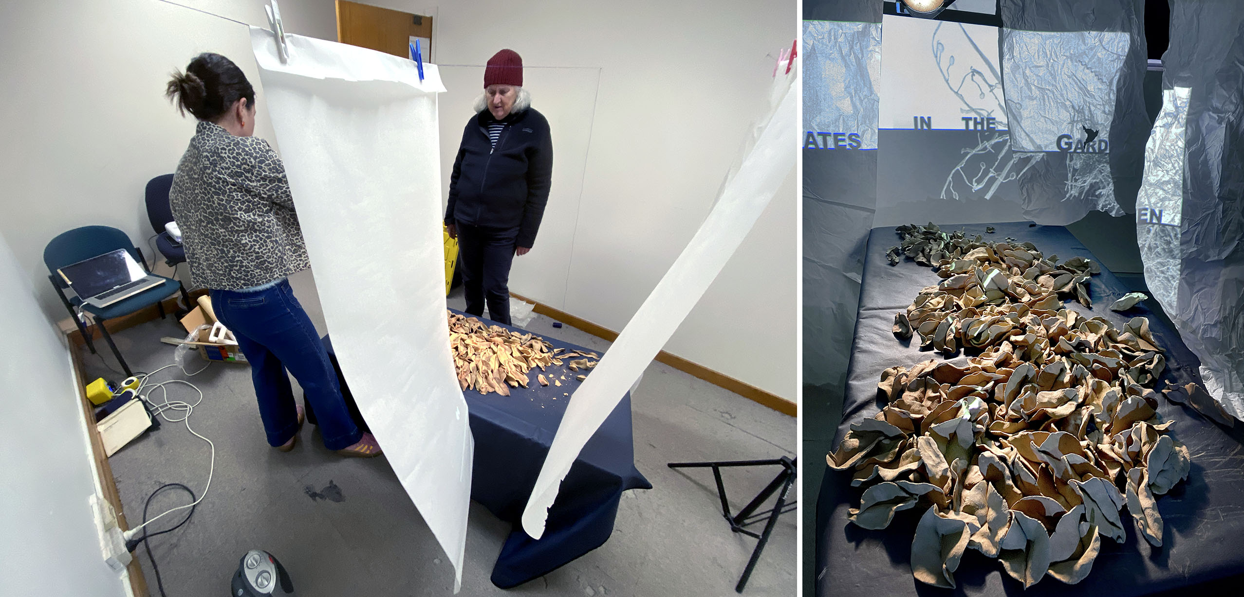
Excited by the flow of concepts we set up an experimental installation with Tegan in our studio. We hung veils of rice paper from the ceiling over a large surface covered with her clay leaves. Studio lighting was arranged and an animated interpretation of an artists book by Victoria was projected over the scene. We saw potential for the work to be developed further. As Tegan had a strong connection with sound artist Bree Marchbank – she was invited to become the fourth member in this evolving collective project.
.
.
With a successful application for an audio-visual, and sculptural installation engaging community to be developed for the Beechworth Biennale we began to work on the project – that was now entitled Ours for the Making.
From the start this work was developed though the team’s sensory response and reflexive exploration and this continued through to the final installation as a visual, spatial and sonic connection with the site.
After discussions with the Beechworth Biennale we were offered the theatre in The Old Priory. Built in the 1870s the large seating area, stage, dance floor all under an 8-metre ceiling – the site at first seemed challenging. However the installation issues were resolved, and the site was opened for public viewing on March 7 for the duration of the Festival, with a one-off performance taking place on the evening of the 9th of March.
.
.
Through Tegan’s efforts we also received an offer of a presentation of the installation in The Hub at the Shepparton Art Festival. As a transformed vacant shop it was a totally different space and provided an exciting opportunity to reinterpret the installation and the concluding improvised performance.
In Conclusion
For us Ours for the Making has been both an exciting and challenging project. Working within this creative and innovative team was an enriching experience. We can see potential for this project to continue in other spaces – each time, a reimagining.
.
Vicky+Doug
April 4, 2026.
.
.
SOME DOCUMENTS OF THE SETTING UP OF THE 2 SPACES
.
BEECHWORTH BIENNALE 7-8-9 March 2026 in THE OLD PRIORY (Site 11)
.
SHEPPARTON ARTS FESTIVAL in the Festival HUB 20–29 March
.
ARTISTS’ STATEMENTS
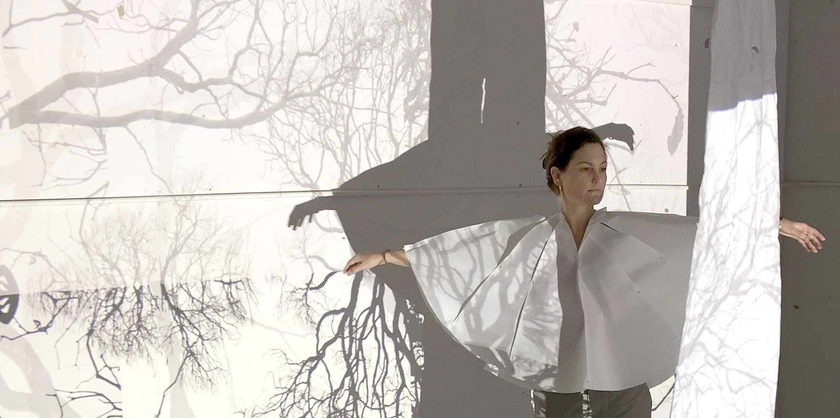
Tegan Nash Ollett in projection
TEGAN NASH OLLETT
While developing the ceramic leaf component of the installation, engages deeply with both the conceptual framework of the work and its physical, immersive elements, including space, projection, sound and structure. Nash-Ollett’s movement practice embodies both the visceral and experiential dimensions of the work’s central themes of life cycles and transformation, offering a physical articulation of the body’s encounter with these ideas.
Through improvisation, she responds intuitively to the spatial environment, sonic landscape, projected imagery, and the installation itself, activating the work and foregrounding the body’s relationship to place and its capacity to hold memory. This exploration unfolds through an emotive and physical engagement with life and its cyclical nature. Each cell of the body becomes implicated in this inquiry, as movement transports performer and audience through layered moments of embodiment.
.
.
Bree Marchbank with gong
BREE MARCHBANK
Approaches sound creation as ritual and collaboration, using improvisation to explore the life cycle of a leaf and our connection to place. The sound developed through a devotional practice which included field recordings and attentive listening in community and nature. These recordings capture the living presence of place, with and without instrumentation, creating sonic textures, and relational gestures that invite deeper connection and shared experiences for the audience. The sound reflects repeating patterns that mirror organic processes of emergence and transformation.
For me music begins with deep listening, sitting, feeling and remembering with/and on country. Sounds, song, rhythm, movement, melody and their carriers always ask me to listen with all my essence first. Being invited to collaborate on this project, I was pulled to go and sit with country and listen in deep remembering in different locations that were connected to land, waters and sky of each of the festival sites. From there, sometimes I was invited in to sing and create in song and ritual and other times it was to go home and take in what I had remembered or had to relearn/unlearn and then act accordingly. It is devotional, it is ritual, but it is also humbling and honouring to be able to create music.
I create improvisations for and with my body, my blood, all my ancestors (known and remembering), mother earth, mother universe, all spirit who share this journey with me. This was how I began the listening journey for ‘Ours for the Making’. Then I went into deep listening in collaboration with us as a team, and all the places we brought together, further places upon where deep listening had happened, and with community who shared in story, place, creating together, connecting in and with country.
.
.
Cooper+Spowart – Toowoomba Gothic Assisted Photo by John Elliott
VICTORIA COOPER + DOUG SPOWART
For these two artists collaboration is a dynamic space to test and challenge their individual creative practice and explore new and uncharted territory. They are informed by Charles Green’s book The Third Hand, where he proposes that collaboration creates a new entity full of potential and possibilities.
Over time they have recognised that their collaboration with Nature and the non-human has deepened and broadened their perceptions of Being-in-the-world. Their practice of Being is therefore fully engaged with Nature. Here, they loose themselves – corporeality evaporates and the physical space becomes a psychological state where poetic and aesthetic narratives emerge through deep reverie.
.
.
IN A FUTURE BLOG POST
In the future we will consider a reflection statement for the project. Currently under development there is a video documentation of the project’s performance at the Shepparton Art Festival which will be made public when complete.
.
.
.
ACKNOWLEDGEMENTS
The artists acknowledge the support of Nina Machielse Hunt the BEECHWORTH BIENNALE team, and Gareth Hart the Executive Producer of the SHEPPARTON ART FESTIVAL, Eric Nash and the Benalla Art Gallery. Also families and friends across Victoria, Melbourne and Benalla, who have contributed to the installation through leaf-making sessions, discussions and sharings in the development of the ceramic leaf feature.
.
Acknowledgement of Country
The artists also wish to acknowledge the Traditional Owners of the various Country locations on which this art project has been made and presented. The artists also acknowledge and pay their respect to the ancestors and Elders – Past, Present and Emerging from these lands and any indigenous people who may attend or read about this presentation.
.
.
The post header photograph is by Tegan Nash Ollett.
.
The team photograph is by Gail Neumann.
.
The portrait of Victoria + Doug was an assisted self portrait with John Elliott.
.
All photographs are by Doug Spowart + Victoria Cooper unless otherwise credited.
.
© All Copyrights are retained by all authors.
.
.
.
.
.
.
.
.
PHOTOS WITH CAPTIONS FOLLOW …


.
.


.
.
.
HELEN COLE VISITS A PAPER UNIVERSE
..
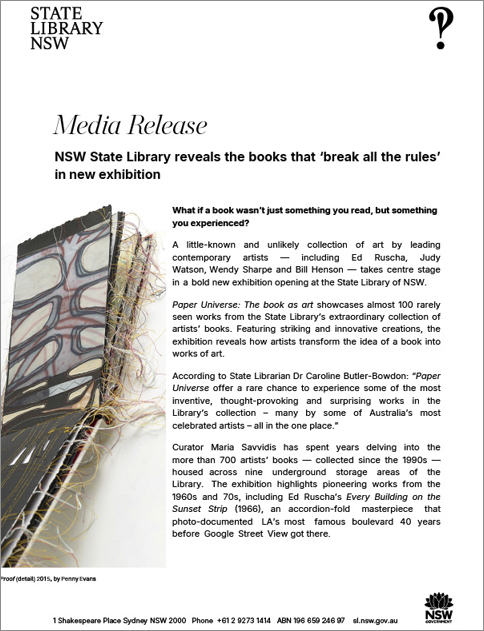
“Artists’ books break all the rules. They stretch, fold, sculpt and reimagine the book as an object — not just something to read, but something to experience”
Curator Maria Savvidis.
Two views of the ‘Paper Universe: The Book as Art’ entry concertina PHOTOs: Helen Cole
.
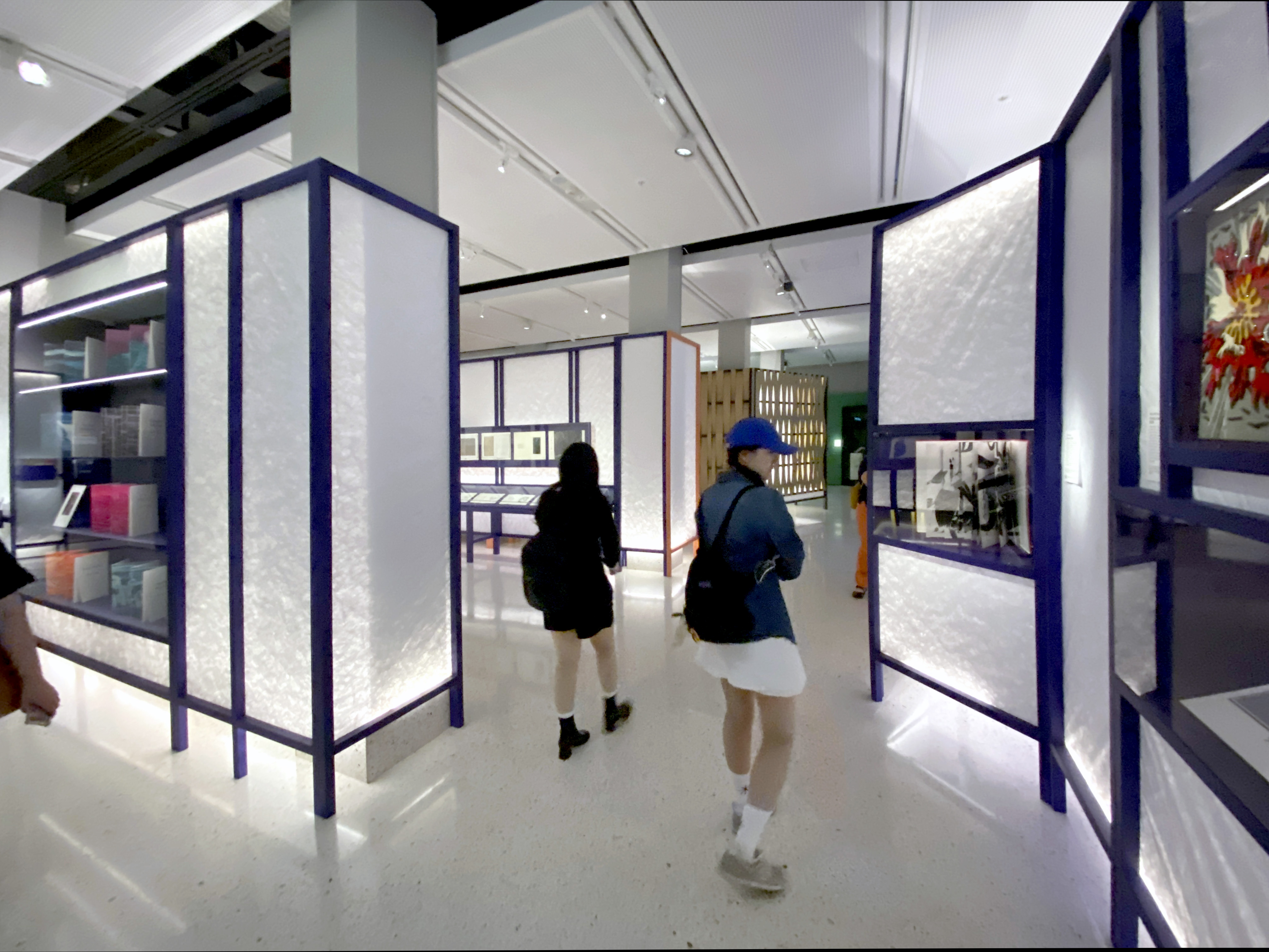
PAPER UNIVERSE: THE BOOK AS ART
A MAJOR EXHIBITION OF ARTISTS BOOKS AT THE STATE LIBRARY OF NSW
.
The exhibition press release states, ‘Paper Universe: The book as art’ showcases almost 100 rarely seen works from the State Library’s extraordinary collection of artists’ books. Featuring striking and innovative creations, the exhibition reveals how artists transform the idea of a book into works of art. According to State Librarian Dr Caroline Butler-Bowdon: “Paper Universe offers a rare chance to experience some of the most inventive, thought-provoking and surprising works in the Library’s collection – many by some of Australia’s most celebrated artists – all in the one place.”
.
Paper Universe: The book as art is a free exhibition at the State Library of NSW until 3 May 2026
.
Visiting ‘PAPER UNIVERSE’ with Helen Cole+Victoria+Doug
Towards the end of 2025 we were drawn to Sydney to encounter the seminal artists book exhibition PAPER UNIVERSE: The Book as Art. We invited our friend Helen Cole to join us and Helen was able to arrange a meeting with the curator Maria Savvides to discuss the exhibition, the books and their presentation.
After our viewing of the exhibition our reflective discussion about what we had encountered led to an invitation for Helen to write an informed essay from her significant experience and knowledge of the artists book.
What follows after a selection of images, mainly taken by Helen, is her essay and a collection of documents and a video of the exhibition.
Paper Universe: The Book as Art – curator Maria Savvidis with Helen Cole PHOTO: Doug Spowart
.
HERE’S A SELECTION OF BOOKS FROM THE EXHIBITION
“Click” on the image to enlarge and see the caption.
.


.
HELEN COLE’S REFLECTIONS ON THE SHOW
When I curated the artists’ books exhibition Freestyle Books from State Library of Queensland’s artists’ books collection in 2008 it was supposed to be a mere taster before a major exhibition of the artform. That never happened. It was very gratifying to find out that State Library of New South Wales has taken up the challenge of both curation and display of this form that can be difficult to exhibit, and given it the title of Paper Universe: The book as art. The curator, librarian Maria Savvidis and her supporting team of librarians, conservators and designers have done a superb job in showcasing the richness of stories and artworks that artists books yield. They were fortunate to have five years to bring the exhibition to fruition, and this is shown by the attention to detail in its staging.
.
The exhibition is introduced in the wide corridor leading to it by a huge concertina ‘book’ with blown-up details of three distinctive works. Before you enter, the view of the concertina is a quiet white book by Nicole Hayes with a delicate texture pierced through the page from front and back with pins. As you leave the view is of colourful, forceful black, red and blue designs in linocut and digital prints from books by Dianne Fogwell and Lyn Ashby, summing up the other extreme of the books you have seen.
Paper Universe exhibition PHOTO: Doug Spowart
That calm entry leads into a quiet space to engage with the works in the exhibition, provided by dividers reminiscent of Japanese shoji screens. The themes around which the exhibition is woven are well chosen and enunciated in the didactics: the art of inspiration – influences and sources in other artists work; the natural world – its beauty, its power, but also its fragility; the civil condition – investigating, reflecting and challenging social issues, politics, morality and equality; unveiling identity – the shaping of personal, family, and national identities and memories; the artist’s eye – investigations into the notion of the book. Each is signified by a different colour in the surrounding exhibition architecture – walls, plinths and borders on the screens
The books are very well displayed, individually, with several strategies used to overcome the perennial problem of exhibiting artists books, that they generally cannot be fully experienced when closed or open at only one page. The most common comment about an artists’ book exhibition is “I wish I could see the whole book” and indeed it is my thought too, even knowing how difficult it is to avoid. The curator has gone to great lengths to show as many books in their entirety as possible.
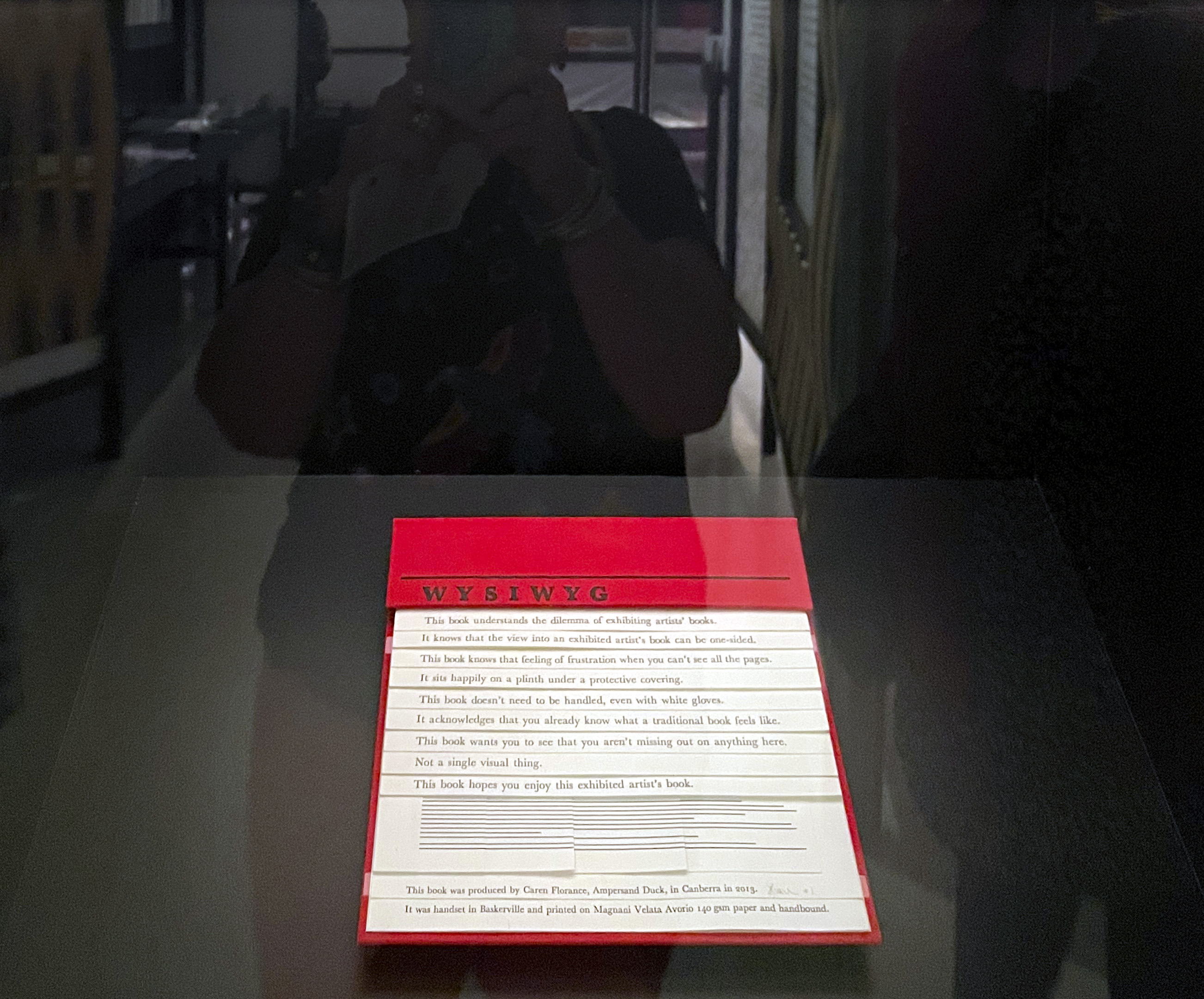
Caren Florance WYSIWYG, 2013
The first book in the exhibition, or is it the last? WYSIWYG (What you see is what you get) (2013) by Caren Florance, the curator’s own copy, was designed to be seen as a whole when the book is closed, displaying what a rarity that is. The text lines are printed on increasingly larger pages, each peeking out from the one above. Maria Savvidis wrote: “This book served as both a talisman and inside joke for me as the curator of this exhibition, years spent thinking about the paradox of exhibiting artist’s books…WYSIWYG is a wry but generous show of empathy from the artist who understands this difficulty and has shown mercy on collecting institutions tasked with the impossible.” Anne-Marie Hunter created the Tower of Babel (2006), (The Tower of Babel, Artists’ Book By Anne-Maree Hunter | State Library of Queensland) a book in the round which was exhibited in my 2008 exhibition, with the same intent.
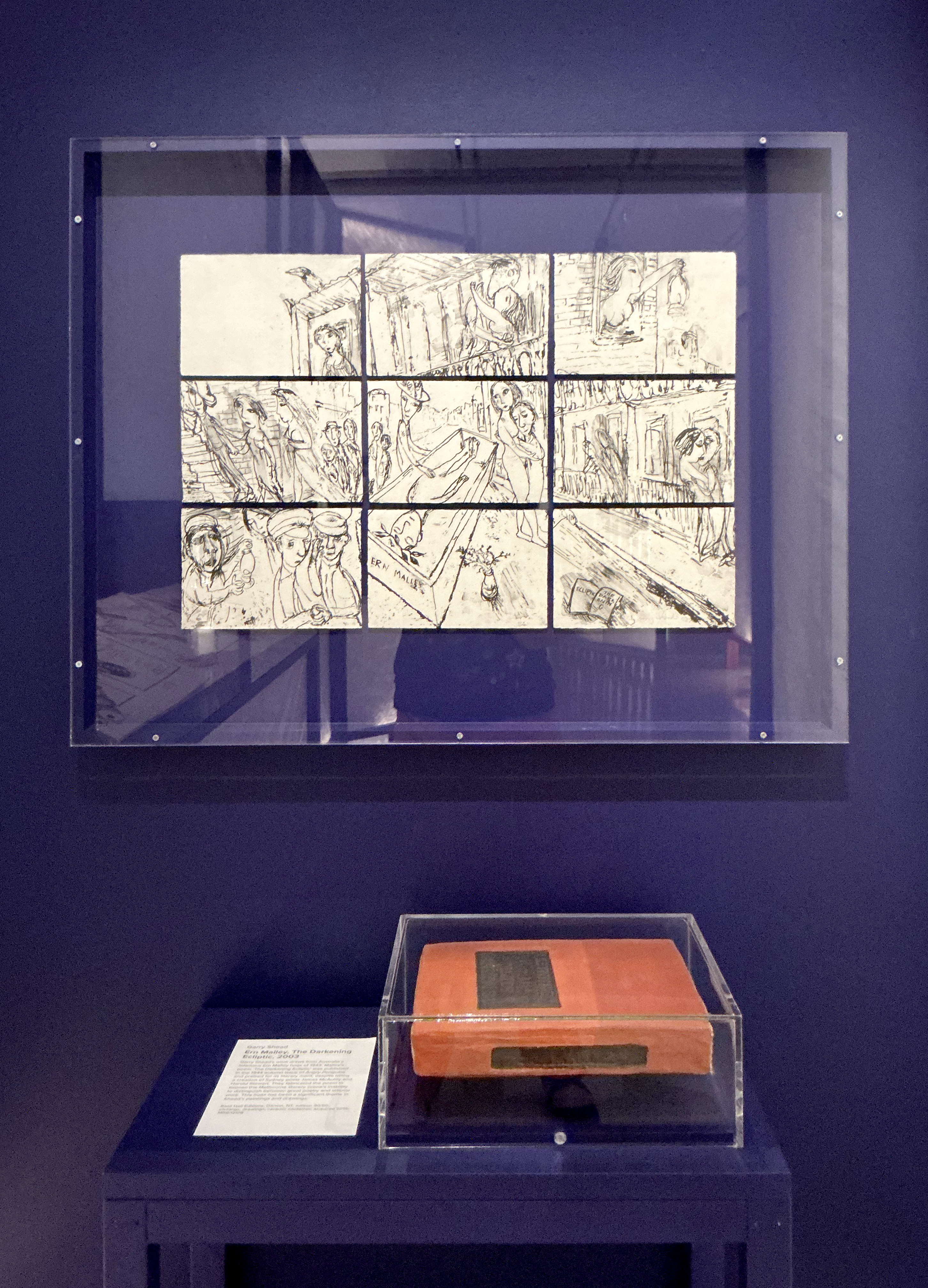
Garry Shead Ern Malley: The Darkening Ecliptic, 2003
Several of the works have been removed from their covers and are displayed, page by page, on the wall. These include Garry Shead’s Ern Malley: The darkening ecliptic (2003): a sequence of etchings, which when presented together create a single image. Along with the display of the ceramic box in which it was presented, this is possibly the best way to show this work.
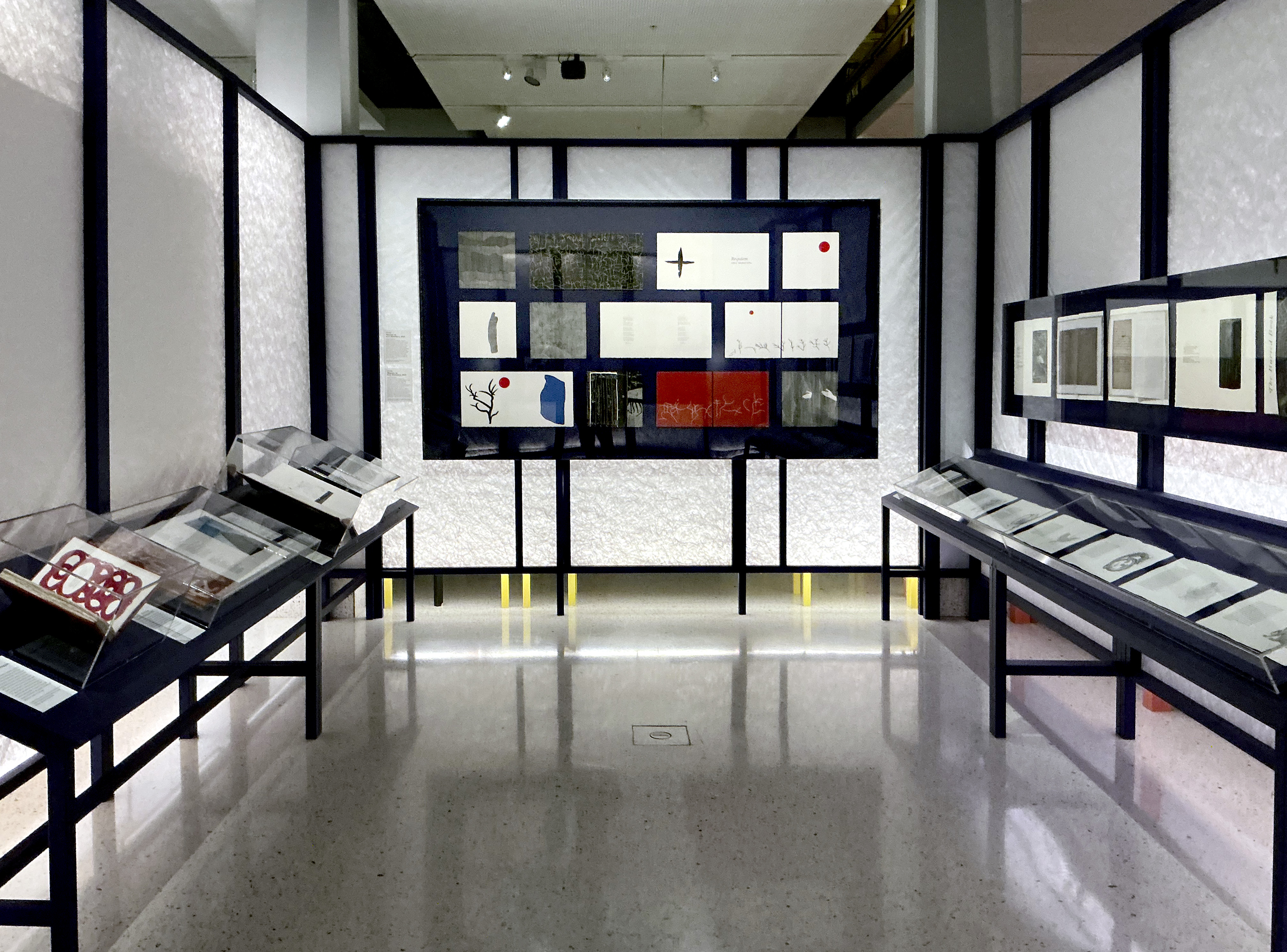
G.W. Bot Requiem by Anna Akhmatova, 2020
The pages of G.W. Bot’s superb linocuts for Requiem by Anna Ahkmatova (2020) are beautifully arranged framed on a blue background, however not all pages of the book are included so it is unfortunately a circumscribed view of the production.
Other works displayed page by page include Paul Uhlmann’s New Insecta, Queensland: AA Girault (1989), Judy Watson’s A preponderance of Aboriginal blood (2005), Peter Lyssiotis and George Matoulis’ Bridge (2021) and Glenda Orr and Kathy Boyle’s Paradise Lost : an artists’ book exploring the status of threatened & iconic plants from Australia and New Zealand collected by Daniel Solander and Joseph Banks during Captain Cook’s 1770 voyage (2020).
Dianne Fogwell Ashes to Ashes – Dust to Dust- Ash Wednesday 16th February 1983, (2018) PHOTO: Doug Spowart
The pages of Di Fogwell’s Ashes to ashes – dust to dust: Ash Wednesday 16th February 1983 (2018) are arranged upright to evoke the flames of the bushfire it describes. There has been some comment that this destroys the original form and order of the books, but I disagree. Some books are meant to be rearranged by the reader or at least read in any order they want. Also, the curator went to some lengths to speak to the artists and present their work as they would want. For most of the works artists’ statements are provided, along with translations of foreign language texts, where appropriate.
I don’t consider print portfolios on a single subject, often by printmaking groups, constitute successful and cohesive artists books, and there are a few in this show including Natural Collection (2017) by the Warringah Printmakers Studio. It was published to celebrate the 20th anniversary of the Studio and is based on the species and ecological communities of the Northern Beaches of Sydney that are under threat. Ten of the 29 prints that comprise the work are exhibited over three changeovers, not including the texts which accompany each print. I don’t think this work has a conceptual framework – a common subject, yes, but not enough to tie them together – as a book.
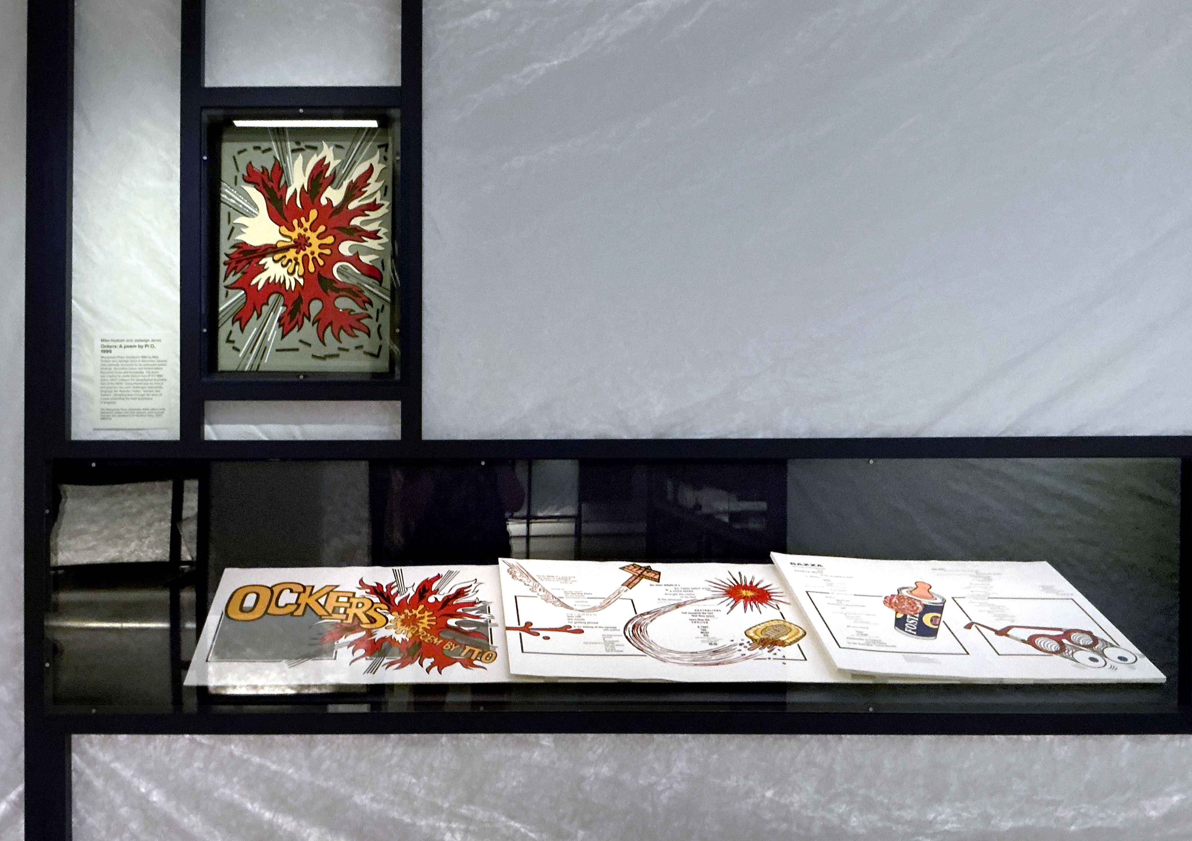
Mike Hudson & Jadwiga Jarvis Ockers: A poem by Pi O 1999
Concertina books are perfectly made for display, extended either framed on a wall or standing upright on a plinth. The bold and colourful Wayzgoose Press book Ockers: a poem by Pi O (1999) is displayed partly opened behind glass. A thoughtful work previously unknown to me was Theo Strasser’s In ecstasy, Franz Kafka (2013) in acrylic painting and collage, based on an aphorism by Kafka. Another is Lossed (2022) by Sara Bowen. Reduction lino prints of her parents, at first strong, becoming lighter as the book is opened page by page. I’m not sure if it represents her memory of them fading or their memories of each other fading through dementia, but it is a very touching work which is displayed to perfection.
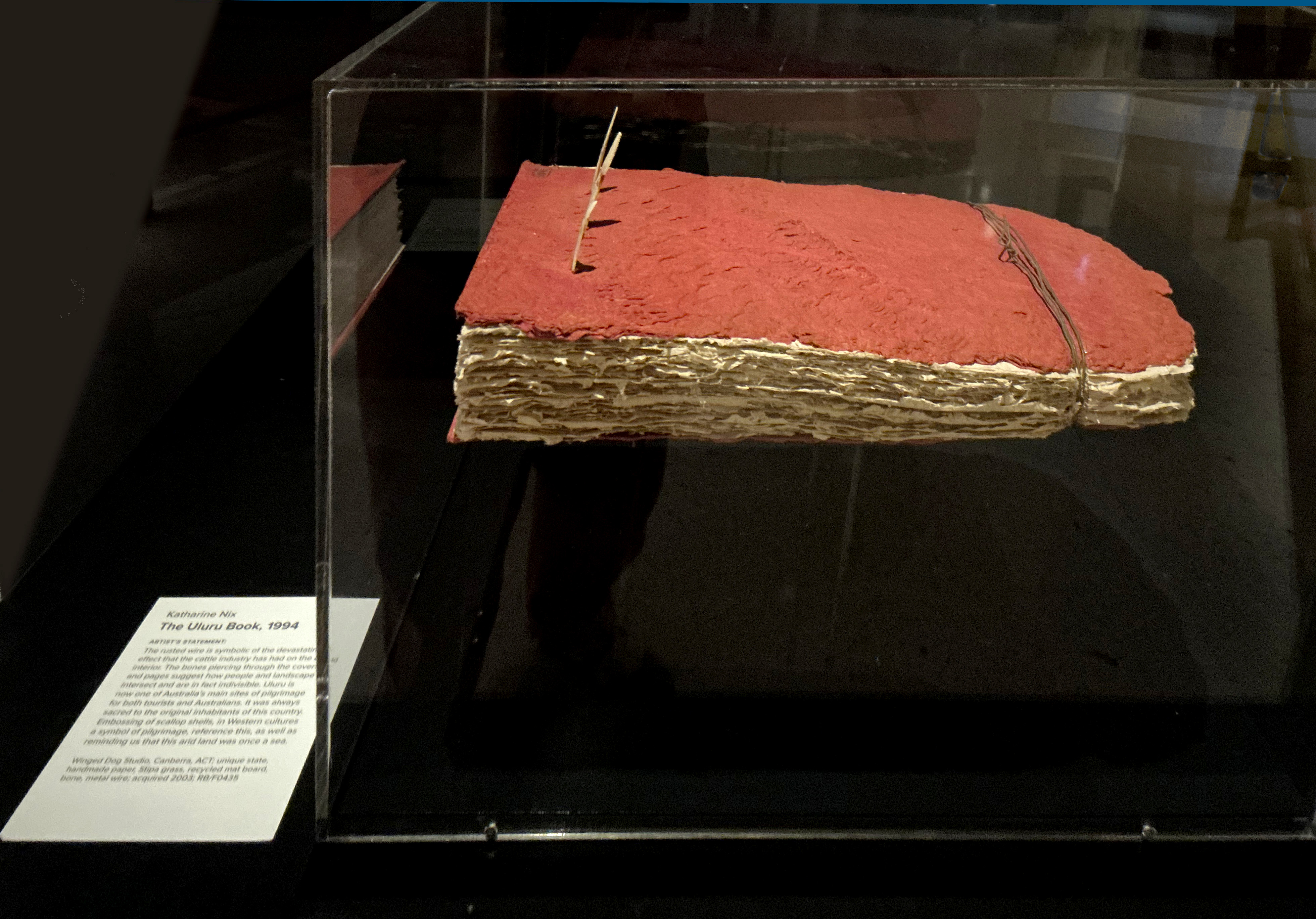
Katharine Nix The Uluru Book, 1994
Several works which could be regarded as book objects were included. The Uluru Book (1994) by Katharine Nix has an imposing physical presence; multiple layers of the hand-made paper for which she is well known, with ochre coloured covers tied with rusted wire and pierced by bones. All elements allude to the close links between the rock and its original inhabitants, and the damage done to the rock and its surrounding environment by the thousands of visitors. Teledex (1981), by Ted Hopkins is a container for poems in the form of an old-fashioned metal teledex, indexed with tabs.
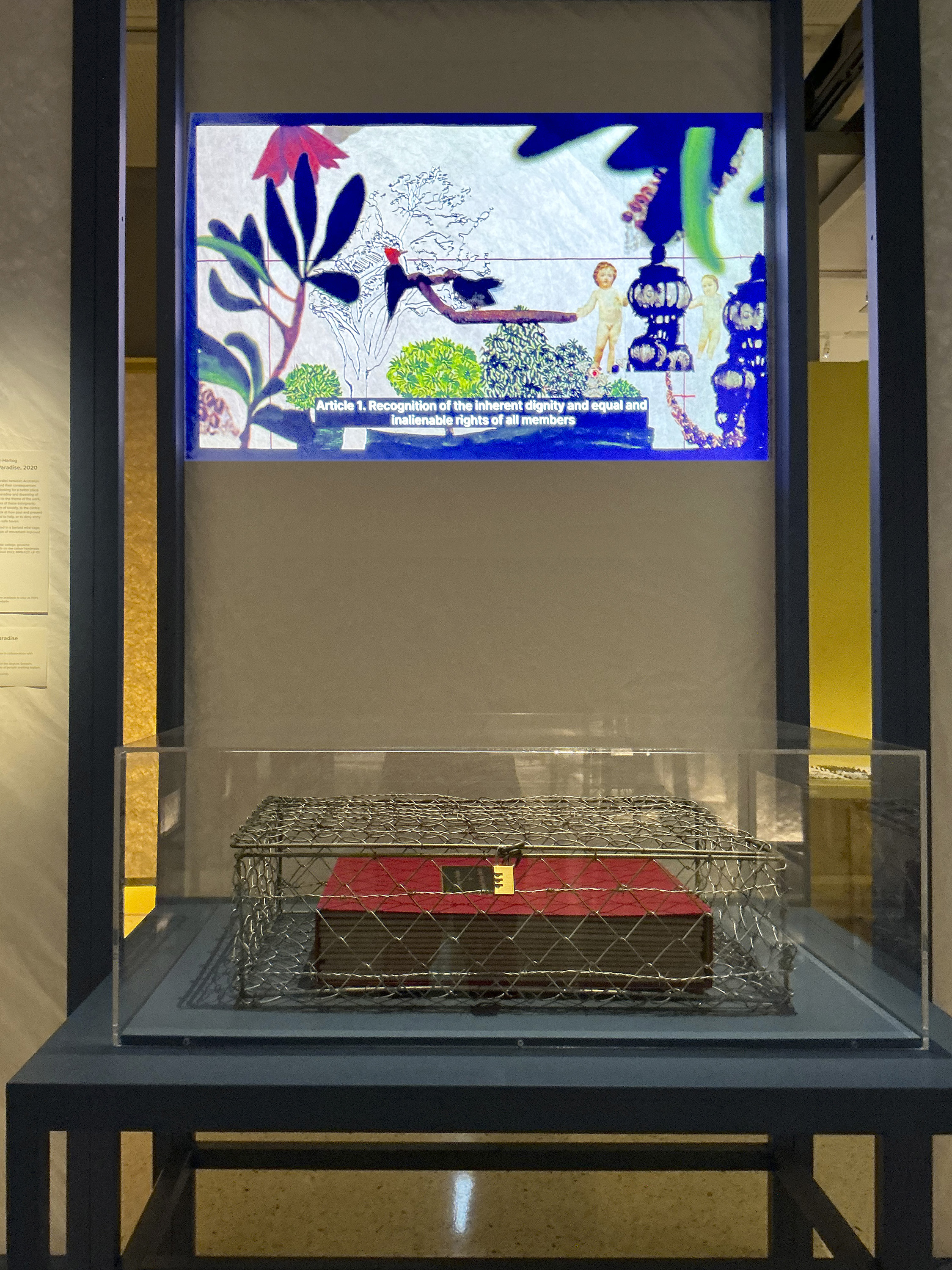
Nathalie Gautier-Hartog
Looking for Paradise, 2020 + Video a collaboration with Broken Yellow
Looking for paradise (2020) by Nathalie Gautier-Hartog, is about refugees seeking a home in Australia, but subject to Australian government policies. It is presented as 12 books inside a wire cage, further emphasizing the restrictions placed on refugees. It is noted that all of the books are available to view as PDFs on the artist’s website with a QR code linking to it displayed. There is also a clever animation based on the United Nation’s Human Rights Charter with images from the books showing in the gallery. It is also on her website. It was created in collaboration with Broken Yellow Studio and the Asylum Seekers Centre. I’m not a great fan of digitised artists books but must admit this combination of media enhances interaction and appreciation of the work.
Penny Evans Proof, 2015
Relatively few First Nations artists create artists books, so it was great to see a works by Judy Watson and a work by Penny Evans, who has Gamilaroi, Welsh, Irish and German heritage using the form to examine connections between culture and country in her unique state book Proof (2015). Using collage and digital prints with stitching it was accompanied by a page-by-page video of the work.
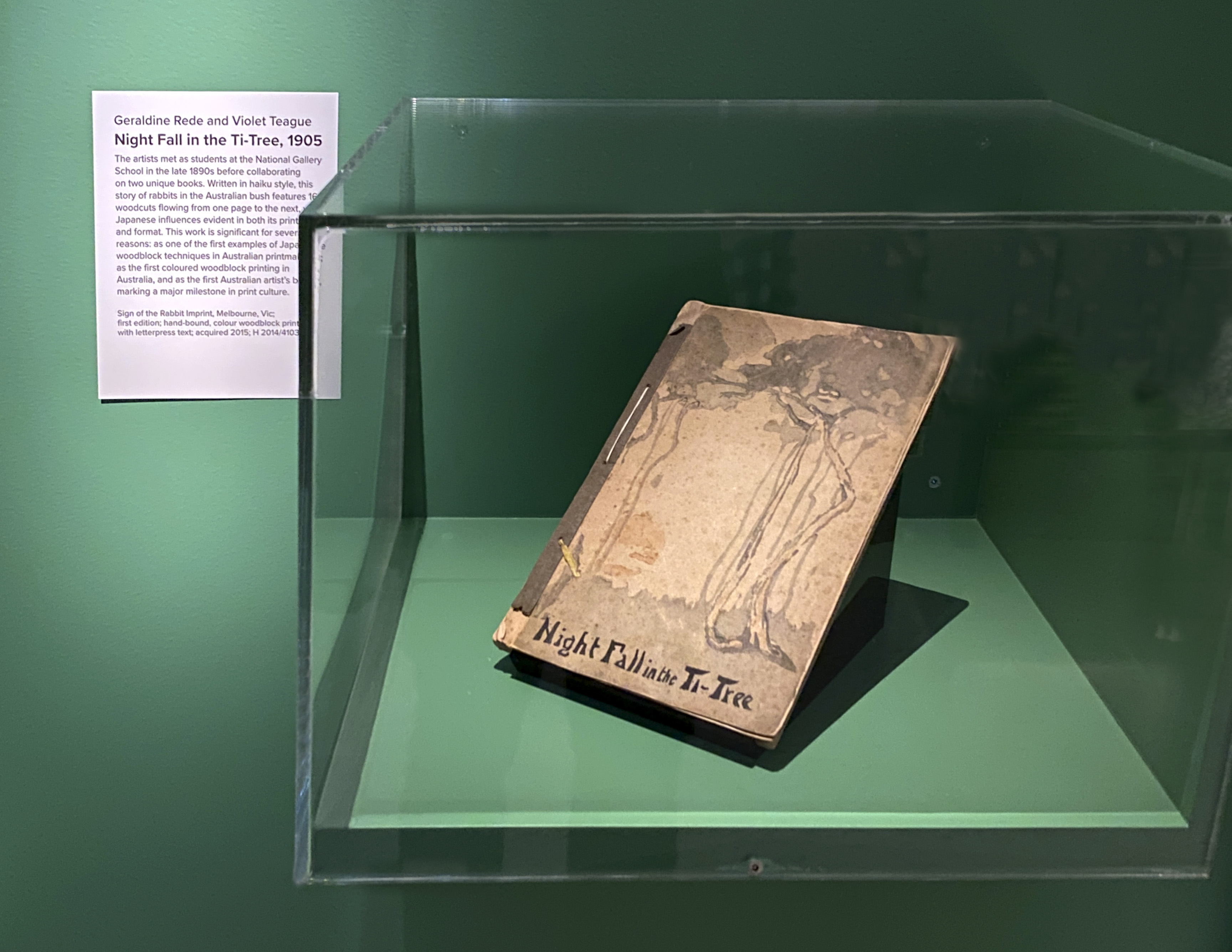
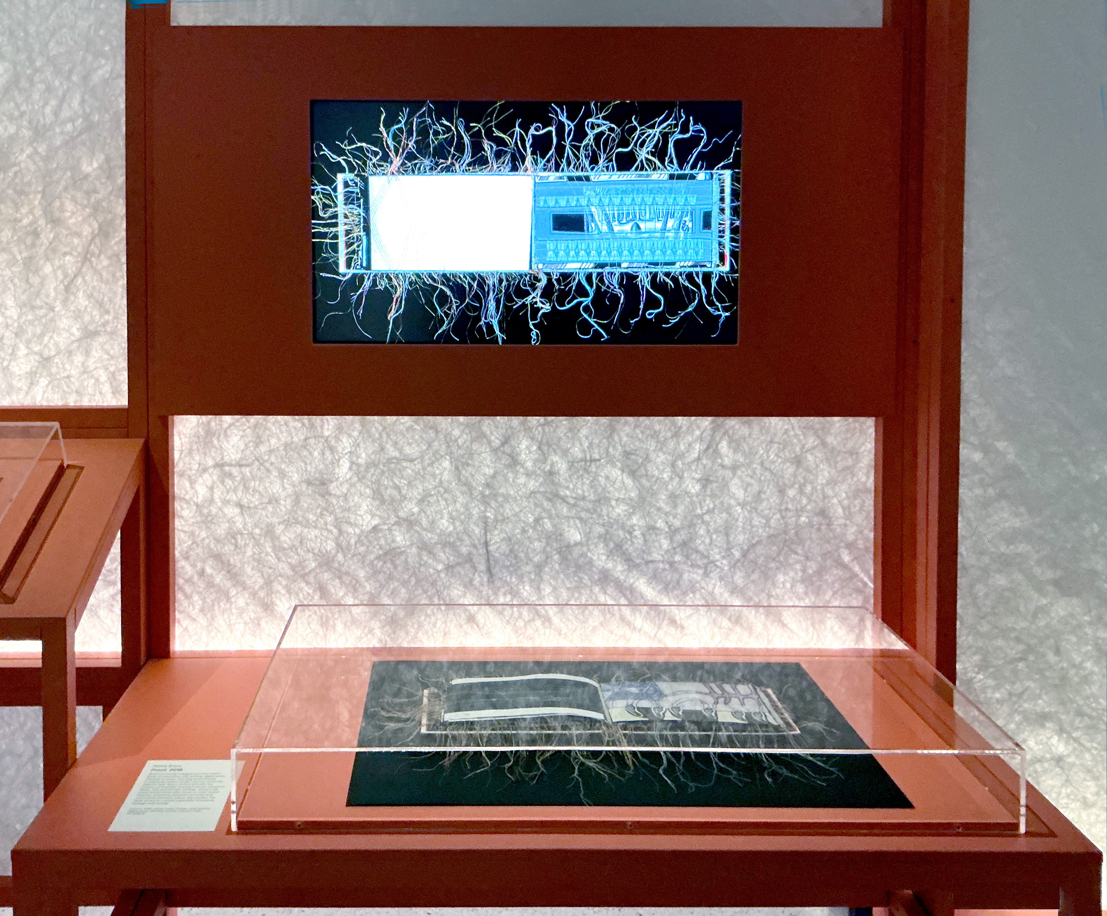
Geraldine Rede & Violet Teague Night Fall in the Ti-Tree, 1905 PHOTO: Doug Spowart
I was surprised that no works from the origins of artists books were shown: books such as those by Picasso and Bonnard published by Ambroise Vollard and Daniel-Henry Kahnweiler in Paris in the early twentieth century. It could be because the library doesn’t hold them. A quick search of the SLNSW catalogue revealed Dingo, with drypoint etchings by Pierre Bonnard published by Vollard in 1924, but few others. I was pleased to see the inclusion of Night fall in the ti-tree (1905) by Violet Teague and Geraldine Rede with its delicate woodcuts, and its acknowledgement as the first Australian artists’ book.
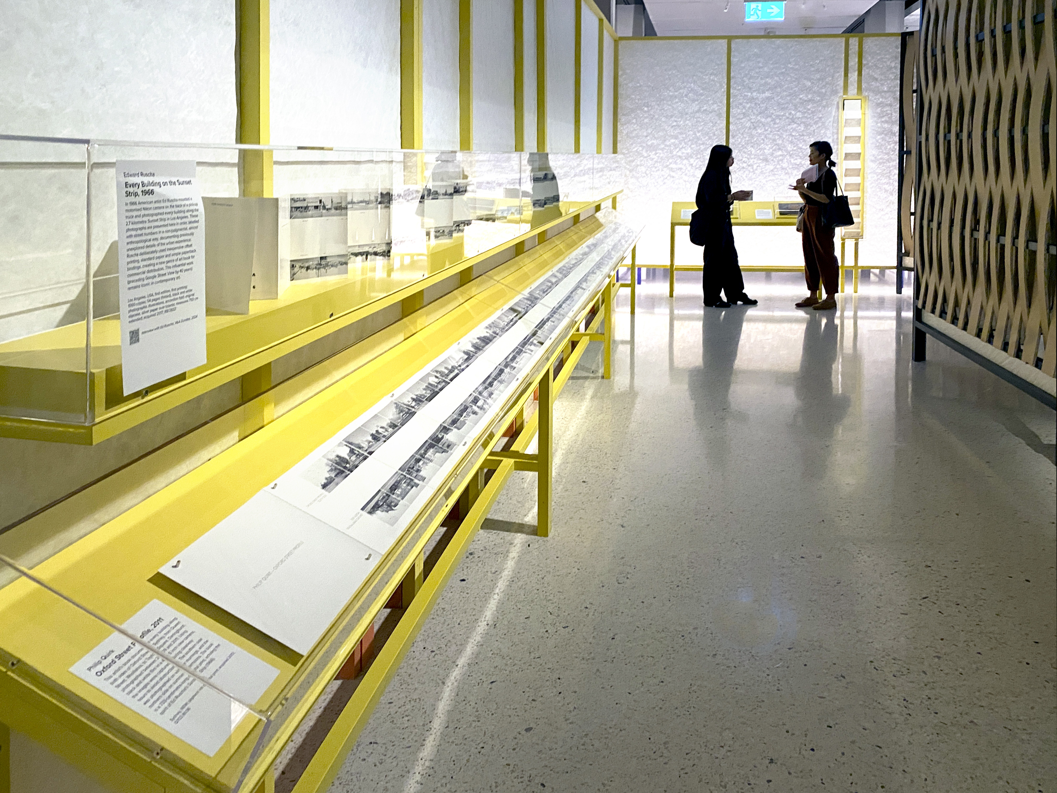
Ed Rusha Every Building on the Sunset Strip, 1966 + Philip Quirk Oxford Street Profile, 2011 PHOTO: Doug Spowart
In a small way the exhibition demonstrates the limitations of the artists’ book collection at the SLNSW, which has not concentrated on its development until relatively recently. Most of the exhibited works have been created in the twenty-first century. There are few books published overseas, one being the fabulous version of the Rubaiyat of Omar Khayyam (1973) by the British artist Susan Allix. The Rubaiyat is a very popular subject for interpretation by artists. An important artist in the history of the artist’s book is American Edward Ruscha, an early exponent of the democratic multiple. He is represented by the concertina photobook Every building on the sunset strip (1966) which has had a huge influence on other artists who continue to create similar works. In this exhibition the book is unusually displayed fully extended to 7.5 metres and is shown with Oxford Street Profile (2011) documenting Oxford Street in Sydney by Australian photographer Philip Quirk. It only stretches to 7.33 metres. It was interesting to see Micky Allan’s early (in Australian terms) artist’s book My Trip (1976). Displayed open, a full facsimile of its newspaper format is also available for closer investigation.
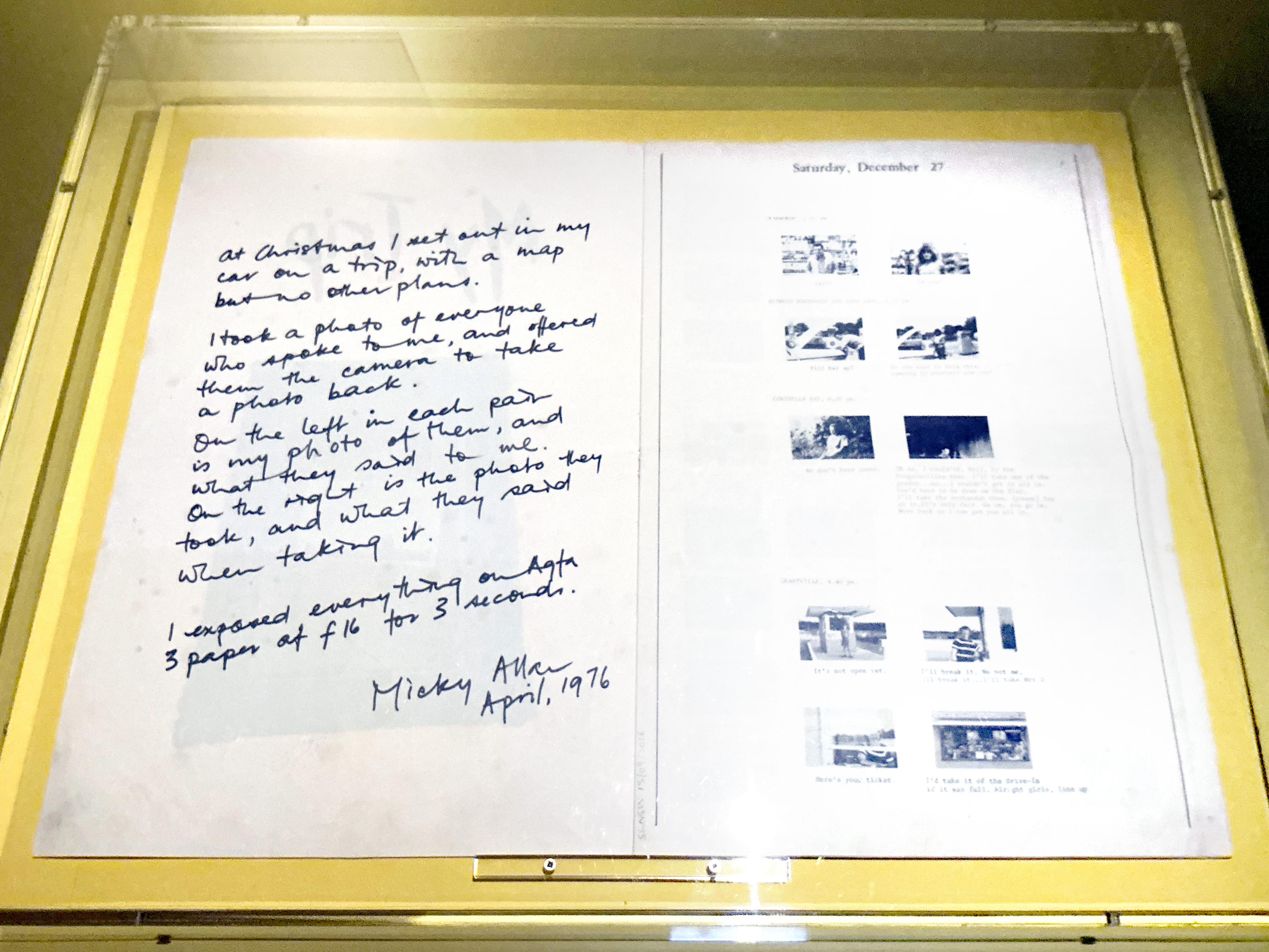
Micky Allan My Trip, 1976
Dancing Over Dark Waters (2012), Howl for a Black Cockatoo (2015), and Phantomwise Flew the Black Cockatoo (2017), by Sue Anderson and Gwen Harrison, with Peter Lyssiotis writing the text for Dancing over dark waters, very impressive books all, are very similar materially and in subject. They could have been replaced by other works expanding the breadth of vision made available in the exhibition. Similarly, several artists are represented by more than one work when other artists and their ideas could have been embraced.
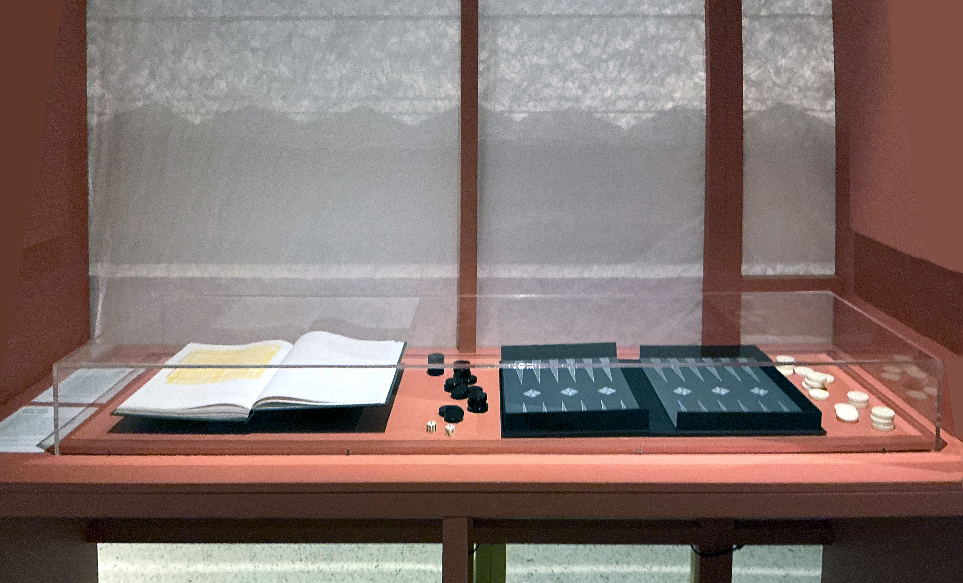
Deanna Hitti Towla, 2017
The exhibition includes some of my favourite artists books including Towla (2017) by Deanna Hitti, with the integral clamshell box creating a board for backgammon, the subject of the book. It is an intriguing book with instructions for backgammon phonetically translated using Arabic and Latin characters but with a twist. Arabic letters spell the instructions in English and Latin letters spell the instructions in Arabic. Some of the books in this exhibition have become my new favourites.
In Conclusion
Criticisms of some components of the exhibition are mere quibbles. In retrospect I could make many about my own exhibition in 2008. This is a fabulous exhibition, beautifully curated, wonderfully designed, and a rare opportunity for the public to experience the breadth and depth of the artists’ book. I hope it will introduce the magical world of artists’ books to a whole new audience in Sydney who will follow up with personal experiences with artists’ books in the library. I also hope that SLNSW will continue to support the art form in both acquisitions and exhibitions.
Helen Cole
March 14, 2026
.
Judges: Helen Cole & Roger Butler with Clyde McGill PHOTO: Artspace Mackay
HELEN COLE: Brief Biography
Helen Cole is intimately acquainted with the world of artists’ books, including their collection and the opportunities and difficulties in presenting these artworks in a public context. Helen was the Arts and Rare Book librarian at State Library of Queensland for thirty years. During much of that time she was responsible for the development of the Library’s extensive Artists’ Books Collection. She has been significantly involved in the artists’ book discipline writing articles and making presentations at conferences. She has judged the Manly Artists Book Prize once and on two occasions judged the Libris Australian Artists’ Book Prize for Artspace Mackay. In 2008 she curated the SLQ exhibition Freestyle Books: Artists’ books from the collection. Helen also co-curated the Tales from the Lyrebird with Ron McBurnie for Artspace Mackay. Apart from her work developing public collections she has amassed a personal library of cherished books.
..
.
OTHER PAPER UNIVERSE RESOURCES
DOWNLOAD: A list of all books in Paper Universe: Paper Universe Book List
DOWNLOAD: A catalogue of Didactic Information on Each Book: Paper Universe Exhibition Captions
DOWNLOAD: A Press Release of the exhibition: Paper Universe Media Release
We wish to acknowledge the courtesy extended to us by curator Maria Savvidis.
The Reflection text ©2026 Helen Cole
All photographs are by Helen Cole unless otherwise credited.
© is retained by all authors
All photographs have been digitally optimised by Doug Spowart.
Two views of th ‘Paper Universe’ entry concertina PHOTO: Helen Cole
.
.
.
.
.
.
.
.
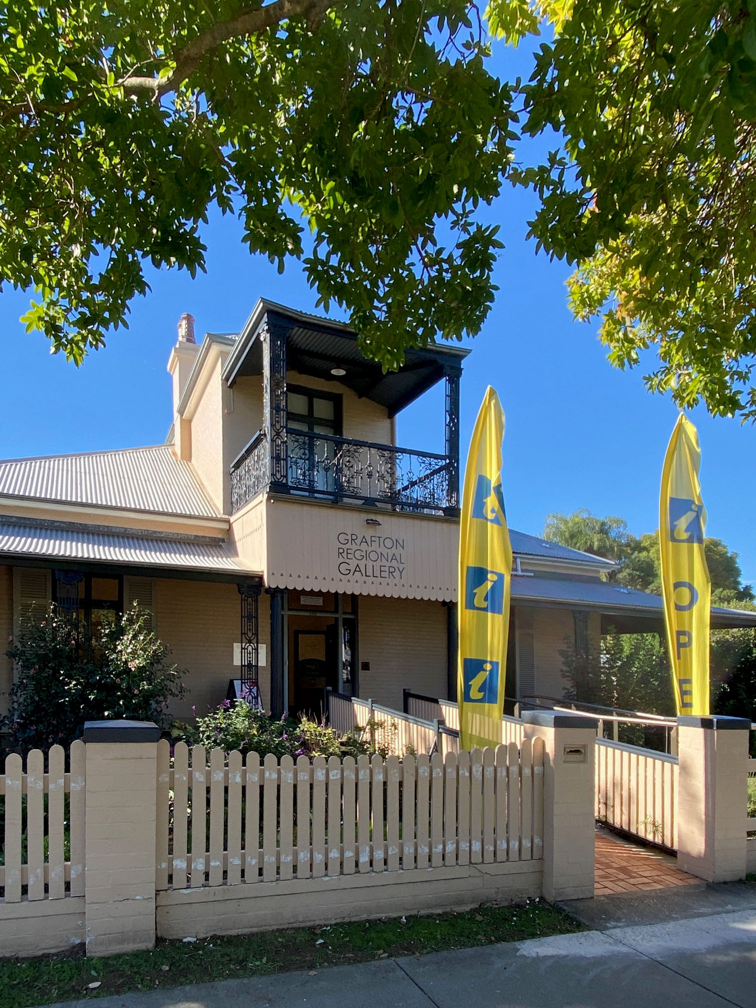
VISITING GRAFTON REGIONAL GALLERY: June 2024
.
Regional Art Galleries exhibitions and events not only say a lot about the culture of a local community but they also provide a connection to the broader national and international world of art. These institutions are places where locals can engage with and present their stories and celebrate their creative spirits. This experience is not one that a capital city can provide – it is unique to the regional gallery and arts centre. It also provides an opportunity for local artists to be located or acknowledged within the broader art community. The Grafton Regional Gallery is one of these galleries.
.
.
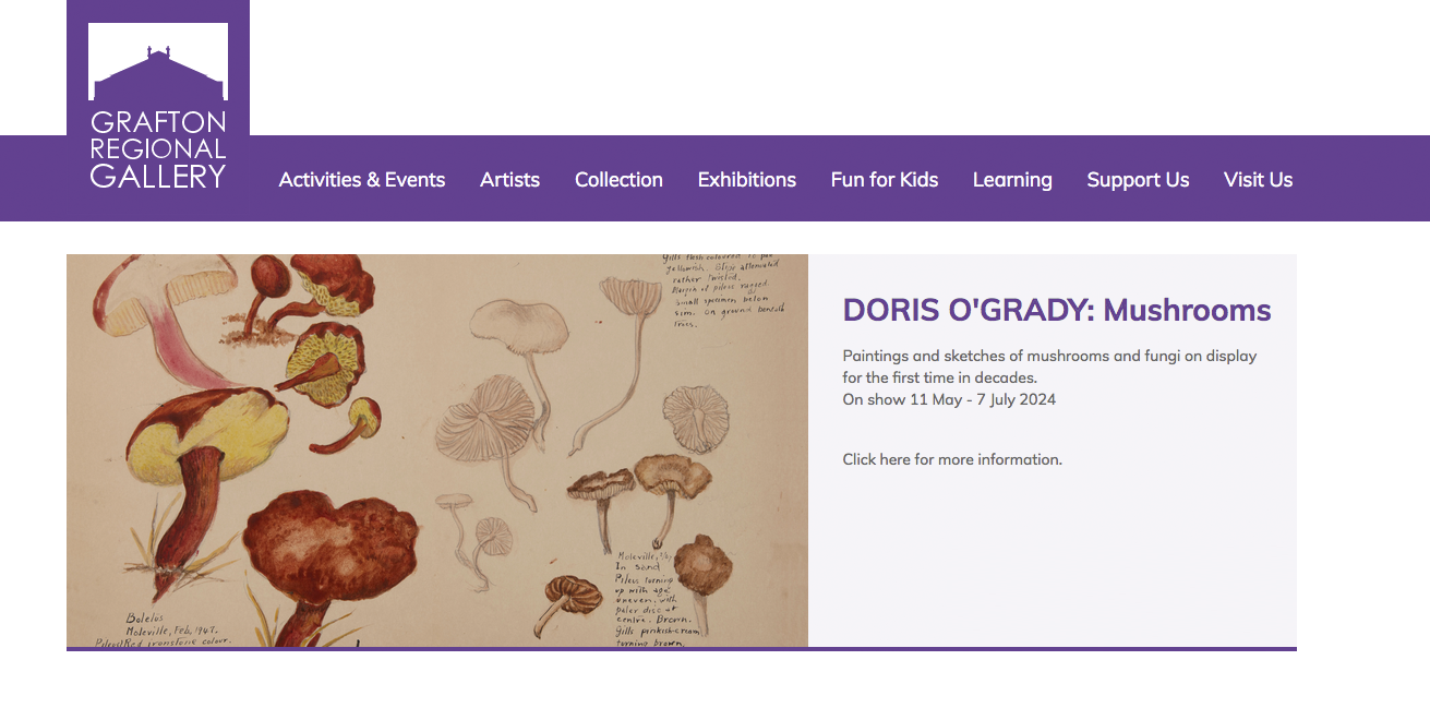
When visiting this region we always make time to see what is showing at the gallery and the current exhibitions were again full of interesting stories and creative work. The entrance to the front of the gallery and information centre is on the ground floor of historic Prentice House[1] . In these front rooms there is a wonderful show of botanical drawings and paintings by local artist, Doris O’Grady. O’Grady’s art can be appreciated for the aesthetics and taxonomic work she made from her collection during the mid 20th Century.
.
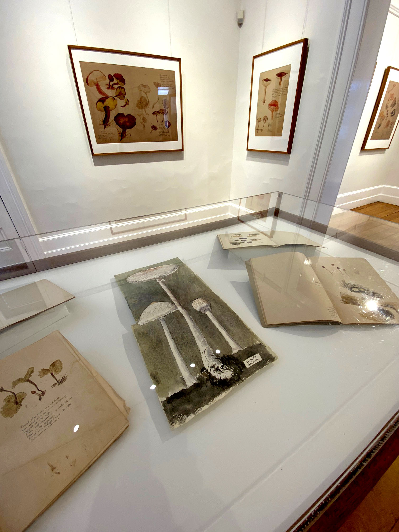
Doris O’Grady “Mushrooms” exhibition
.
Interestingly the place where we are staying in this region had some strange fungi growing in the garden about which we were curious. Amongst Doris’ paintings was the very same fungus we had seen that morning in the front garden! O Grady’s work in emblematic of the blurred lines between art and science. Where the scientist or naturalist creates interpretive aesthetic drawings of their beloved subject for both further investigation and display.
.
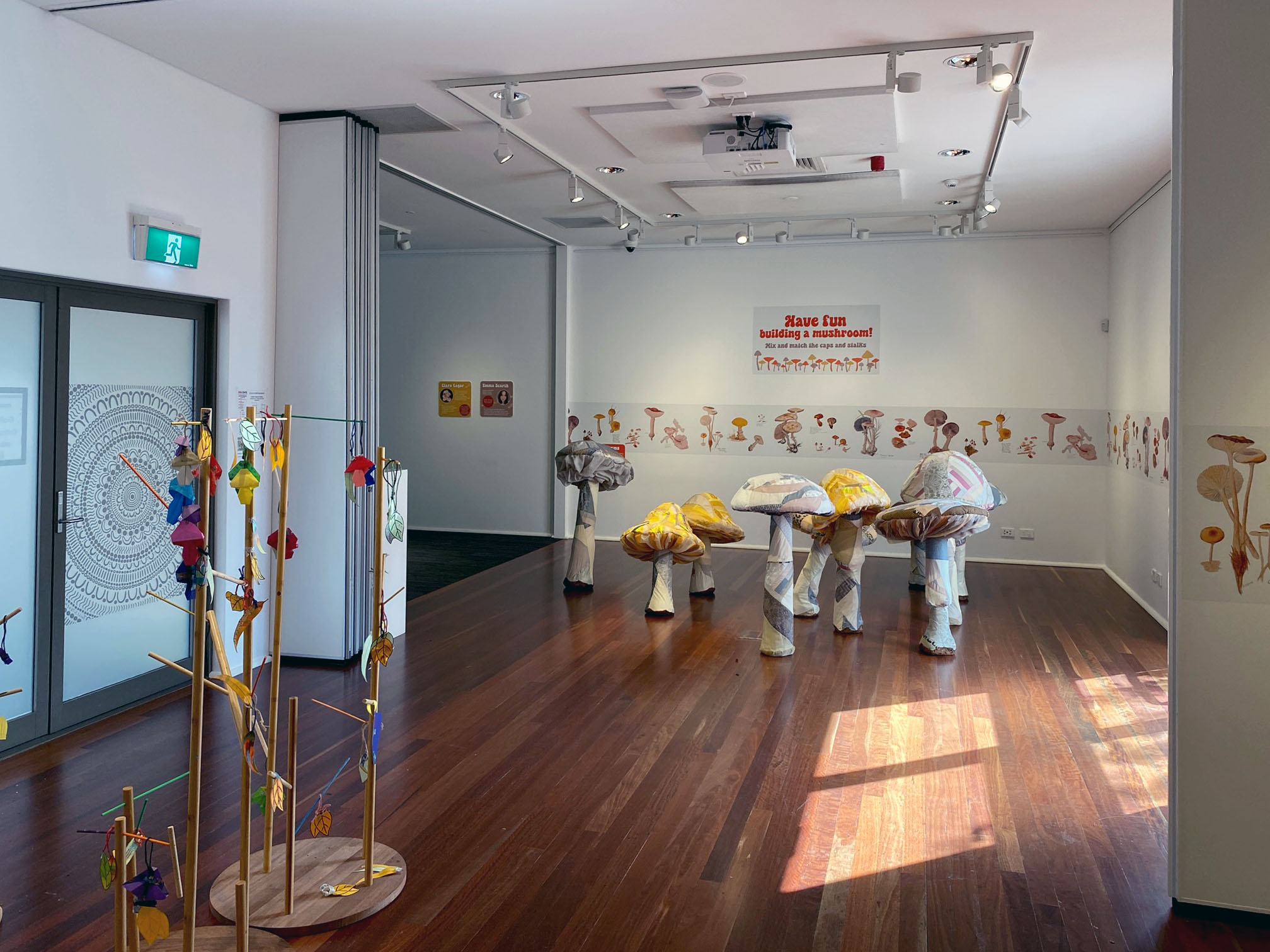
The Mush Room Family Play Space with soft sculptures by Antony Perring, Design and education by Bush Fairy animations by Clara Lagor (USA) and Emma Scarth (Canada)
.
Across the courtyard the newer second part of the gallery, we encountered a magical space inventively named, The Mush Room. Here artists and designers have playfully created a space of soft sculptures, a video and didactic wall panels. There is also an interactive drawing and sculpture for the young at heart to investigate fungi and environmental themes by creating their own work and adding leaf elements to adorn the wooden tree shapes.
.


.
In the next gallery spaces, mushrooms and fungi feature again within a larger exhibition of prints and an artists book, The Printer’s Proof: The Fred Genis Collection. Genis over his long career as a master printmaker collaborated with many nationally and internationally renowned artists including John Cage, Robert Rauschenberg, Tim Storrier, Judy Watson and Brett Whiteley.
.


.
There is a huge diversity of themes and work, the Mushroom Book by John Cage is a main feature. Pages from the book are displayed between Perspex to allow the viewer to see both sides of the pages and connect with the books conceptual design incorporating lyrical texts and visual elements. The bound book was displayed in a vitrine adjacent with some archive documents of the production and sale.
.


.
Artists Proof is a comprehensive exhibition bringing together a history of art and printmaking, the artists and studios. It is an exhibition that would appeal to many particularly those wanting to touch with the practice of Genis and his contemporary colleagues. There is the potential for many discussions around the individual works as objects and concepts, of and for their time in art.
We will return to the gallery as to fully engage with the depth of these exhibitions will take more than one visit.
Victoria Cooper
[1] For more history see https://galleryfriends.com.au
.
.
Grafton Regional Gallery
June 2024
Exhibitions, 11 May to 7 July 2024
Doris O’Grady: Mushrooms
The Mush Room
The Printer’s Proof: The Fred Genis Collection
.
All photographs by Doug Spowart Text by Victoria Cooper
.
.
.
.
.
.
.
.
.
NICHOLAS WALTON-HEALEY – SALT FRAMES


.
.
A SELECTION OF IMAGES
.

‘SPOOR’ Nicholas Walton-Healey from the exhibition SALT FRAMES

‘WHISPER’ by Nicholas Walton-Healey from the exhibition SALT FRAMES

‘SKIN’ Nicholas Walton-Healey from the exhibition SALT FRAMES

‘TOUNGE’ Nicholas Walton-Healey from the exhibition SALT FRAMES

‘CARESS’ Nicholas Walton-Healey from the exhibition SALT FRAMES
.
A COMMENTARY ON THE BODY OF WORK by Victoria Cooper
.
watch the water long enough and you’ll see a fish jump … *
.
Salt Frames review
Nicholas is a poet…
Salt Frames is simultaneously a visual and textual poem. On the surface it is an exhibition of light and colour abstractions from time spent on the Nightcliff Foreshore, Darwin. But this work also has deeper layers and meaning that are evoked through the supporting words and symbols within the images, as Walton-Healey discloses: “Sea salt aids the healing of wounds (including those beneath the surface of the skin).”
Walton-Healey points out that more broadly Australians have an affinity to the coast. The sea and the coast become places of personal meditation and for some physical and psychological healing. His seascapes are not the usual pictorial or grand panorama – instead he shares visual metaphors; those moments of revelation and contemplation that can hold many different meanings to the viewer.
The text blocks with the images are, for me, not titles but words that operate as codes to other ways of being and thinking. If we cast our minds to memories of reverie by the sea, perhaps these words articulate our collective human experience of being at the coast.
On connecting with Walton-Healey’s opening speech, the meaning embedded in the words and the images of layered light, colour and stilled moments was underpinned by a deeply moving human story. Through the visual poetry of this exhibition the artist has humbly shared vulnerability, tenderness and deep thinking. In this openness of vision he also created space for the viewer to spend time to consider and connect with our own stories and memories.
.
Dr Victoria Cooper
* A teaching by Larrakia Warrior Robert E. Lewis to Nicholas Walton-Healey
.
.
THE OPENING SPEECH BY PAMELA KLEEMANN-PASSI

Pamela Kleeman-Passi speaks
.
Acknowledgement to Country
We respectfully acknowledge the Traditional Owners of the land, the Boon Wurrung and Woiwurrung (Wurundjeri) peoples of the Kulin Nation. We extend gratitude to all Elders past and present and their enduring connection to land, sea and community.
.
.
Welcome to the Salt Frames exhibition …
.
My friendship with Nick grew out of a deeply personal connection of loss and renewal, and a mutual passion for experiencing life through the lens of creativity. And now we have Darwin in common! Our shared stories meandered and overlapped during my month there mid-last year for my own exhibition. I actually didn’t know that much about Darwin until that visit, and I returned to Melbourne with a deep fondness for the culture, the landscape and the communities. I thank Nick for facilitating a visit to the Tiwi Islands to spend a moment of precious, rejuvenating time at the Tarntipi Bush Camp on Bathurst Island.
.
So what you see within these salt frames of the Nightcliff foreshore is Nick’s immersion in and introspection on the blessings and cruelties of life, and the healing power of the water and the land. The evocative single word titles express an array of feelings and experiences and the images are imbued with opposites:
Landscape / seascape Water / land Surface / depth
Smoothness / crusty, gritty textures Clarity / blurriness Light / dark
Shadows / highlights Colour / monochrome Reflection / absorption
Representation / abstraction Emotion / rationale
He’s combined the poetic and the photographic, with an Impressionist painterly quality to many of the works. Nightcliff is a very special place for Nick… but it also has a fascinating history and I quote from Tess Lea’s personal/historical book, Darwin: “Even the dumping grounds of Nightcliff, where unwanted machinery and detritus from WWII were tipped over a cliff, have merged into the rocks below, no longer distinguishable, just deformed lumps of rust and chalk.” The colour of rusted metal is very evident within some of the images – how over time, it’s merged with the landscape shaped by the power of the sea.
In this time of climate fragility and significant settler land and sea degradation, I feel compelled to refer to ecological grief and the healing power of the land and the water because the land and sea are absolutely fundamental to a community’s overall mental health. Nick’s images are testament to that healing power.
For Nick…
On the edge, at the edge… of love and loss and longing,
And remembering and wanting to forget
And letting go but holding on…
Wedged between land and water, pushing and pulling
Lapping across a surface that belies a depth so utterly profound and unfathomable
A photographic imprint, focused and blurred
Where light inscribes water, water inscribes land
And language and form mutate and merge, rippling and surging in a constant soundtrack
That violently crashes and gently caresses in waves and heartbeats
Eroding, erasing, healing and repairing
The run-off leaving traces that ebb and flow
As life and love and loss and longing ebb and flow…
And it’s sink or swim or scramble to a fragile stability on solid ground and remain upright
or undone
Or both…
.
.
Pamela Kleemann-Passi © 2023
.
.
ROBERT LEWIS TALKS ABOUT HIS CONNECTION WITH NICK

Robert Lewis, Larrakia Warrior, speaks at the opening of SALT FRAMES
.
Nic from Vic
Hi my name is Robbie Lewis, I’m a Larrakia Man. Born and bred on Larrakia land in Darwin.
2013, The Eye See Workshop, working with young Indigenous people living on a local community, in the Darwin region, where I met a young man trying to make understanding of life, this is when I first met a young spirited man, Nicholas Walton-Healey!!
.
A student photographer trying to find he’s way around the community. At first, I saw another white man taking photos of Indigenous people. But now, 10 years later, I see a great man showing the rest of the world through he’s eyes the beautiful things he sees through a camera.
To talk about
Communications – to talk, to say, to hear, to listen, to answer, to reply, also to understand and help.
Management – to be a leader, a teacher, to educate, to be in charge, to manage and help.
Worker – to do a job, to earn a wage, to keep things moving forward, to do work and to help where there is no other.
Just don’t forget why they go together.
The Student
This one person brings all these people together.
Now I see this man as a teacher!!
.
Robert Lewis © 2023
.
.
NICK’S RESPONSE

Nick addresses the audience at his exhibition
.
Thank you everyone for making it out tonight. I don’t have the time to personally thank each one of you, here. But I’m really proud of, and humbled by, the diversity of the groups represented in this room. Friends. Family. Collaborators. Colleges. Mentors. And Muses. You’ve all contributed in some important way to the journey I’ve been on, with my photography.
Pam and Rob, I’m especially grateful for the friendship I share with each of you, and for your very kind and thoughtful words tonight.
.
What you’re looking-at in the salt frames photographs, is The Timor Sea. And more people go missing each year in The Timor Sea, than they do in any other sea throughout the world.
I can certainly say that I’ve felt the pull. The allure of its rhythm, and hypnotic calamity.
It made perfect sense to me, when I read that statement in a book that Pam recently lent to me. Over the past twelve months, Pam has gifted me some important inspiration – we met at the ANAT Spectra Live event in Melbourne, and our paths crossed again in The Northern Territory last year. They converged at Tactile Arts in Darwin, during Sweet Dreams and Gut Reactions, the title of Pam’s exhibition, which got me thinking…
It’s probably an understatement, for those of you who know me, to say I’m inspired by the viscerality of art. I’ve always understood the role of the artist to entail a questioning of accepted definitions of the normal and possible. And that the moral and aesthetic responsibility of the photographer is to make the invisible, visible and the familiar, strange…
Photography is a highly intuitive process for me. I make the pictures first, and make-sense of them, second. So, I wasn’t exactly sure what I was doing, walking up and down the Nightcliff foreshore at all hours of day and night, last year.
I was actually stopped one evening by an elderly couple, who said ‘ahh, you’re a photographer!?’ I looked-at them, bemused, because I had a camera in my hand, and responded with, ‘yeah!’ But then the lady then came closer, and touched me on the arm. She looked into my eyes and said, ‘Well, that’s good, because we’ve seen you out here every night this week and thought you were homeless.’
The remark startled me because, while I was always on the lookout for crocs, I actually felt pretty safe in Darwin last year, which was when I made the majority of these photographs. Even if I was sleeping on a mattress on the floor of Rob’s kitchen.
I have a really special connection with Rob, who is like a big brother, to me; one of my mentors, teachers, guides and best mates, over the past ten years.
I first met Rob on an Indigenous community known and referred to in Darwin as Knuckey’s. This was back in 2013, when I first travelled-up to Darwin with one of my university lectures – Mark Galer – for The Eye See Workshop. Although our initial encounters were brief, I remember being struck by the enormity of Rob’s heart; the fact that he actually, genuinely cared for the people living on this, and the other communities we visited.
At the end of that workshop, I was invited back to Darwin by Rob’s boss-at-the-time. From this point, I entered into what became a five-year-plus partnership. This lead me back out onto those communities, and ultimately, to almost all of the so-called town camps in and around the Greater Darwin Region.
For all this time, I was like Rob’s little shadow. I followed him everywhere, and especially to the programs he ran with the men and family groups from these communities. Through these means, I built my own friendships and connections. But that’s another story, another project…
The Salt Frames are more overly focussed on my personal connection with Rob. Our friendship grew partly through the bond I developed with his late mother, Robyn, who I learnt to recognise and identify as an authentically Darwin person; Robyn’s mother (Rob’s maternal grandmother), was born at Lamaroo Beach, before being stolen as a child, and was eventually adopted by Juma Fejo.
The Fejos are one of the original eight family groups recognised as the Traditional Custodians of the Greater Darwin Region.
So Rob’s Larrakia, and the Larrakia are also known as The Salt Water People. The Salt Frames show Larrakia country, which includes Nightcliff, the place where Rob and I spent a lot our time when we weren’t working on the communities together.
Watch the water long enough and you’ll see a fish jump. That’s what Rob used to say to me. And I found it really frustrating at first, because I couldn’t see any fish. But over time, I realised that, rather than asking me to simply look-at the water, Rob was actually asking me to look into it. In this way, he transformed my ability to ‘see.’
But he wasn’t the only person I went to Nightcliff beach with. Before and after re-locating from Melbourne to Darwin, Nightcliff was the place that my late fiancé most liked to visit. She loved watching the sunsets. And unwinding and connecting on the beach. Over the years, we made a lot of love along this coastline. Beside the Timor Sea. And sure enough, it was not too far up from one of these spots that we returned on the afternoon she received her cancer diagnosis.
Shit happens. We deal with it. And then we move-on. That’s also one of Rob’s sayings; but it was the teaching I found most difficult to comprehend. Dealing with it, was what I really trying to do in the five and half months I spent in The Territory last year, walking around the beach like a homeless person.
Making these photographs was one way I felt I could make-good on my promise to do something with my photography, while at the same-time maintaining the connection that my finance and I shared with the families and communities we worked with. In August last year, Rob accompanied my mother and I over to the Tiwi Islands, for her Pukamani ceremony. The overwhelming majority of the photographs in this collection were made in the weeks that followed this event.
So whichever way you look at them, the Salt Frames show profound and enduring connection. But they also acknowledge the inescapably transient nature of being. You don’t get to beauty without pain, and love is very hard to name, without seeing the full-face of loss. The process of curating and assembling this show, and gathering you all in this room tonight, is part of an attempt to move forward.
..
Thank you all … Nicholas Walton-Healey
Nicholas Walton-Healey © 2023
.
.

Nicholas with Pam Kleemann-Passi and Robert Lewis
.
.
.
.


.
.
© Photographs by Nicholas Walton-Healey Photographs of the opening ©2023 Doug Spowart
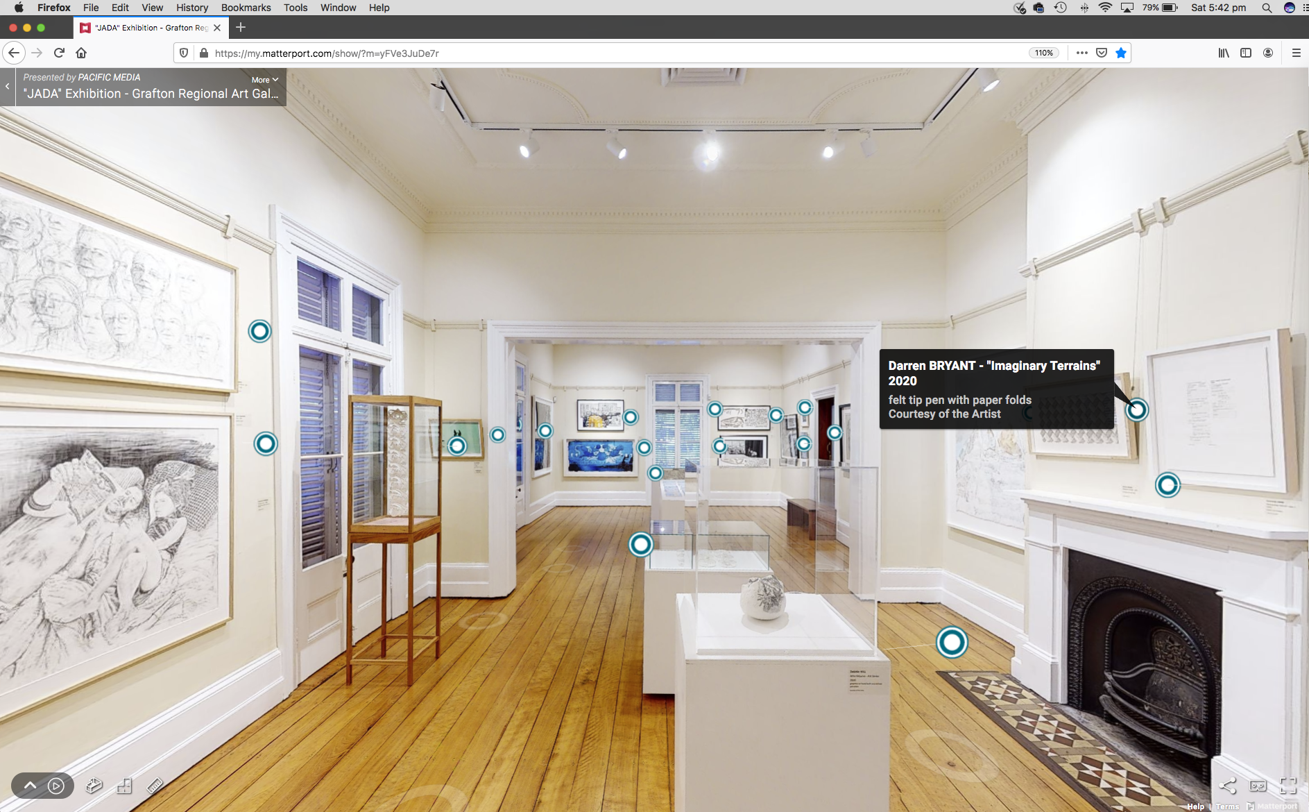
JADA 2020: DRAWING on the PHYSICAL & VIRTUAL Exhibition Space
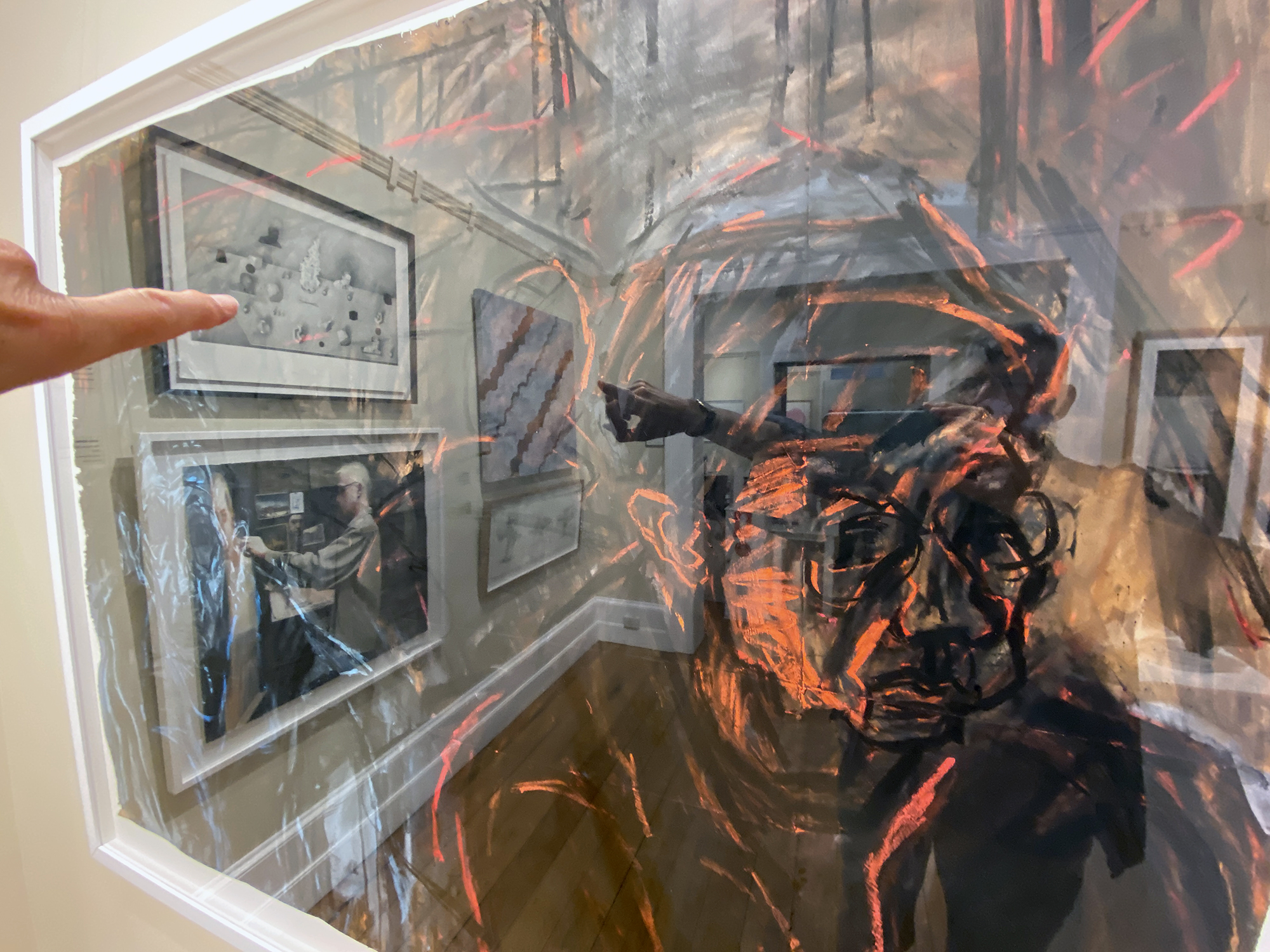
Standing in the gallery before David FAIRBURN’s Drawn together-Double portraits V.H & J.E.L NO5
.
The Pandemic and its significant social disruption has reduced the ability for visitors to enter the physical gallery. However the gallery has reached out through Internet mediated platforms to present online formatted exhibitions to not only to those in lockdown just down the street but also to those geographically distanced from the gallery.
This take-up of online exhibitions has been significant that now it seems that every gallery, as well as entrepreneurial artist, have a virtual gallery. Specialist online providers include Matterport, Ortelia Curator and Exhibbit.
.
Some of these online programs can not only give the gallery a record of virtual attendances and where those visitors came from through their ‘hits’ stats, they may even be able to track the way visitors navigate through the online exhibition space. Bravo to the galleries who have stepped up to provide art interested people a 21st century solution to the COVID-19 challenge to provide a connection with commercial or institutional gallery spaces.
.
.

Grafton Regional Gallery
.
At the end of November 2020 after the relaxation of the Pandemic travel restrictions on the Queensland/New South Wales border we visited the Grafton Regional Gallery and the showing of the 2020 Biennial Jacaranda Acquisitive Drawing Award (JADA).
Earlier in lockdown we visited the 2020 JADA quite a few times via their excellent online gallery. On these virtual visits we were presented with an online experience of being ‘in’ the space with enhancements that enabled us to zoom into full size images of the work and through a ‘click’ button, the ability to read the title of the work, artist’s name and other artwork details. While we were online visiting it was interesting to consider that others from all over the country, or even the world, could be simultaneously in the same virtual gallery space.
.
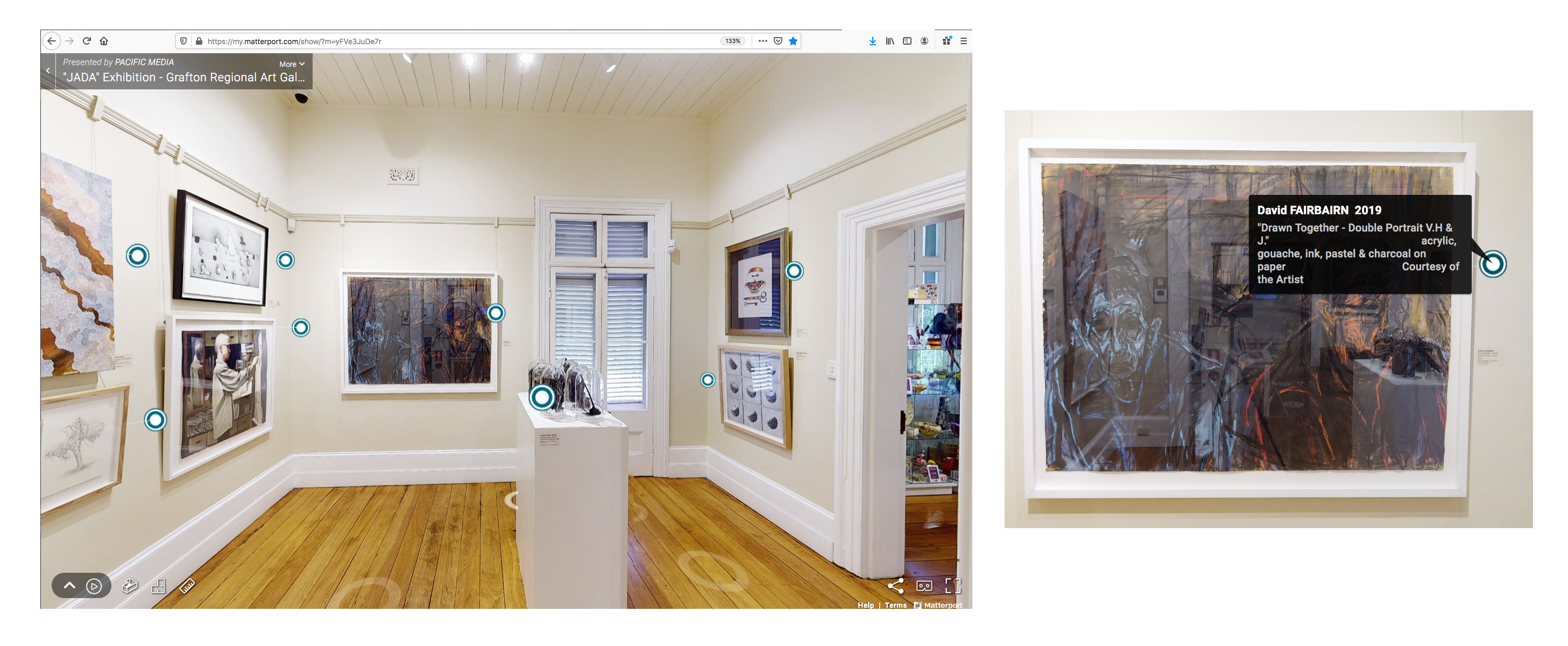
The Matterport virtual gallery – JADA 2020
.
SOME OF THE 2020 JADA FACTS
The JADA exhibition presents a snapshot of the contemporary practice of the drawing artform. The 2020 awards presented 56 works from a record total entry of 659. Pre-selection was carried out by Peter Wood (CEO, Arts Northern Rivers), Brett Adlington (Director, Lismore Regional Gallery, Michael Zavros (artist and 2002 JADA winner), and Heather Brown (President, Friends of Grafton Gallery). The judge of the final Award was Peter McKay, curatorial manager Australian Art at the Queensland Art Gallery — Gallery of Modern Art. A catalogue essay was written by Andrew Frost.
Teo TRELOAR – This is impermanence
.
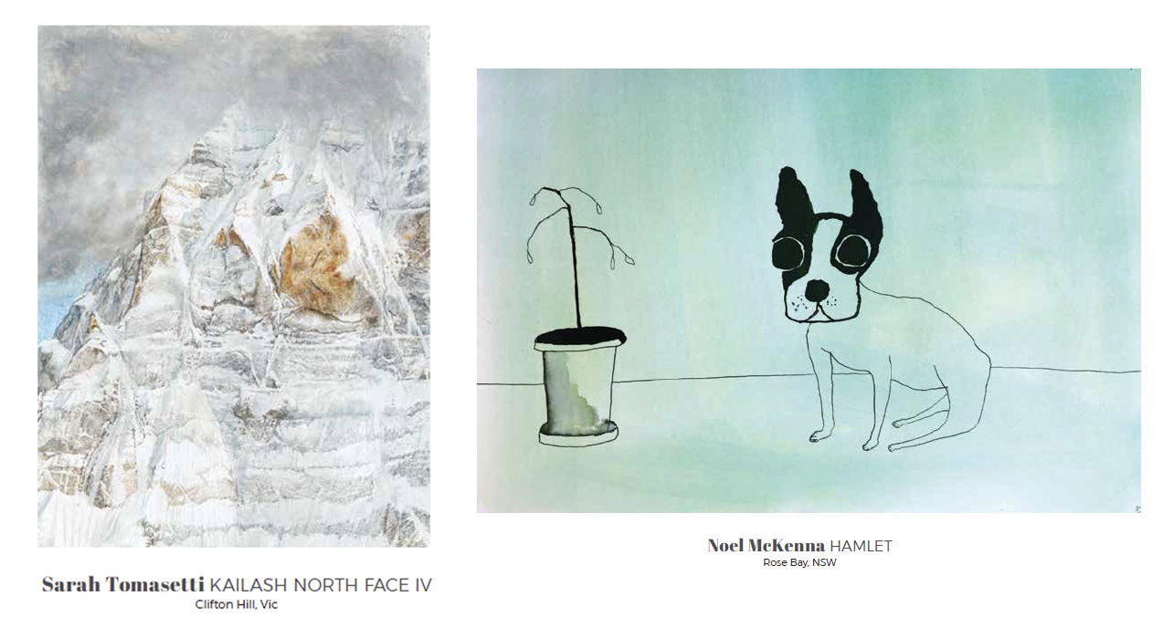
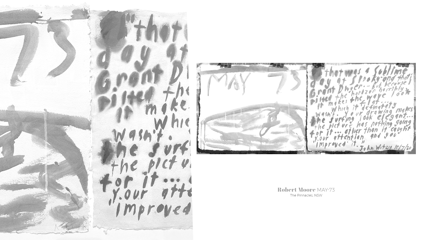
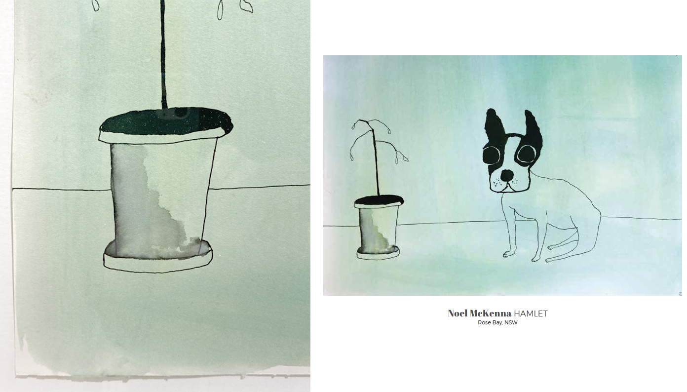
Teo Treloar’s work titled This is Impermanence (2019) was announced as the winner and Sarah Tomasetti’s work titled Kailash North Face IV (2019) and, Noel McKenna’s work titled Hamlet (2020) were recommended for purchase for the JADA Collection.
.
.
DRAWING ON THE EXPERIENCE OF THE ARTWORKS
The JADA exhibition reveals a myriad of techniques, media and surfaces. The view of the artwork in the physical space of the gallery is a sensory experience that provides an opportunity to encounter the actual art object and the potential for much closer viewing that can reveal so much more about the work.
For that reason my physical experience in viewing the actual work gave me a deeper experience of the media used and the way it contributed to the artist’s communiqué. Now this may sound as if I’m proposing that the physical beats the virtual but that is not my point. The online space is critical to the broad distribution of the artworks in any exhibition. In many ways the viewing of a pixel presented view of an artwork is not dissimilar to how we experience art in the printed form in a magazine or book.
The online exhibition can convey extended information about the art and the exhibition through downloadable catalogues that cover artist’s statements, the judge’s comments and an essay. What I’m highlighting is that the online exhibition plays an important role in connecting viewers with art that is inaccessible for whatever reason. Seeing the physical object in the gallery is an elevated experience. So it is important to note that JADA is a travelling exhibition and that the ability to physically view the works will be afforded thousands of visitors during its 2 year showing.
It is important to applaud the Grafton Regional Gallery for their initiative in organising, hosting the physical show, coordinating the online exhibition and the touring component. For without JADA’s significant biennial review of the discipline in Australia the drawing community of practice could be fragmented and isolated.
My discussions in this Blog post has been in response to seeing the drawing artworks in the gallery space and connect personally with the detail of the mark and its surface. So to share the richness of the close-up physical experience I approached the Gallery to provide me with access to the catalogue and the information it contains. I have now linked this information with close-up images of selected works from photographs* made while I viewed the exhibition. Through this Blog post I’m attempting to extend the virtual viewer’s experience – it may represent a future enhancement to the online gallery.
Enjoy …
Doug Spowart
*Note some of the photographs contain minor reflections of lighting and other frames from the gallery space.
.
.
View our Blog posts on previous JADA 2018 and JADA 2014
.
Download a copy of the JADA 2020 Catalogue 2020 JADA Catalogue
2020 JADA Catalogue Cover
VIEWING THE JADA 2020 IN DETAIL
“CLICK” Image to enlarge
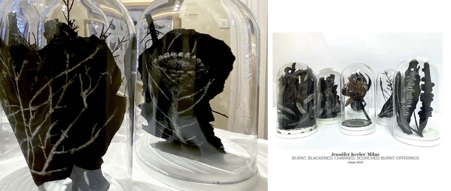
MEDIUM: 7 domes: charcoal, paper, glass, timber, foliage, paint
MEDIUM: ink and pencil on paper
MEDIUM: graphite on rag paper

MEDIUM: charcoal and pastel on mat board
MEDIUM: charcoal and pastel on paper

MEDIUM: charcoal and ink
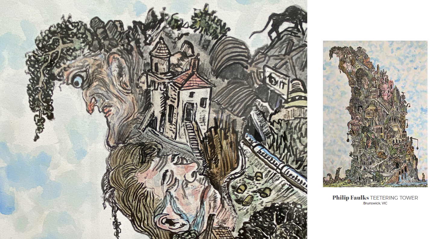
MEDIUM: ink, acrylic, oil stick, pastel and hand stitching with string on paper
MEDIUM: ink, pastel and stitching
MEDIUM: ink, pigment, acrylic binder on handmade paper
MEDIUM: ink on paper

MEDIUM: ink, gouache and pastel primer on cast carbon fibre
MEDIUM: felt tip pen with paper folds
MEDIUM: charcoal on Snowden catridge

MEDIUM: charcoal and white chalk on toned paper
MEDIUM: graphite on paper
MEDIUM: charcoal and conte on fabriano
MEDIUM: hand painted ceramic tiles
MEDIUM: graphite and White Conte Crayon on Grey Canson Paper
MEDIUM: graphite and White Conte Crayon on Grey Canson Paper
MEDIUM: graphite on hand built and etched porcelain
MEDIUM: ink and gouache on paper
MEDIUM: digital video: chalk, charcoal and acrylic animation on paper, 5:58 minutes (Detail of digital presentation)
VISIT THE ONLINE GALLERY HERE
.
.
.
Thank you to Niomi Sands, Director of the Grafton Regional Gallery and the Gallery team for their support in preparing this Blog post.
In accessing this post please respect the copyrights in the works displayed.
.
.
.
.
WOTWEDID BLOG CELEBRATES 100,000 VIEWS
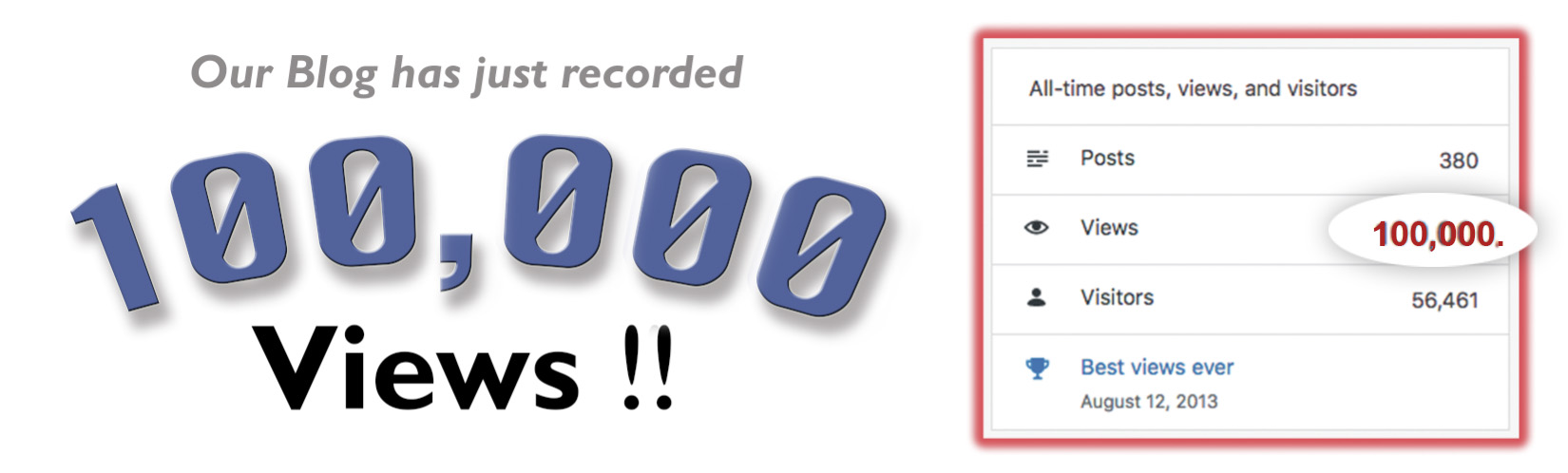
100K Header
Our www.wotwedid.com blog reached the milestone of 1000,000 views last week. It has had 56,000 visitors who have had the opportunity to view 380 posts and read around 250K words and see the hundreds of photographs that we have made to compliment the stories.
Our wotwedid Blog was started nine years ago as an opportunity to connect with our friends and creative communities via social media. The topic cloud for the wotwedid Blog includes ARTISTS’ BOOKS, PHOTBOOKS, CAMERA OBSCURA, EXHIBITIONS, MEETING PEOPLE, THE ART AND PRACTICE OF PHOTOGRAPHY, REGIONAL ARTS, CYANOTYPES, PLACE PROJECTS and POST-DOCTORAL RESEARCH.
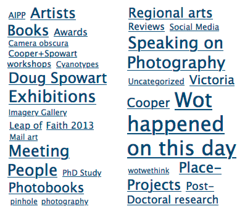
Topic cloud wotwedid
Usually the content that we post is generated by us and includes the written commentaries, the photographs and illustrations – it can be quite a lengthy time consuming task to get a blog up.
While many posts relate to what we do, have done or will be doing, the Blog represents a chronology of activity in our art practice, our lives and issues that we are concerned about. Due to the contemporary space that the arts and artists occupy today much activity and many events go unnoticed and unrecorded. So a significant driver is to provide a space for commentary on what is happening outside of the popularist ‘art bubble’.
Early this year we were excited to learn that the State Library of Queensland had nominated wotwedid.com for inclusion in the Pandora Archive managed by the National Library of Australia, ‘to ensure the collection and long-term preservation of online publications relating to Australia and Australians. This objective contributes to the Library’s statutory function to comprehensively collect Australia’s documentary heritage.’
Over the years we have found that many views, screen dumps and downloads of resources we make available take place anonymously without comment or feedback. Then again, we understand that this is the same for most online resources. Despite this we find that as we travel and meet friends, fellow artists, academics and curators many say how much they appreciate and enjoy the content that we generate and post.
So, a BIG Thank You to all have visited … And we look forward to your return to help take www.wotwedid.com to the next milestone – 200,000K views.
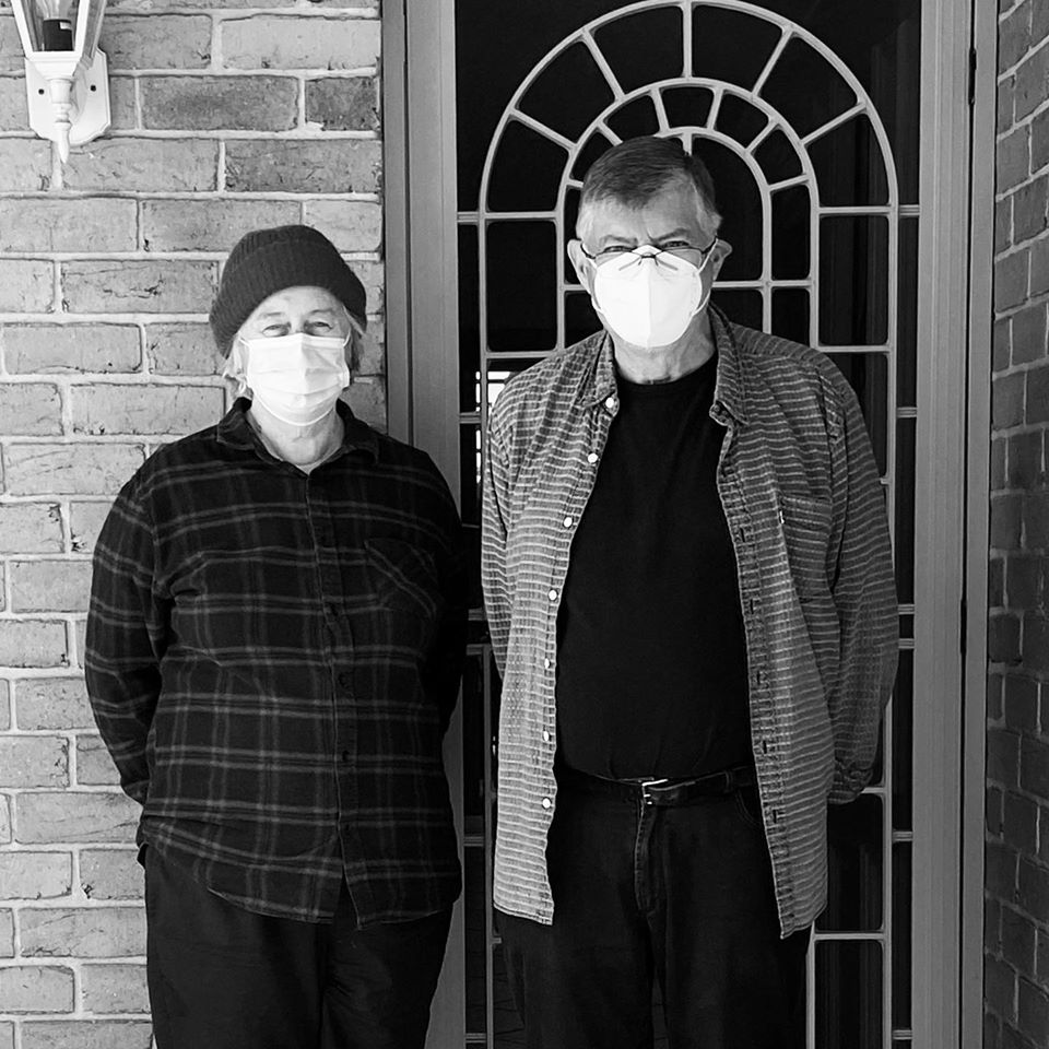
D+V with masks
Vicky+Doug
PORTRAIT PHOTO: Susan Belperio
Here are some images of people met, events documented and our own art activities over recent years …


1959 watercolour Spowart+Cooper Corner of Kitchener and Herries Streets 1996 silver gelatin fibre print")


 at the Vienna Photobook Festival PHOTO: Doug Spowart")


©2020 Doug Spowart+Victoria Cooper
..
.
Our photographs and words are licensed under a Creative Commons Attribution-NonCommercial-NoDerivs 3.0 Unported License.http://creativecommons.org/licenses/by-nc-sa/2.5/au/..
WOTweTHINK: Joe Ruckli’s ‘LIGHTNING WITHOUT FLASH’
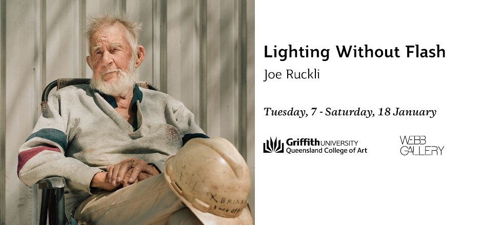
.
Walking into Joe Ruckli’s exhibition Lightning Without Flash at the Queensland College of Art’s Web Gallery was a little like entering into the subject of his documentary work.
The white walls of the gallery evoke the opal miner’s white clay tunnels of Lightning Ridge in northern NSW. Here and there the glimmer of what opal miners call ‘colour’ appear in the form of photographs arranged in rows and in one random gallery hang.
In the center of the room on plinths sit piles of ‘potch’ – miners slang for junk opal in the form of Keno tickets, fractured clay clods, crumpled beverage cans, machinery debris and a ‘roly-poly’(tumble weed).
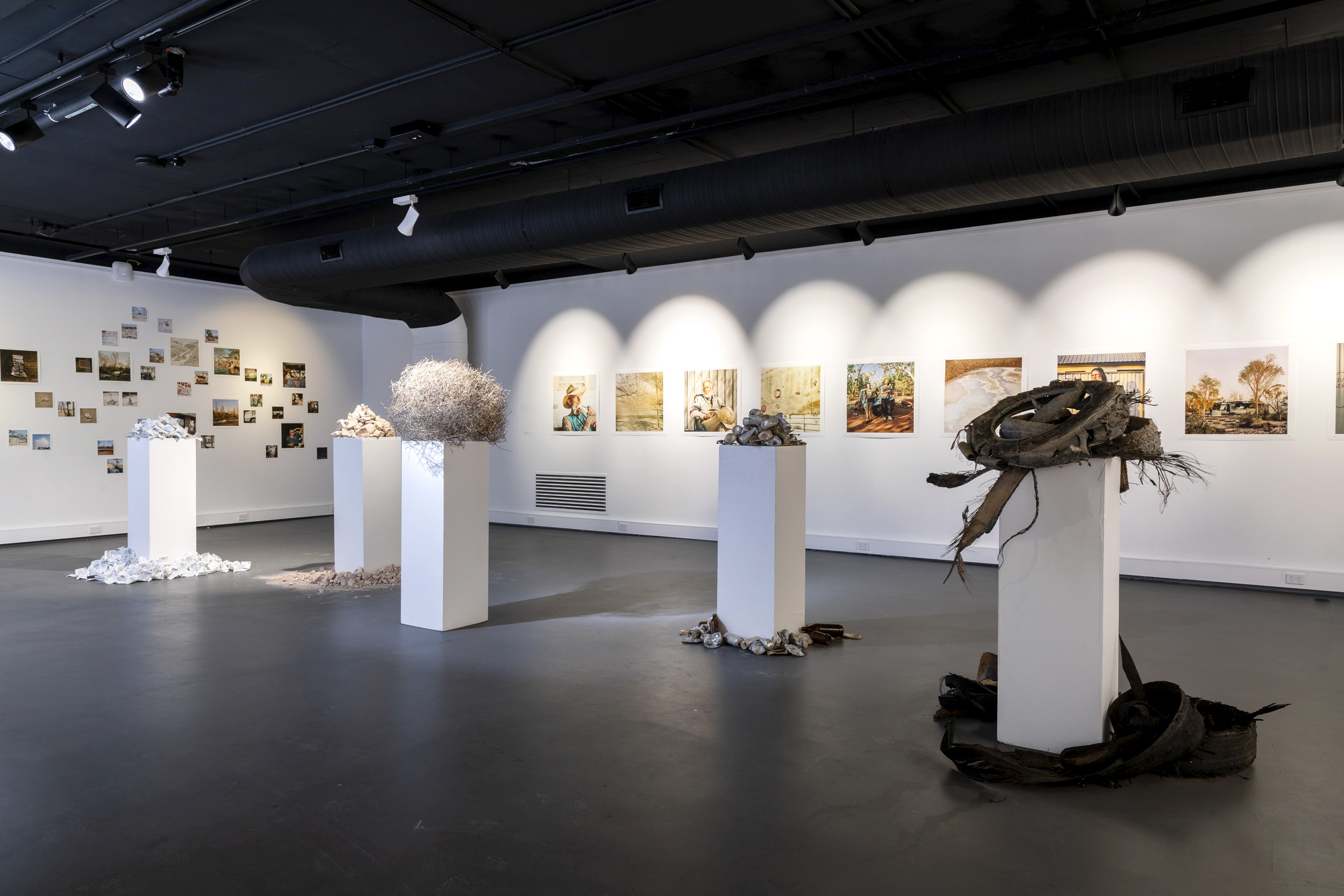
Lightning Without Flash…… Installation QCA Webb Gallery PHOTO: Joe Ruckli
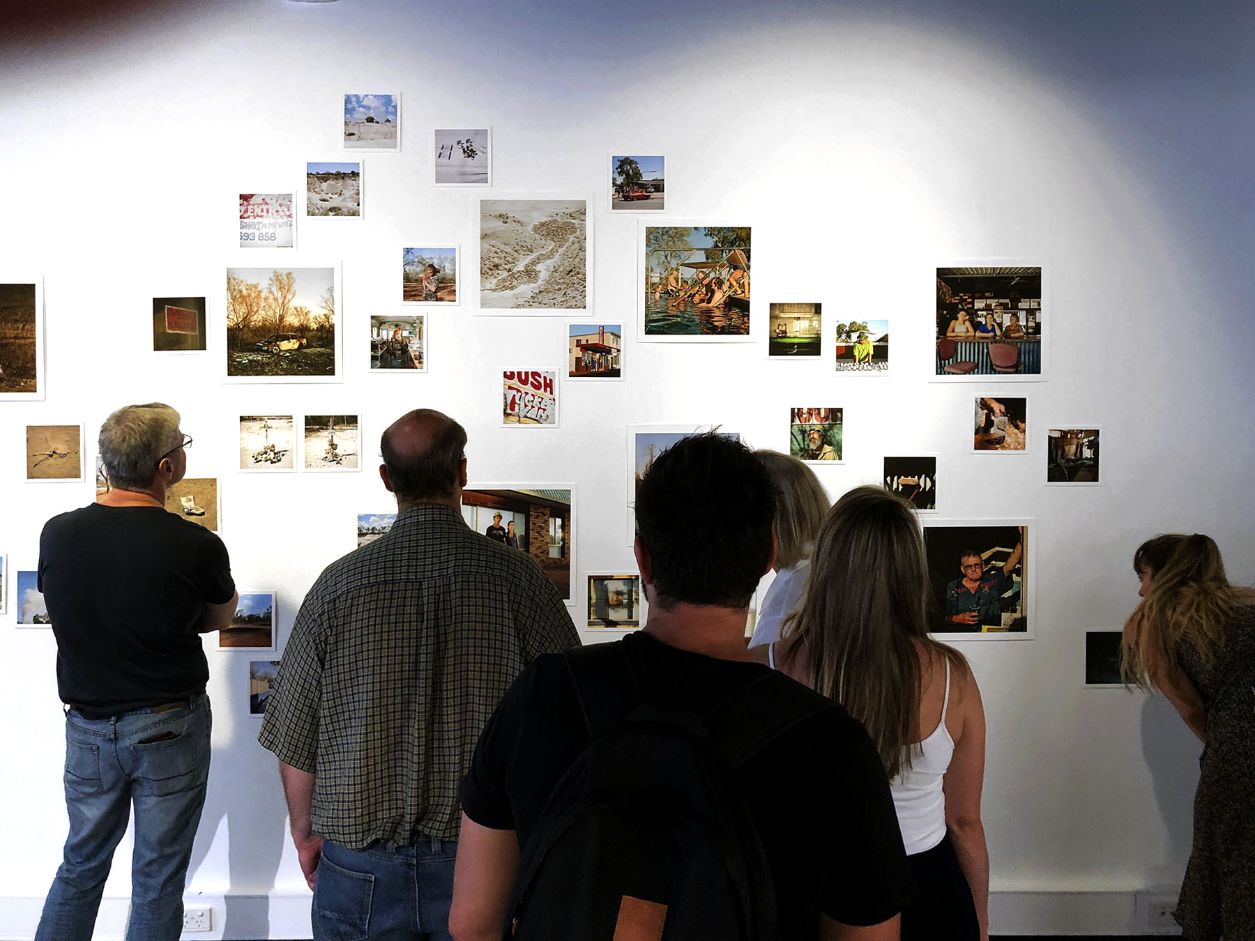
Gallery visitors at the exhibition opening … PHOTO: Doug Spowart
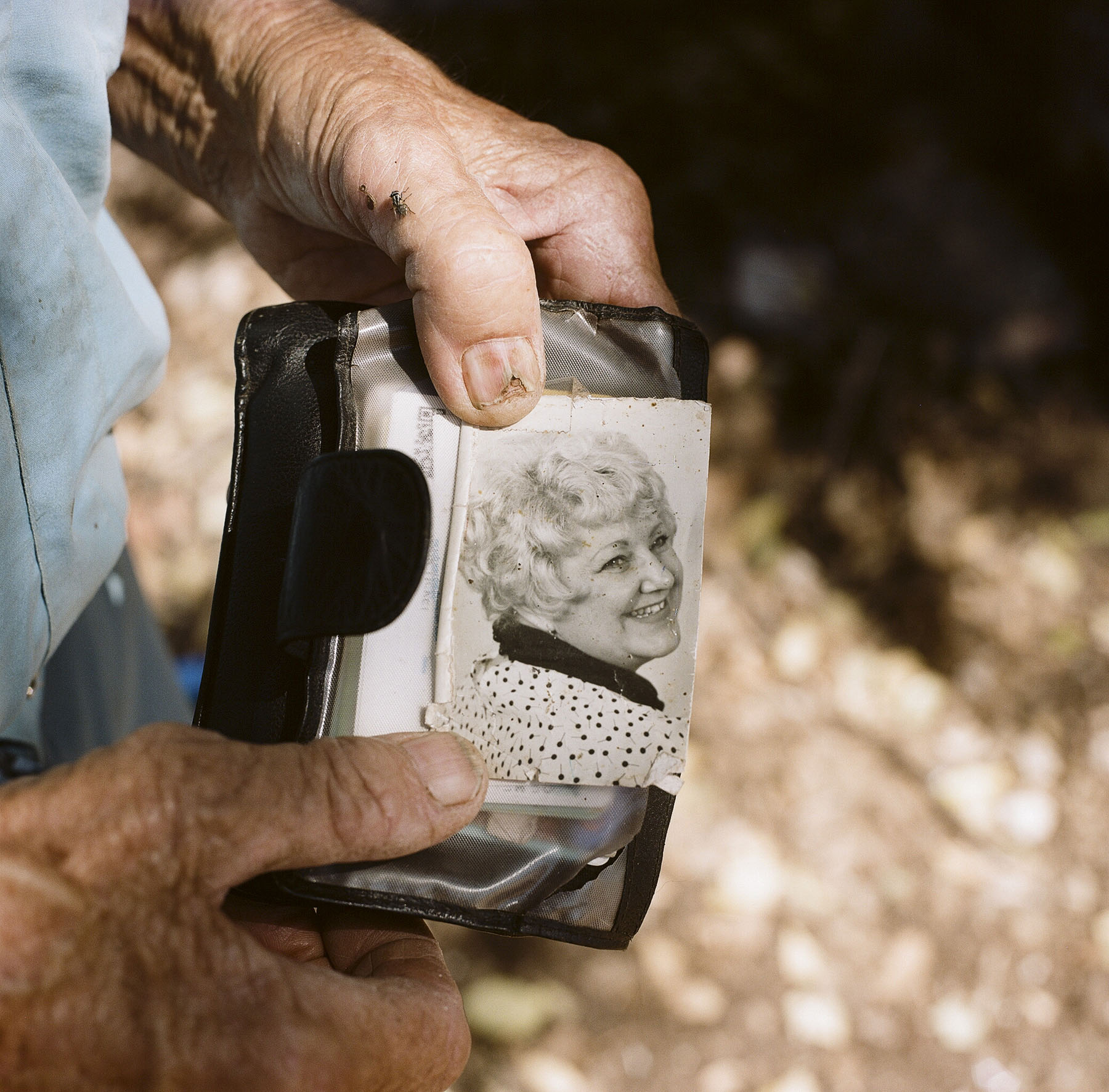
In traditional documentary style Ruckli’s ‘miner’s tunnel’ presents visual material that tells or invokes stories about place.
Ruckli’s human inhabitants live hard lives working in difficult conditions.
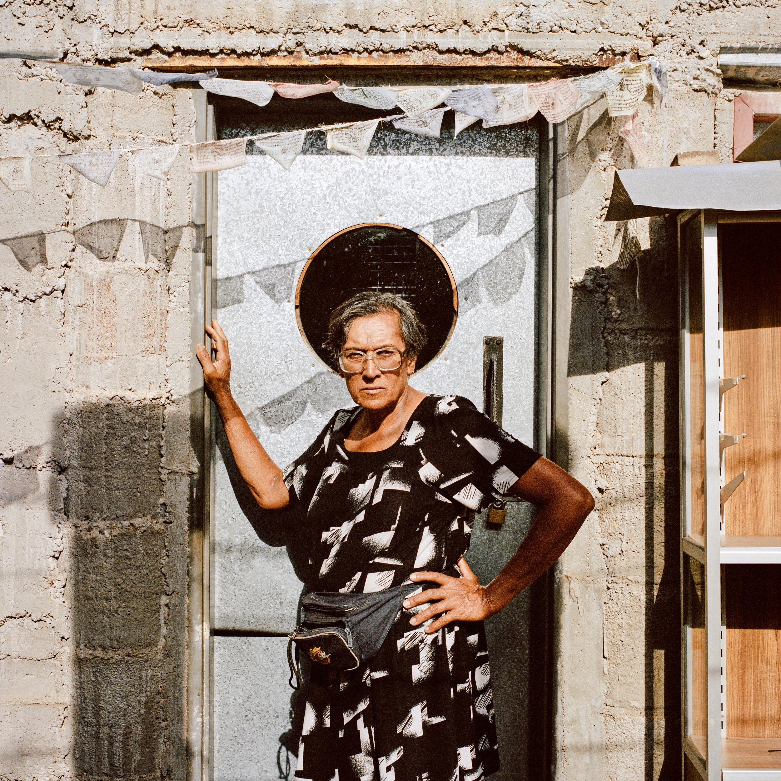
- A hand holds a wallet in which a well-handled 1960s b&w portrait of lady looks out of the frame – the thumbnail of the hand is damaged and cracked and a fly sits on the knuckle…
- A 50s+ lady stares challengingly at the camera, hand on hip the other resting on the doorway to her ‘home’ – behind her head a circular dark shape, perhaps a window, acts like a halo. There are layers of meaning here…
Lightning Without Flash…… QCA Webb Gallery PHOTO: Joe Ruckli
Lightning Without Flash…… QCA Webb Gallery PHOTO: Joe Ruckli
The human occupied space where people live and work is depicted as a run-down, rough and inhospitable place.
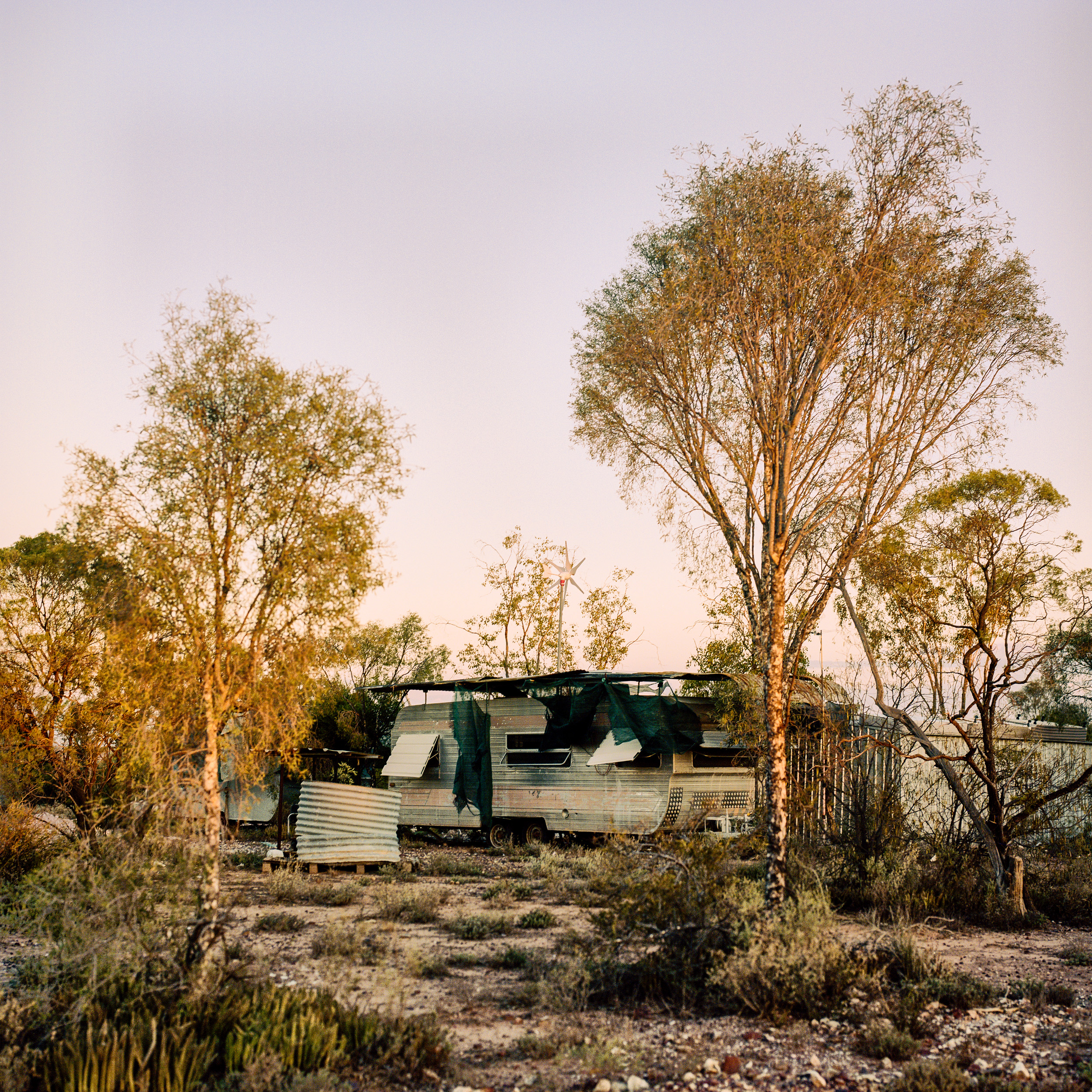
- A caravan surrounded by assorted re-purposed corrugated iron sheeting hides within a barren withered land.
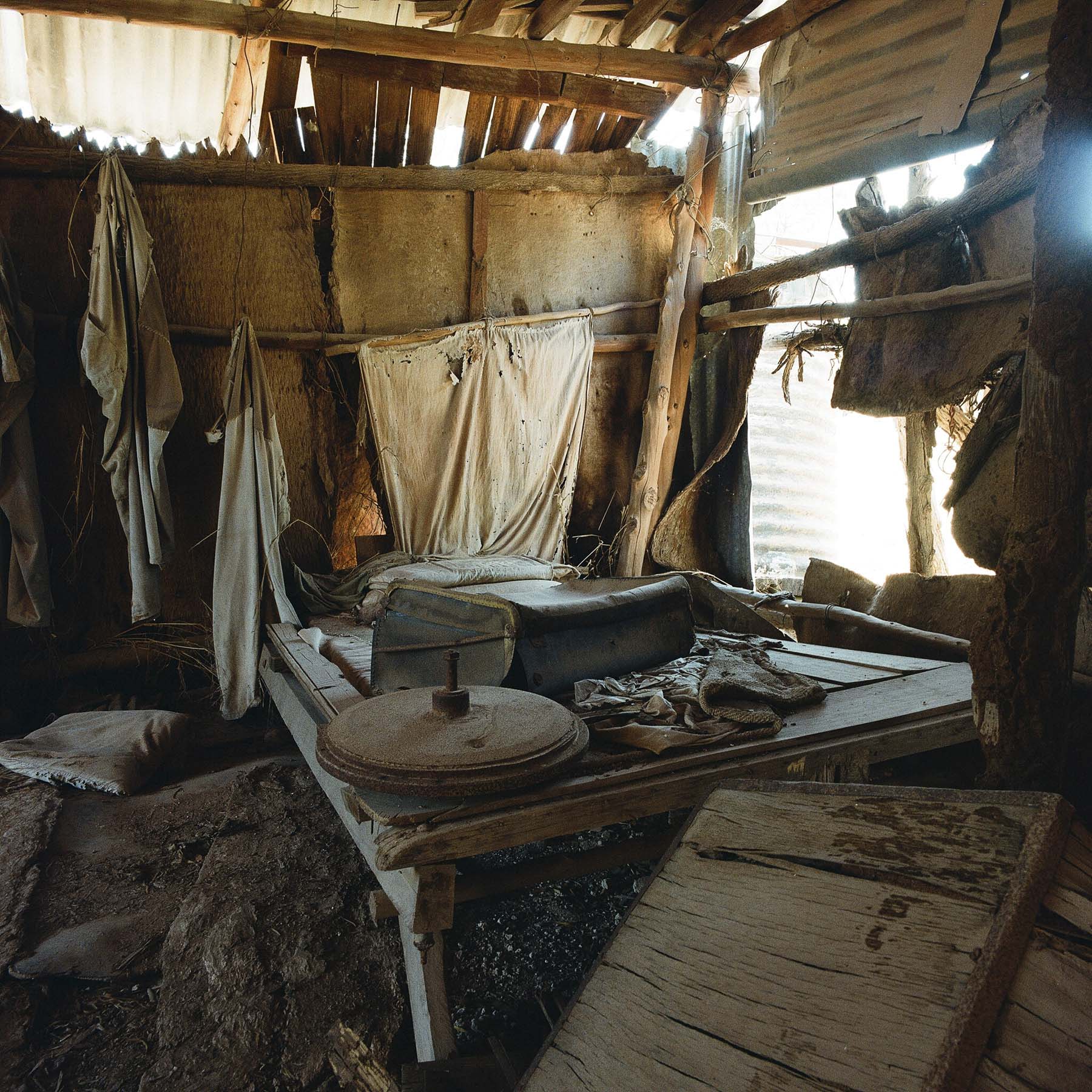
- A ‘room’ of walls made of bits of bags, iron sheets, wood and bush poles seems like an abandoned hermit’s lair laid dormant for a century.
- A shop in the street ‘Peter’s Opals’ presents a stark elevation despite the beauty of the stones inside for sale.
Lightning Without Flash…… QCA Webb Gallery PHOTO: Joe Ruckli
Lightning Without Flash…… QCA Webb Gallery PHOTO: Joe Ruckli
The natural space is tough enough for plants and animals without it being overlaid by the detritus of human habitation and exploitation.
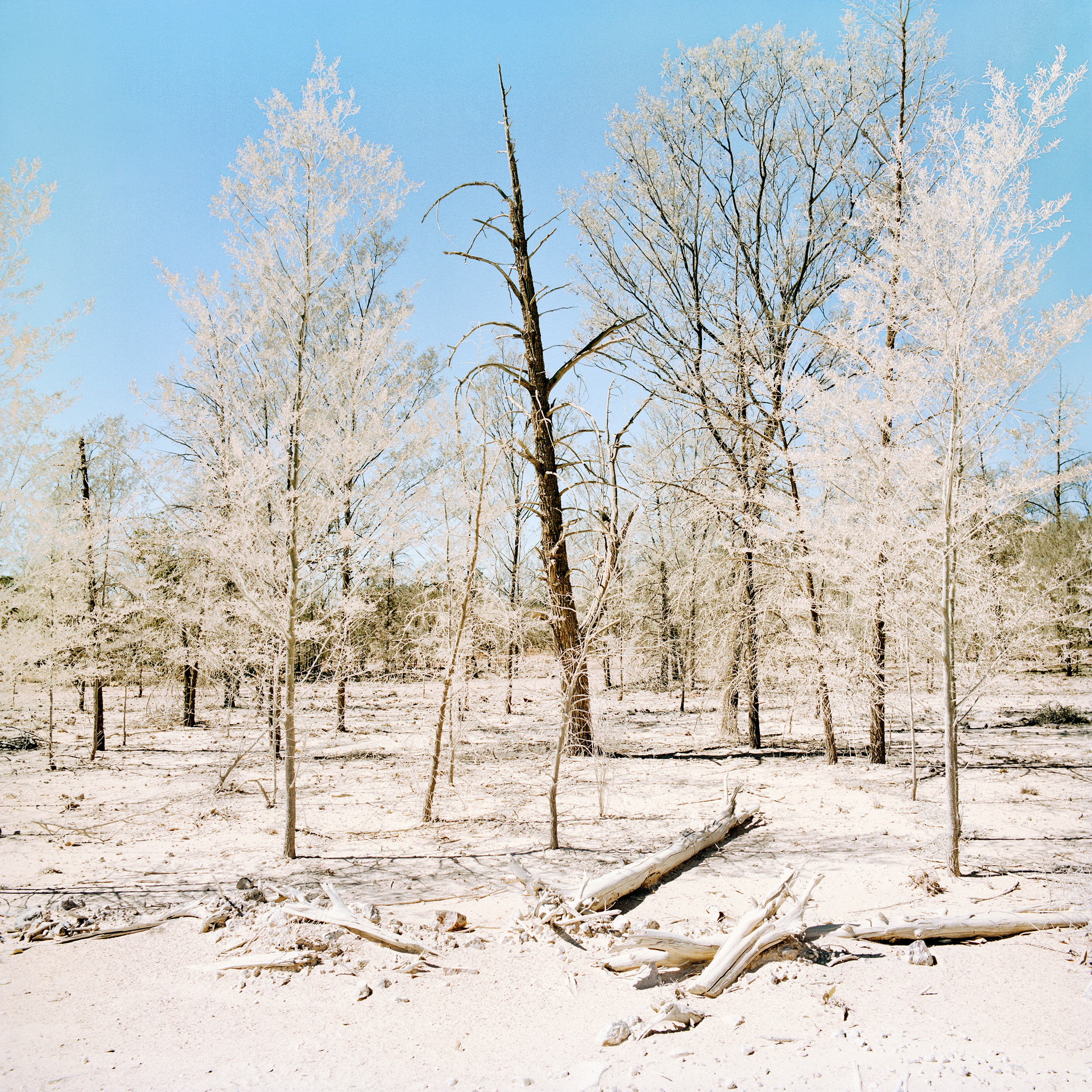
- Bushland slashed by the track of grader blades, scattered bleached kangaroo bones and shrubbery covered by powdered bulldust giving the appearance of a snow scene.
- A kangaroo skeleton lies in profile, its running pose is gradually being smothered by wind-blown dust to perhaps one day to be found as a fossil of this time…
Lightning Without Flash…… QCA Webb Gallery PHOTO: Joe Ruckli
Lightning Without Flash…… QCA Webb Gallery PHOTO: Joe Ruckli
.
Ruckli has selectively, through his image and ephemera collecting, presented us with a first-hand experience of Lightning Ridge. It’s an alien space that few of us will ever encounter. But for one moment, in this white ‘tunnel’, we came to experience something of what lies behind the opal’s seduction. So powerful that it drives human endeavour to live, work and endure the hardships to strike the illusive and lucky find.
And we wonder about the gem – once extracted from its hiding in the claystones and then polished – destined for another place to adorn, as a jeweled accessory, the lifestyles of another world …
Doug Spowart with editorial support by Victoria Cooper
13 Jan 2020
.
What is WOTweTHINK …?
We attend many exhibitions and lament that these shows rarely have personal or reflective commentaries published about them. Our concept is to condense our thoughts into an Instagram-like short/sharp rought draft post. We hope that WOTweTHINK may encourage a broader discussion …
.
A SELECTION OF OTHER IMAGES FROM THE EXHIBITION
.


THE HIDDEN ART OF DRAWING – REVEALED: JADA 2018
.
Artists fill notebooks with drawings using a range of mark-making methods from burnt sticks (charcoal), lead and coloured pencils to ink pens and colour washes. These can be renderings that replicate the subject in ways that a camera might. They can be of details and juxtapositions of elements. Or they can be quick-made glimpses full of emotion and movement that come not so much from the subject itself but rather from the artist’s response to the inspiration created by what they witness.
Later in the artmaking process the artist retrieves these references and in the studio space with the grander media of canvas, metal or expanses of paper the drawing’s trace is carefully made and through the application of pigments applied by brush and palette knife or engraved, etched, inked and pressed. Here a ‘real’ artwork is made. Yet, underneath the final artwork the reference drawing resides – hidden.
The secret hidden ‘art’ of the artist’s drawing has for 30 years been the focus of the biennial Jacaranda Acquisitive Drawing Award (JADA) at the Grafton Regional Gallery (GRG). In this award the drawing is revered not as an aide-mémoire for the artist’s later work but rather as the product of a deliberate creative and expressive artmaking activity.
The gallery has as it’s rationale for JADA and the GRG Drawing Collection the following statements:
The award seeks to encourage and promote innovation and excellence and plays a vital role in fostering Australian drawing practice.
The … collection exemplifies the developments and changing parameters of contemporary drawing since 1988. The collection explores the way that drawing resonates as a contemporary medium, demonstrating the relevance and strength of drawing. Works in the collection offer a varied and extensive overview of drawing ranging from highly resolved articulate works to spontaneous expressive works that are mostly retained on the conventional support of paper.
… the collection has attractively developed through the tastes, opinions and approaches of the various judges into a collection that is compelling, thought provoking, innovative, exuberant, and diverse.
JADA 2018 Grafton Regional Gallery installation
For those interested in artists in their practice of drawing a visit to the GRG will reveal all. In 2018 fifty-five artworks were selected from 498 entries by a pre-selection panel of suitably qualified persons. The selection of the major JADA award as well as acquisitions for the gallery’s drawing collection were adjudicated by Anne Ryan, Curator of Drawing, Prints and Watercolours from the Art Gallery of New South Wales.
What is surprising in the JADA selection is the way in which the techniques and media of drawing the can lead to such a diverse and stimulating variety of artworks. There are works that:
- Emulate photographs in their fine detail and tonal rendition
- Are exquisite in the draughtsmanship expressed
- Show the artist’s use of the drawing to ‘find the edge’ and give shape and form to the subject
- The emergent use of computer software, digital output, and digital media animation screen presented time-based artworks
- Express the textural nature of the drawing media on the receiving surface
- The passing of time in a stilled framed work
- Explore caricatures
- Play with simple gestural lines and equally simple ideas


")


 2017 70 x 96cm")


 2018")
' 2018 100 x 150cm")


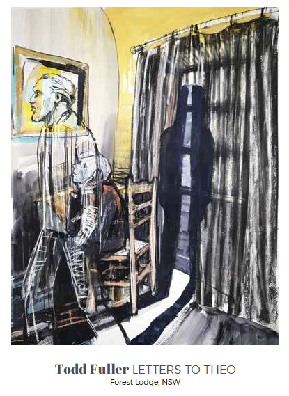
The winner of the $30k 2018 JADA award was Todd Fuller, a Sydney based artist with his work titled Ode to Clarence as described in the Gallery’s website as: a hand drawn and painted animation, created during a residency at Grafton Regional Art Gallery.
The work deals with the current issues in Grafton associated with the building of a new bridge connecting the city with the highway. Through a digitally presented narrative relating to the disruption to the community caused by the terraforming, street changes and house demolitions caused by the bridge building. The work is created as a continuous drawing in parts.
Some may question how this work is classified as a ‘drawing’ as we usually encounter a drawing as a static artwork in a notebook, on paper or in a frame. As such time-based digital media presentations and other such works present a challenge to the traditional paradigm. These digital media ‘drawings’ may be documentation of drawing projects or of performances commenting on the concept of drawing. As we know there is a significant history of animated drawings presented as moving picture films. It should also be acknowledged that documentation by video might also make visible a drawing work in transformation. Though it might be asked how do these works ‘fit’ with the term ‘drawing’? And when does a drawing cease being a ‘drawing’ and become a work in the discipline of animation or digital media?
Interestingly Fuller’s drawing work uses a technique similar to that used by the artist Blu in his famous street graffiti video documentary MUTO. Blu describes his work as: …a seven minute animated mural.
Thoughts such as these will no doubt occupy the minds of many visitors to the JADA exhibition as it travels around the eastern seaboard over the next two years. Whatever the outcome for such thoughts ultimately JADA has provided an important biennial review and space for critical commentary and reflection on the discipline and has stimulated this enquiry. The award also reveals and makes visible the work of artists, it shares their stories and ideas through the discipline of drawing – perhaps the oldest of all human creative endeavours.
Dr Doug Spowart
With thanks to Dr Cooper for editorial support

JADA 2018 Grafton Regional Gallery installation
FOOTNOTE:
Other works acquired for the Grafton Regional Gallery Collection with their $10k allocation are:
- David Fairbairn Portrait of T.J.K No 1,
- Kedal Gear Haze,
- Nicci Haynes Drawing Dancing (an animation),
- Noel McKenna Silent Assassin and
- Claire Primrose Assembled Landscape 3.
An illustrated catalogue of the JADA entries can be downloaded here: 2018_JADA_Finalists_Catalogue
Apart from the Gallery exhibition in late 2018 the JADA will tour regional galleries over the next two years to the following venues; Manning Regional Gallery, Hervey Bay Regional Gallery, University of the Sunshine Coast Gallery, Griffith Regional Art Gallery, Latrobe Regional Gallery and the Tamworth Regional Gallery.
.
.
.
.
Text ©2018 Doug Spowart Photographs of gallery ©2018 Doug Spowart. Copyright of artworks is retained by the artist
Many artworks have been photographed to show the nature of the framing and matting of the work.
.
IMPRINT JOURNAL: Article on regional arts awards
IMPRINT COVER Vol53 #2
In March this year we were approached by the Editor of IMPRINT MAGAZINE, the journal of the Print Council of Australia to write a piece about regional galleries and the national awards that they coordinate. Of particular interest to Editor Andrew Stephens was Artspace Mackay’s Libris Awards: National Artists’ Book Award, and Mornington Peninsula Regional Gallery’s National Works on Paper Awards.
We were familiar with both awards events and in particular we’ve had a long connection with the Libris Awards as entrants and reviewers. In 2017 we visited the Mornington Peninsula Regional Gallery as viewed and exhibition of works from their awards. Many of you will also be aware of our interest in, and support of regional art so we were excited by the opportunity that the commission provided.
We set about to prepare the commentary and to add extra voices to the piece we contacted some artists who have significant participation in regional arts awards. What follows is the article with the 4 page layout and photographs followed by the text, references and acknowledgements.
.
Imprint: Page 22+23
Imprint: Page 24+25
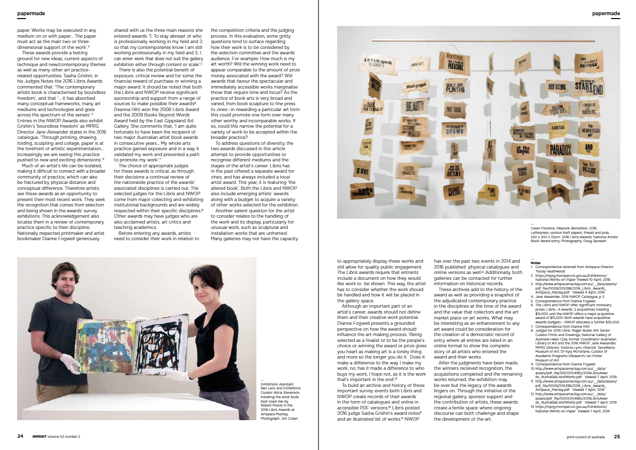
BEYOND THE CITY LIMITS:
Two regional art awards for artists’ books and works on paper
The art gallery is a place for presentation, display and the sharing of art. It is a space that orchestrates the development of cultural discourse by connecting the world of the artist with an art-interested audience including members of the public, art students, the artist’s peers, curators, critics and collectors. Big city art galleries can mount blockbuster national and international shows and also cover a diverse range of disciplines that regional galleries cannot ever hope to match. The regional gallery can however specialise in key areas of activity and collection by including in their programs discipline based national awards. These galleries also aren’t so constrained by orthodoxy and can open up the dialogue leading to more widespread changes. Through the awards they can push boundaries and help to define what is contemporary in various disciplines.
.
Two noteworthy regional galleries and their specialisations are Artspace Mackay (AM) has the Libris Awards: National Artists’ Book Award (Libris) and Mornington Peninsula Regional Gallery (MPRG) has National Works on Paper Awards (NWOP). To ensure the currency of the entries both awards are offered biennially with a requirement that the works entered must have been completed within the preceding two years. Each gallery has a particular focus for their award.
The Libris Awards provide Artspace Mackay with: ‘an opportunity to become known as a centre for artists’ books; we develop/build meaningful relationships over many years with artists; the award attracts the latest and best works from artists in the field and introduces us to new artists; and provides us with a wonderful opportunity to acquire new artists’ books for our Art Collection by leading artists in the field’.[1]
At the Mornington Peninsula Regional Gallery the NWOP’s role ‘is to support and promote contemporary Australian artists working on or with paper. Works may be executed in any medium on or with paper… The paper must act as the main two or three-dimensional support of the work’.[2]
These Awards provide a testing ground for the new ideas, current aspects of technique and new/contemporary themes as well as many other art practice related opportunities. Sasha Grishin, in his ‘Judges Notes’ the 2016 Libris Awards commented that: ‘The contemporary artists book is characterised by boundless freedom’, and adds that: ‘… it has absorbed many conceptual frameworks, many art mediums and technologies and goes across the spectrum of the senses’.[3] Entries in the NWOP Awards also exhibit Grishin’s ‘boundless freedom’ as MPRG Director Jane Alexander states in the 2016 catalogue: ‘Through printing, drawing, folding, sculpting and collage, paper is at the forefront of artistic experimentation… increasingly we are seeing this practice pushed to new and exciting dimensions’.[4]
Much of an artist’s life can be isolated making it difficult to connect with a broader community of practice, which can also be fractured by physical distance and conceptual difference. Therefore artists see these awards as an opportunity to present their most recent work. They seek the recognition that comes from selection and being shown in the awards’ survey exhibitions. This acknowledgement also locates them in a review of contemporary practice specific to their discipline. Nationally respected printmaker and artist bookmaker Dianne Fogwell generously shared with us the three main reasons she entered awards: ‘1. To stay abreast of who is professionally working in my field and 2; so that my contemporaries know I am still working professionally in my field and 3; I can enter work that does not suit the gallery exhibition either through content or scale’.[5]
There is also the potential benefit of exposure, critical review and for some the financial reward of purchase or winning a major award. It should be noted that both the Libris and NWOP receive significant sponsorship and support from range of sources to make possible their awards[6]. Deanna Hitti won the 2008 Libris Award and the 2009 Books Beyond Words Award held by the East Gippsland Art Gallery. She comments that, ‘I am quite fortunate to have been the recipient of two major Australian artist book awards in consecutive years… My whole arts practice gained exposure and in a way it validated my work and presented a path to promote my work through’.[7]
The choice of appropriate judges for these awards is critical as through their decisions a continual review of the nation-wide practice of the award’s associated disciplines is carried out. The selected judges for the Libris and NWOP come from major collecting and exhibiting institutional backgrounds and are widely respected within their specific disciplines.[8] Other awards may have judges who are also acclaimed artists, art critics and teaching academics.
Before entering any awards the artist needs to consider their work in relation to the competition criteria and the judging process. In this evaluation some gritty questions tend to surface regarding how their work is to be considered by the selection committee and the awards audience. For example: How much is my art worth? Will the winner’s work need to appear comparable to the amount of prize money associated with the award? Will awards that favour the spectacular and immediately accessible works marginalise those that require time and focus? As the practice of book arts is very broad and varied, from book sculpture to fine press to zines—in rewarding a particular art form/s this could promote one form over many other worthy and incomparable works. If so this could narrow the potential for a variety of work to be accepted within the broader practice?
To address questions of diversity, the two awards discussed in this article attempt to provide opportunities to recognise different mediums and the stages of the artist’s career. Libris has in the past offered a separate award for Zines, and have always included a local artists award. This year they are featuring the altered book. Both the Libris and NWOP also include emerging artists’ awards along with a budget to acquire a variety of other works selected for the exhibition.
Another salient question for the artist to consider relates to the handling of the work and its display, particularly for unusual work, such as sculptural and installation works that are unframed. Many galleries may not have the capacity to appropriately display these works and still allow for quality public engagement. The Libris awards require that entrants include a document on how they would like work would be shown. This way the artist has to consider whether the work should be handled and how it will be placed in the gallery space.
Although an important part of an artists career awards should not define them and their creative work potential. Dianne Fogwell presents a grounded perspective on how the award should influence the artmaking process: ‘Being selected as a finalist or to be the people’s choice or winning the award or prize gives you heart as making art is a lonely thing and more so the longer you do it. Does it make a difference to the way I make my work, no, has it made a difference to who buys my work, I hope not, as it is the work that’s important in the end’.[9]
To build an archive and history of these important survey events both Libris and NWOP create records of their awards in the form of catalogues and online in accessible PDF versions.[10] Libris posted 2016 judge Sasha Grishin’s award notes[11] and an illustrated list of works.[12] NWOP has over the last two events, 2014 & 2016 published a physical catalogue and online versions as well.[13] Additionally AM and MPRG can be contacted for further information on historical records.
These archives add to the history of the award as well as a snapshot of the adjudicated contemporary practice in the disciplines at the time of the award and the value that collectors and the art market place on artworks. What may be interesting as an enhancement to any art award could be consideration for the creation of a democratic record of entry where all entries are listed in an online format to show the complete story of all artists who entered the award and their works.
CONCLUSION:
After the judgements have been made, the winners received recognition, the acquisitions completed and the remaining works returned, the exhibition may be over but the legacy of the awards lingers on. Through the initiative of the regional gallery, sponsor support and the contribution of artists, these awards create a fertile space where ongoing discourse can both challenge and shape the development of the art.
Prepared by Dr Victoria Cooper and Dr Doug Spowart
With thanks to: Tracey Heathwood Director Artspace Mackay and Narelle Russo MPRG Curator-Collections / Registrar.
Dr Lyn Ashby, Dianne Fogwell, Deanna Hitti, Johanna Kambourian, Dr Clyde McGill, Dr Felicity Rea.
[1] Correspondence received from Artspace Director Tracey Heathwood
[2] https://mprg.mornpen.vic.gov.au/Exhibitions/National-Works-on-Paper Viewed 10 April, 2018.
[3] http://www.artspacemackay.com.au/__data/assets/pdf_file/0009/205398/2016_Libris_Awards_Artspace_Mackay.pdf Viewed 4 April, 2018
[4] Jane Alexander, 2016 NWOP Catalogue, p 3.
[5] Correspondence from Dianne Fogwell
[6] The Libris and NWOP offer significant monetary prizes: Libris—4 awards, 2 acquisitive) totalling $15,000, and the NWOP offers a major acquisitive award of $15,000. Both awards have acquisitive awards budgets – NWOP allocates a further $35,000.
[7] Correspondence from Dianna Hitti
[8] Judges for 2018 Libris: Roger Butler AM, Senior Curator Prints and Drawings, National Gallery of Australia Helen Cole, former Coordinator Australian Library of Art
and the 2018 NWOP, Jane Alexander, MPRG Director;
Victoria Lynn, Director, TarraWarra Museum of Art;
Dr Kyla McFarlane, Curator of Academic Programs (Research) Ian Potter Museum of Art.
[9] Correspondence from Dianne Fogwell
[10] http://www.artspacemackay.com.au/__data/assets/pdf_file/0007/204955/2016LibrisAwards_IllustratedListofWorks.pdf Viewed 7 April, 2018
[11] http://www.artspacemackay.com.au/__data/assets/pdf_file/0009/205398/2016_Libris_Awards_Artspace_Mackay.pdf Viewed 7 April, 2018
[12] http://www.artspacemackay.com.au/__data/assets/pdf_file/0007/204955/2016LibrisAwards_IllustratedListofWorks.pdf Viewed 7 April, 2018
[13] https://mprg.mornpen.vic.gov.au/Exhibitions/National-Works-on-Paper Viewed 7 April, 2018
SOME OTHER AUSTRALIAN – PRINTMAKING + ARTISTS’ BOOK AWARDS @ March 2018
Manly Artists Book Award—Bi-yearly, next 2019
https://www.northernbeaches.nsw.gov.au/things-to-do/arts-and-culture/manly-artists-book-award
Hazelhurst Art on Paper Award—Bi-yearly, next 2019
Gippsland Print Award—Bi-yearly, next 2019
http://www.gippslandartgallery.com/prizes/gippsland-print-award/
Swan Hill Print & Drawing Acquisitive Awards—Bi-yearly, current 2018
https://gallery.swanhill.vic.gov.au/2018/03/print-drawing-finalists/
2017 Geelong Aquisitive Print Awards
http://www.geelonggallery.org.au/cms_uploads/docs/2017-geelong-acquisitive-print-awards_online.pdf
Banyule Award for Works on Paper—Hatch Contemporary Arts Space
https://www.banyule.vic.gov.au/Arts-and-Events/Banyule-Award-for-Works-on-Paper
.
.
.
.
.
ABBE 2017 – The academic artists book conference
ABBE Logo
The second Artist Book Brisbane Event (ABBE) promised an academic conference dealing with the artists book as a folded and risky space. The event consisted of three elements at the Queensland College of Art and a fourth satellite pop-up exhibition at the State Library of Queensland. Drawn to ABBE 2017 were artists bookmakers, thinkers, commentators, teachers, lecturers and tinkerers from across Australia. All came with a desire to contribute to, or participate in, perhaps this Australia’s penultimate artists book gathering.
Dr Tim Mosely ABBE coordinator and chair
The event was convened and chaired by QCA lecturer Tim Mosely and was launched by Griffith University’s Dean Academic, Arts, Education and Law Professor Ruth Bereson who spoke about the book as art and the need for that the discipline has for scholarly discourse. She commented that the Griffith Centre for Creative Arts Research ABBE program and its connection with Columbia University’s JAB (Journal of Artists Book) publication of selected papers would contribute to this discourse. Significant keynote speakers, Uta Schneider and Ulrike Stoltz from Germany and Clyde McGill from Western Australia headlined the event. Other program contributors came from practitioners, academic staff, students, and recent graduates from institutions in the USA, New Zealand and around Australia.
Ulrike Stoltz & Uta Schneider
The first keynotes were Uta Schneider and Ulrike Stoltz who presented a paper entitled betwixt & between. Presenting in tandem their voices were almost like a turning of the pages – recto and verso. They teased out and formed the conference theme of ‘folding’ into an ordered analysis of the physical and metaphorical ways that books fold. They connected the theme ‘folding’ with their own individual and collaborative works and the concepts, philosophies and discussions about artists books that informed them. Mythology, Martin Heidegger on contemprality and the ekstaticon, Carrion, Gillies Deleuze and ‘thinking means folding’ and Michel Serres and ‘the crumpled nature of time’.
The lecture then proceeded to a review of book forms with terms like:
- Folded paper
- Cross fold
- Sharpness of the fold
- Container folds
- Staging folds
- French fold
- Inside folding outside
- Concertina and multi-concertina folds
- Wormholes and science fiction
The works they illustrated their paper with were refined and exquisitely designed. They featured wordplay and poetry, folded page spaces, transparency using ‘show-through’, typography and graphic design elements. As an introduction to the topic, the hour long presentation provided a solid and exciting insight into ways of considering the fold, its forms and the way it can connect with the reader, as receiver of the communiqué.
A K Milroy + Brad Freeman presenting
Other presentations on the program included:
- Marian Macken Reading Volume: Between Folded Drawings and Collapsible Models
- Caren Florance & Angela Gardner Unfolding to refold: collaborative wordings
- Paul Uhlmann Meditations on process: Three artists books, letters to the land, sea and sky
- Caren Florance An Instrument of Collaboration: Unfolding the GIW Legacy
- Monica Oppen Eclectic items: early books by Australian artists
- Ana Paula Estrada “Memorandum”, from concept to publication
- Wim de Vos Air, edge, surface image – concertina books
- Nicola Hooper The Citronella Artists Book as an Augmented Narrative
- Amy E. Thompson Folding and the potential of Artists’ Books
- A K Milroy & Brad Freeman Folding and unfolding in JAB41: cultures, research, pages
- Tess Mehonoshen DISINTEGRATE: the destructive folding of materials
- Marian Crawford A lively phantom: the rare and popular artists book
- Carolyn Craig Unfolding(s)
- Isaac Brown Relationship risk and ethics in photographic artist books
- Monica Carroll & Adam Dickerson Unfolding the episteme of artists’ books
- Bridget Hillebrand Handling folds: an intimate encounter
- Julie Barratt & Virginia Barratt The exquisite fold, the immanent word
- Maren Götzmann The Anarchist Notebooks


While most papers were read from the dais with carefully illustrated PowerPoint slides the second keynote speaker Clyde McGill emerged on the stage with a device that could be called a ‘bibliophone’. McGill had altered a range of book titles by folding back the pages and attaching a sound pick-up to the book cover and then connected the 7 books to an amplifier. Volunteers from the audience were given bonefolders as plectrums and, on McGill’s guidance were instructed to make the various movements of hands and object associated with hand-making a book. The haptic actions were converted to sound and the room filled with the noise of ‘making’ associated with a great deal of laughter.
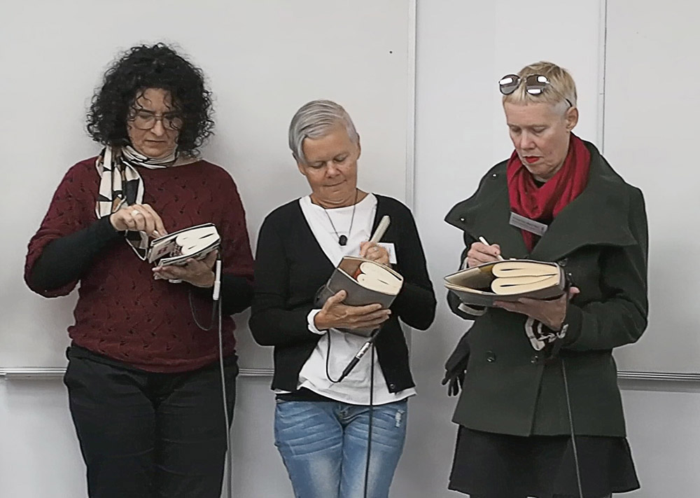
Making book music with Clyde McGill


McGill continued his presentation with a detailed investigation of the idea of folding books. Where possible his own works were referenced. At other times he created new books by playful investigation… bending and folding light was a particularly humorous but gave those present an insight into how the artist’s off-tangential and obtuse thought processes process can lead to new conceptual and visual discoveries.

Julie and Virginia Barrett’s performance
Another departure from the read-the-paper format was a performance by Julie Barratt and her sister Virginia Barratt. Attendees, on returning to the lecture theatre after morning tea, found the space darkened except for two sharply defined spotlit circles. One pool of light was vacant, just the floor’s carpet – in the other artists’ book maker Julie Barratt was busy unfurling paper, measuring it and tearing of lengths and positioning them in a stack on the table before her. Also on the table were scissors a ball of thread and other bookmaker’s things. The unroll>measure>cut>position sequence was progressing methodically for some time making the sheets one might guess that would go to making a book. A soundtrack began with a female voice expressing thoughts ideas, word associations sometimes repeated – perhaps the thoughts of the bookmaker? There was a rustling sound – stage right. Gradually a large dome-like white shape appeared and moved towards the empty spotlight area. The shape was covered in what looked like pages – ominous maybe… the audio continued and Julie Barratt left her table and proceeded toward the shape and picked up a folded sheet and returned to the table – flattening out the sheet it was melded with other sheets. The performance continued. What was it about? What came to my mind was that the shape was like the book working with Julie so its story could be told as in Paul Carter’s ‘material thinking’. At the end of the performance it was revealed that Virginia Barratt, Julie’s sister, was the artists book ‘monster’.


Another aspect of the conference presentations were two papers by photographers Ana Paula Estrada and Isaac Brown both featuring bookwork’s that they had created. Estrada, as a State Library of Queensland Siganto Foundation Creative Fellow, discussed concepts of memory, photography and old age as the inspiration for her project. She detailed the process of design, making maquettes, refining and working with commercial printers and binders to complete the project. Brown spoke of the integration of his project and PhD study focussing on his relationship to his father, a Vietnam veteran. Aspects of text and dialogue were addressed as well as Brown’s own recent fatherhood. What was interesting was the informal narrative and connection with audience that both presenters had and the expanding space of the artists book being inhabited by photographers.
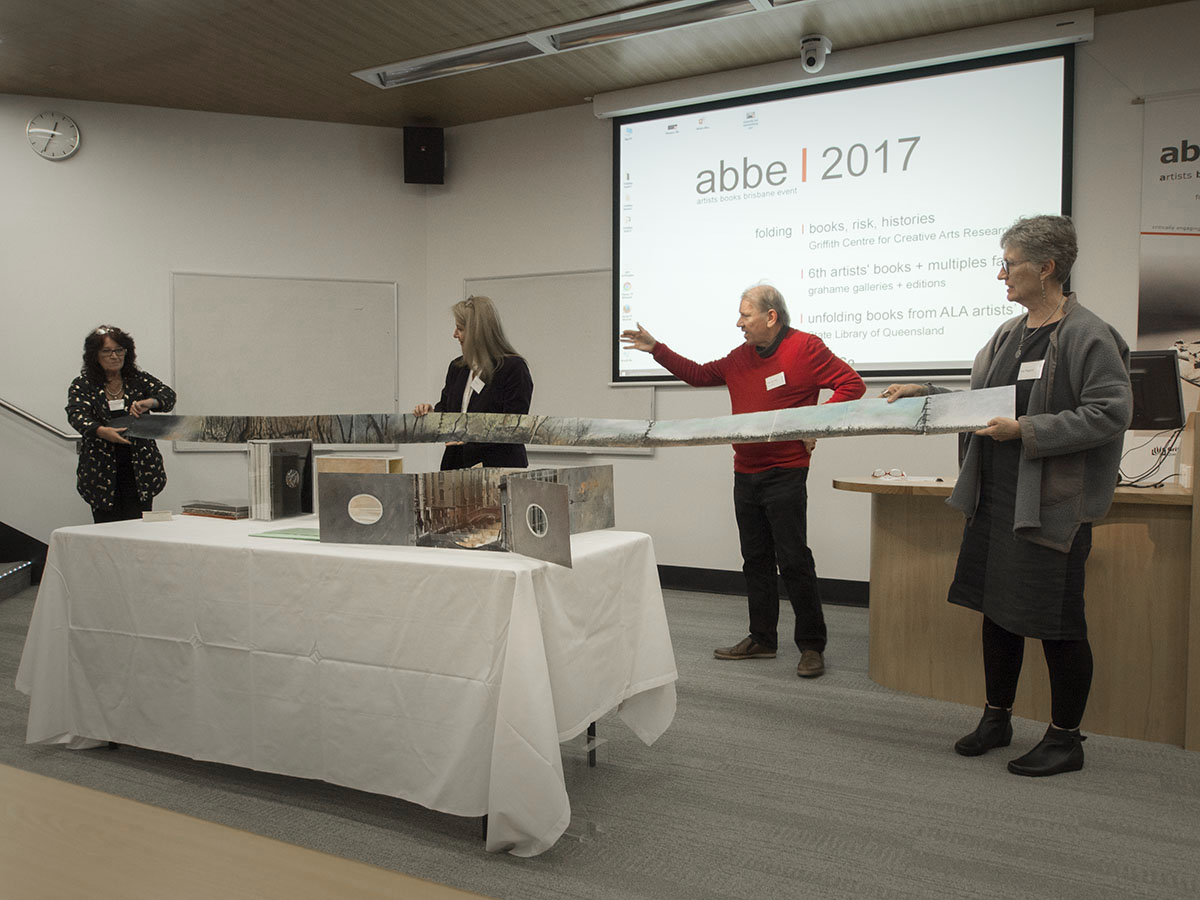
Wim de Vos presents his work
Wim de Vos made an animated presentation and several helpers as his concertina books by the metre unfolded across the width of the theatre and tunnel books expanded, evidence of the pre-eminence of his artists book practice in Queensland.


Midway through the academic papers a ‘plenary’ session consisting of a panel of artists’ book ‘movers and shakers’ discussed several issues relating to the discipline. The session quickly became absorbed with the perennial issues of nomenclature, the dearth of private and public purchasers of bookworks and the grooming of possible artists book collectors. The impact of the term ‘Art Book’ was mentioned and the way events associated with the term has grown in popularity worldwide and has come to encompass artists books, photobooks, zines, art books and institutional catalogues. Another topic mentioned was the importance of research and critical commentary on the discipline. A suggestion was made for the formation of a ‘double-blind peer review’ collective.
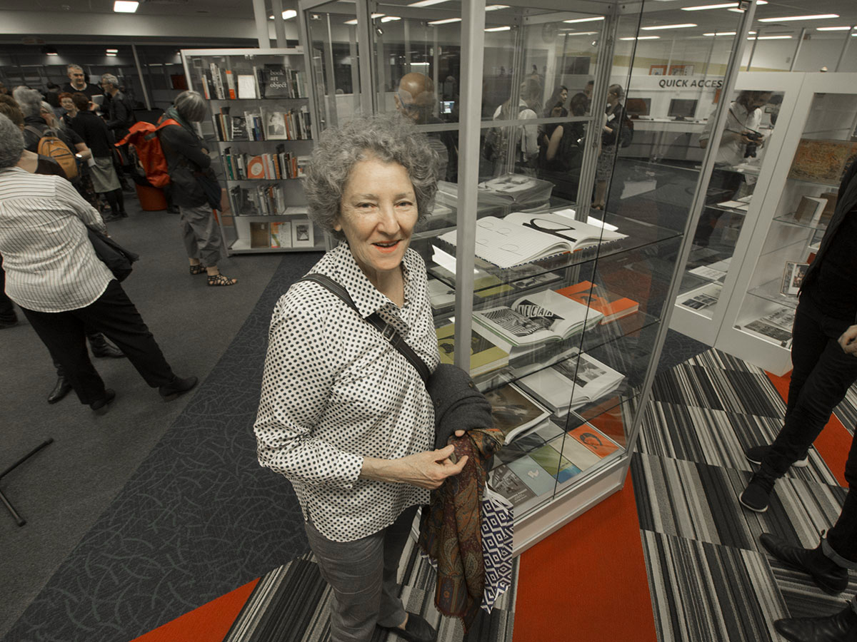
Noreen Grahame at the QCA Library and her ‘… & So’ artists book show
On the evening of the first day Robert Heather, Director, New England Regional Art Museum opened the exhibition “… & So” at QCA Library. The exhibition features a significant collection of seminal Australian and international artists books and multiples sourced predominately from Noreen Grahame’s Centre for the Artist Book collection and her numero uno publications alongside artists’ books from the Queensland College of Art. A list of the selected works can be downloaded here. ALA Books for abbe 2017 … $ so Exhibition list
Mid afternoon on the second day the State Librarian and CEO from the State Librarian of Queensland Vicki McDonald opened the 6th artists’ books + multiples fair. Twelve tables presented a hand-to-eye experience of books by significant makers of contemporary artists’ books. These included:

A silhouette view of the Grahame Galleries tables
Stand 1 – grahame galleries + editions
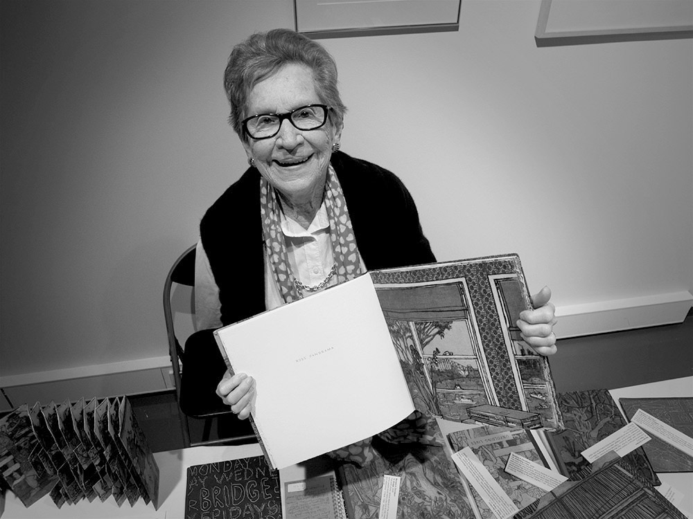
Barbara Davidson

Caren Florance
Stand 3 – Caren Florance – Ampersand Duck

Photo from ABBE Artists Book Conference July 6-9 2017 at the Queensland College of Art

Anne-Marie Hunter
Stand 7 – Psyclonic Studios – Anne-Maree Hunter
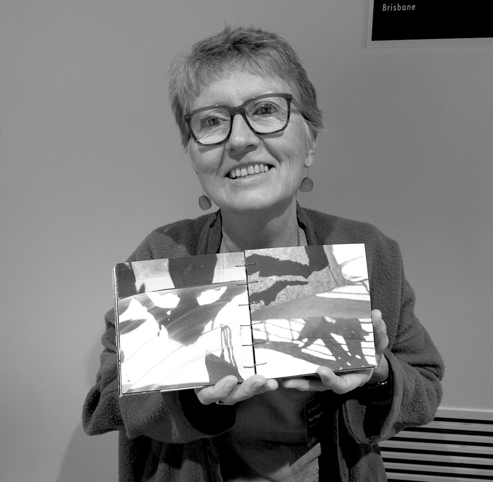
Sue Poggioli
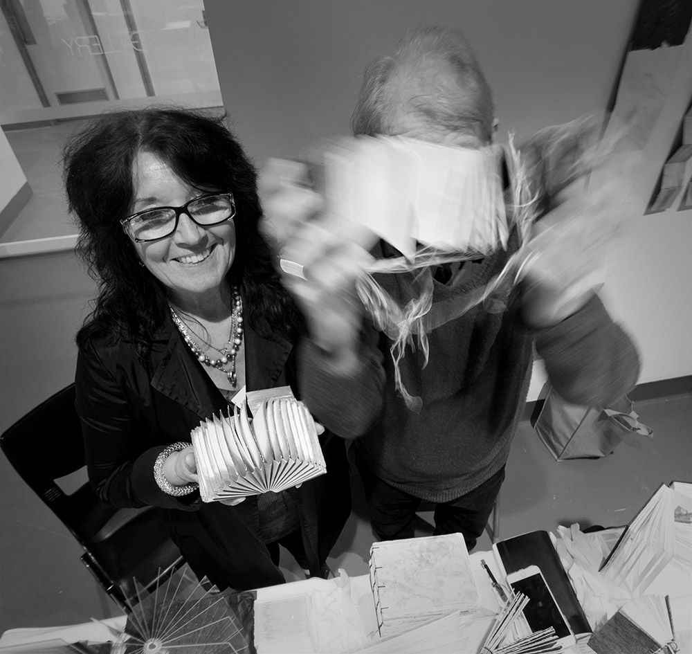
Adele Outteridge & Wim de Vos

Ulrike Stoltz & Uta Schneider
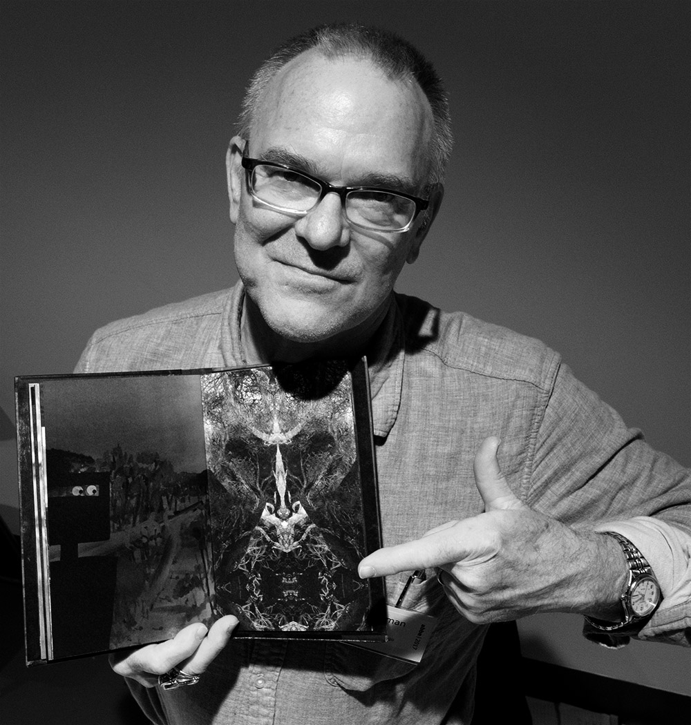
Brad Freeman

Anita Milroy
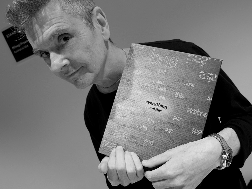
Lyn Ashby
Stand 11 – Milroy-Australia / Freeman-USA / Ashby-Australia
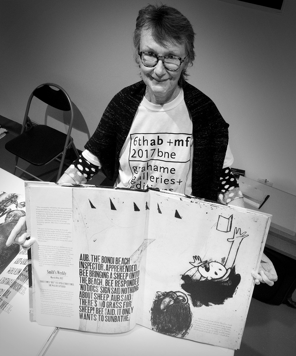
Sue Anderson

SLQ Australian Library of Art artists book exhibition
To complement the theme of the ABBE conference a special collection of concertina and folded books was curated by Christene Drewe of the Australian Library of Art at the State Library of Queensland. Open only for 2 hours on the Saturday morning of the conference this satellite event was well patronised. The Australian Library of Art is recognised as Australia’s premier public collection of artists books and the range of works presented was a testimony to the variety and depth of the collection. A list of the books displayed can be downloaded here. ALA Books for abbe 2017
In keeping with the conference theme the community of practice for artists books in this country is supported by the ‘folding’ and ‘unfolding’ of ideas, theories, concepts, access to exemplar book samples and the social connection that ABBE provides. While selected ABBE 2017 papers will be published in JAB, beyond that, the influence and impact of this gathering highlights the need for ABBE to provide this ongoing forum in Australia.
Dr Doug Spowart
All photographs and text ©2017 Doug Spowart
.
.
