Archive for the ‘Mail art’ Category
MARTIN HANSEN MEMORIAL ART AWARDS: Our Works

.
Once again we entered the Martin Hansen Memorial Art Awards at the Gladstone Regional Art Gallery and Museum. These Awards are the 48th event – Congratulations to the Gallery Team and the continued recognition of Martin Hanson’s early patronage of artists initiatives in Gladstone through these Awards.
For us each award entered is a place to present new works and their presentation – it is a challenge that hones our skills as artists.
.
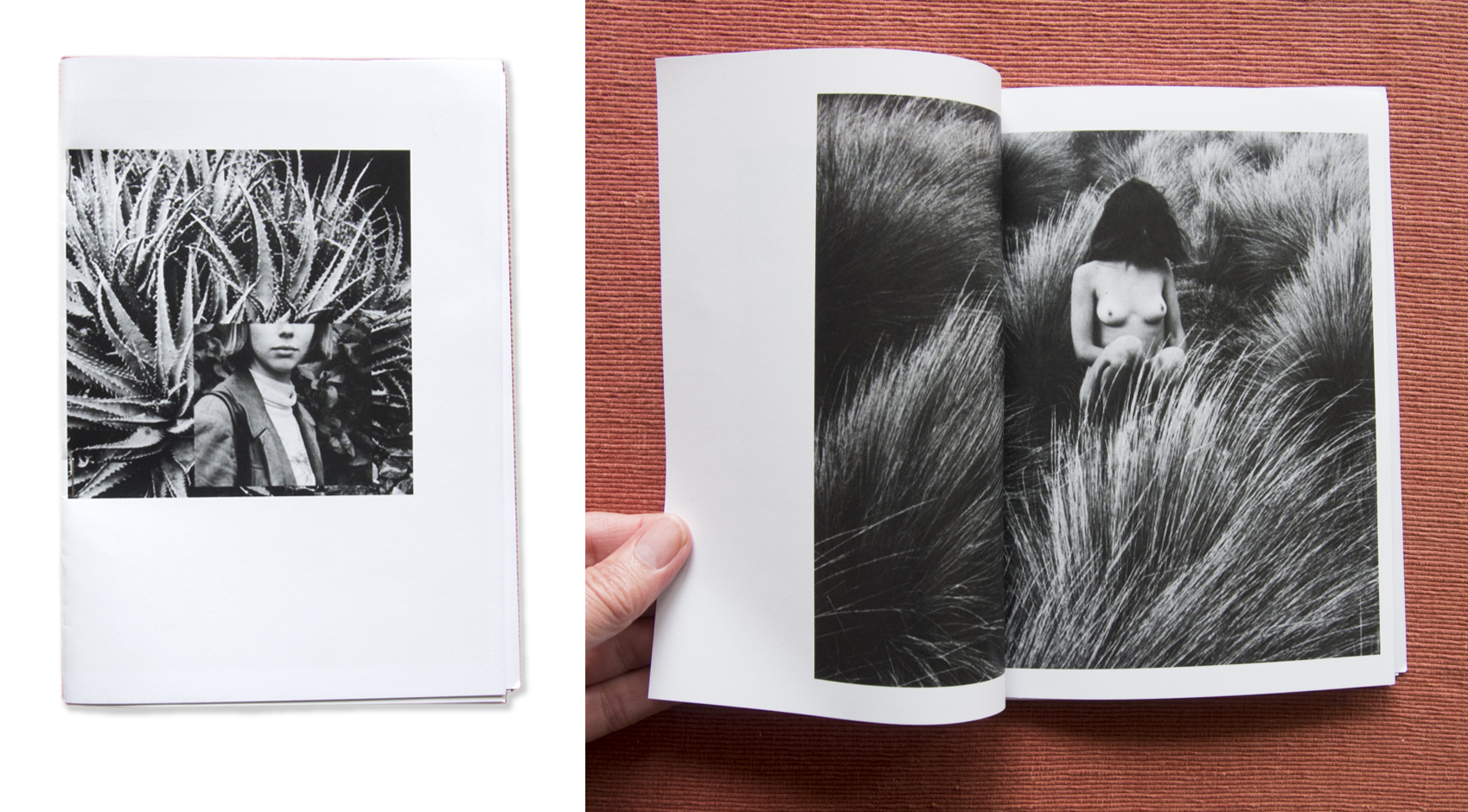
This year Victoria’s entry was an artist book entitled String Theory Explained.
.

Victoria COOPER’s String Theory Explained presented
.Artist’s Statement:
String Theory Explained… its all about the unplanned and chaotic nature of everyday life… the beauty and terror within the order of “normal” existence.
.

.

Opening up the book
.
Bibliographic Details:
Format: Concertina book embedded in folded cover
Media: various pen inks on art paper with Stonehenge black cover
Size: 764 x 230mm
.
.
Doug’s entry this year was Story Trees – First Nations a concertina artists book presented in a circular form.
.

Doug SPOWART – Story Trees artists book
.
Artist’s Statement:
For me a poignant physical sign of First Nations presence remains embedded in the dead trees found throughout Mokoan. In witnessing these scar trees I found a profound sense of a time now passed and thoughts of the many stories that this place can tell.
This book was book two in a series of personal responses to encountering the locality of Mokoan and the Winton Wetlands. It was part of my contribution to the PALIMPSEST collaborative exhibition with Maggie Hollins and Victoria Cooper shown at Bainz Gallery in Wangaratta in August.
.
Bibliographic Details:
Format: Concertina book
Media: Pigment inks on photographic paper
Size in circular presentation: 600 x 700mm
.

Doug’s Story Trees installed at GRAGM
.
.
The Martin Hansen Memorial Art Awards exhibition will be on show until 2.00pm on the 27th of January 2024 at the Gladstone Regional Art Gallery and Museum.
.
Here is some information about the 2023 Awards and the Entry Form.
.
 CLICK THIS LINK MH 23 Catalogue Online-r
.
 CLICK THIS LINK Martin Hansen Award 2023 Entry Details
.
.
Photo of gallery installation courtesy of GRAGM
.
.
.
.
.
.
.
.
The NGA’s CEREMONY: An Art Educators workshop at Shepparton Art Museum

SAM / NGA Ceremony Teacher Learning Program
.
ABOUT Ceremony + The 4th National Indigenous Art Triennial
From the publication Foreword by Nick Mitzevich, Director – National Gallery of Australia
The National Gallery of Australia is proud to present the fourth iteration of the National Indigenous Art Triennial, titled Ceremony. The exhibition is curated, and this publication edited, by National Gallery Senior Curator-at-large, Aboriginal and Torres Strait Islander Art Hetti Perkins (Arrernte and Kalkadoon peoples), one of the country’s most celebrated and experienced curators.
Ceremony brings together more than 35 artists from around Australia whose work highlights the primacy of ceremony in their practice and how it connects to community, culture and Country. Featuring newly commissioned works from across the continent, Ceremony represents the diverse practices of First Nations artists in this country, from large-scale installation, performance and video, to ceramics, carving, weaving and photography.
.
Ceremony: Teacher Professional Learning Program – An Art Educators workshop at Shepparton Art Museum
.
WORKSHOP STRATEGY: The intent of the Teacher Professional Learning Program is to develop capacity for educators in engaging with First Nations visual arts practice using Ceremony, the National Gallery of Australia’s National Indigenous Art Triennial (NIAT) traveling exhibition, as a reference point.
.
Anni Jane Linklater, SAM Education Coordinator, opened the event with an Acknowledgement of Country and we were introduced to the NGA teams facilitating the program including members from the curatorial work group, the education representatives and attending artists exhibited in the exhibition.

In the Teacher Professional Learning Program at SAM
With our fellow art educators and other art community representatives the program began with a short lecture session discussing the issues and framework for educational programs and presentations on First Nations art and artists. In this presentation Kelli Cole (NGA First Nations Curator), Aidan Hartshorn (Ceremony Exhibition Curator) and Belinda Briggs (SAM First Nations Curator) discussed the importance of the NIAT to the Australian National Gallery, ‘the significance of commissioning new work, First Nations perspectives and engagement as key National Gallery priority’.
.

Kelli Cole discusses Yarrenyty Arltere Artists & Tangentyere Artists, Blak Pariament House (detail), 2021
.
In the next part of the program we undertook a floor talk with Kelli Cole and Aidan Hartshorn. Also in this session we were introduced to artist Penny Evans (K/Gamilaroi people), who talked about her work in the show – Burn, 2021. Aidan Hartshorn spoke about his personal connection with his language that was referenced in S.J Norman’s (Wiradjuri people), Bone Library, 2012-2021. The floor talk was both informative and inspirational. We were invited to ask questions and add our thoughts to the interpretation of each of the artworks.
.


, 2021")


, 2021")

 2022")
.
Some of the discussion topics included were:
- Rather than use of the word “Country” in discussing the artist and their art, which was not advised, instead “Place” was suggested as an alternative term. In using the word “Place” the presenter shows they understand and respect the deep and layered meaning embedded in the word “Country” for First Nations’ culture.
- Research the artist; their story, history and approaches to their art before presenting to give an informed discussion.
- Always use the artists’ words where possible, if not, draw upon the curators’ information.
- Bring creative interactive activities; sensorial and conceptual connections and empathy to the experience of the work for the audience/students.
.

Penny Evans, K/Gamilaroi people, discusses her work Burn, 2020-2021
.
After morning tea we worked under the guidance of artist Penny Evans in shaping malleable brown clay into small objects to reference the banksia or other forms of nature. Evans created an inclusive, relaxing, meditative space for the participants in their creative work. While working we discussed issues of contemporary education and the importance of using hands in teaching and learning across a variety of subjects beyond art. We were all in agreement that this is a fundamental mode of education to empower students to communicate and work through the development of ideas and knowledge.

Penny Evans in her clay workshop
.
After a working lunch in SAM’s Café, Leanne Waterhouse discussed that the NGA were in the process of refining a framework with which First Nations art and cultural issues could be presented. She introduced the provisional draft document entitled The Art Ways of Learning Principles which outlines a values-based approach for best practice and engagement in the National Gallery of Australia’s Aboriginal and Torres Strait Islander arts program and broader learning programs. The principles consist of 5 themes or “pillars” that outline concepts including the values and characteristics of the framework as follows (from the lecture slide):
- Encouraging deep listening and thinking
- Centring First Nations artists voices
- Elevating First Nations arts diversity
- Creating memorable experiences
- Promoting living culture(s) of First Nations people
As educators we were encouraged to consider these Principles and their connection with ‘Indigenous ways of Knowing, Being and Doing’ when we are communicating with others about culture and art.
.

Joel Bray, Wiradjuri people, Giraaru Galing Gaanhagirri (the wind will bring rain), 2022 (fragment of video)
.
Finally, under the guidance of Noah Watson, NGA First Nations Learning Facilitator and Leanne Waterhouse, we were asked to form two separate groups and prepare a presentation each focussing on a different artwork. One group was given Joel Bray, (Wiradjuri people), Giraaru Galing Gaanhagirri (the wind will bring rain), 2022: an installation of TV screens in which the audience is engaged with the artist’s performance of a dance where his body becomes transparent merging his movement with images of his country.
.

Discussing Gutiŋarra Yunupiŋu, Gumatj people, Maralitja, 2021 (constructed image)
.
The other group discussed Gutiŋarra Yunupiŋu, (Gumatj people), Maralitja, 2021: an installation of 3 large-scale screens that engaged the audience with a video of waves breaking on the beach from a ground level perspective. During the video there were segments of ceremony and meaning that connected to the artist’s life, his totem, Bäru (the crocodile) and his story in Place.
Through our deep immersion in the Ceremony exhibition through this program we were challenged, inspired, and at times deeply moved by the sharing of knowledge/knowing. This workshop has enhanced both our teaching and learning experience in the engagement with, and discussion of the art of First Nations Peoples. We wish to acknowledge the Shepparton Art Museum for hosting the event and exhibition as well as the National Gallery of Australia for their initiative with the National Indigenous Art Triennial and the opportunity for regional artists and educators to connect with such an informative program.
.
Drs Victoria Cooper + Doug Spowart
.

4th NIAT – CEREMONY Online Publication
FOR MORE INFORMATION VIEW THE ONLINE PUBLICATION: “CLICK” HERE

.
.Images of the workshop and gallery installation ©Doug Spowart 2023
All other copyrights reside with the artists whose works were represented in the Ceremony exhibition
.
.
.
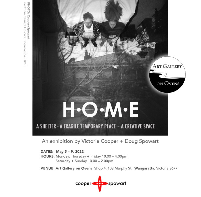
HOME: Our exhibition at GALLERY ON OVENS
.
WE NOW LIVE IN BENALLA in north-eastern Victoria, and to celebrate we held an exhibition at GALLERY on OVENS in May 2022.
.
A STATEMENT ABOUT THE EXHIBITION
Great writers, artists and philosophers have considered the physical, psychological, emotional and political place we call HOME. We reflect and are inspired by their work as we consider our personal perceptions of home personal within the broader human condition.
We have been artists and collaborators for over three decades. Our HOME has been: a house in a suburb or town, our car, a friends place, an artists in residence, a studio, a library, a campsite, a motel room. Whether stable or temporary the places we have inhabited – their architecture, history, social condition or collected objects have evoked our creative and questioning thoughts about perceptions of existence.
For us all these places we call HOME are spaces where we can contemplate, re-invent, conceive, originate, initiate new ideas for the future. We use the broad palette of our arts practice including – Camera obscuras, Cyanotype printing, Pinhole photography, Projections, Light painting and Nocturne light and the resolved artworks are presented as wall-images, artists books and photobooks.
.

COOPER+SPOWART – Home exhibition montage
.
.
In this post we report on the exhibition and the works it contained relating to the concept of HOME …
.
PREPARATION

Gallery on Ovens installation planning
.

Selecting work and preparing work
.
THE INSTALL


.
THE EXHIBITION

Table view of artists’ books

Gallery on Ovens window

Exhibition duo

Cyanotype wall

Looking at books with Maggie
.
THE DE MOUNT

The de Install
.
DOWNLOAD A “HOME” CATALOGUE – “CLICK” HERE

Catalogue Book Cover
.
.
.
.
Images and texts ©Cooper+Spowart 2022
.
.
.
WOTWEDID BLOG CELEBRATES 100,000 VIEWS
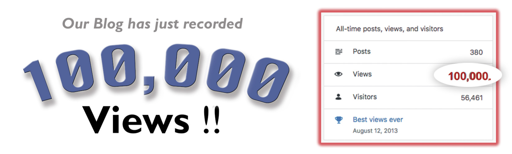
100K Header
Our www.wotwedid.com blog reached the milestone of 1000,000 views last week. It has had 56,000 visitors who have had the opportunity to view 380 posts and read around 250K words and see the hundreds of photographs that we have made to compliment the stories.
Our wotwedid Blog was started nine years ago as an opportunity to connect with our friends and creative communities via social media. The topic cloud for the wotwedid Blog includes ARTISTS’ BOOKS, PHOTBOOKS, CAMERA OBSCURA, EXHIBITIONS, MEETING PEOPLE, THE ART AND PRACTICE OF PHOTOGRAPHY, REGIONAL ARTS, CYANOTYPES, PLACE PROJECTS and POST-DOCTORAL RESEARCH.
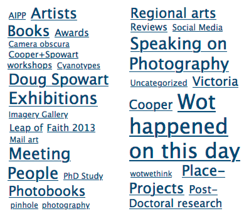
Topic cloud wotwedid
Usually the content that we post is generated by us and includes the written commentaries, the photographs and illustrations – it can be quite a lengthy time consuming task to get a blog up.
While many posts relate to what we do, have done or will be doing, the Blog represents a chronology of activity in our art practice, our lives and issues that we are concerned about. Due to the contemporary space that the arts and artists occupy today much activity and many events go unnoticed and unrecorded. So a significant driver is to provide a space for commentary on what is happening outside of the popularist ‘art bubble’.
Early this year we were excited to learn that the State Library of Queensland had nominated wotwedid.com for inclusion in the Pandora Archive managed by the National Library of Australia, ‘to ensure the collection and long-term preservation of online publications relating to Australia and Australians. This objective contributes to the Library’s statutory function to comprehensively collect Australia’s documentary heritage.’
Over the years we have found that many views, screen dumps and downloads of resources we make available take place anonymously without comment or feedback. Then again, we understand that this is the same for most online resources. Despite this we find that as we travel and meet friends, fellow artists, academics and curators many say how much they appreciate and enjoy the content that we generate and post.
So, a BIG Thank You to all have visited … And we look forward to your return to help take www.wotwedid.com to the next milestone – 200,000K views.
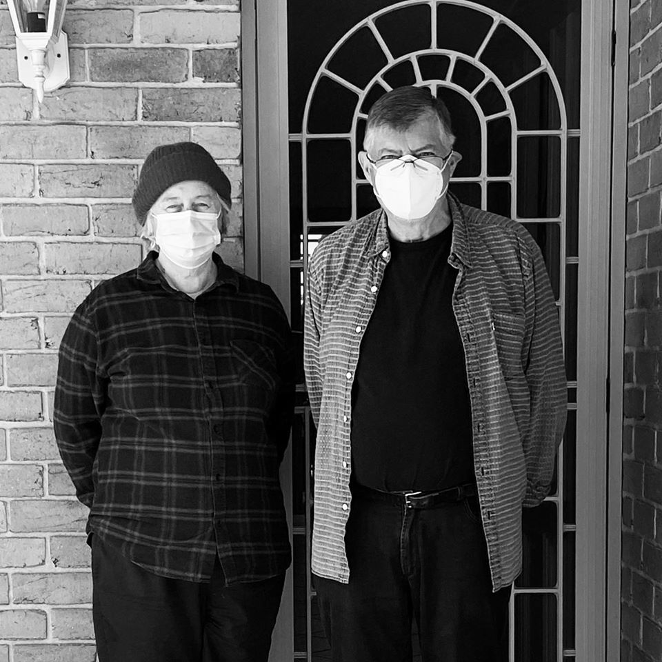
D+V with masks
Vicky+Doug
PORTRAIT PHOTO: Susan Belperio
Here are some images of people met, events documented and our own art activities over recent years …


1959 watercolour Spowart+Cooper Corner of Kitchener and Herries Streets 1996 silver gelatin fibre print")


 at the Vienna Photobook Festival PHOTO: Doug Spowart")


©2020 Doug Spowart+Victoria Cooper
..
.
Our photographs and words are licensed under a Creative Commons Attribution-NonCommercial-NoDerivs 3.0 Unported License.http://creativecommons.org/licenses/by-nc-sa/2.5/au/..
OUR 2019 FIELD STUDY Submission: Tidal fire debris
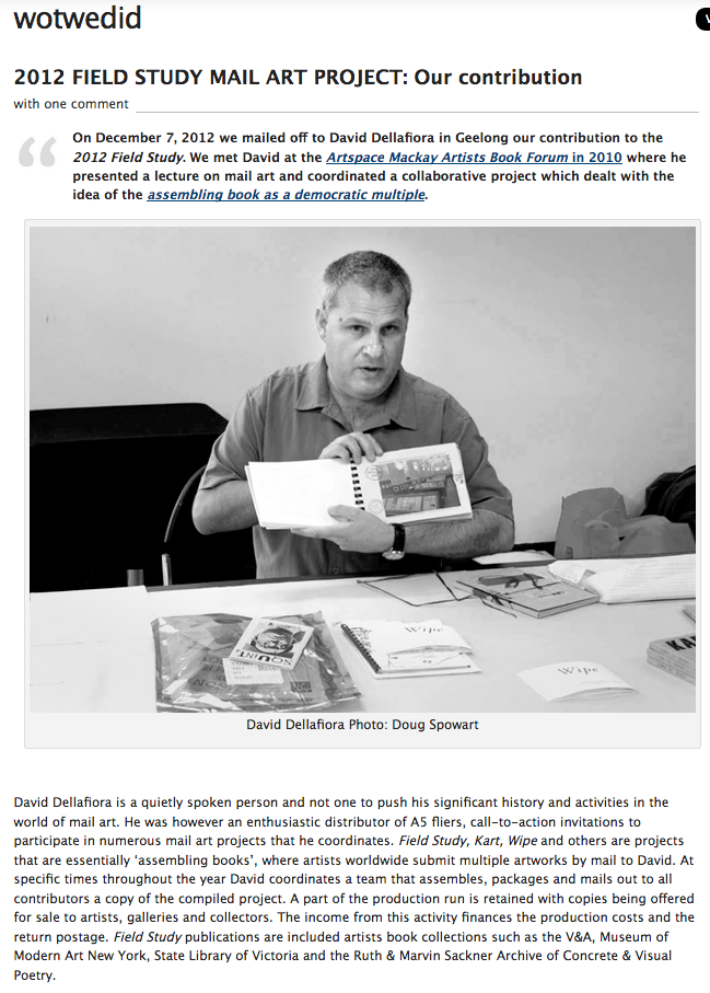
Each year artists from around the world submit 100 copies of an artwork and mail them to an address in Geelong, Australia. Coordinator of the Field Study International mail art project David Dellafiora works with a team to collate and assemble the A5 sized artworks into books. Copies of the Field Study International are sold to collectors and institutional libraries around the world to raise funds for the workshop and to cover project costs. Contributing artists are also sent a copy.
.
This has been a great yearly project for us for over 10 years. What follows is the story of our submission for 2019. At the end of the post there’s a brief story about Dellafiora’s Field Study Projects. David is also involved in many other mail art projects… LOOK HERE
.
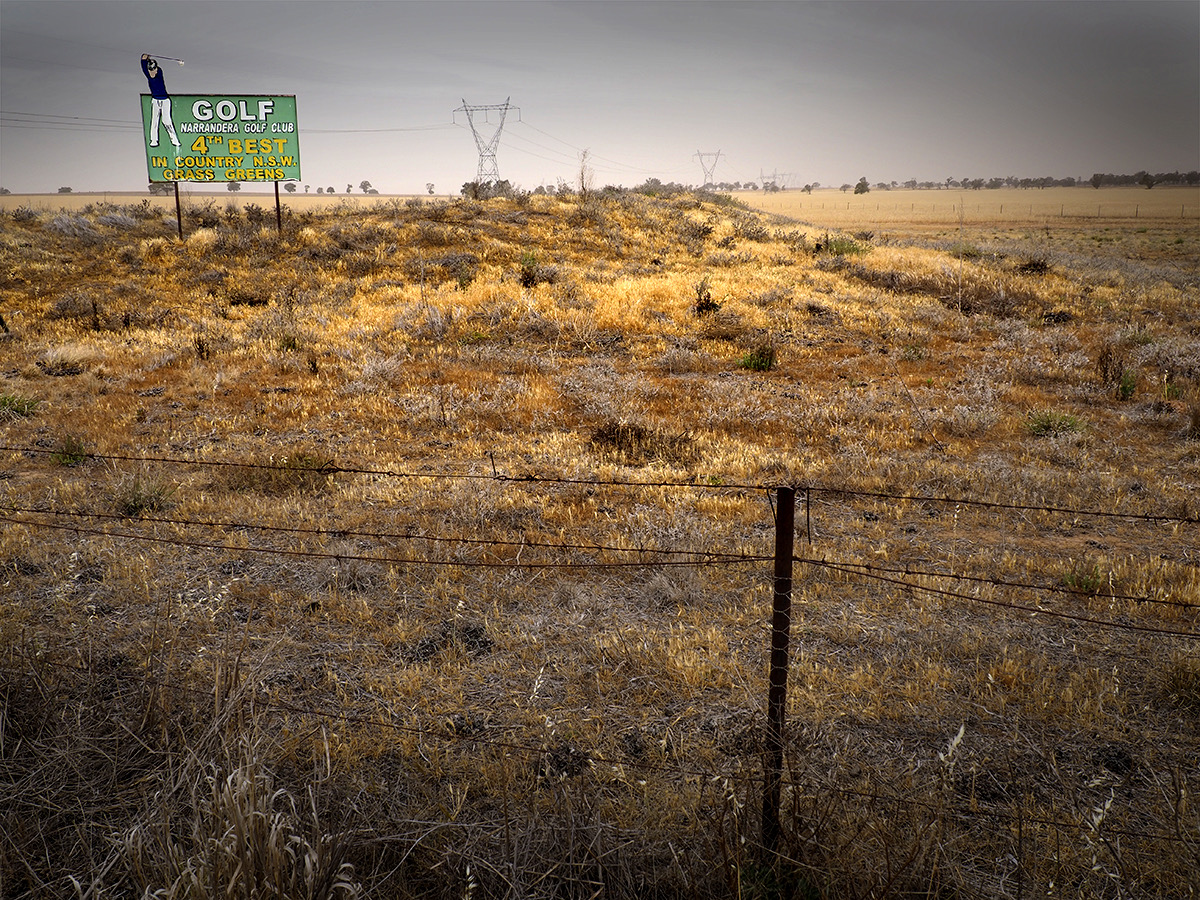
Narrabri roadside PHOTO: © Doug Spowart
.
Surrounded by fire
Recently we drove through central western New South Wales and southern Queensland. The country was dry and hot with willy-willies and dust storms lifting and moving the precious soil across the landscape. There was little or no green and the dams were dry- even rivers that would normally have some water were just sand and dry dirt. Travelling on further we witnessed the great Brigalow forests of southern Queensland seemingly quivering under the heat of the summer sun.
.
Overall the country was brittle and broken from the endless dry. Not even summer there was a concern for the future as country towns not used to running out of water were in dire situations. Coastal areas where fire is a part of environmental regeneration there was also widespread concern for this now unusual extended periods of dry. This was not a normal cycle… The country was about to explode… all it takes is a dry thunderstorm with lightning, a careless smoker driving past or sadly a deliberate act from criminals.
So then the fires started so much earlier than expected… the many brave souls rallied to fight for their community. But these were not just the normal local bush fires… They grew and joined to form huge firestorms, the fighters used all they could find from buckets to the fire fighting trucks… But much of the land was inaccessible and many areas of forest could not be saved from the onslaught of wind and heat… Some forests that had survived through the millennia without fire in unique and protected ecosystems were now potentially changed forever.
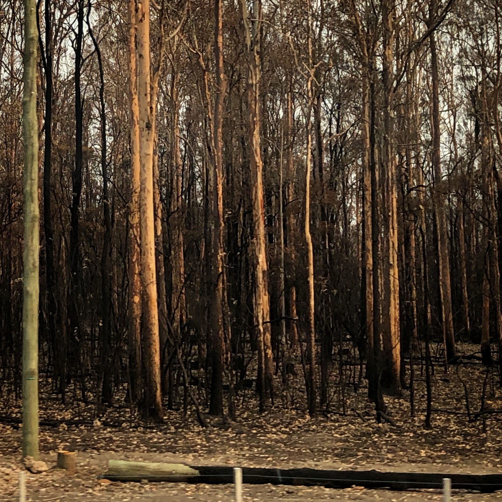
Fired forest near New Italy, northern NSW PHOTO: Victoria Cooper ©
We then came to stay at a friend’s family retreat on the coast of Northern NSW… The road to this place passes through huge areas of swamp and eucalypt forest that rarely burns as it is usually has good rain. But now we drove past kilometres and kilometres of burnt and dry country… We soon found that the regional area where our destination is located was surrounded by blackened country. The atmosphere, as with most of the coast in NSW was chocking with smoke and dust.
Even though we were assured that our town was safe these were not usual times and we felt uneasy and depressed by the enormity of this disaster.
We decided to dedicate our field report work to record this devastation. Our dismay was deepened when we walked along the beach and witnessed lines of leaves and twigs and other blackened material washed up with the tide .. like the dead bodies of victims discarded by criminals. Down the length of the entire coast of NSW where other fires raged, these waves of blackened and broken forests were appearing – the sea has returned the evidence to the place of the crime.
We began by gathering small samples of the material as symbolic references to vast amount of evidence left behind from these black tides. This Field Report is our first response as part of future substantive work on the contemporary condition of indifference, arrogance and ignorance towards a deteriorating environment.
Victoria Cooper
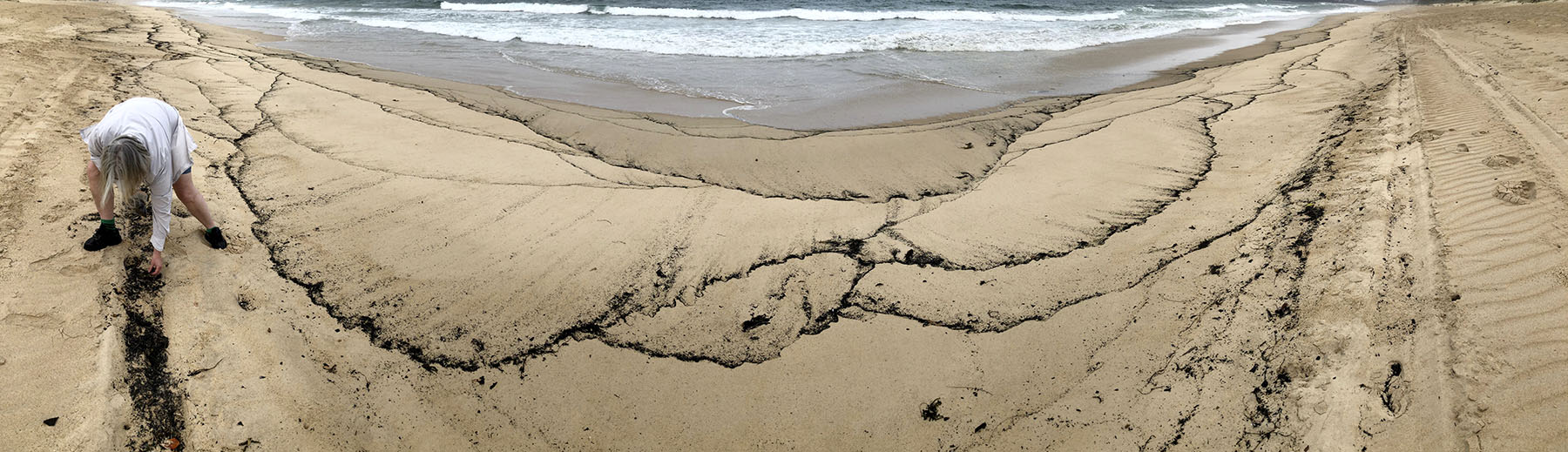
Ashed beach, Wooli northern NSW PHOTO: Doug Spowart ©
OUR SUBMISSION

COOPER+SPOWART 2019 Field Study submission
Signing the 100 prints…
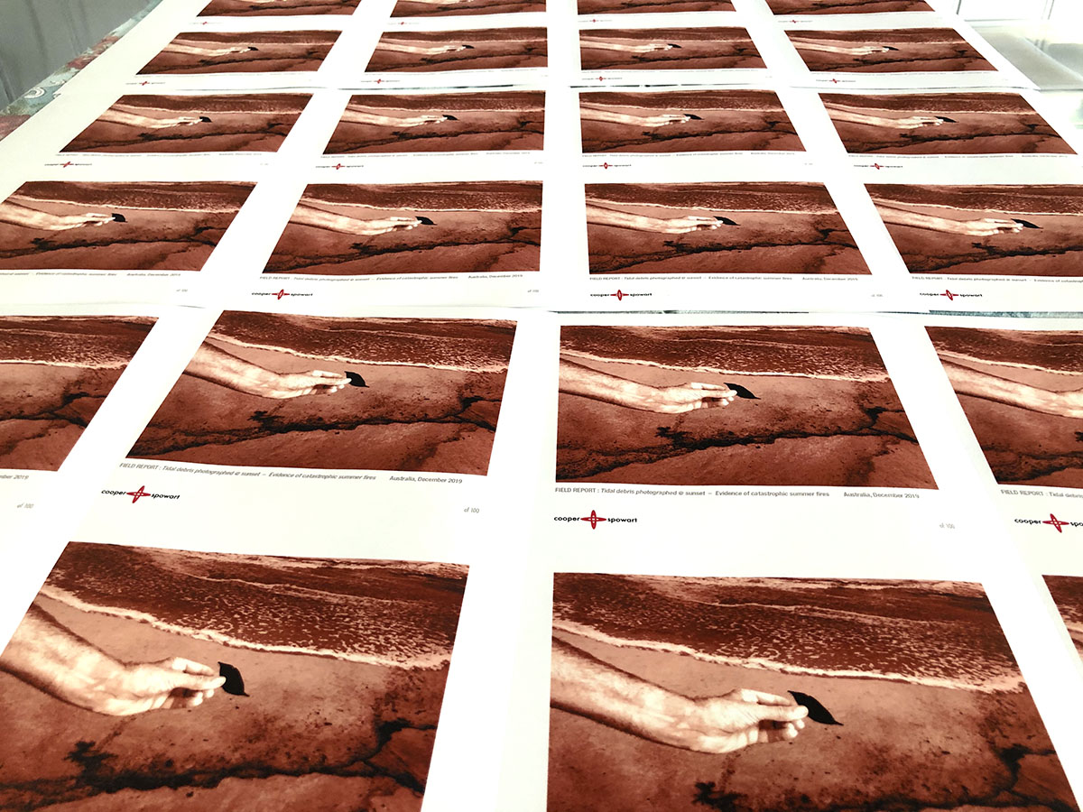
100 prints…
.
SOME BACKGROUND TO FIELD STUDY REPORT
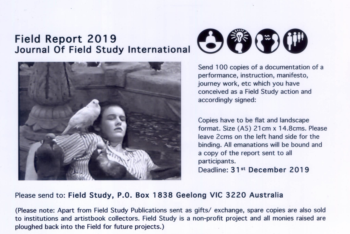
Field Study International 2019 Call for Entries
.
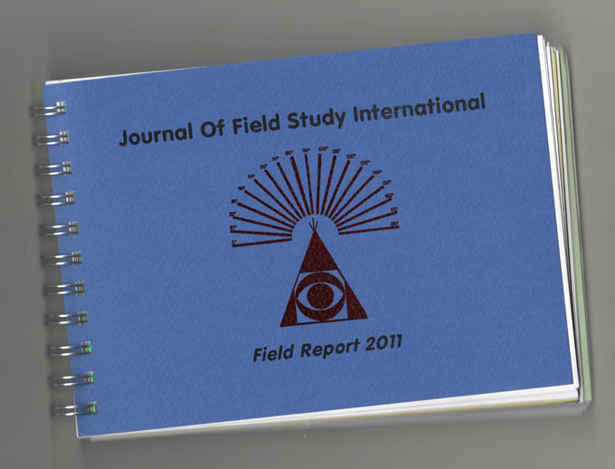
2011 Field Report cover
.
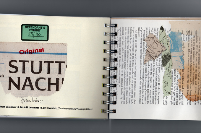
2011 Field Report pages
2011 Field Report
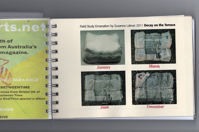
2011 Field Report pages
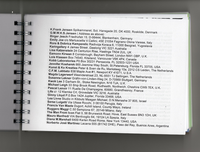
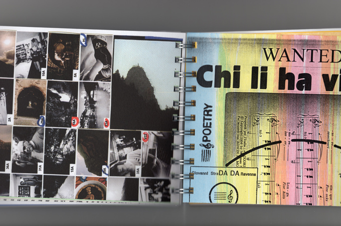
A page of participants – 2011 Field Report
.
.
Look out for the 2020 Call for Submissions …
.
.
.
2018 FIELD STUDIES: CAMERA OBSCURA FERRY PORTHOLE – Bass Straight waves over the Spirit of Tasmania
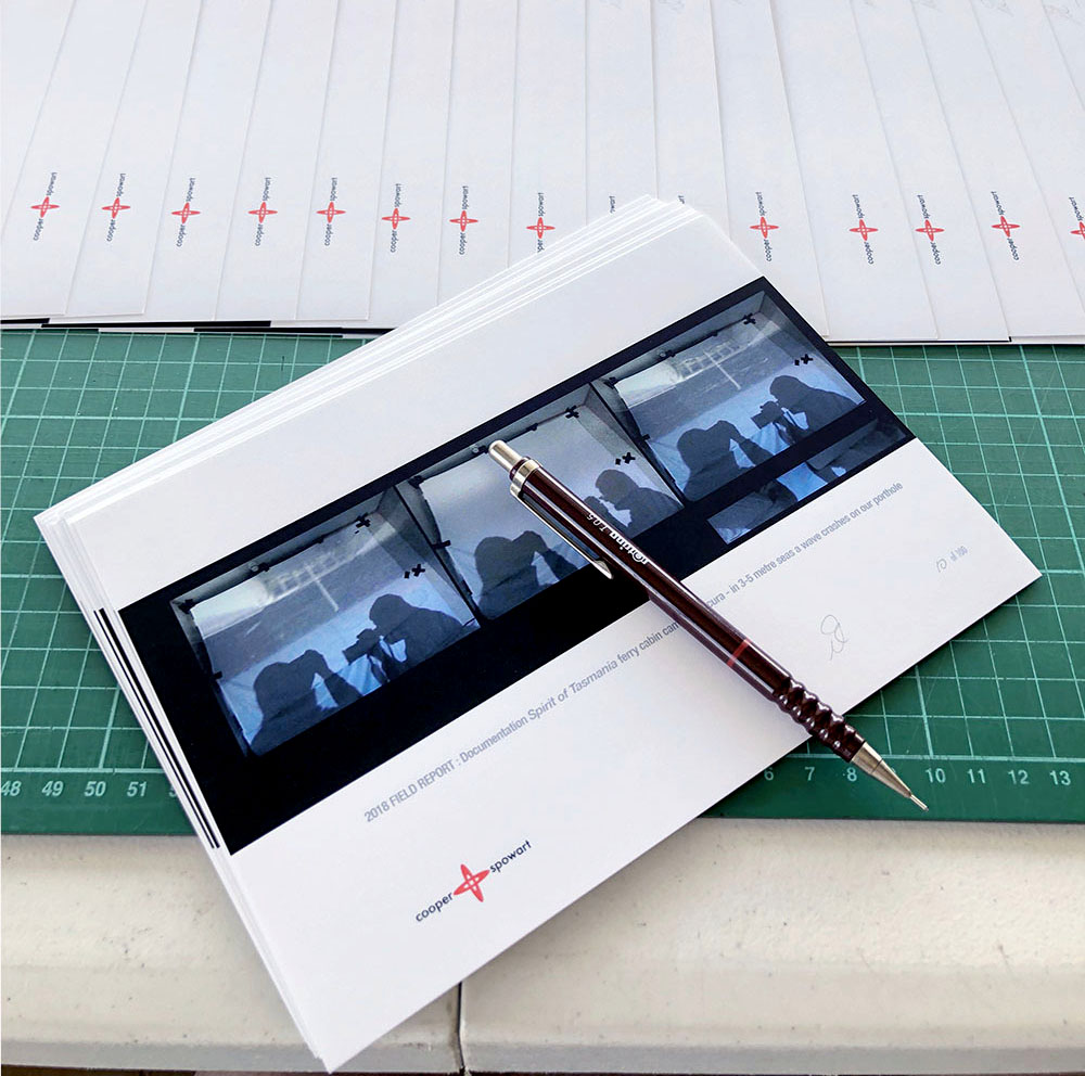
Our 2018 Field Studies submission of 100 artworks
As an important end of year ritual, we have once again prepared our submission to the ‘FIELD STUDIES INTERNATIONAL’ collaborative mail art project organised by David Dellafiora. Artists from around the world contribute to this project by mailing to David 100 artworks of any process and printed media made to A5 size. He then works with a team to collate all the submissions and assemble 100 copies of the collaborative book. After each participant receives one of these books, a number are then sold to private and institutional collectors to fund the project. We have contributed to the Field Studies for the last 10 years. Some links to the previous submissions are provided at the end of this post.
Here’s the story of our 2018 Field Studies report…
In 2000, we began a series of site-specific camera obscura projects that is a continuing body of work… This year we made two attempts to construct a cabin camera obscura. The second attempt proved more successful and so in this blog we present this recent work – Through a porthole in 3-5metre seas on the The Spirit of Tasmania.
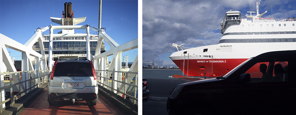
The Spirit of Tasmania
On the morning of the 3rd of November we boarded the Spirit of Tasmania and checked in to our cabin for the nine-hour day crossing. We had booked months earlier and had requested a porthole cabin with the idea of making a camera obscura.
Earlier in 2018 we had tried unsuccessfully to make camera obscura images on an overnight crossing figuring that by the time we boarded the ship we would have a brief period of sunlight – alas, that would not be the case it was dark by the time we had boarded and checked into our cabin. This second time we worked it differently with a day crossing and a porthole cabin… we then prepared for a full day of camera obscura work.
You can imagine our excitement to find that our cabin was in the middle at the front of the boat with a view over the flagpole on the prow of the ferry to the sea beyond. So we set to work with a mini camera obscura tool kit had been prepared for the preparation of the darkroom:
- A quantity of heavy-duty black garbage bags
- Gaffa tape
- Scissors
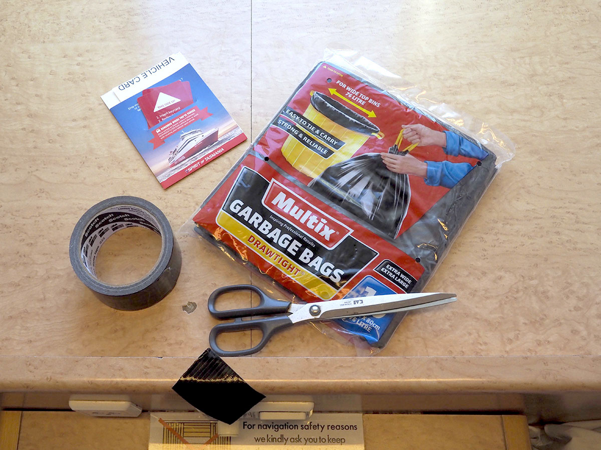
A camera obscura tool kit
Vicky documented Doug as he negotiated the space beyond the bunks to tape the black bags over the window. Progressively the room got darker and glimpses of the features outside our little cabin imaged themselves on the walls of the cabin. One problem was the darkening down of the central image area caused by depth of the room and a mirror on the reverse of the door. We decided that to create an observable image we needed re-purposed two white doona covers as a screen by taping them to the ceiling and walls with the gaffa tape. To recreate the theatrical space of the cabin camera obscura, we combined a series of images of the cabin walls and the screen at different stages of the journey. We also found our humble Olympus Pen camera set at ISO25,000 the best option as it fitted the small space and enabled hand-held exposures.


The Spirit of Tasmania left Devonport port and headed out into Bass Straight. For us this was a challenging crossing as there were strong westerly winds and huge 3-5 metre waves for most of the day. It wasn’t long before we began to experience the ‘bang’ and ‘splash’ of waves over our porthole… we were on one of the upper decks – deck 8!!! Kwells (anti-seasickness pills) were taken and to take our minds off the thump and roll we got active documenting the CO crossing.
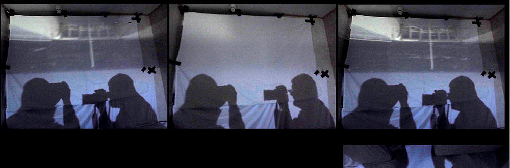
Two composite images were constructed from our work that day that we entitled Through a porthole in 3-5 metre seas on the The Spirit of Tasmania. The first is a panorama that shows Vicky on her bunk looking at the projected camera obscura image. On the right-hand side the shadow of the camera held aloft is imaged. The final panorama is made of 4 images.

Vicky observing the panorama camera obscura image
The second image is a triptych of the projected image on the screen showing a series of three photographs made by Vicky as the boat rocked with the centre image documenting a whiteout as a wave crashes on the window.
Camera obscura: a 3-5 metre wave crashes against our porthole (inverted)
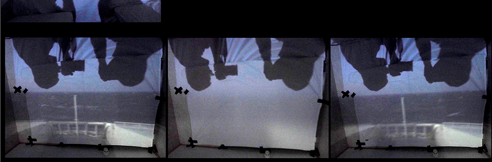
Camera obscura: a 3-5 metre wave crashes against our porthole
We left the camera obscura setup until we docked. Midway across Bass Straight the images described above we assembled and optimised as the ‘bang’ and ‘whoosh’ of the waves on the boat continued incessantly. At one stage we ventured out to see how those brave souls in the public areas of the ferry were managing… they all looked pretty green–some not well at all, and many finding any horizontal space they could to find some comfort.
When the Spirit docked we dismantled the CO and disembarked, glad to be on terra firma again.
.
.
.
To see a post about the FIELD STUDIES INTERNATIONAL and other of our Field Studies submissions
About David Dellafiora and Field Studies International
https://wotwedid.com/2013/01/05/field-study-international-our-contribution/
Our 2016 Field Studies International submission
https://wotwedid.com/2017/01/17/field-studies-international-2016-our-contribution/
.
.
.
.
.
ZINES IN MELBOURNE: Sticky Institute’s Festival of the Photocopier
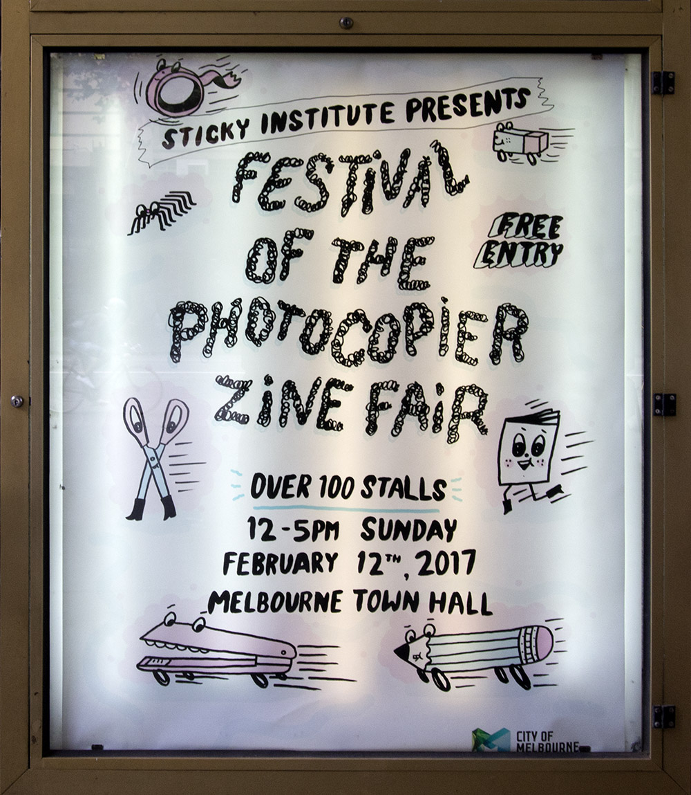
Town Hall foyer sign
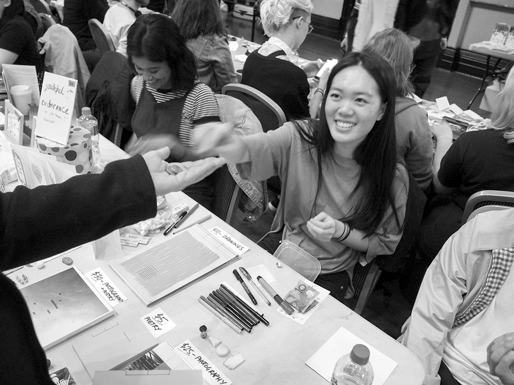
On Sunday 12 February the Melbourne Town Hall and was packed with sellers, lookers and buyers attending the Sticky Institute’s Festival of the Photocopier Zine Fair. At a guess, there could have been around 100 zine tables with a variety of zine-makers: both showing their own work, or representing other zinesters. For the visitor to the Fair there was an opportunity to see and handle almost any kind of communication that could put onto a sheet of paper, or into collated pages – folded, stapled, glued, stitched and sewn. Each ‘publication’ representing a personal approach to what the medium “zine” means to the author. And, as the ‘Zine’ is a slippery medium those within the discipline keep pushing the limits by integration of opportunistic technologies and ideas gleaned from contemporary media.
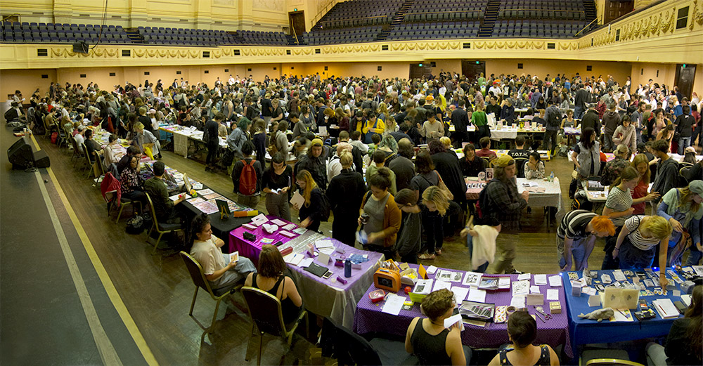
PHOTO: Doug Spowart – Stickies Festival of the Photocopier Zine Fair 2017
The content of the zines presented to us were from a broad church of visual and written media including: text as prose, poetry or as visual typographic forms, and calligraphy. There was a rich diversity of illustration from photo-realism to comic flat field work, photographs and even, in one sighted example – the ancient art of marbling. The narrative forms in these publications ranged from concrete poetry, prose, comic stories and disjointed stream of consciousness curated visuals.
In keeping with the tradition some zine makers aired their political opinions while others shared a fascination of contemporary everyday life. There were groups that concentrated on gender issues, music and issues of the street, while others presented dreamy naive and whimsical scenarios, adventures in suburbia, the road and outer space, nonsensical ghoulish and vampire episodes.
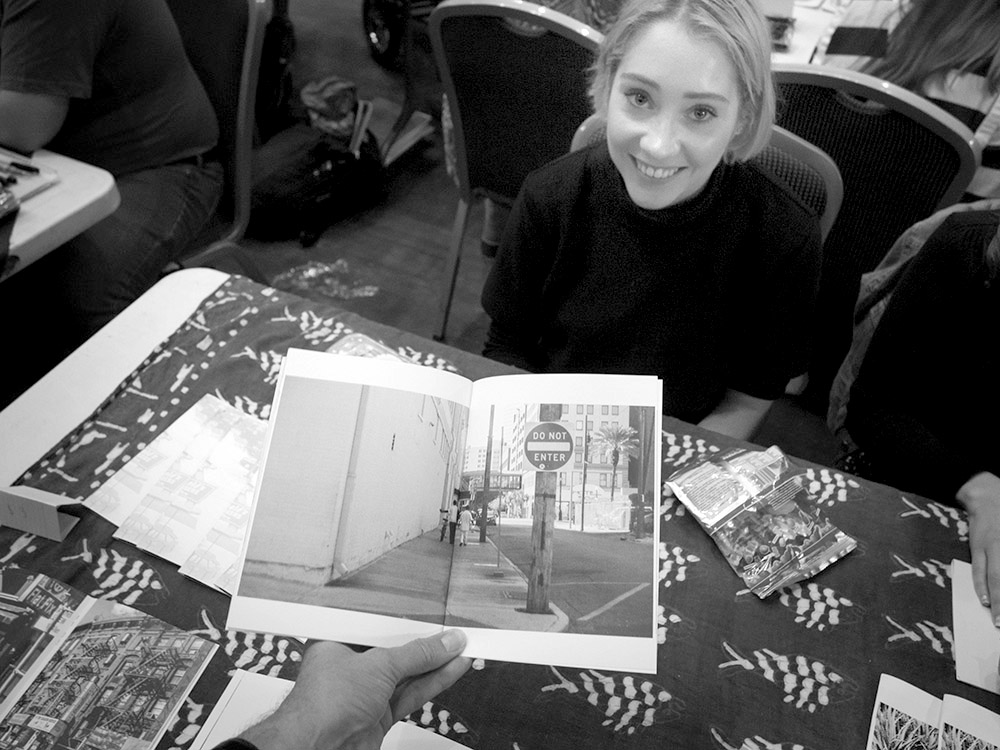
Our specific interest were zines based on or utilising photos sometimes referred to as photozines, as well as others that use photomontage in their narrative or conceptual work. Examples seen dealt with topics like the destruction of traditional family homes in the Chinese city of Guangzhou, skateboard stories, and a faux streetscape made up of photos of distressed buildings.
The Fair was a place to network. Greetings were made with like-minded people across the display tables and discussions took place about zines, life and art. We caught up with a few people we knew – David Dellafiora, Gracia and Louise and Glen Smith – Queensland’s zine hero Jeremy Staples was in the building somewhere but we didn’t get to meet. Zine-makers, or sellers, were keen to engage with us to tell the story of the work and where it fits with their practice and their life.
But did anyone sell anything? Many visitors were seen toting quite a few brown envelopes and calico bags filled with new additions to their personal collections. Perhaps a personal experience might shed some light on how success for such an event could be measured. It was right at the end of our shop, we had spent our budget and were talking to two young zinesters who were actually making their little photo zines on demand at their table. Their selling price was $3 and we wanted one of each but could only scrape together $5 in coin. One of the zinesters said ‘that’s fine, I’ll take the $2’, and stated that, ‘it’s important to have my zine out there…’
Being out there with your work. That is what zines are all about … your message in print as a democratic multiple … telling your story, was always what zines were about. That tradition it seems, continues…
Doug Spowart
February 13, 2017
.
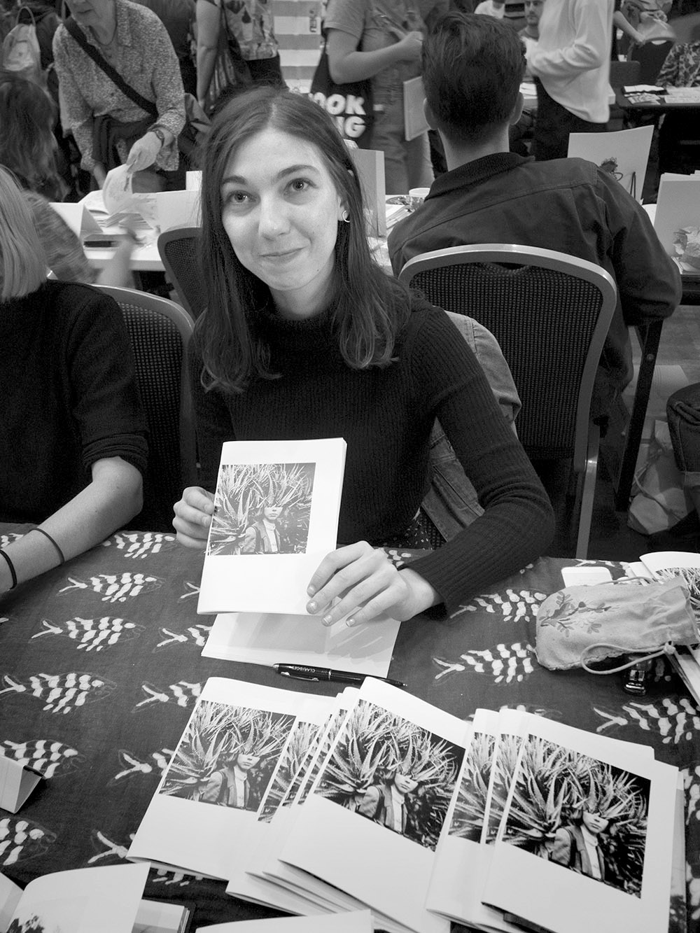
SOME ZINES ADDED TO OUR COLLECTION
.
Trudi Treble at the Fair
Trudi Treble: united states of america – october 2017 – november 2017, my diary. #6/25.
Trudi Treble – Instagram: trud.i
.
Johanna Ng at the Fair
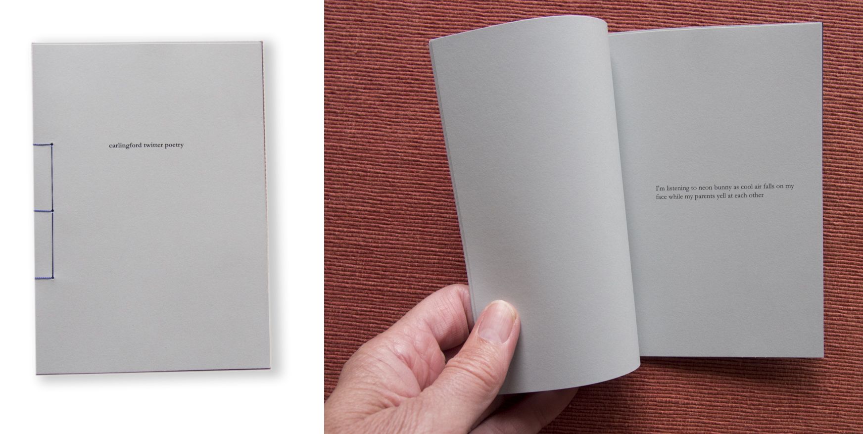
Johanna Ng: carlingford twitter poetry
Glen Smith at the Fair

Glen Smith: Constructed Landscape
Glen Smith: https://nofrillsart.net/
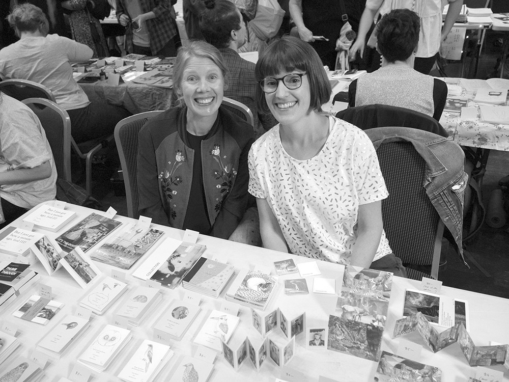
Gracia and Louise
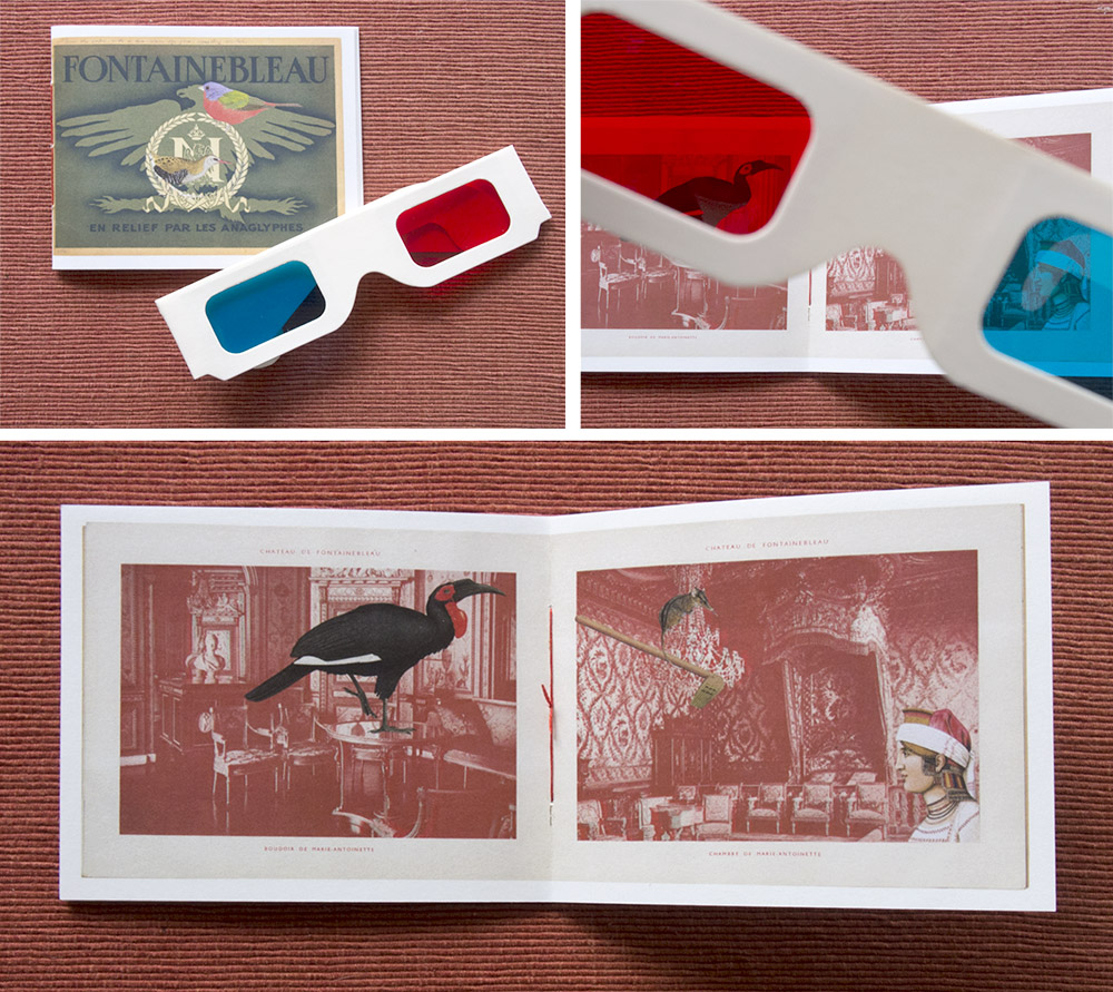
Gracia Haby: Under the water with a two-colour eye-glass, something similar (2014) #49/100
Gracia and Louise: www.gracialouise.com
.
.
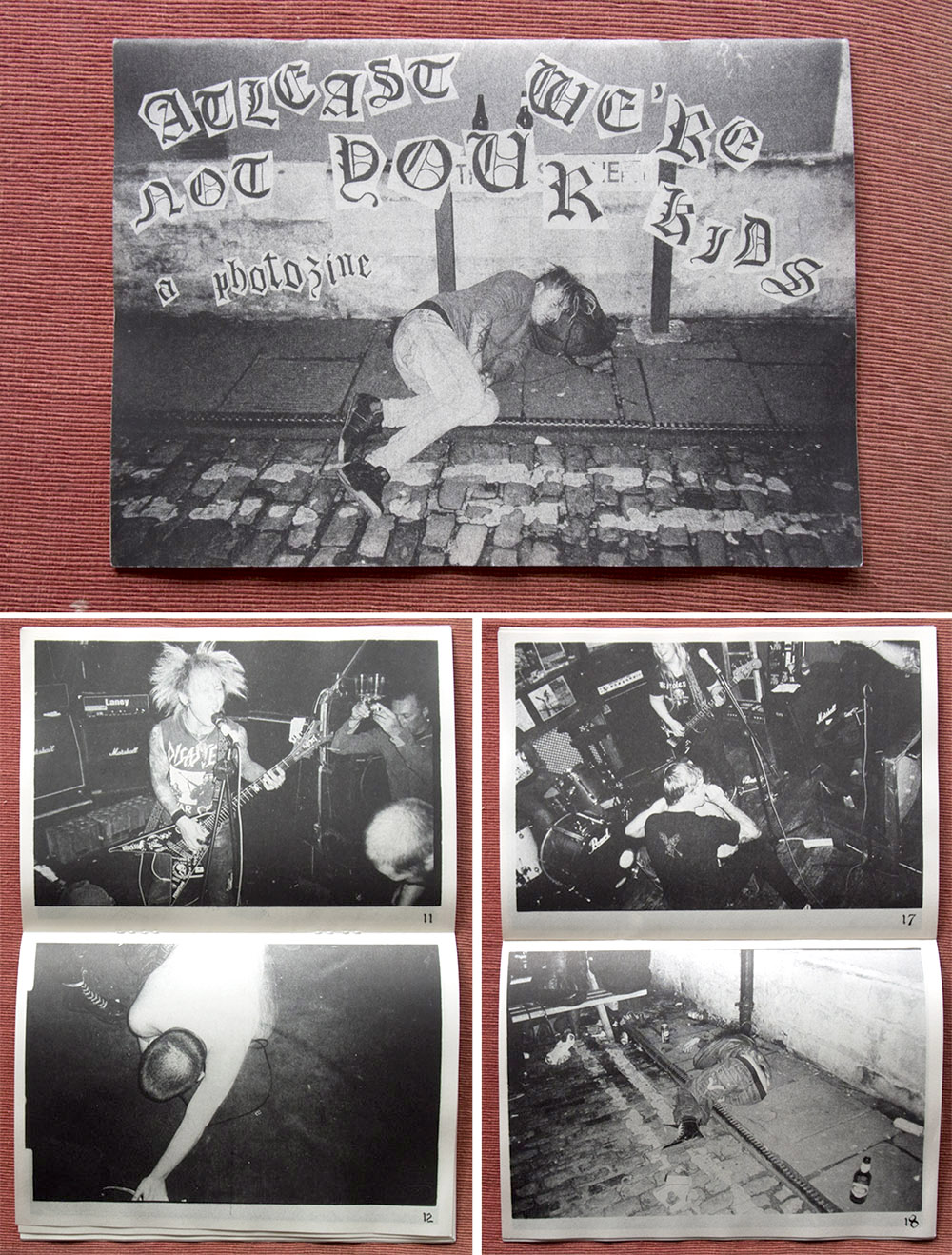
martinpf: At least we’re not your kids – a photozine. #81/100. Published by Russian Glue Press
martinpf@hotmail.co.uk. Russiangluepress@gmail.com
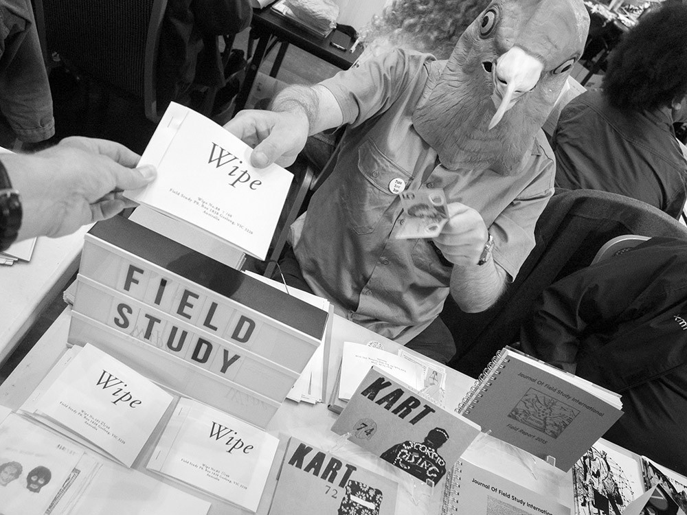
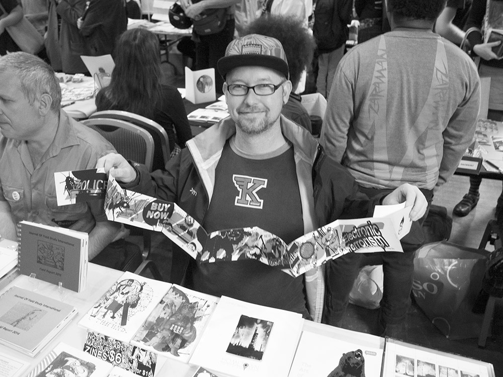
David Dellafiora Field Studies
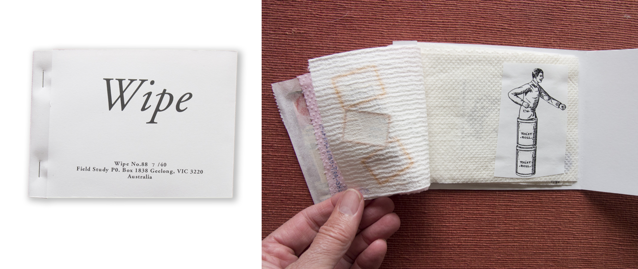
Field Study (David Dellafiora): Wipe No.88
Field Study – https://daviddellafiora.blogspot.com.au/
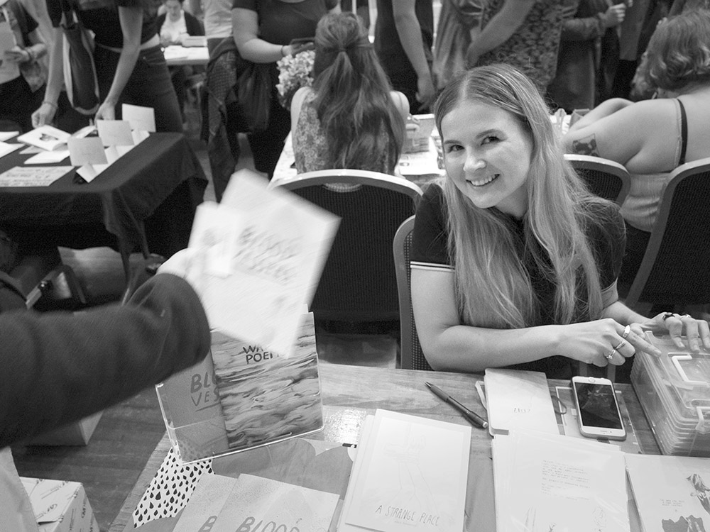
Alice Fennessy at her table
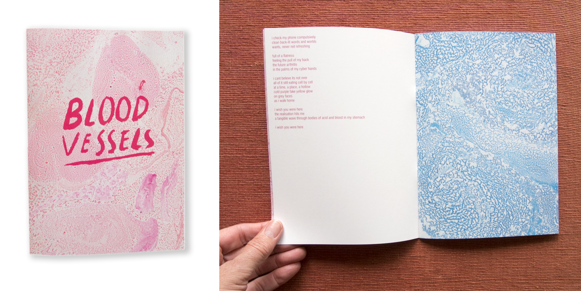
Alice Fennessy: Blood Vessels – A collection of poems about me memories
Alice Fennessy Instagram: @alicefennessy
Claire Wakeford and her zine
Claire Wakeford: Untitled
Claire Wakeford: www.clairewakeford.com
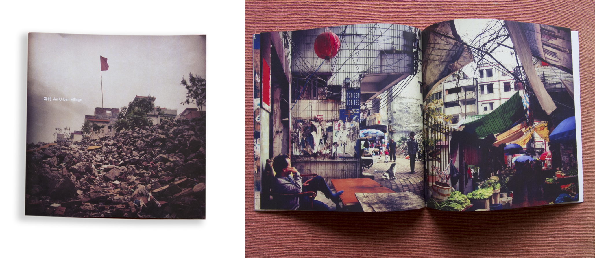
Ning Xue: An Urban Village
Ning Xue: http://www.xuening.me/me.html
.
UNTIL NEXT YEAR …
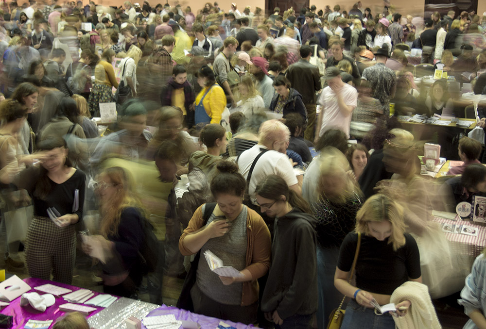
PHOTO: Doug Spowart – Sticky Institute’s Festival of the Photocopier Zine Fair 2017
.
.
Copyright in the zines is retained by the authors. All photographs + text + video ©2017 Doug Spowart
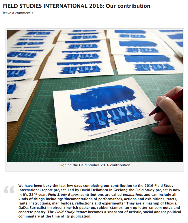
FIELD STUDIES INTERNATIONAL 2016: Our contribution
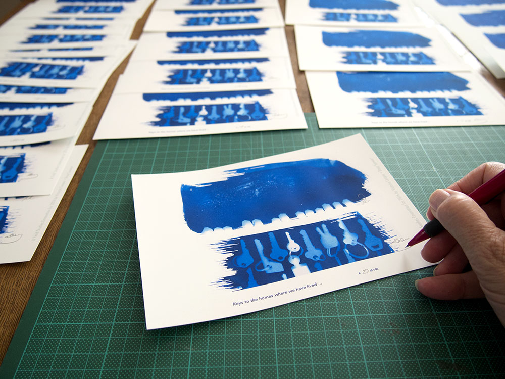
Signing the Field Studies 2016 contribution
We have been busy the last few days completing our contribution to the 2016 Field Study International report project. Led by David Dellafiora in Geelong the Field Study project is now in it’s 22nd year. Field Study Report contributions are called emanations and can include all kinds of things including: ‘documentations of performances, actions and exhibitions, tracts, rants, instructions, manifestoes, reflections and experiments.’ They are a mashup of Fluxus, DaDa, Surrealist inspired, zine-ish paste-up, rubber stamps, torn up letter ransom notes and concrete poetry. The Field Study Report becomes a snapshot of artistic, social and/or political commentary at the time of its publication.
Our submission for 2016 is a commentary on our present nomadic lifestyle. Since moving from Toowoomba 2½ years ago we have been house-sitting, doing artists in residence projects, staying with friends and renting – we have lived in approximately 15 places.
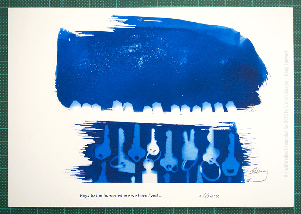
For our submission we made a diptych of original cyanotype images recently while staying on the beach at Wooli. One print represents a starry night above a line of houses. The other print is a selection of of different keys –referencing all the houses we have stayed in. The two cyanotype prints were copied, scaled and arranged on the one sheet with the captions: ‘Keys to the homes where we have lived …’ and, ‘A Field Study Emanation for 2016 by Victoria Cooper + Doug Spowart’.
Each A5 print is numbered and signed and the edition is 100. Each contributor gets a copy of the assembled works and some copies are sold to support the project and the group that helps make it happen.
Cooper+Spowart Field Study 2016 contribution
Submissions for 2016 are now closed however, get ready for 2017. For more information about Field Study and other projects see: https://daviddellafiora.blogspot.com.au/
About Field Study:
Field Study began in 1993 as a way of reclaiming the negative spaces between art and life. Activities stemming from Field Study are emanations and group emanations are manifestations. Field Study sees each work as a manifestation of a collective spirit. Everyone is welcome to become a member of Field Study, irrespective of their arts practice, and contribute to the Field Report. Field Study also produces the assembling publications WIPE and ReSite, and, in collaboration with Karingal, KART.
An earlier WOTWEDID Blog post has more detail… Check it out:
https://wotwedid.com/2013/01/05/field-study-international-our-contribution/
.
.
.
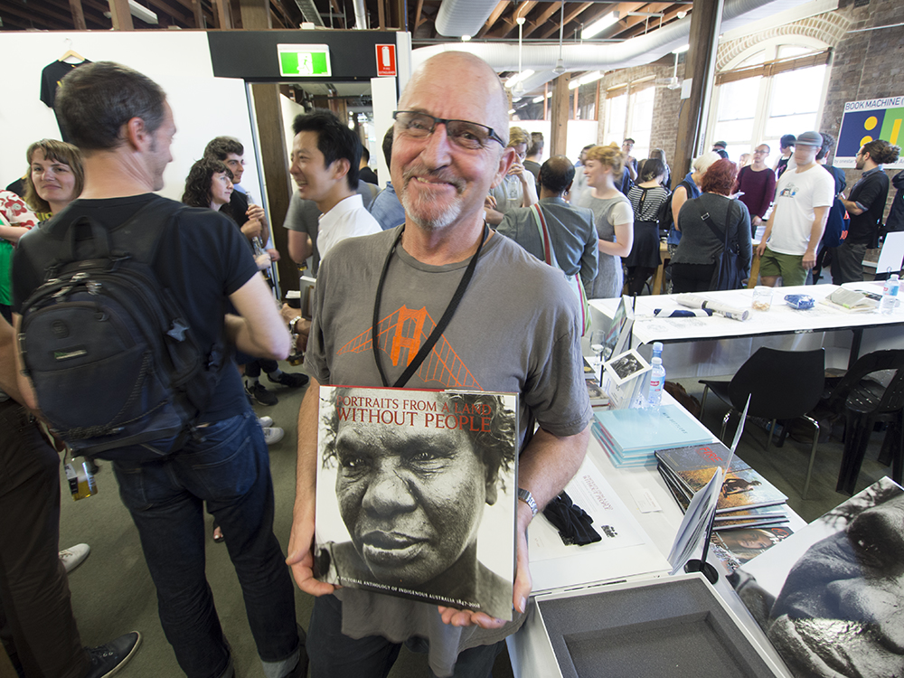
PUMPING-UP the VOLUME on PHOTOBOOKS
Screen dump on Volume site
.
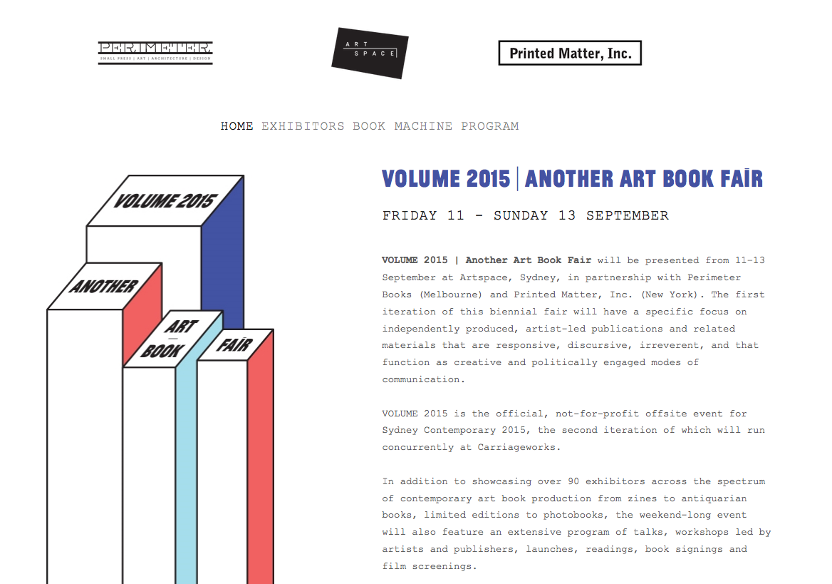
I attended Volume: Another Art Book Fair in Sydney on the weekend of September 11+13, 2015. The event was a collaboration between Artspace, Perimeter Books and the American artists’ book not-for-profit book shop Printed Matter. Packed into the Artspace building in Woolloomooloo were around 100 ‘Art Book’ makers, publishers and sellers all vying for the attention of potential purchasers. The table holders had spread before them all things book – let’s not try and get into discussions around what an ‘art book’ is, but rather celebrate the range of published products from thin stapled zines and comics, to self-pub photobooks, artists’ books and gallery catalogues, and further to trade-styled ‘fine art’ books and livre d’artiste productions.
.
Some of the Volume Art Book Fair table participants included:
.
Shannon Michael Cane from Printed Matter
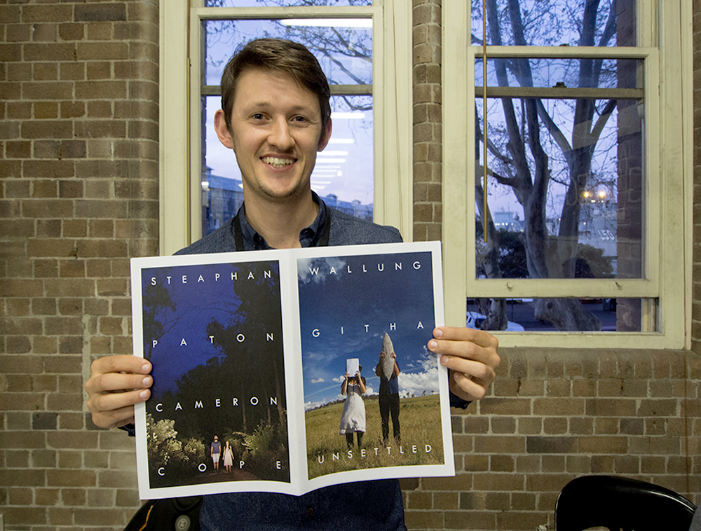
Cameron Cope
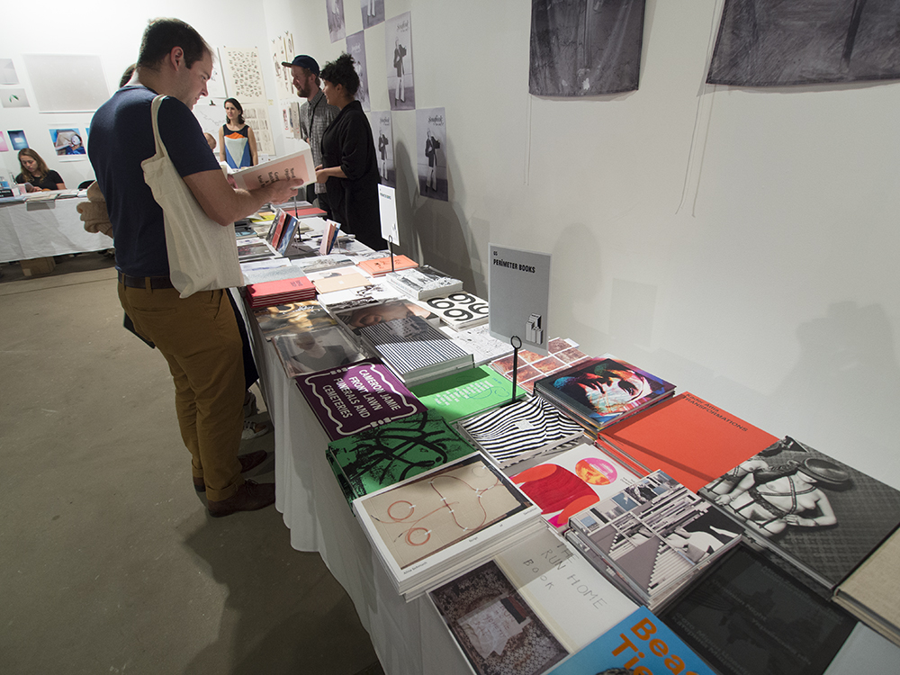
The Perimeter Books table
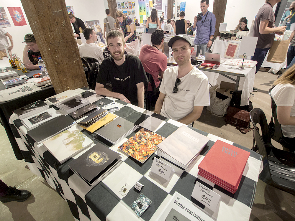
Bloom Publishing Lloyd Stubbers + Jay Dymock
Bloom Publishing: Lloyd Stubbers + Jay Dymock
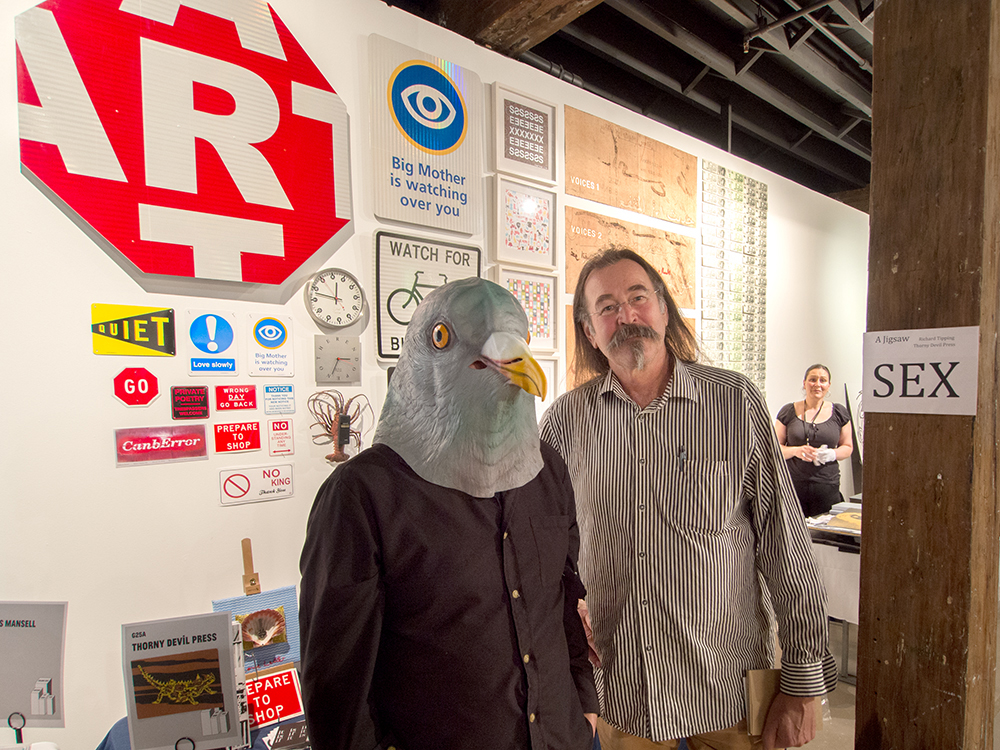
Richard Tipping and Max Ernst (David Dellafiora)
Thorny Devil Press: Richard Tipping
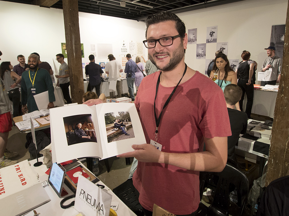
George Voulgaropoulos
Pneuma Publishing: George Voulgaropoulos
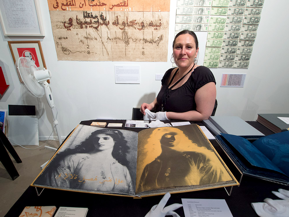
Deanna Hitti
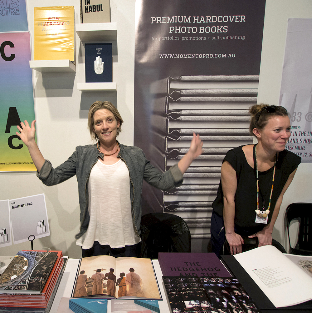
Libby Jefferies MomentoPro after a long day on Sunday
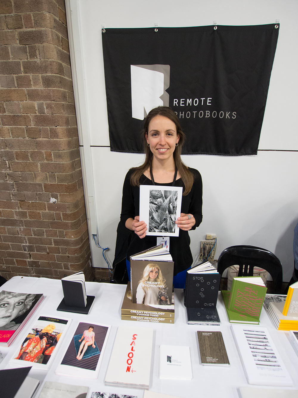
Anita Totha Remote Photobooks NZ
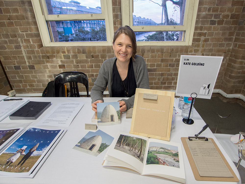
Kate Golding
John Ogden Cyclops Press
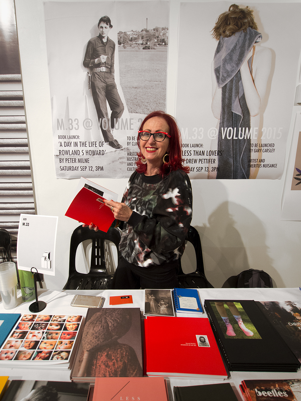
Helen Frajman – m.33
.
Selling books to interested collectors and lovers of books is one thing but as is the case with the emergent trend in self-pub everyone wants to have their own book. To cater to this growing group of keen makers the program included many free forums, workshops and lectures by a variety of key makers and commentators on various aspects of the disciplines of writing and self-publishing (self-pub).
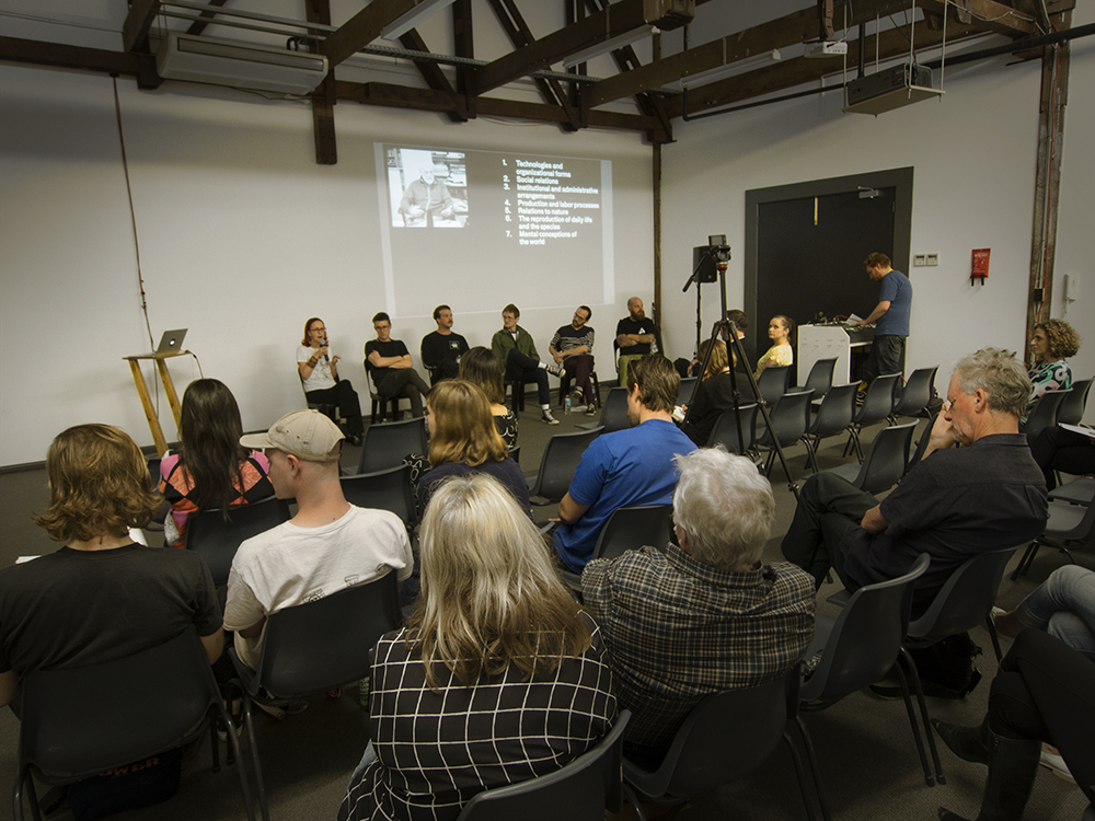
Why Publish panel
As my interest is in topics related to photobooks I attended two sessions: Why Publish and Designing Photobooks. The why-pub panel consisted of Helen Frajman (m.33), Daniel Boetker-Smith (Asia-Pacific Photobook Library), Brad Haylock, Jack Harries and Geordie Cargill and Shannon Michael Cane from Printed Matter. Attendees, of which there were around 30, heard discussions relating to the usual issues of publishing, getting a designer, edition numbers, marketing, selling and getting your work into the right hands including the international market. Brad Haylock suggested the key themes for photobooks were:
- Technologies and organizational forms
- Social relations
- Institutional and administrative arrangements
- Production and labor processes
- Relations to nature
- The reproduction of daily life and the species
- Mental conceptions of the world
Ultimately the overall message seemed to be ‘Give it a go’!
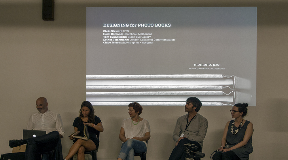
The Designing for Photo Books panel
Associate Professor Christopher Stewart from University of Technology Sydney chaired the Designing for Photobook panel. Each speaker showed examples of their work and discussed design concerns associated with their books. Heidi Romano from Unlessyouwill spoke of her history in design, her passion for the photobook and her experience of the international world of book design. She cited her interest in advancing Australian photobook design as being a driver for her establishment of Photobook Melbourne. Esther Teichmann, and artist from the UK discussed her exhibition work and the challenge of bringing wall-work into the space of the book as well as her experiences, not always pleasant ones, with book designers. Tom Evangeledis, Black Eye Gallery described his interest in encouraging exhibitors at his gallery to consider a book to support the exhibition but also to enhance the opportunity for the artist’s work to be extended beyond the exhibition dates. Chloe Ferres, probably kept the most on track with the topic of book design by presenting a range of works that in some ways subvert the idea of the book being a vessel to hold photographs that express a narrative – she considers the book structure as also important to the narrative and uses a range of design interventions to disrupt the preciousness that many photographers seem to consider important when they make books.
Christopher Stewart posed questions to the panelists to draw out aspects of the topic but when asked if there were questions from the floor Daniel Boetker-Smith asked about how we can make photobooks that are more about the ‘fetish’ of the book – ‘some books all look the same – I’m interested in all kinds of books. A young photographer in Myanmar stapling a bunch of photographs together to make a book is just as important to me as some “coffee table tome”!’ An attendee agreed and responded that books often look the same as they as designed from a dummy where all decisions about the book are considered at the beginning and immutable – whereas another less formal method is the development of a book in a process where opportunities for review and discovery are made along the way allowing the book to be like a collaborator with the artist…
Bella Capezio making Insta Photobooks for APPA
Make your own Photobook with Garry Trinh
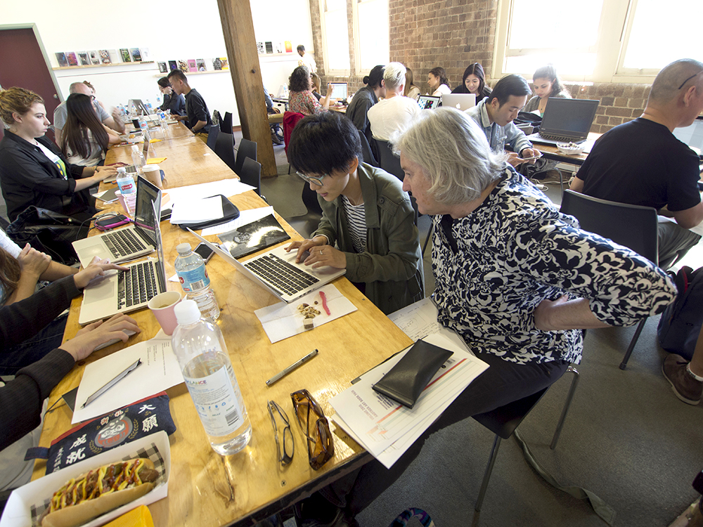
While some attendees attended these lecture sessions others were busy making books. The print-on-demand company BLURB offered bookmaking workshops over the weekend led by photobook self-publisher Garry Trinh. Asia-Pacific Photobook Archive presented a selection of their books at the event and founder Daniel Boetker-Smith and Bella Capezio led photobook-making sessions as well.
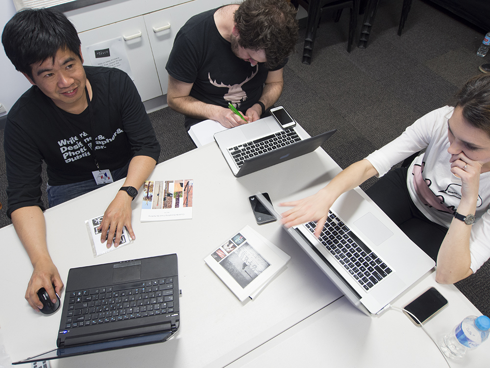
Victoria Cooper and Ruyin Yang
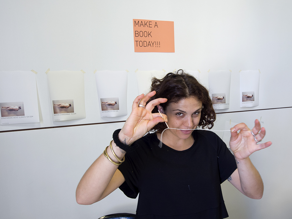
The biggest book-making venture over the weekend was a special project coordinated by Onestar Press who, with Artspace and other supporters including Surry Hills Print & Design Konica-Minolta, design students from University of New South Wales – Art &Design. The project, entitled ‘Book Machine’, brought together a designer with a ‘content provider’ (artist or photographer), and over the course of 3.5 hours the two work together to design a book. Overnight the book was printed and made available to its collaborative participants.
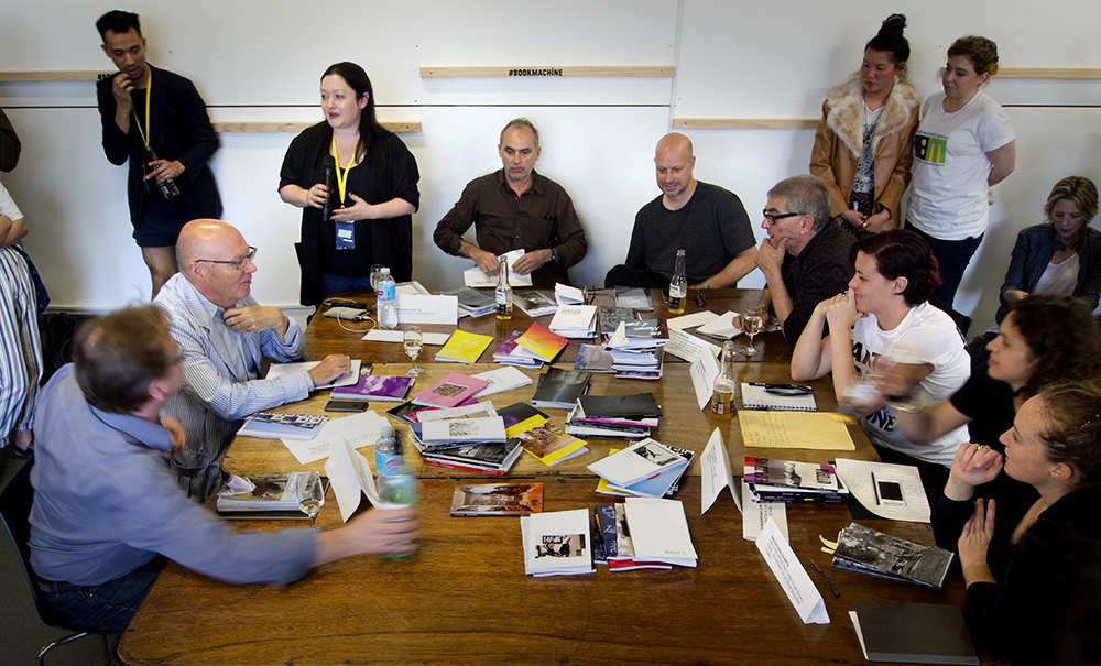
Alexie Glass-Kantor – introduces the Book Machine commentators
Late on Sunday afternoon the Artspace coordinators drew together a distinguished panel of erudite book critics and commentators including Brianna Munting – NAVA, Simon Barney Artist, Alexie Glass-Kantor – Executive Director Artspace, Maddalena Quarta – One Star Press, Bella Capezio – Asia-Pacific Photobook Archive, Philip Keir – publisher and artists’ book collector and Nicholas Tsoutas – Curator and Art management executive. A crowd gathered to hear this discussion and celebrate this unusual project.
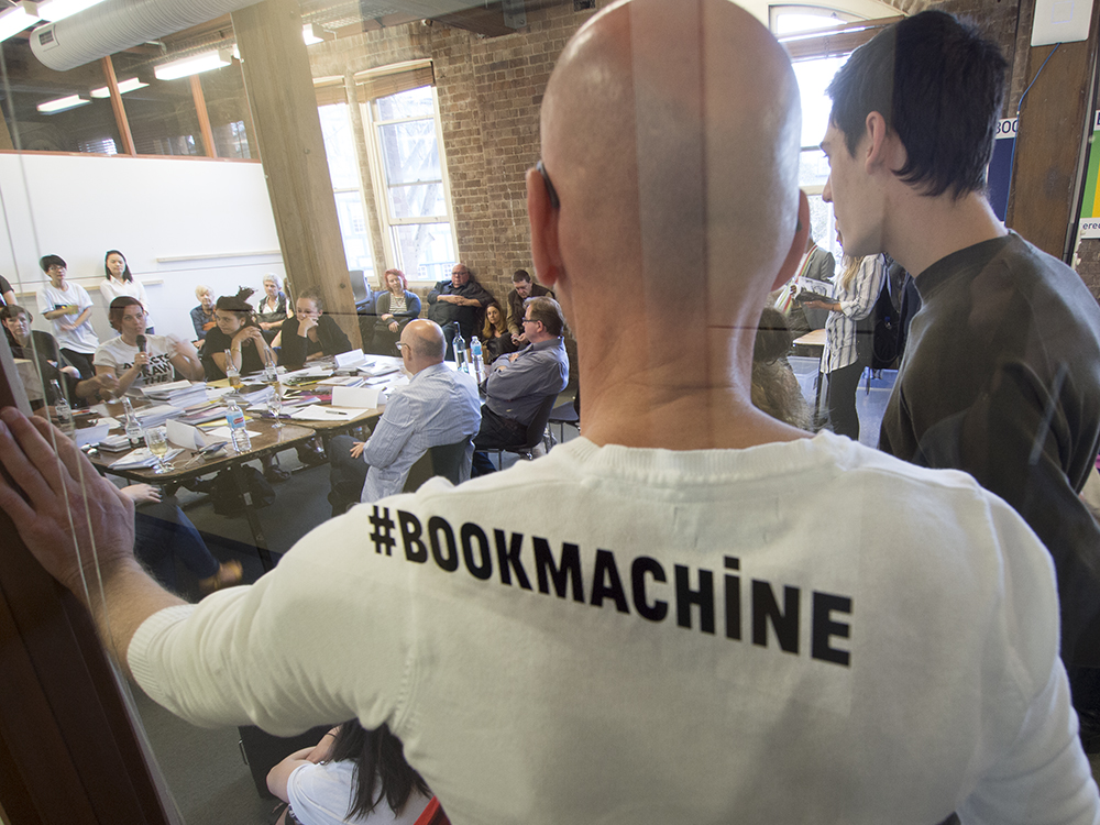
Book Machine
Towards the end of the day on Sunday I rushed around to catch up with people that I still hadn’t spoken with and books not yet seen. I felt something of the heightened energy levels with which these table holders had been operating in the preceding days. Did they sell enough books…? Did they make contacts with people who will do future business with them or provide content for future books…? Did they get a chance to check out what everyone else was doing…? Did they get to do a Book Machine project…? Buy a pie at Harry’s Cafe de Wheels or take-in the harbor, the Finger Wharf and the view of naval ships at Garden Island.
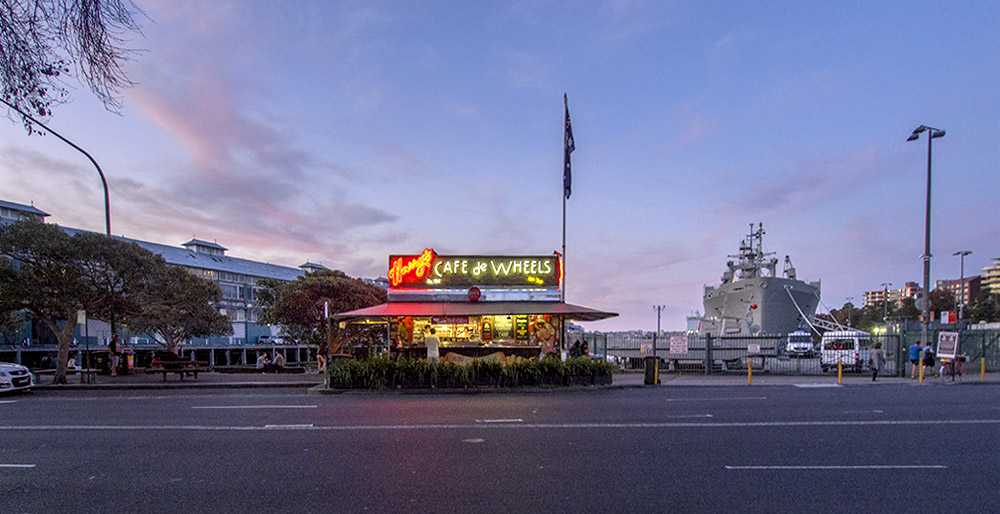
Harry’s Cafe de Wheels
Volume: Another Art Book Fair was a major undertaking for the visionaries who conceived it and then brought it into fruition. There were so many activities, add-on events, presentations and booksellers and books available for artbookophiles in which to luxuriate. There was a real sense of community created in this art book fair that can only advance the disciplines associated with it. One thing is for certain, at least for me, is that I know I have just attended one of the most significant art book fairs to be held in this country to date. When, and where the next one will be is something we’ll await with much anticipation…
Doug Spowart
14 September 2015
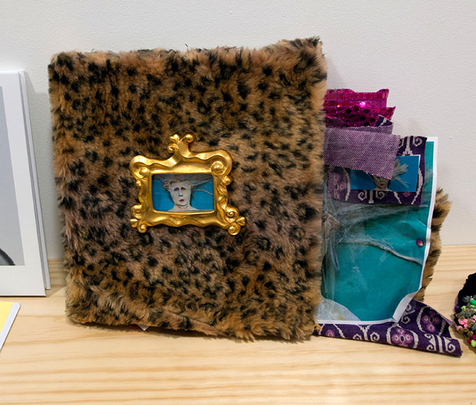
GEORGE PATON GALLERY: Artist’s Books (reprised) Exhibition
Artists’ Book Selfie
.
Digging in the archive: past and present
Artist’s Books (reprised) [artists’ books 1978-2014]: George Paton Gallery, University of Melbourne
Dates: 26 August to 5 September
A recent show entitled, George Paton Gallery, Artist’s Books (reprised), promoted that it would be showing “four decades of investigation into the possibilities and limitations of the artists’ book form.” Whilst the exhibition as presented had some gaps in the chronology, it did live up to its claim of presenting a significant collection of contemporary works alongside a carefully curated group of seminal artists’ book works from shows presented at the George Paton Gallery in the 1970s and 80s.
.
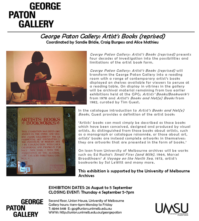
George Paton Gallery Website notice
.
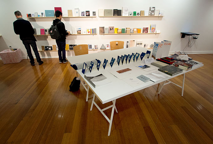
Visitors to the gallery encountered a space resembling a reading room with trestle tables and bookshelves presenting the contemporary books for viewing, handling and reading. Some books were marked as ‘white-gloved’ handling whilst the majority was available for direct tactile experience. Enclosed in vitrines were the historical books on loan from the University of Melbourne archives. Interestingly during the 1970s and 80s these books would have only cost a few dollars to buy but now they attract significant values. Included in this prized collection of books are: Ed Ruscha’s Small Flres and Milk; 1964; Marcel Broodthaers’ A Voyage on the North Sea; 1973; Sol LeWitt’s Grids – using all combinations of straight, not- straight and broken lines; 1975; Richard Long’s The North Woods, 1977 and Dieter Roth’s, Gesammelte Werke, Band 7, 1974. These books were sourced from past exhibitions held by the George Paton Galley: Artists’ Books/Bookworks from 1978 and Artist’s Books and Not (e) Book! from 1982, the latter curated by Canadian Tim Guest.
.
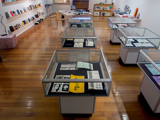
George Paton Gallery
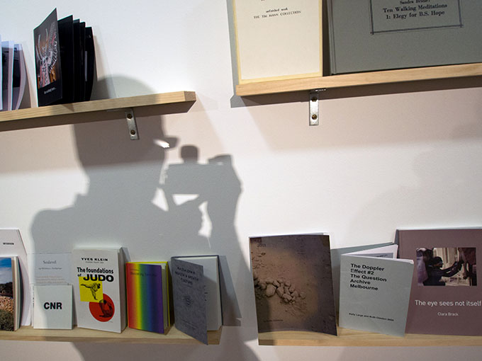
In all just over 100 books were available for viewing essentially coming from a ‘call out’ for artists book makers to present work for the show. There were some interesting names; Peter Lyssiotis, Theo Strasser, Sandra Bridie, mail artist David Dellafiora, zinesters Gracia Haby and Louise Jennison, and photo-newspaper publisher Jacob Raupach. Anyone with a preconceived idea of what an artists’ book is, or should be, may have been challenged by some of the works in the show – but what an experience it was to be challenged in that way. It was a rare opportunity to view and compare such a diverse and historical collection of artists’ books.
.
Exhibition installation
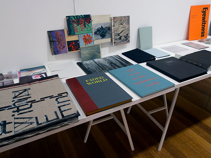
Antoni Jach’s Faded World and books by other artists
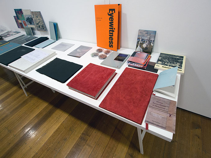
Books by Peter Lyssiotis, Theo Strasser and others
After spending a couple of hours in the exhibition space I searched for a way of describing the show. Then I found a text that offered a perceptive critical evaluation of the artists’ book genre. Some relevant passages from this text follow…
.
Artists’ books can most simply be described as those books which have been conceived, designed and produced by visual artists. As distinguished from those books about artists, such as a monograph of catalogue raisonee, or about art, artists’ books are instead complete artworks in themselves: they are artworks that are presented in the form of books.
Since about 1960 a distinct genre of artists’ books has appeared. These are by artists who are self-consciously exploring the possibilities of printed books: the social dynamics of a reproducible vs. a unique art object; the aesthetics of the mass print media vs. fine art prints or deluxe editions.
The contemporary genre of artists’ books is now a widespread phenomenon. Practically every significant development in western art has been reflected in the ongoing publication of artists’ books. There are books coming out of the movements of pop art, minimalism, arte povera, performance art, fluxus, happenings, and new image painting. Conceptual artists of the 1960’s and 70’s in particular, utilized the book form as a method of realizing artworks. We can regard these books now as a vein which runs through many areas of contemporary art and includes diverse movements, interests and preoccupations.
Or have the interests been so diverse? Pop art, minimalism, performance art, arts provera, were all movements distinct from (even antagonistic to) one another, yet they all belonged to a general tendency towards “non-objective” art… Briefly, this tendency has been reflected in a desire on the part of artists to explore new media, in an attempt to abandon the traditional (modernist) disciplines of painting and sculpture. It was/is in favour of the widened scope of the flux and flow of a multi-disciplinary approach. For example, an artist may be involved in sculpture as easily as film, performance, video, photography and/or books. Perhaps most significantly there has been a conscious determination to undercut the reification of artworks – society’s valuation of art – by concentrating on the non-objective. This has meant, for instance, producing works from common industrial or throw away materials (art povera, fluxus), works constructed only in theory (conceptual art, language art), imagery stolen from the banal repertoire of mass media (pop art) ….. All this seems to have been more successful as an ideal than as an actual practice. Minimal sculpture in the late 60’s was quite successful in the art marketplace. Conceptual art has been immensely influential, popular, and saleable. As much as these artworks were determined in opposition to the bourgeoise reification of art they were inevitably complicit with it. That is because capitalism is a social system which seems to embrace new ideas but in fact appropriates and establishes a commercial value for then.
A book by Dianne Dickson
Artists’ books typify this interest in non-objectivity and reflect the internal contradictions of such an ideal in a particular way. In contrast to the traditional “livre d’artistes” of deluxe editions, artists’ books are usually inexpensively produced and sold. They are affordable, accessible and as plebeian as an art object can be. In fact they are almost too exemplary of the non-objective ideal.
As books they are not commercially viable simply because they defy the expectations of a mass market by presenting avant-garde information. Yet they have few patrons in the art world because their affordability to the public represents a low profit for a dealer. Also, books can not [sic] be viewed in the same way as other art objects; they must be held in one’s own hands and read. It is remarkable then that despite the contradictions and foils of art’s survival, artists’ books have become such a highly evolved genre of contemporary art, as evidenced by the works in this exhibition.
Suzannah Griffith’s While The City Sleeps
.
To illustrate means to make something clear by example, or to adorn a book with pictures. Within a publication, an illustration can be a picture, a drawing, a photograph, a design, or an ornament. Illustration is, of course, a prominent element in all mass media publishing. To consider all illustrations as a single genre is, in a way, quite boggling. It means imagining all magazines in the world and all the printed pictures.
With this imagining I try to analyze these pictures but have only an individual response to guide me. In principle my inquiries and suggestions are all subjective, my curiosity is intuitive, my critical remarks are speculative. These habits of mind and predilections constitute the trail of my argument. Because illustration operates as such an enormous social phenomenon, it is difficult to grasp its total meaning as a genre. It is too huge a concept. Yet paradoxically, all is intimately familiar.
Sarah McConnell’s 29 2011
Practically everyone looks through magazines, sees the pictures, knows what they mean. But try to separate yourself from a simple recognition of the picture and examine the picture as a conceptual model and you may understand how difficult it can be. An illustration is not simply a picture of an object or thing. In that object’s absence a picture is a way of visualizing it, recalling it or conjuring it. Then all together the medium of illustration is a way of visualizing the world. As illustration is a mass medium, it is certainly a very powerful and influential instrument of ideas. As a conceptual model, a picture is showing us how to think and what to think about.
Art characteristically departs from conventions. In leading the way from these conventions and artists can end up revealing and/or inventing upon a given culture, popular or otherwise. Furthermore, the artists’ books in this exhibition occupy a middle ground between the hermetic region of high art and the mass culture of popular illustration. They also embody a comparison between the two; they have been produced as a way of participating (in theory at least) in the mainstream of popular culture at the same time as they are an extension of art, extending beyond galleries and museums, and outside of the realm of the rarified art object.
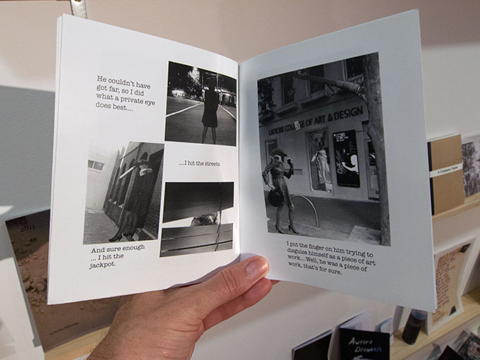
Jon Hewitt’s feel the confidence 2011
It may be noted that the photo works included in the exhibition are not photography books in the usual sense. For example in some books, the artist has exchanged the customary fine detail and high quality printing found in most art photography books for the flat, grainy, aesthetic of newswire or snapshot photographs, with all their vernacular associations. In other books the artist may manipulate the photographic frame by cropping it tightly to draw attention to narrative details or expanding it to the edge of the page for a window effect. Some books here constitute a repertoire of personalities through a wide array of photographic self-portraits. Others are collections of images specific thematic subject matter which suggests an interpretation of the complex meanings of culture and its institutions through the examination of its artifacts.
.
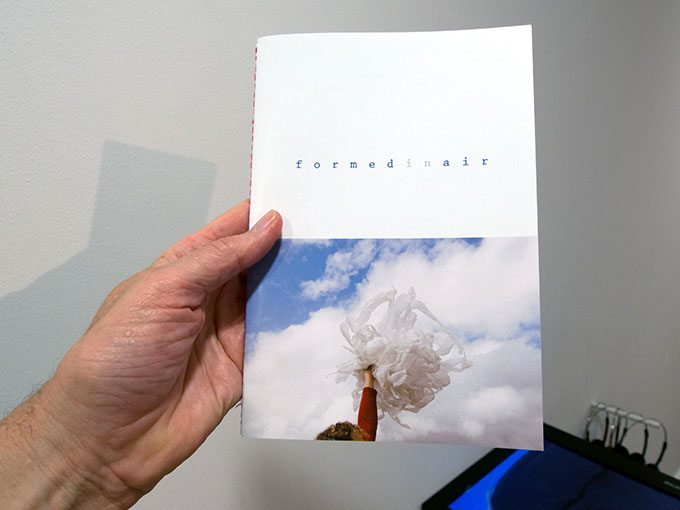
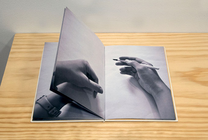
Yasmin Heisler’s formed in air 2014
In opposition to the conventions of art photography, which dictate an aesthetic around the “integrity” of an individual print, these photo books, to some extent, are each engaged with the qualities inherent in reproduction by offset and other printing processes. The artists represented in this exhibition are utilizing photographs as something other than a clear, well-composed picture. In their books they manipulate the “natural reality” of photographs and so inform our recognition of photographic images with their mannered inventiveness.
There are also a few books included here which are constructed sculpturally to introduce a tactile sensation to the fingertips and so expand the act of reading illustrations into the field of sensory awareness.
.
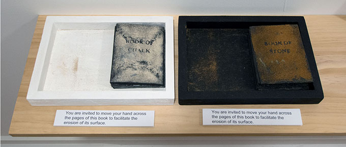
Bridget Hillebrand’s Book of Chalk 2014 and Book of Stone 2014
Finally, just as the works in this exhibition are included towards an exploration of the social and aesthetic attributes of illustration, they also demonstrate a way of looking at and experiencing the world. Theses artist’s books reveal and embody a way of reading deeply into they dimensions of contemporary culture. As much as they foster an incipient consciousness they ask for sensitivity on the part of the reader.
.
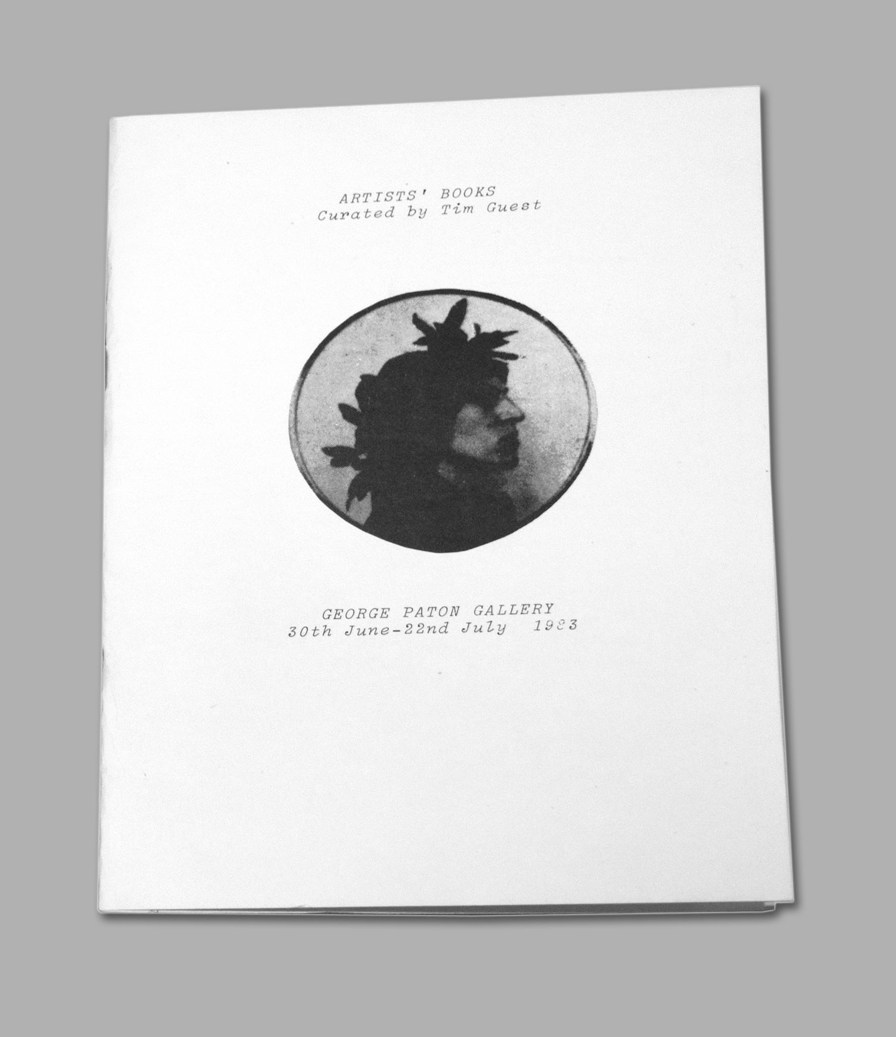
Tim Guest, the catalogue for the 1982 George Paton Gallery Artist’s Books and Not (e) Book!
These words come from Tim Guest, the curator for the 1982 George Paton Gallery Artist’s Books and Not (e) Book! A copy of his catalogue for the show was made available at the exhibition. Guest’s commentary is as relevant today as it was in the early 1980s, and while we have moved on, and now view the artists’ book works of that time with a degree of comfort and acceptance, the new artists’ book works continue, as Guest points out to, ‘demonstrate a way of looking at and experiencing the world’. For me it emphatically confirms that artists’ book are still ‘edgy’ and still pushing limits.
Doug Spowart
September 5, 2014
DOWNLOAD the contemporary list of artists’ books gpg artists books list of works
DOWNLOAD the books on loan from the University of Melbourne ArtistsBooksloanselectionGPG2014 docx
.
.
Part of the associated activity for the show – an artists’ book making event outside the gallery led by Michele and Laine. It was a a sunny and warm late winter’s day in Melbourne.
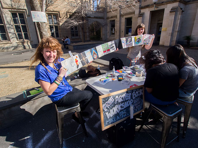
Michele Grimston and Laine Stewart and their Free Artist’s Book activity
.
.
.
.
