Archive for the ‘Doug Spowart’ Category
2019 WORLDWIDE PINHOLE DAY 28 April – Our images
.
Round the [w]hole world on Sunday the 28th of April 2019 pinholers were out having fun – Making their images for the 2019 WPD. Far away from the darkroom (again) we’ve once again fitted a pin-prick in a piece of aluminium fitted to a body cap of our Olympus Pen camera and we went on a road trip in Tasmania from the D’Entrecasteaux Channel to the mountains and back again.
This is the 14th year we have supported the WPD project!
.
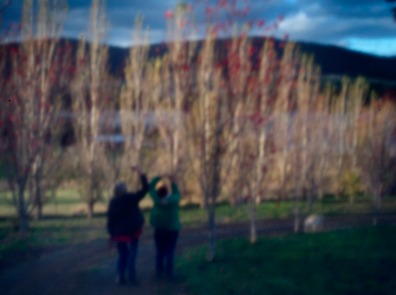
ABOUT VICKY’S PINHOLE IMAGE:
.
Capturing time and light in the mountains of Tasmania..
The photo was taken by digital capture with hand-made hole on an Olympus Pen using manual setting.
.
My friends take a photo with their iPhones
.
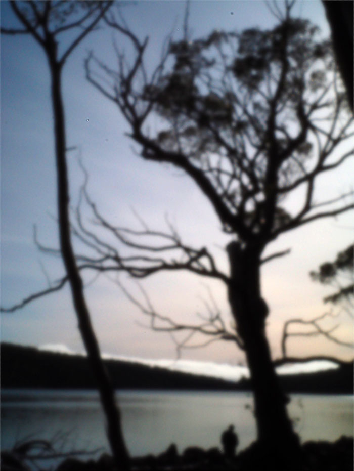
ABOUT DOUG’S PINHOLE IMAGE:
.
Late this afternoon we went walking in the Autumn light down past the bare trunks and branches of deciduous trees – my friends stopped to photograph with their iPhones… Callie walked on…
Both pinhole photographs were taken on an Olympus Pen camera
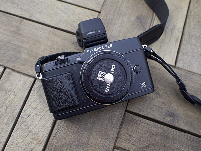
Camera with pricked pinhole in alfoil, Aperture exposure mode, ISO 800.
.
Other images we made on the day…


Visit the WPD Site for details of other submissions: http://pinholeday.org/
.
Our Past WPD images:
2018 Doug+Vicky https://wotwedid.com/2018/04/29/2018-worldwide-pinhole-day-29-april-our-images/
2016 Doug: http://www.pinholeday.org/index.php?id=1235
2016 Vicky: http://www.pinholeday.org/index.php?id=1540
2015 https://wotwedid.com/2015/05/04/april-26-worldwide-pinhole-day-our-contributions-for-2015/
2014 Vicky’s http://pinholeday.org/gallery/2014/index.php?id=1810&City=Toowoomba
2014 Doug’s http://pinholeday.org/gallery/2014/index.php?id=1811&City=Toowoomba
2013 https://wotwedid.com/2013/04/29/world-pinhole-photography-day-our-contribution/
2012 http://www.pinholeday.org/gallery/2012/index.php?id=1937&searchStr=spowart
2011 http://www.pinholeday.org/gallery/2011/index.php?id=924
HERE IS THE LINK to the 2011 pinhole video http://www.youtube.com/watch?v=Yk4vnbzTqOU
2010 http://www.pinholeday.org/gallery/2010/index.php?id=2464&Country=Australia&searchStr=spowart
2006 http://www.pinholeday.org/gallery/2006/index.php?id=1636&Country=Australia&searchStr=cooper
2004 Vicky http://www.pinholeday.org/gallery/2004/index.php?id=1553&Country=Australia&searchStr=cooper
2004 Doug http://www.pinholeday.org/gallery/2004/index.php?id=1552&Country=Australia&searchStr=spowart
2003 http://www.pinholeday.org/gallery/2003/index.php?id=615&Country=Australia&searchStr=spowart
2002 http://www.pinholeday.org/gallery/2002/index.php?id=826&Country=Australia&searchStr=spowart
.
.
The man who photographed every house in Australia
BACK STORY on the FRANK & EUNICE CORLEY HOUSE PHOTOGRAPH COLLECTION
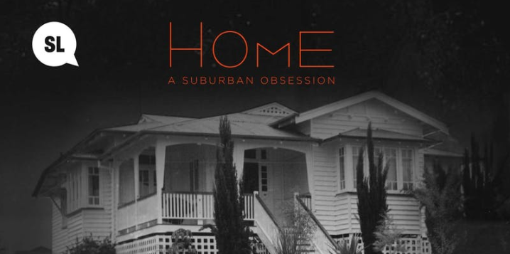
in the State Library of Queensland and the exhibition HOME: a suburban obsession

Imagery Gallery – with my mother and business partner Ruby Spowart
.
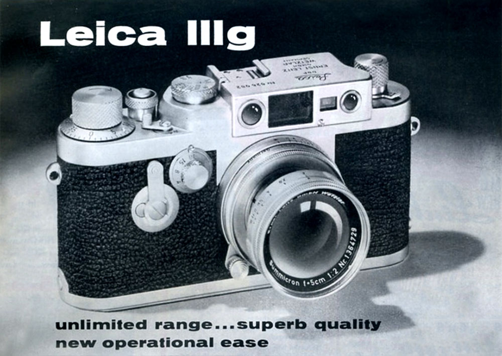
From 1980 to 1995 I was co-director, with my mother Ruby, of Imagery (photography) Gallery (1). The gallery operated in 3 locations in South Brisbane two of them being on the corner of Grey and Melbourne Streets. Although our main business activity was a photographic gallery and workshop we were also suppliers for specialised equipment for photographers – one of them was the famous Leica 35mm camera. As a Leica user myself since the early 1970s my special knowledge of this equipment was not so much from the point of view of a salesperson but rather as a user of the full range of Leica cameras, projectors, enlargers, binoculars and accessories in my documentary and art photography practice.
.
In the late 1980s or early 1990s an elderly man visited the gallery and exhibited an interest in Leicas. He mentioned that has had been a professional photographer and that he used the older screw mount Leica gear. Initially I saw him as a potential purchaser, though in time and after many visits I realised that this was not to be the case. His name was Frank Corley and I found him to be a storyteller. With each visit came my understanding that he enjoyed the opportunity to talk with someone interested in his life.
Frank lived in Annerley and dined every evening at Sizzlers – he called it “Zizzlers”. He was a dapper man with a hat and very well dressed. His visits to the gallery were easily accomplished by train as the gallery was situated just over the road from the South Brisbane Railway Station.
.
Frank’s camera
At one stage in 1994 Frank indicated that he had some Leica equipment he wanted to sell and invited me to his home. I went with my partner Victoria Cooper to his Annerley home. On entering the house one came in contact with the enormity of Frank and his wife’s life as in every room there was ‘stuff’. His partner in his business his wife Eunice had passed away by this time. Everything had a story – a watercolour painting of Central Australia by Ewald Namatjira (if I remember correctly), Frank recounted was purchased by him when he was photographing homes in Alice Springs. He bought the painting from the artist who presented work for sale at the front gate of the caravan park from which Frank was operating his business. We went from room to room looking for the items he wanted to sell which finally amounted to some very out-dated photographic paper, an enlarging easel and an old Leica Focomat enlarger.
We did a tour of the back yard in which were parked several vehicles. One was the now famous Cadillac (though not pink in colour as often described), another was a little like a Bedford delivery van. We went inside and in the back of the vehicle was a compact darkroom, enlargers, trays, and rolls of processed film in special cardboard gridded boxes. It was cramped but functional – later I was to discover that Eunice was the darkroom operator. I had a lot of respect for that lady and her workspace.
In a lean-to shed at the back of the property Frank reached into a large cardboard box and pulled out a handful of black and white prints of houses. He had already told me of his Pan American Home Photographic Company business of photographing houses from the Cadillac (and other vehicles) as he drove down the street steering the car with his knees taking photos. These photographs were subsequently processed and printed and salesmen, sometime Frank himself, would then call back at the houses and sell prints that could be mounted on cards or calendars. The company brand phrase was From Our Home to Your Home.
I looked around and saw maybe 8-10 boxes the size of which would have been 80cmx60cmx60cm and each box was crammed full of prints. I asked how did he end up with so many photographs? His answer was that at the time the sales tax on photographic materials was 27.5% and as he did not have a sales tax exemption number for his business he paid tax when he bought film and photo paper. At the end of each financial year the value of the tax on the unsold photographs could be claimed as a sales tax credit. The volume of work he was doing that was unsold amounted to a reasonable credit but the prints needed to be retained along with other taxation documents for many years. These photographs came from a time 20-25 years earlier and had not been disposed.
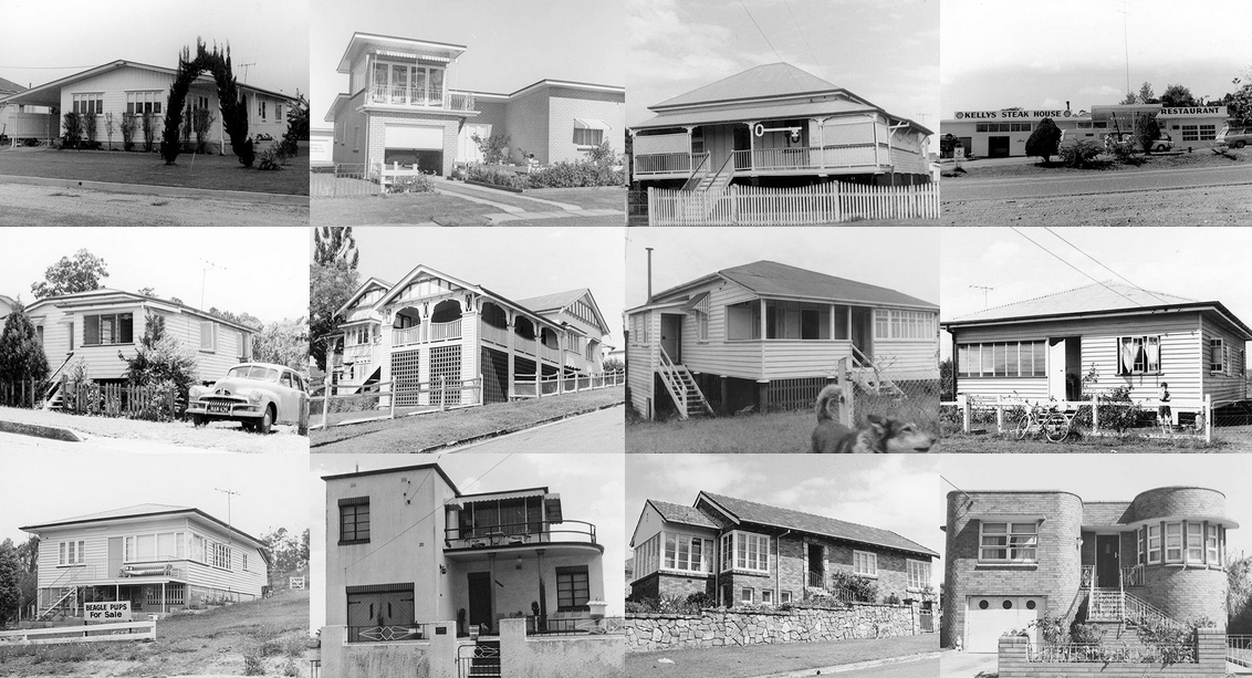
Some Corley house photographs Source: State Library of Queensland
I reached into one of the boxes and pulled out a bundle of photos. What I saw were very ‘straight’ photos of houses all with very similar framing, usually recorded almost as plan elevations. The houses look dated to perhaps 20-30 earlier and I sensed that I was holding in my hands a documentary photography history record. I asked Frank what would happen to these photographs when he moved on… his answer was that they’d probably be sent to a silver recovery plant or dumped. Ohhh! I thought. Before leaving Frank that day he posed for a couple of portrait photos with his trusty Leica IIIg.

Frank Corley circa 1994
At this time in my photodocumentary practice I had undertaken re-photography projects where early photographer’s pictures were relocated and re-imaged as a way of showing the passing of time. My own history making photographs and also from building my own collection of photographs from the beginnings of the invention of photography 150 years earlier meant that to me these images were special and needed preserving. I couldn’t let them be lost, not only because they represented Frank’s life work, but also for their historical value.
On leaving Frank’s home I worked through some ideas with Vicky as to what could happen with Frank’s photographs. At the time I was a valuer for the Australian Government’s Taxation Incentives for the Arts a program where the value of donations to cultural institutions could be used as a tax credit for the donor. I had been involved in valuations for the State Library of Queensland so I made contact with some of the people I knew there. I must have sounded convincing, as there was interest in the work from SLQ Field Officer Niles Elvery. I contacted Frank who said that he would be happy to donate the photographs to the Library and in due course I travelled in a Library station wagon driven by Niles back to Frank’s place.
I’m not sure how we fitted the boxes into the station wagon but I remember it being a tight fit. Frank signed a document that Niles had brought with him and we travelled back to the Library. We reckoned that there were around 12,000 photographs.
A few months later I heard via Frank’s solicitor that he had died and that any items that Imagery Gallery was holding of his pending sale needed to be returned. I was somewhat taken by Frank’s passing and as he seemed to be without friends or family around I thought it appropriate that I write an obituary which I published in a journal I edited called PHOTO.Graphy, ISSN 1038-4332 – The Christmas edition, v. 6, 1995. It reads:
FRANK CORLEY: Obituary
Unknown to most of us Frank Corley, a travelling photographer passed away on October 19, 1995. I suppose we all die eventually and our life’s work, the photographs we make are left to the destinies of those who possess them. In a life full of entrepreneurial activities Frank owned and managed a transport business, caravan parks and a lolly shop. A fascination for photography led to the formation of Pan American Studios. Street photography and in particular photographing houses was his big passion.
I call him the man who photographed every house in Australia because if you ever spoke with him about it he made you believe that he did. Frank Corley won’t be missed by many but his legacy ~ his photographs, will live on in private family archives but most significantly through the donation of around 12,000 prints of Queensland homes presented to the John Oxley Library, Brisbane in June this year. This fragment of Frank’s work would have been lost except for a fluke of meeting with me and his generosity.
I just wish there could have been more time to record the experiences that he so happily shared with me.
Doug Spowart 6/11/95
The years went by and memory of Frank and his donation were for me a faded memory. In 2015 I was granted a Siganto Foundation Artists’ Book Research Fellowship at the SLQ. One day I met a volunteer called John Wilson at the library and I found out that he had been working for years in trying to unlock the Corley code for the photographs, what town – what street? We spoke about his method of working which was hindered by limited information available in the bundles of prints and scant markings on the prints. John had street directories from Queensland towns which he had identified street names and had himself been out on the road looking to confirm hunches.


Soon after this meeting I met Denis Peel and became aware of the work that the Annerley-Stephens History Group had done in identifying many of Corley’s home photographs from the Fairfield, Annerley, Yeronga, Yeerongpilly, Tennyson and Moorooka areas. As a volunteer group they held meetings, provided teams and individuals with Corley photos who then went out looking to identify houses. A significant Phase One report was generated by the group in 2015. Additional research was subsequently prepared. By June 2016 they reported that they had located over 3000 matching houses. I visited one of their meetings and was impressed by the energy of the volunteers. In 2017 The Annerley-Stephens History Group were awarded the John Oxley Library Community History Award for their continued and highly successful community project. The activities of the group were supported by the State Library through access to the photographs and later aided by the digitisation of the collection that has only recently been completed.
.
SLQ Home Website Banner
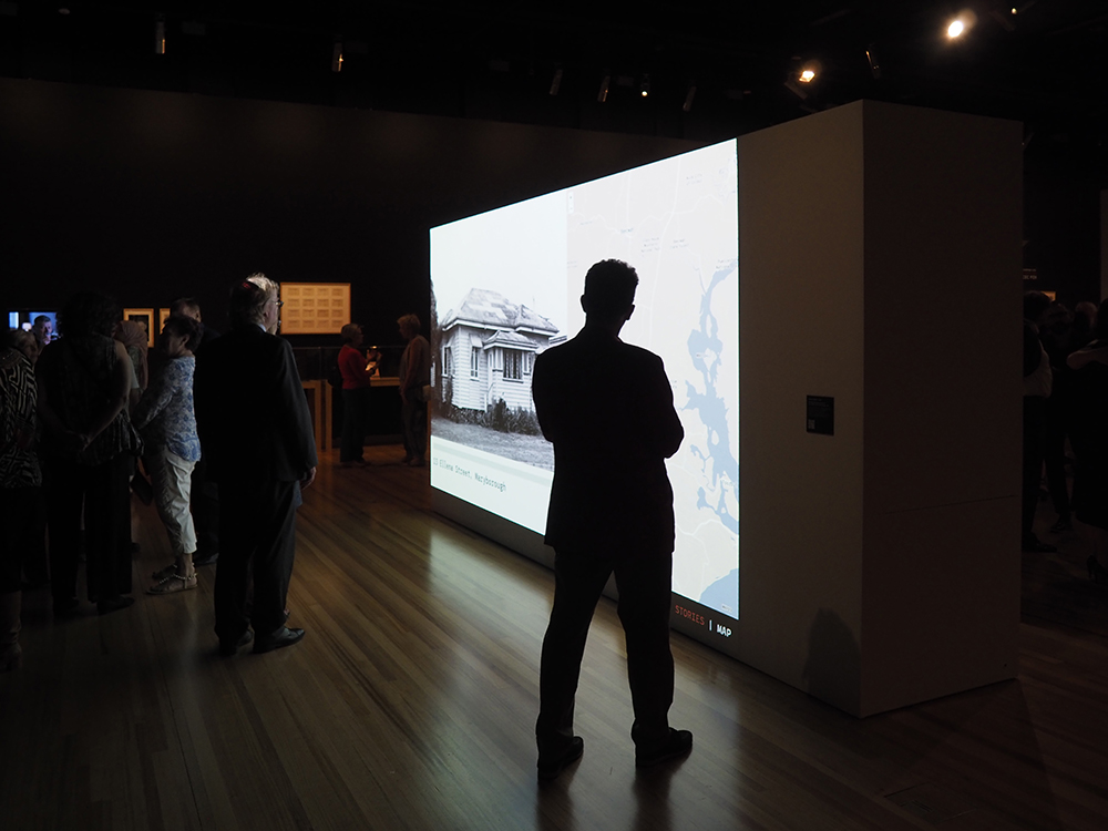
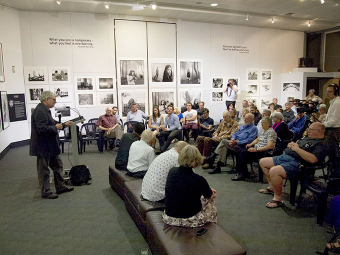
With the growing interest in the Corley Collection and the recognition of its value as an extensive and unique record of Queensland houses and suburbs the SLQ scheduled the planning and preparation of the exhibition which they have entitled – Home: a suburban obsession. As the facilitator of the donation and my knowledge of Frank and his work I have assisted Chenoa Pettrup and Adam Jefford from the Asia Pacific Design Library wherever possible in the preparations for this show. As an artist/photographer and researcher I appreciate the efforts by the exhibition coordinators to involve appropriately talented and skilled personnel to give this event the opportunity to capture community interest. Special commissions for inclusion in the show include Ian Strange‘s large-scale charcoal rendition of a Queensland home, an installation by Queensland artist/designer Jennifer Marchant and an immersive Brisbane virtual reality streetscape by [f]FLAT. Assembled in the exhibition space were artists’ books, books, catalogues and photographs from the SLQ collections that highlighted the idea of ‘home’ and included Ed Ruscha, Bernd and Hilla Becher and Australian photographer John Gollings and his Gold Coast works. Alan Scurr, a Leica camera collector collector from Toowoomba loaned camera items for a display of the camera equipment that Frank used.

Entry to the exhibition Home: a suburban obsession
The Home: a suburban obsession offers many significant opportunities:
(1) It reveals how suburban architecture looked 40 or so years ago,
(2) It provides an opportunity for contemporary Queenslanders to connect with their homes of the era,
(3) The historical nature of the photographs will be a provocative agent for nostalgia and, for some solastaligia,
(4) It enables us to appreciate unusual photographic business activities and the partnership that exists in many small photographic enterprises, and
(5) It celebrates the value of the physical photograph as a time capsule.
The Internet may have given us the modern invention the Google Street View but in a way the Corleys were doing it 40 years ago – the evidence is in the nearly 62,000 photographs in the collection. Though it is interesting to consider how the digital age and the Corley Explorer Webpage will provide the key to unlocking the code to enable every one of the Corley’s houses to be located and revisited anew. The process has started and according to SLQ sources the Corley Explorer in the first few weeks has enabled a further 14% of the collection to be identified. SEE the Stories webpage HERE.
Back in Frank Corley’s shed nearly 25 years ago I could never had imagined how those boxes of house photos could provide the amazing opportunities that we are just now encountering with this exhibition and other uses yet to be discovered. But I did know one thing and that is I could not allow them to be lost. I’m sure that Frank would feel quite chuffed that his unsuccessful unsold photographs have finally found success and have made the journey from his home to a their rightful home in the history of Queensland.
Dr Doug Spowart
(1) LINK TO: The Imagery Gallery Archive is held in the State Library of Queensland
In the exhibition – I muse that this man was Frank looking at the interest his work has now received…
Various links and associated reports and reviews of the Corley Collection follow:
The SLQ website for the exhibition: http://home.slq.qld.gov.au/
SLQ Home Website Banner
..
.
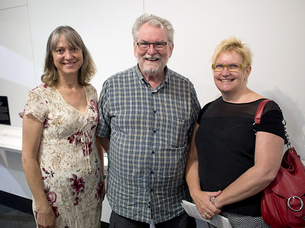
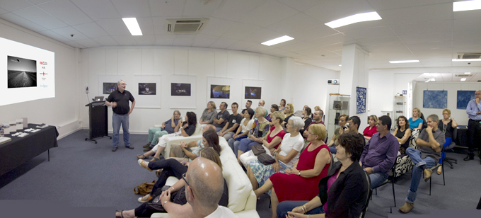
Photographs of the exhibition’s opening event on December 6, 2018


.
My video of the exhibition opening
.
2 Special commission video projects produced, directed and edited by Shih-Yin Judy Yeh. These videos present the story of Frank and Eunice Corley and the SLQ work with the Corley Collection.
SLQ The Corley story Video
A video describing the SLQ’s story about the Corley collection, includes information about the donation, conservation and investigation
A link to the Annerley-Stephens History Group’s Corley project HERE
An SLQ event with Denis Peel and Kate Dyson talking about the Annerley-Stephens History Group project HERE
.
Frank Corley Wikipedia HERE
ArchitectureAu article HERE
.
Brisbane News / Sydney Morning Herald Article HERE
.
.
.
All photographs © Doug Spowart unless othervise credited. The copyrights in other material and website resides with their relevant copyright owners.
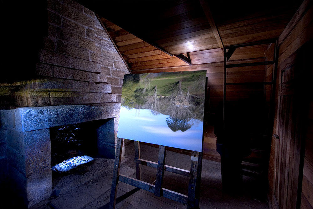
BUNDANON Residency 2018 – WHY ARE WE HERE?
WHY ARE WE – documentation of a page from the Island Book
WHY ARE WE … Here at Bundanon?
In 2007 we were successful applicants for a Bundanon residency that enabled is to realize a major component of our individual PhD research. However we still needed to resolve many issues raised by this work and to return our finished works to be documented in the site that they were created. So in 2009 we were granted a second residency to complete this part of our studies.
While we were deep in our research other interesting and unanswered questions arose that have haunted us since this time. Although our itinerant life in the last few years has been exciting and constantly changing, we have missed the opportunity to be in a studio and a place devoted to just working on our practice.
Now this latest residency will give us time to work again at the boundaries of our practice and create the new work that has been gestating in our minds over these few years.
See our COOPER+SPOWART website for further info. (Please note the content of this page are Adobe Flash driven presentations)See relevant aspects of our past Bundanon residencies relating to our PhD research here Victoria COOPER Thesis – Doug SPOWART – Thesis.
FOLLOW OUR WORK over the next 3 weeks on our FACEBOOK Page
A SELECTION OF IMAGES
From artists’ books, photobooks, experimental projects, artwork documentation and our collaboration made during our 2007 & 2009 residencies.


.
SINGLE MEN’S QUARTERS CAMERA OBSCURA


Documentation of the Camera Obscura image in the Single Men’s Quarters
PROJECTIONS
‘CLICK’ to enlarge


SOME IMAGES FROM DOUG’S WORK
‘CLICK’ to enlarge


SOME IMAGES FROM VICKY’S WORK
‘CLICK’ to enlarge


TO FOLLOW OUR ACTIVITIES OVER THE NEXT 3 WEEKS “LIKE” our FACEBOOK PAGE and in “Follow” – click “SEE FIRST”

FB-Follow
.
Please join with us in this exciting project…


LIBRIS ARTISTS’ BOOK AWARD – Cooper+Spowart Finalists
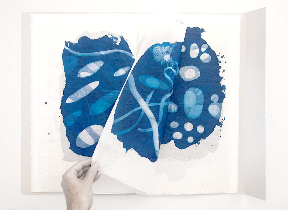
The artists’ book TIDAL by Cooper+Spowart
Our artists’ book TIDAL is now on show as a FINALIST in the 2018 LIBRIS ARTISTS’ BOOK AWARD at Artspace Mackay, Queensland, Australia.
We are excited to be finalists in this Award exhibition. The awards were announced on May 26 – details of the winning works and a download of the exhibition catalogue are available at the bottom of this post.
ABOUT OUR ARTISTS’ BOOK – TIDAL :
TIDAL is a montage of fragmented imprints made from the solid reality of found objects swept up by the tide–beautiful castaways from the ocean.
These objects as image elements, no longer in their original form, are woven together as if a poem, song or dance. In many ways TIDAL relates to a ‘desire for that melancholy wonder that is the blue of distance’ from Rebecca Solnit’s A field guide to getting lost. Or just simply it could be about the artist and their art.
It is book of double-sided cyanotype prints, when held to the light, allow for the montage of the images front and back, thus merging and unfolding the space and time of the page and the book. Reading becomes the blending of the fragments through the spatial divide of the turning page.
The video that follows gives a basic view of the TIDAL book:
ABOUT THE TIDAL BOOK PROJECT:


This project began with the collection of beach detritus at low tide after the super moon at Wooli, north coast New South Wales.
We worked collaboratively in the intense heat of Christmas Day 2016 to hand coat the cyanotype emulsion on ricepaper, expose the ‘found objects’ to the paper in the sun, and then wash-out in running water with a dash of lemon juice to create the double-sided cyanotype folios.
Over the next year we developed the structural form of the book, and finally returned to finish it at Wooli, as this state, over Christmas in 2017.
The double-sided cyanotype prints, when held to the light, allow for the montage of the images front and back, thus merging and unfolding the space and time of the page and the book. Reading becomes the blending of the fragments through the spatial divide of the turning page.
THE BOOK:
A unique state book of 6 double-sided cyanotype images on rice paper.
Book size 49.5x30x1 cm
The text was written by Victoria Cooper and includes a quote by Rebecca Solnit.
Folders and text:
Canson Stonehenge and Arches paper with rice-paper collage elements.
Garamond font family in pigmented inks on Arches paper.
This book is another work created in an ongoing series relating to the locality of Wooli and we acknowledge the support provided by Dr Felicity Rea
BOOK TEXT:
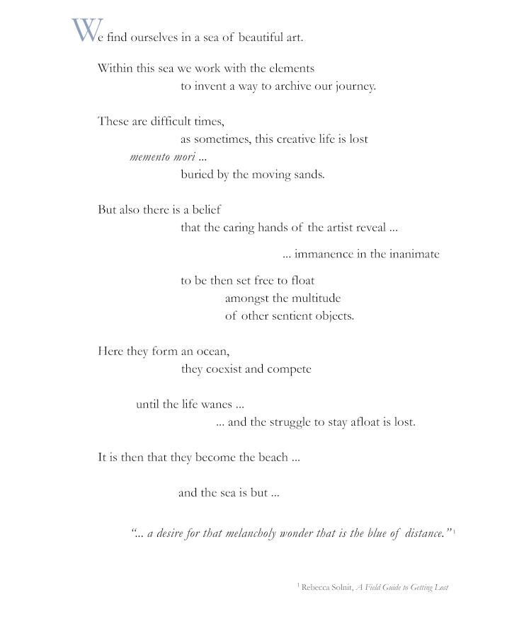
Frontpiece: TIDAL
OTHER INFORMATION INCLUDING THE WINNING BOOKS:
Category 1. Dalrymple Bay Coal Terminal National Artists’ Book Award
Winner: Clyde McGill for his work ‘Witness’
Category 2. Dalrymple Bay Coal Terminal Altered Book Award
Michelle Vine for her work ‘Contested Biography I (quadrat)’
Category 3. Mackay Regional Council Regional Artists’ Book Award
Jamian Stayt for his work ‘Tagged’
Category 4. Artspace Mackay Foundation Tertiary Artists’ Book Award
Jenna Lee for her work ‘A plant in the wrong place’

LIBRIS CATALOGUE
CLICK THE LINK BELOW TO DOWNLOAD A COPY OF THE CATALOGUE
Libris_Awards_2018_Catalogue_of_Entries_brochureA4
SEE OUR POST ABOUT THE 2016 LIBRIS AWARDS HERE
.
.
.
.
.
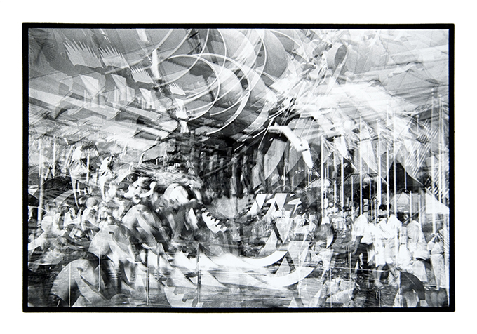
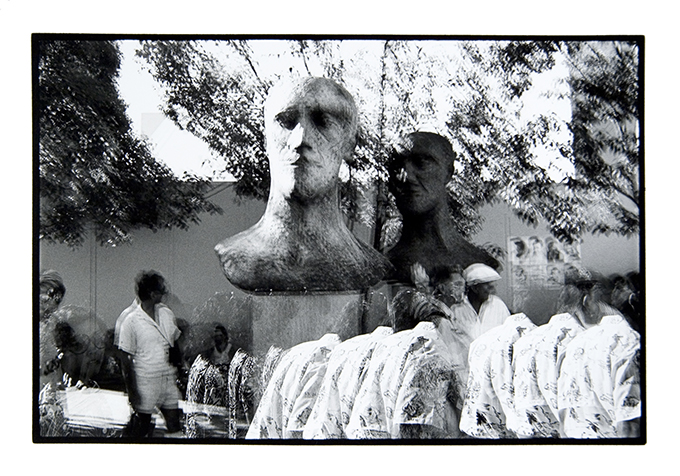
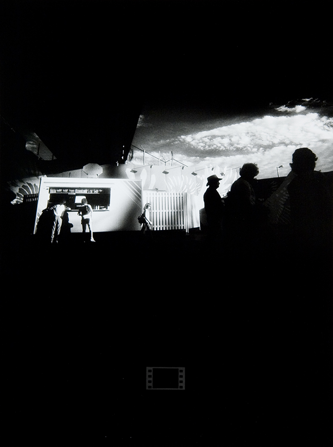
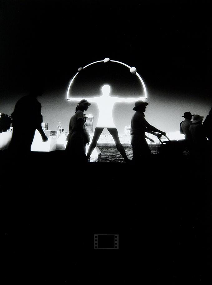
THE EXPO 88 PHOTO SHOW – 30 years on
.
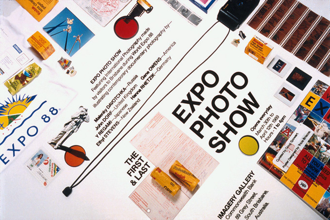
First & Last EXPO PHOTO SHOW Poster
.
EXPO’88 – A conceptual photographer’s document
.
At this time thirty years ago the people of Brisbane were beginning their EXPO’88 six-month adventure opportunity to encounter the world and its cultures and cuisine. EXPO’88 is often seen as a watershed in the transformation of Brisbane as a sleepy backwater into a vibrant cosmopolitan city of the world and, most certainly part of the 21st Century.
I had a season pass for EXPO’88 and created a personal body of work as a response to my experience of the event. As celebrations are beginning to hit the social media space I thought I would recollect on my EXPO’88 work.
.
Here is the back-story behind my 1988 project … The First & Last EXPO PHOTO SHOW
.
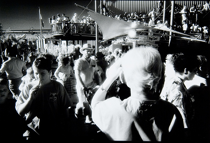
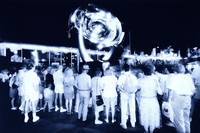
EXPO 88 Crowd Crush ………..PHOTO: Ethyl Stevens aka Doug Spowart
.
In the EXPO’88 event I recognised an opportunity for the creation of a new body of work investigating emerging approaches to my work methodology. For varied reasons I had introduced to my practice the creation of alias identities to which my work was attributed. These identities were quite complete in that they had refined working styles, subject matter, presentation forms, a photographic portrait, signatures and artists statements. As a gallery director it was easy to slip the work of these ‘photographers’ into group shows for commentary and critical acclaim. These personae enable me to play a little game on a system that at times, from my perspective at times, was biased, exclusive, nepotistic and overly critical. It also enabled me to explore ideas and concepts relating to my photography and the presentation of photographs.
.
When EXPO offered season passes I attended the passport portrait session with pair of fake glasses and a fictitious name, Eugene Xavier Pelham Owens, the initials and the signature spelled ‘EXPO’. The deception had begun. In time this project grew into an extensive body of work from 5 different personae all representing their manufactured personal responses to the EXPO experience. The exhibition was opened on April 1st 1989 (April Fools Day), it was reviewed positively in the Courier Mail and sales of work resulted from people who found the photographs reconnecting them with their experience of the event. The deception went undetected and after the exhibition the body of work passed into obscurity, as do so many exhibitions of photographs, and was slipped into archive storage boxes in my studio.
Whilst, at the time of the fieldwork on this project I called myself a ‘conceptual photographer’ as I felt that my work was driven by the overarching idea of personal experience documents rather than the photodocumentary reportage principles of truth and reality. I was aware of the term ‘conceptual artist’ and recognized that it had all kinds of baggage attached to it based on art theory and movements, however my work as a photographer at this time has simpatico with Sol Lewitt’s 1967 manifesto on conceptual art. He states:
In conceptual art the idea or concept is the most important aspect of the work. When an artist uses a conceptual form of art, it means that all of the planning and decisions are made beforehand and the execution is a perfunctory affair. The idea becomes a machine that makes the art. (Lewitt 1967)
Recently Melissa Miles has discussed the term ‘Conceptual Documentary’ in her 2010 paper The Drive to Archive: Conceptual Documentary Photobook Design. The discusses in reviewing the photobooks of Stephen Gill, Mathieu Pernot and Matthew Sleeth. She asserts that this mode of photography is based on a theory that photographers want to collect and respond to a kind of ‘archive impulse’, making and arranging image sequences of daily life into photobooks. What appeals to me is that, as a Conceptual Documentary photographer I, as Miles defines, ‘seek[s] out and frame[s] their subjects according to a pre-determined idea or scheme. Processes of repetition and categorization are central to Conceptual Documentary’ (Miles 2010:50). For me, what I was engaged in was to make a commentary from a personal viewpoint and to create a contemporary record for public presentation and, ultimately archiving. While Miles’ contemporary Conceptual Documentary practitioner including the likes of Martin Parr freely publish their photobooks in the 1980s trade published productions were beyond the reach of most photographers including myself.
What I find interesting now is that the 1980s was a particularly productive period for me as I created a trilogy of exhibitions: Tourists Facts, Acts, Rituals and Relics, Icons & Revered Australiana and The First & Last Photo Expo Show. These were essentially social documentary projects based on a personal directorial premise. I found that the limited opportunities for presentation of the framed exhibition format of these shows led me to initial experiments with boxed sets of images and ultimately to self-published photobooks, the first of which was completed in 1992.
These days I’m not so concerned about any tag as my work is often so interdiciplinarian it is hard to define. What for me is interesting is that at the time I made work that may now be able to be defined and categorized using contemporary terms and definitions. What is also important now is that the EXPO’88 photographs, some 5,000 of them, exist as an archive not necessarily as a document of the place but rather as a personal, conceptual documentary photographer’s response to the EXPO’88 experience.
Doug Spowart December 26, 2013
.
Lewitt, S. (1967). Paragraphs on Conceptual Art. Artforum 5: 8.
Miles, M. (2010) “The Drive to Archive: Conceptual Documentary Photobook Design.” Photographies 3, 49-68.
.
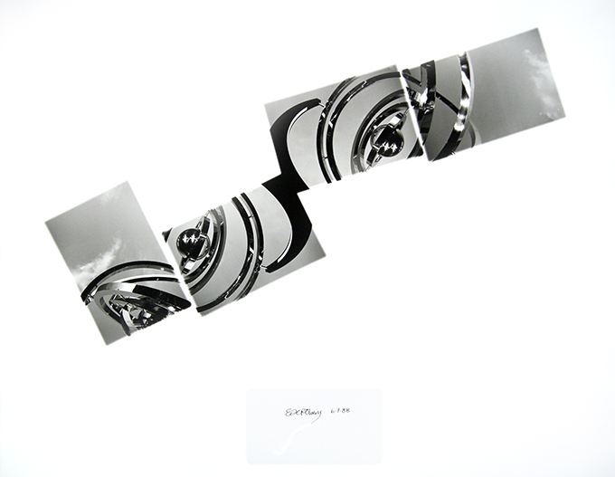
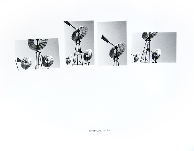
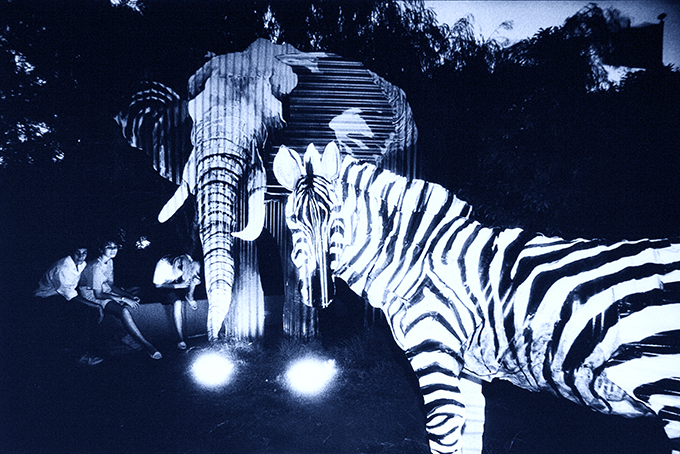
HERE IS A SELECTION OF WORKS FROM MY EXPO’88 PSEUDONYMS
.
John (Jack) Dorf ………(United Kingdom)

John (Jack) Dorf ………(United Kingdom)
Eugene Owens …….(USA)
Eugene Owens …….(USA)
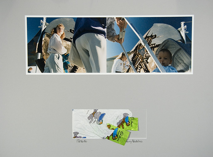
Malenky Davotchka ……. (Russia)
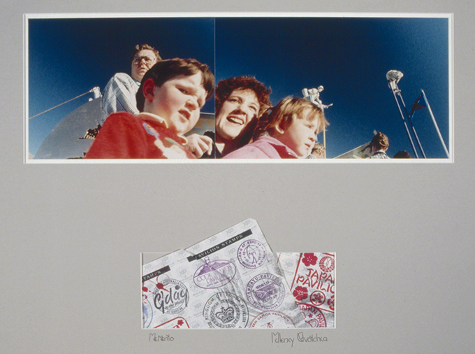
Malenky Davotchka …….(Russia)
Y Regami ……(Japan)
Y Regami ……. (Japan)
Hanna Rhetzik …….(Czechoslovakia)
Hanna Rhetzik ……(Czechoslovakia)
Ethyl Stevens …….(USA)
Ethyl Stevens …….(USA)
.
A PDF PRESENTATION CONTAINING MORE IMAGES IS AVAILABLE HERE: EXPO-SPOWART-v3
.
First & Last EXPO PHOTO SHOW Poster
.
.
Images and text © Doug Spowart Design of the Poster: Trish Briscoe
From the Doug Spowart Personal Art Archive 1953-2014
..
.
![]()
This work is licensed under a Creative Commons Attribution-NonCommercial-NoDerivs 3.0 Unported License.
.
National Works on Paper submission – not shortlisted
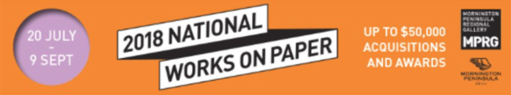
NWOP-banner
.
As an artist there is a need for affirmation and justification for one’s life in the activity and practice of artmaking. Artists prepare and curate their work in gallery exhibitions to present work – and then there are awards and competitions. Each year, as the call for entries comes around, we like many artists around the country, look at recent work and consider its appropriateness for specific awards.
There are of course thoughts of winning an award but perhaps more importantly is the opportunity to be shortlisted for exhibition and considered for purchase or collection. Equally important for us is the opportunity to connect with fellow artists in the curated exhibition that represent the judge’s opinion of what constitutes the most relevant works based on the competition’s criteria.
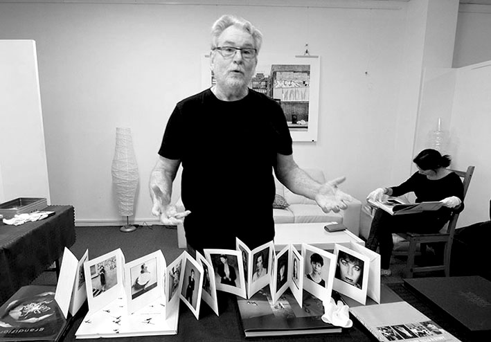
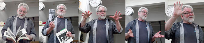
This year I submitted to the National Works on Paper Award an artists’ book that I had made during our Skopelos Works on Paper workshop in Greece last year. The book is an exploration of the idea of a montage of light capturing the performance of reading a book. Simultaneously the reader, the location where the reading took place and the page-turning action of reading is imaged in light sensitive cyanotype on the watercolour pages of the book.
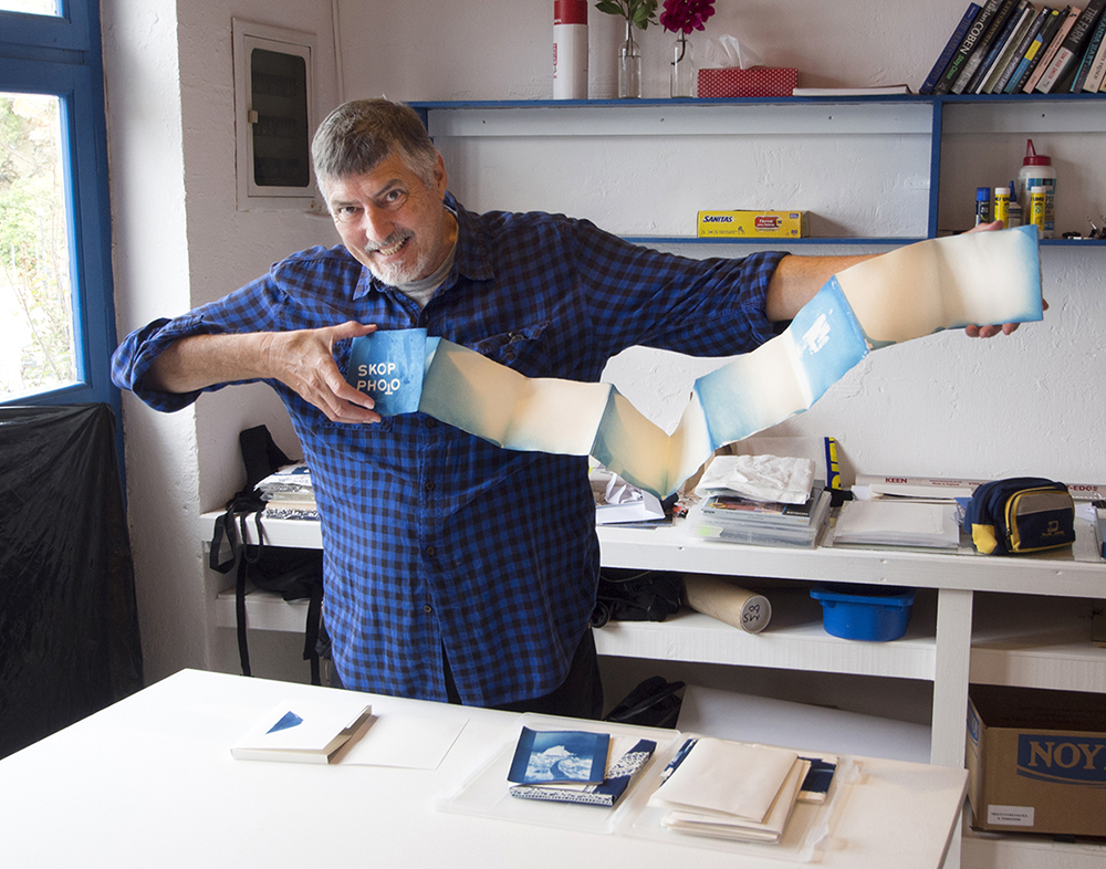
Doug Spowart opens SKOP PHOTO after its creation in Greece PHOTO: Victoria Cooper
.
Here’s an image of the book:
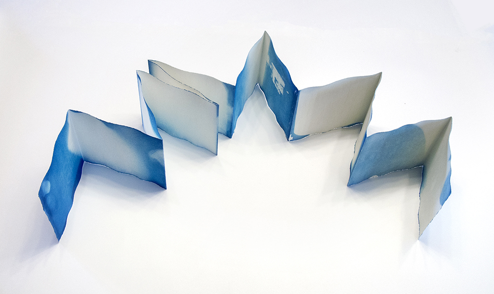
SKOP PHOTO artists’ book by Doug Spowart
.
Other images of SKOP PHOTO folder, cover and details


ARTIST’S STATEMENT: SKOP PHOTO an artists’ book by Doug Spowart
This book is created using the cyanotype (sun print) process as part of the author’s ongoing investigation on the ontology of reading.
The book was folded into a concertina form to eventually allow for a variety of potential readings; either extended or page after page. The author then coated the light sensitive cyanotype emulsion onto the pages of the book.
The pages were slowly turned and extended over several minutes allowing the sunlight of the Greek island of Skopelos to strike the emulsion as author performed reading.
After washing in a bath of water, an image of the Aegean light was formed in Prussian blue on the pages of the book. Alternatively, where the light had not fallen on the page – there seemed to be no image formed. But this apparent absence was a “shadow” – a kind portrait of the artist reading the book in its moment of creation.
Today I received an email advising that my submission was not shortlisted..
.
Not a big problem for me as only 1 in 16 artworks were accepted for the 2018 awards and those names on the list are a fine group of artists.
.
If you are interested the 2018 National Works on Paper finalists were:
Raymond Arnold, Peter Atkins, Alec Baker, Martin Bell, Ray Besserdin, Solomon Booth, David Bosun, Godwin Bradbeer, Kate Briscoe, Jane Brown, Jon Campbell, Susanna Castleden, Danica Chappell, Hua Cun Chen, Sam Cranstoun, Lesley Duxbury, Robert Fielding, David Frazer, Ian Friend, Dana Harris, Katherine Hattam, Pei Pei He, Kendal Heyes, Mark Hislop, Deanna Hitti, Anna Hoyle, Natalya Hughes, Alana Hunt, Locust Jones, Jennifer Joseph, Noŋgirrŋa Marawili, Brian Martin, Georgie Mattingley, Mish Meijers, Viv Miller, Helen Mueller, John Nixon, Open Spatial Workshop, Elena Papanikolakis, Louise Paramor, Hubert Pareroultja, Jemima Parker, Riley Payne, Dan Price, Lisa Reid, Louise Rippert, Cameron Robbins, Brian Robinson, Elissa Sampson, Emily Sandrussi, Geoff Sargeant, Jo Scicluna, Liz Shreeve, William Smeets, Kylie Stillman, TextaQueen, James Tylor and Laura Wills, Trent Walter, Rosie Weiss, Mumu Mike Williams, Puna Yanima, Yvonne Zago, Tianli Zu.
Exhibition details at the Mornington Peninsula Regional Art Gallery:
The opening event and award presentations will take place on Saturday 21 July from 4-6pm. An electronic invitation will be sent to you closer to the date.
Now I’m looking forward to 2020
In the meantime I’ll be pursuing some more cyanotype documentations of the act of reading – maybe during our upcoming Bundanon Artists Residency in June…
.
.
,
2018 WORLDWIDE PINHOLE DAY 29 April – Our images
.
Round the [w]hole world on Sunday the 29th of April 2018 pinholers were out having fun – Making their images for the 2018 WPD. Far away from the darkroom (again) we’ve once again fitted a pin-prick in a piece of aluminium fitted to a body cap of our Olympus Pen EP-5 camera and we went on a cruise around the New South Wales town of Muswellbrook pinholing…
This is the 13th year we have supported the WPD project!
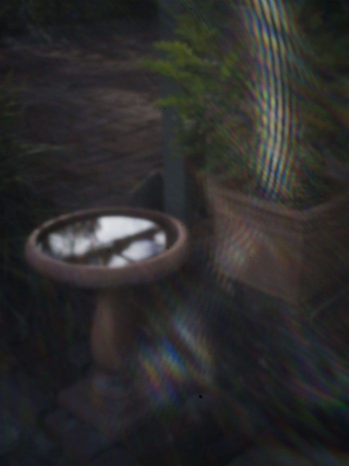
Bird bath by Victoria Cooper
.
ABOUT VICKY’S PINHOLE IMAGE:
.
Each day birds of all sizes come to drink from this and it is shared with the two cats who live here too… It is the driest April on record in this region of Australia.
The photo was taken with the intention of capturing the sun flare. Digital capture with hand-made hole on an Olympus EP5 on manual setting.
.
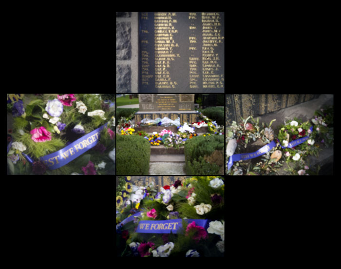
Lest we forget – April 25th by Doug Spowart
.
ABOUT DOUG’S PINHOLE IMAGE:
.
Each year on April 25 Australian and New Zealand peoples commemorate ANZAC Day in recognition of the sacrifice made by soldiers from our country in the First World War. Floral tributes are laid at memorials all over the country. The message on most wreaths is the phrase ‘Lest we forget’.
The photomontage is made up of 5 images – each photo was taken on an Olympus EP5 digitally with a hand-made pinhole.
.
Olympus Pen with hand pierced aluminum foil hole, Aperture exposure mode, ISO 800.
.
.
Visit the WPD Site for details of other posted: http://pinholeday.org/
.
Our Past WPD images:
2016 Doug: http://www.pinholeday.org/index.php?id=1235
2016 Vicky: http://www.pinholeday.org/index.php?id=1540
2015 https://wotwedid.com/2015/05/04/april-26-worldwide-pinhole-day-our-contributions-for-2015/
2014 Vicky’s http://pinholeday.org/gallery/2014/index.php?id=1810&City=Toowoomba
2014 Doug’s http://pinholeday.org/gallery/2014/index.php?id=1811&City=Toowoomba
2013 https://wotwedid.com/2013/04/29/world-pinhole-photography-day-our-contribution/
2012 http://www.pinholeday.org/gallery/2012/index.php?id=1937&searchStr=spowart
2011 http://www.pinholeday.org/gallery/2011/index.php?id=924
HERE IS THE LINK to the 2011 pinhole video http://www.youtube.com/watch?v=Yk4vnbzTqOU
2010 http://www.pinholeday.org/gallery/2010/index.php?id=2464&Country=Australia&searchStr=spowart
2006 http://www.pinholeday.org/gallery/2006/index.php?id=1636&Country=Australia&searchStr=cooper
2004 Vicky http://www.pinholeday.org/gallery/2004/index.php?id=1553&Country=Australia&searchStr=cooper
2004 Doug http://www.pinholeday.org/gallery/2004/index.php?id=1552&Country=Australia&searchStr=spowart
2003 http://www.pinholeday.org/gallery/2003/index.php?id=615&Country=Australia&searchStr=spowart
2002 http://www.pinholeday.org/gallery/2002/index.php?id=826&Country=Australia&searchStr=spowart
.
.
A Spectrum: Photobook to Artists’ Book
About 4 years ago during post doctoral research I was involved with at the State Library of Queensland as a Siganto Foundation Research Fellow. I submitted a paper concept to a call-out for contributions to a major book on photobooks being prepared by a significant contributor to the international photobook discipline at that time. Unfortunately the publishing project was never realised and the essay did not enter the critical discourse on photobooks.
Recently there has been much discussion about terminologies in photobooks and some aspects of the artists’ book are beginning to blur. I passed the paper on to a UK PhD candidate who found interest in the discussion that I raised and suggested that I self-publish the essay.
So here it is…
.

Spectrum
. A Photo Spectrum: Photobook to Artists’ Book
.. [DRAFT@January 21, 2015]
The contemporary popularization of the ‘photobook’ is arguably attributed to the three published commentaries that have become seminal texts on the subject, the first of which: The Photobook: A History Volume I was released in 2004 by photographer and photobook maker Martin Parr, and photo historian Gerry Badger. Commentator and photographer Tim McLaughlin observes: ‘The term “photobook” which never really existed before Parr and Badger (most dictionaries still do not recognize it), would, within a few years, come to identify a growing industry…’(McLaughlin 2013). Interest in the photobook has never been greater. Digital technologies have emancipated photography and book publishing and now anyone can take photos and make their own photobooks. Accompanying this publishing revolution are awards, ‘books of the year’ lists, catalogues, and an auction market. Specialist online and bricks-and-mortar bookshops now service an ever-increasing buying and collector market.
Although photobook publications have aesthetic definitions for what a photobook is, the term has a lot of ground to cover. Photography writer and teacher David Campany recently noted in Aperture’s Photobook Review that: ‘The compound noun ‘photobook’ is a nifty little invention, designed to turn an infinite field (books with photographs in them) into something much more definable’(Campany 2014). But while the ‘infinite field’ may be ‘easily defined’ the term photobook can only serve as a generalised umbrella for the plethora of photobook products that shelter under it.
The definition of photobook today could include a roughly printed or photocopied zine-like object created by a child, to a blatantly over-designed limited edition book. In between these bookends lies a range of products: Print-on-demand and hand-made unique state, small editions, self-published or bespoke books, ephemeral items, newspapers, pamphlets and zines. Although many of these published forms may not have the universal distribution and commercial opportunities afforded a trade published book, they are, none the less, part of the broad practice of the contemporary photobook. Additionally many of these books occupy much of the emergent contemporary scene and tend to be overlooked as the critical discussion is usually focussed on the photobook exemplars from the past.
The boundaries of the photobook discipline are blurred by their intersection with a variety of other book genres including the expansive mediums of artists’ books and zines. As independent publishers of books, artists have for over 100 years communicated their ideas and stories using their chosen media in book form. Artists have embraced photography and the various forms of photography from found collaged photos, to screen-printing, photo etching and gravure, as well as actual silver gelatin, type C, inkjet or laser prints in their artists’ book works. Anne Thurmann-Jayes commented in the catalogue for ars photographica, an exhibition about artists and photographers and their photobooks, that: ‘In very general terms, it is possible to say that half of all artists’ books produced to date have been based on photographs’ (Thurmann-Jajes 2002:19). For that reason any discussion of the photobook needs to consider a broader range of contributors to the discipline as well as other forms of the book where photographs act as carrier of the visual communiqué.
In her essay Thurmann-Jajes also comments on the differences that she felt existed between the artist and the photographer in conceptual aspects of making a photobook. She states that:
The authors of photo books followed photographic tradition, according to which the photograph as such was decisive, becoming the bearer of meaning… By contrast to the photo book, the artists’ book is not the bearer, but the medium of the artistic message. (Thurmann-Jajes 2002:20)
In highlighting the differences in the way the photograph is used and considered by these two groups, Thurman-Jajes has identified a division may have always existed between the photographer and the artist using photography. Yet making books with the photograph as a ‘bearer of meaning’ or ‘message’ should not belong to any particular practitioner. If the photograph is therefore a universal and an open medium for all book makers then any questioning on what is and what can be a photobook requires consideration that embraces this diversity.
To ensure that the photobook remains vibrant and relevant, a flexible space for discourse and critique needs to be created that is inclusive of the broad range of authors and book forms in this medium. In 1998 artists’ book librarian, collector and curator Clive Phillpot suggested a metaphor for the artists’ book discipline as being ‘white light’ and the individual colors that made up white light as being the ‘many categories of the spectrum’ representing the broad nature of the practice. In this essay Phillpot’s ‘white light’ metaphor is now applied to the range of published forms that employ or contain photographs beyond that of the artists’ book. (Phillpot 1998:38)
Through an extension of Phillpot’s prism, this essay will propose a grouping of the various forms of the book from photobook through zines to artists’ books and their salient characteristics using individual colors (wavelengths of light). As the visible light spectrum has a rainbow of seven visible colors this proposition has seven as well. Although two additional ‘colors’, familiar to photographers, that of infrared and ultra-violet, have been added to recognise specific aspects of photography publishing at the extreme ends of the range. Each color and book form has specific characteristics and identifiers associated with it – it is recognized that many books may challenge attempts to place them within just one color in this spectrum.
The transition from the infrared to ultra-violet intentionally locates those books conceived and produced by photographers at the warmer end of the spectrum. Book forms in the cooler end of the spectrum would be principally books made by artists using photography. Placement within this spectral framework may create some interesting challenges including the divisions of ‘artist’ and ‘photographer’, and how practitioners describe themselves and their creative products.
The 9 colors and their identifiers are:
Infrared – The Deluxe Photobook
- A book of monumental proportions approaching what bibliographers and librarians call ‘double elephant’ (up to 78cm tall for Helmut Newton’s Sumo);
- Usually consists of a monograph styled ‘best of’, or, of a tightly thematic subject matter by a particular photographer;
- Are limited editions, expensive to buy and have limited markets that center on private collectors and institutions; and
- Are usually commissioned by a small number of specialist art publishing houses as opulent objects of art, design and packaging.
An exemplar:
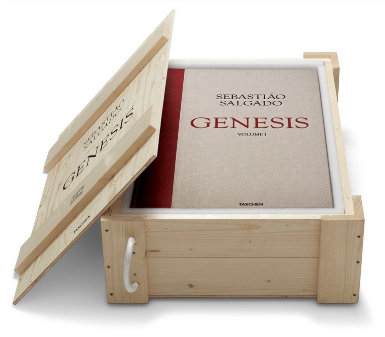
Genesis, Sebastião Salgado, Taschen
Genesis
Sebastião Salgado, Taschen, Hardcover, 2 vols, with bookstand, 18.4 x 27.6 in., 704 pages, £ 2,500. https://www.taschen.com/pages/en/catalogue/photography/all/02613/facts.sebastio_salgado_genesis.htm
Viewed: April 6, 2018
Red – The ‘Classic trade’ Photobook
A book form in the tradition of Walker Evans’ American Photographs (1938), William Eggleston Eggleston’s Guide (1976), Robert Frank’s The Americans (1959), and John Gossage’s The Pond (1985). Characteristics of these books may include;
- A single photograph per opening, the facing page blank and may sometimes contain a title or caption;
- Sometimes it is a book co-published with an exhibition of the same title;
- Simulation of the gallery experience of viewing photographs and therefore is sometimes referred to as an ‘exhibition in a book’;
- Images in these books are carefully and purposefully sequenced to carry the narrative intended by the author; and
- An essay relating to the work by the photographer, curator or writer often accompanies this book form – occasionally the essay may be of an obtuse content.
An exemplar:
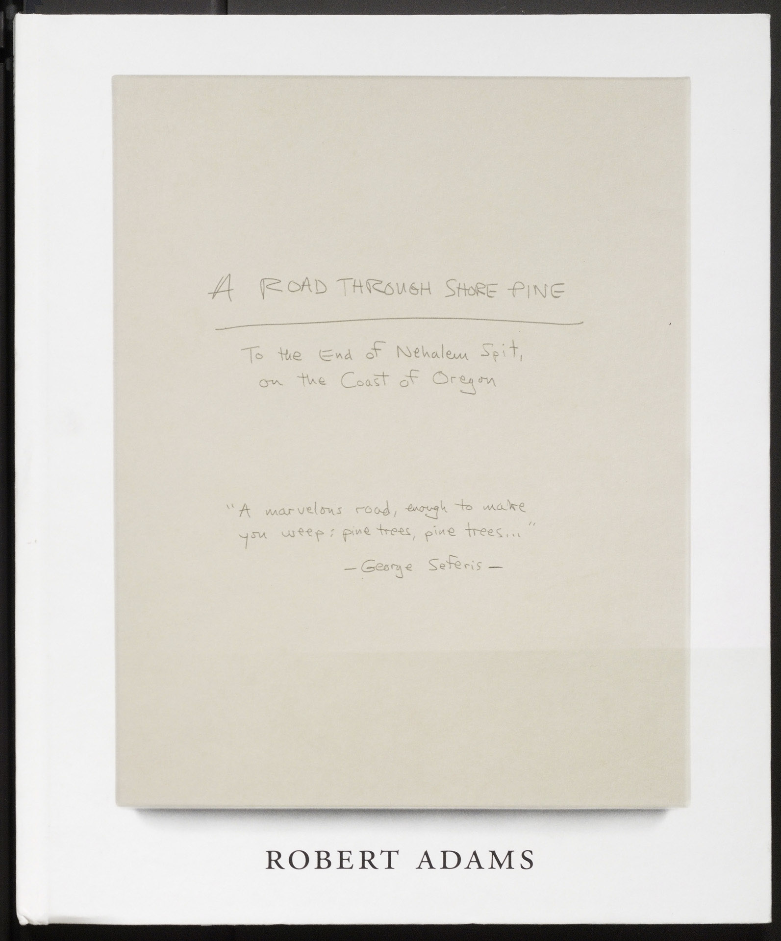
A Road Through Shore Pine, Photographs by Robert Adams
A Road Through Shore Pine
Photographs by Robert Adams. Fraenkel Gallery, 2014. 42 pp., illustrated throughout, 9¾x11¾”. http://www.photoeye.com/bookstore/citation.cfm?Catalog=DS364
Orange – Design Photobook (collaboration)
The authors of this form consider that photobooks are an experience that can be enhanced by the influence of creative graphic design that may include:
- Usually is a collaboration between the photographer and a designer so as to transform the photographs into a strident work of visual communication;
- The presentation of photographs over double pages, or being montaged, or printed full-bleed as well as being scaled variably;
- Inventive typography and layout design enhancements;
- High quality book production, printing, finishing and packaging; and
- A differentiation from other photobooks by the inventiveness of the design features and the surprise that is encountered by the reader in engaging with the physicality of the book and how it operates as a communicative device.
Exemplars:
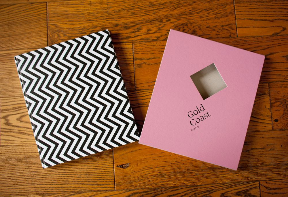
Gold Coast, photography by Ying Ang, co-designed with Teun Van Der Heijden
Gold Coast, photography by Ying Ang, co-designed with Teun Van Der Heijden
Self-Published, 2014. 132 pp., 72 color illustrations, 9½x11¼”.
http://yingangphoto.com/page.cfm?id=34&subid=121
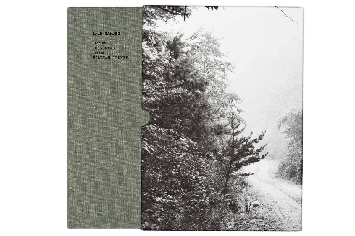
Iris Garden, photography by William Gedney and designed by Hans Seeger
Iris Garden, photography by William Gedney and designed by Hans Seeger
63 pages plus insert, 6.75 x 9.5 in. Heavy softcover with wraps & slipcase,
Little Brown Mushroom, 2013, in an edition of 1,000.
http://www.littlebrownmushroom.com/products/iris-garden/
Yellow – POD Photobook
- These books are usually self-published;
- They may emulate bookstore trade books from simple booklets to grand coffee table tomes;
- They can be produced by anyone with minimal photography and computer skills and just require access to online photobook-service providers;
- Single book or multiple copies can be made;
- Affordable pricing considering the sophistication of the product;
- POD services generally utilize templates for ease of use by clients of limited skill;
- POD books may have designer input, but due to the limited range of options for special finishing or designed-in features; and
- Many POD book users create book ‘dummies’ that may lead to a more trade-based publication at a later stage.
For exemplars see works offered in the photography category of http://www.Blurb.com.
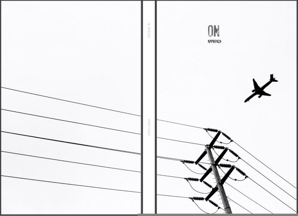
On Approach by Daniel Milnor, BLURB Book
On Approach by Daniel Milnor, BLURB Book, 13x20cm, 26 pgs
http://www.photoeye.com/bookstore/citation.cfm?Catalog=ze462
http://www.smogranch.com/2012/09/26/cleveland-musuem-of-art-diy-photobooks/
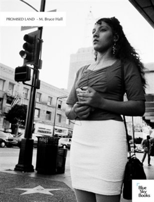
Promised land by M Bruce Hall
Promised land by M Bruce Hall, Blue Sky Books/MagCloud. Standard 8.25″ x 10.75″. 56 pages, perfect-bound.
http://www.magcloud.com/browse/issue/815317
Green – Emergent – PhotoStream* [of Consciousness], Photozine*or Insta-photobook*, Imagistbooks*
This aspect of photobook publishing is occupied by a large number of DIY practitioners accessing a range of print technologies from desktop inkjet and laser printers to affordable digital press printing and binding technologies. Content of these books could be considered a visual form of imagist or concrete poetry – they exhibit and subject and assembly sensibility that could match ‘stream of consciousness’ approaches to art. Other aspects include:
- Usually self-authored or collaborative publications;
- Are made in limited numbers/editions, often hand sewn or stapled;
- The books are sold through specialist popular culture bookshops or online;
- Often these books may be the result of crowd sourced funding and may be derived from online image storage or social media platforms like Instagram; and
- Their locale of popularity and distribution may be regional.
*Names considered to best describe these emergent forms
Exemplar:
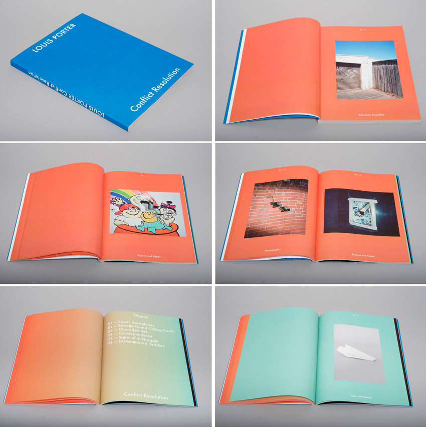
Conflict Resolution by Louis Porter
Conflict Resolution by Louis Porter, published by Twenty Shelves (Melbourne/Australia), 164 Pages full color, Design by Pierre Hourquet, Section sewn paperback with de-bossed cover, 20 x 27 cm, Edition of 1000.
http://louisporter.com/twenty-shelves/
Blue – Photopapers* Photomag* (broadsheet / newspaper / magazine)
These emergent photobooks take their physical form and production values from conventional print media. Other aspects include:
- Availability through POD service providers;
- Print runs may be small and limited or quite extensive of 1,000 copies or more;
- These works may parody existing newspaper or magazine titles as a form of activism or commentary on print media and society; and
- They may provide a photographer with a larger-scale publication format at a low production cost.
*Names considered to best describe these emergent forms
Exemplars: Photopaper
LBM Dispatch #7: Georgia photography by Alec Soth and Brad Zellar, designed by Meredith Oberg
LBM Dispatch #7: Georgia photography by Alec Soth and Brad Zellar, designed by Meredith Oberg
Little Brown Mushroom, Publication Date, November, 2014
48 pages 11.25 inches x 15 inches, 50 lb newsprint paper, Edition of 2000
http://www.littlebrownmushroom.com/products/lbm-dispatch-7-georgia/
Exemplar: Photomag
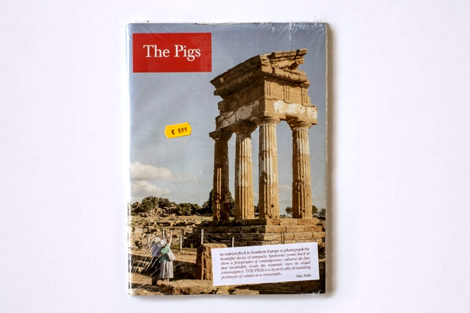
PIGS Photography by Carlos Spottorno, designed by Carlos Spottorno and Jaime Narváez
PIGS
Photography by Carlos Spottorno, designed by Carlos Spottorno and Jaime Narváez based on a replica of The Economist magazine.
Published by: RM Verlag and Phree, Madrid, 2013
112 pages 27 x 19 cm
http://spottorno.com/web/pigs
Indigo – Innovative Artists’ Book
This genre of the book is based around the idea of the artist as author, publisher and maker, and forms of the book that represent innovation, creativity and exploration of the book form. Historically this book form has been the domain of the artist and the way photography finds its way into the book can be more about the photo as a record, a fact or a trace representing the world and society that created it. Rather than something representing the passion that photographers have for the photograph as the product of their special visual perception of the world. Characteristics of these books include;
- Forms integral to the narrative expression and the artist will break rules and conventions to achieve their expectations for the book;
- Books engineered in ways that demand interaction, both through the visual senses but also through the haptics of handling and reading – the turning of pages;
- Books that may mix photographs and text or text over photographs, or text as photographs and photographs as text;
- Multi-media productions where the photograph becomes a part of a larger interplay of media; and
- Bespoke unique state or a work that is published as a limited edition.
It should be noted that the artists’ book discipline might encompass an equally diverse range of book forms
Artists’ Book exemplar:
Eleven, Marshall Weber et al.
Eleven, Marshall Weber 1960- ; Christopher Wilde; Sara Parkel; Alison E Williams; Isabelle Weber; Booklyn Artists Alliance. New York : Booklyn :c2002
http://www.booklyn.org/artists/Marshall%20Weber.php
Violet – ‘Artists’ Book’ Codex
Related to books that utilize the conventional codex form and may explore the narrative form, conceptual art ideas as well as artmaking techniques. These books may exhibit the following characteristics:
- Codex book form;
- A range of production values including artisan printers and binders;
- Contain texts as well as graphic elements and photographs; and
- Printing techniques such as silkscreen, photoetching and gravure, inkjet, digital press and alternative imaging techniques like cyanotype.
An exemplar:
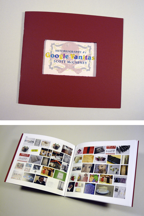
Google vanitas : autobiography # 7 concept and design by Scott McCarney
Google vanitas : autobiography # 7 concept and design by Scott McCarney.
16, [2] p. : col. ill. ; 22 x 20 cm.
http://scottmccarneyvisualbooks.com/Pages/google%20vanitas.html
Ultra-Violet – ‘Book Arts’, Livre d’Artiste Book
Consistent with the production and aesthetic values of the ‘fine press’ with the following characteristics:
- Texts are usually handset letterpress, photographs made by traditional photo etching or gravure techniques and binding and presentation in cloth and leather often with ‘book arts’ embellishments;
- The books are limited editions and utilize artisan practitioners and specialists in the production of the work;
- Often the book may be commissioned by an entrepreneurial publisher following the French tradition of the latter 19th century; and
- These works are expensive to buy and have limited markets that center on private collectors and institutions.
An exemplar:
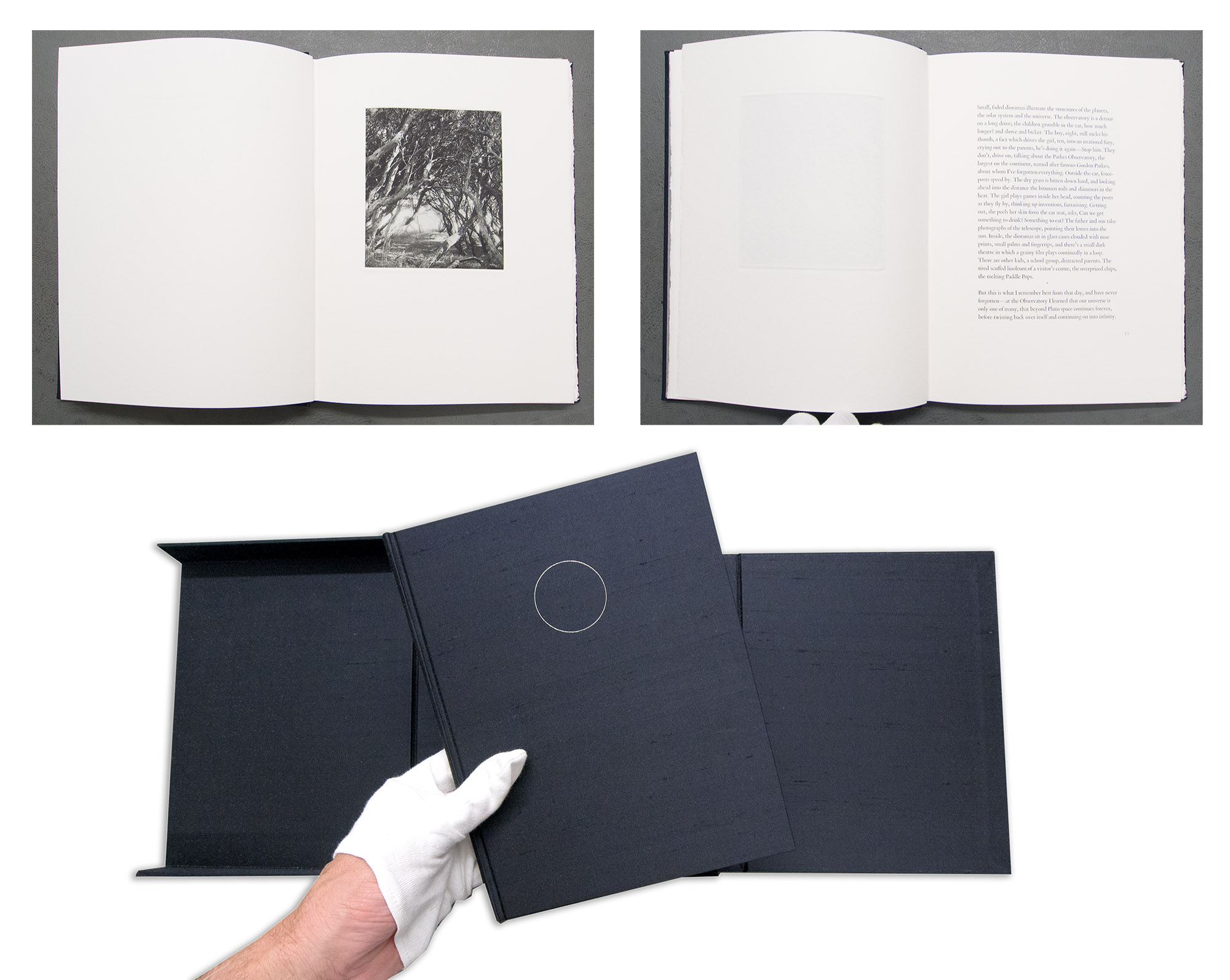
Extinguishing of stars Carolyn Fraser and Holly Morrison
Extinguishing of stars Carolyn Fraser and Holly Morrison
Idlewild Press, Cleveland, Ohio :2003. 61 p. : ill. ; 24 cm., in case 26 x 20 x 4 cm. Edition of fifty.
https://thedesignfiles.net/2011/03/interview-and-studio-visit-carolyn-fraser-of-idlewind-press/
http://www.carolynfraser.com/wp-content/uploads/2011/11/Issue4_Uppercase_Fraser.pdf
In any attempt to define creative book publishing caution needs to be exercised. The artists’ book discipline has for years been dogged by attempts to define ‘what is, and what isn’t an artists’ book’. In 2005 Johanna Drucker put forward a proposal for classification of artists’ books. Even though she predicted that her proposition would ‘… cause strife, competition, [and] set up a hierarchy, make people feel they are either included or excluded’, (Drucker 2005:3) it inspired worldwide debate and furore from artists and librarians and became known as ‘Druckergate’. Ultimately the angst cooled and the artists’ book field continued with qualified debate, in both academic literature and everyday conversation, thus creating a basis for ongoing questioning and commentary on the discipline.
More recently, in 2010, Sarah Bodman and Tom Sowden from the Centre for Fine Print Research at the University of the West of England sought to define the canon for the artists’ book in the 21st century. They did this by creating a survey of world practitioners of bookmaking by artists in every conceivable outcome, including the emergent eBook. They found that the hierarchical form of a tree diagram was ‘too rigid and too concerned with process’ (Bodman and Sowdon 2010:5). They discovered that their respondents wanted to alter the diagram to satisfy the, ‘cross-pollination that is often required by artists’ and added in, ‘connectors across, up and down to bring seemingly disparate disciplines together.’
Just as Bodman and Sowdon found from their research, this visual spectrum structure is open to challenge where practitioners and commentators are encouraged to mix and augment new color palettes for the presence of the photograph within the book. So what is proposed is not a rigid structure, deeply rooted and immovable as in the tree trunk, branch and leaf, but rather one where books of similar characteristics can be grouped, blended and mixed.
The intention for this nomenclature is to bring visibility to the diversity of creative publishing forms using the photograph. It is offered as a potential tool that recognises this evolving and extended medium to: curators, judges, cataloguers preparing ‘the best books of the year’ lists and books for sale or auction, and commentators engaging in critical debate. Additionally the links with artists’ books and zines can also be acknowledged thus extending and enriching the discipline of the photobook.
In the debate surrounding the evolving photobook this photo-specific spectrum analysis is offered, as a non-hierarchical, flexible and creative nomenclature. The spectrum should be able to move with change and developments within the photo in the book and the ideas and the motivations behind those who create these communicative devices and their commentators and readers. Each constituent of the spectrum, although emanating its own ‘wavelength’ or ‘color’, forms a part of the “white light” that is the continuum of the photograph and its place in the book.
Dr Doug Spowart[1]
January 2015
.
Bodman, S. and T. Sowdon (2010). A Manifesto for the Book: What will be the canon for the artist’s book in the 21st Century? T. S. Sarah Bodman. Bristol, England, Impact Press, The Centre for Fine Print Research, University of the West of England, Bristol.
Campany, D. (2014). “The ‘Photobook’: What’s in a name?” Aperture: The Photobook Review(#007).
Drucker, J. (2005). “Critical Issues / Exemplary Works.” The Bonefolder: An e-journal for the bookbinder and book artist 1(2): 3-15.
McLaughlin, T. (2013). “Classic – The Photobook: A History Vol 1.” Retrieved 17 June 2014, 2014, from http://imageonpaper.com/2013/05/17/131/.
Phillpot, C. (1998). Books by artists and books as art. Artist/Author: Contemporary Artists’ Books. C. Lauf and C. Phillpot. New York, D.A.P./Distributed Art Publications Inc.
Thurmann-Jajes, A. (2002). ars photographica: Fotografie und Künstlerbücher. Weserburg, Bremen, Neues Museum
[1] This essay is informed by an ongoing and long term personal interest which involved a practice of making, observing and considering the position of photographs published in the creative book realm along with recent research into the intersection of photobooks, zines and artists’ books.
.
TEXT © Doug Spowart 2018
Most of the images in this post are from the promotional websites for the books and some are by the author – copyright resides with the authors and the images here are used for the purpose of review and commentary. Source links are provided for the reader’s connection with the publication under discussion.
.
.
.
.
.
IAN POOLE photographer: eulogy

Poole by Poole 2006
IAN POOLE photographer: eulogy by Doug Spowart
I was over in Wellington New Zealand attending the Photobook NZ conference when our mutual friend Simon Woolf came to tell me that Ian had passed away. Vicky and I had visited Ian and Louise at the Mater Hospital a couple of weeks ago and while Ian was in a difficult place we shared some past experiences. We spoke excitedly about how Ian came out of hospital recently to open ‘Floating’ at Woolloongabba Art Gallery. It was an important occasion as the exhibition featured work by his long-term friends Glen O’Malley and Yoshiteru Asai as well as artworks by Yayu, Ken Yamane’s grand-daughter.
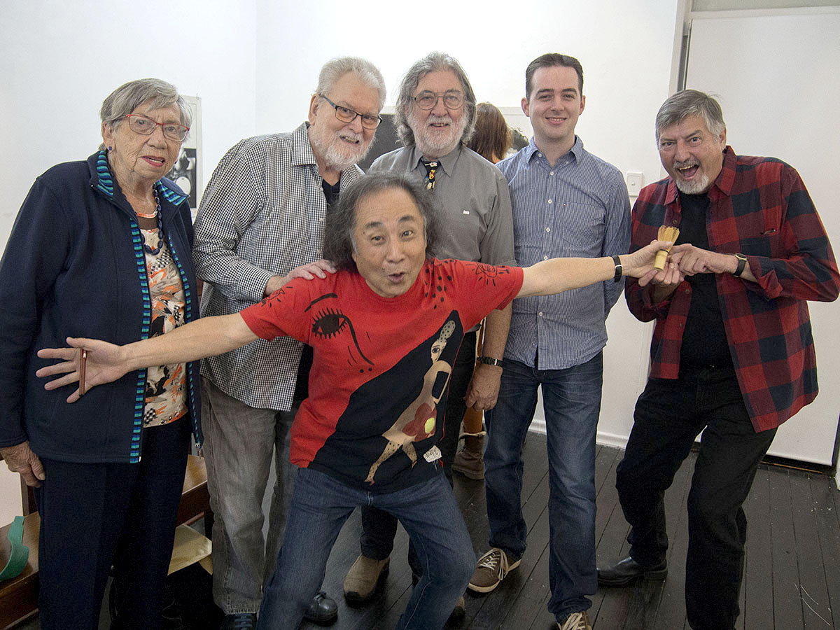
Ian Poole, Glen, Ruby, Asai, Joe and Doug at the opening of Floating
Ian Poole and I shared quite a chunk of history – On hearing the news whatever I was to do that day in Wellington, and my flight home to Brisbane, my thoughts were with Ian, Louise, Nicola and Denise. What follows is a fragment of our connections and things that I remember about the guy…

Pinhole portrait of Ian Poole 1993 by Doug Spowart
My earliest memory of Ian was in the mid 1970s when I met him as an employee of Kodak in Brisbane. Ian had formed a commercial photography partnership with Greg Minns and I served him in my early sales position behind a wholesale warehouse counter in the Fortitude Valley head office. Over time I was to learn of Ian’s pre-commercial work as a part-time wedding photographer for some of Brisbane’s significant studios.
Ian Poole went out on his own in 1976 with the business name ‘Ian Poole does Photography’. He shared a studio in an old church in Warren Street, Fortitude Valley with commercial photographer and AIPP devotee and then Federal President David McCarthy. From there good wine, cigars and Fiats were funded through a diverse range of commercial commissions.
Ian and Denise were married and soon after Nicola was born. A long-term relationship with documentary/art photographer Glen O’Malley strengthened along with his interest in photography beyond the ‘job’ – for him photography was more than just what you did to earn a living.
Ian Poole and the IAP and the AIPP
Ian joined the Institute of Australian Photography (now AIPP) in 1975. An interesting bit of information about Ian is that he entered the very first Merit Awards (APPA) in 1977, and was awarded a Merit for a high contrast photo of a fuzzy hairstyled, seated, saxophone player. I remember that photo well.
In reflection, I always remember Poole being involved with the AIPP in some capacity either at state division level and in the late 1980s on the National Board. During the 1980s I served with Ian on the Queensland Divisional Council and remember many council meetings at Imagery Gallery that finished with us discussing the meaning of life and photography. Together, we also contributed to the development of education and training for photography in Queensland and served on many Arts Industry Advisory Council and Curriculum development committees.
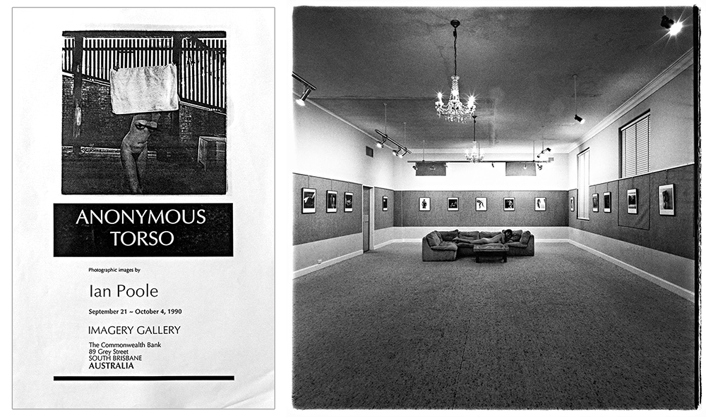
Anonymous Torsos exhibition at Imagery Gallery 1990
Early exhibitions of his work
His interest in personal photography, and in particular the female nude, led to his work being presented in exhibitions. In 1984 I curated an exhibition entitled ‘5 One man shows’ in Stephens Gallery in the Brisbane City Hall, which included a selection of Ian’s nudes. Later in 1990 his first solo exhibition ‘Anonymous Torsos’, was held in Imagery Gallery (a gallery run by myself and my mother Ruby). He also participated in many group shows in galleries in Australia and Japan.

Doug Spowart and Ian Poole with the poster for Shot from down under PHOTO: Victoria Cooper
The Japanese connection
Ian made connections with Japanese photographers through his co-ordination of AIPP events in the early 1980s. This led to an exhibition of 13 photographers organised by Ian and hosted by artist Rick Everingham in his Brisbane studio during Expo 88. Poole followed up this exhibit with an exchange show, ‘A shot from down under’ at Design Expo in Nagoya, Diacolo Gallery in Osaka and amazingly in the Kodak Salon, the Ginza, Tokyo. Ian coordinated a tour for the participating Queensland photographers who spent about 3 weeks in Japan travelling with the exhibition, attending the openings, staying with the Japanese photographer’s families and experiencing Japanese life and landscape.

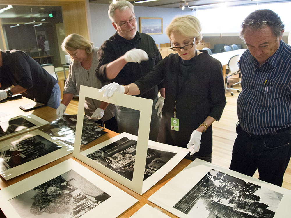
Poole+Spowart at QCP: Photo Adam Finch
Working for the Queensland Government
By the early 90s photography was changing and the Queensland Government reviewed all their departments that had employed staff photographers. They decided that only 3 photographer positions would be funded into the future. The 3 positions were advertised in the public domain and Ian, not only applied, but also won a position. It should be noted that Ian around that time completed by part-time study a Graduate Diploma of Visual Art at the Queensland College of Art. The topic of his research was portraits of artists.
Australia Council Residency and sessional teaching
Poole’s interest in the art of photography needed to be pursued alongside the day-to-day grind of professional work. After completing the Graduate Diploma he sought and was awarded and Australia Council Artist in Residency in Tokyo where he immersed himself in his passion for portraiture and Japanese culture.
Ian Poole and photobook made in a workshop with Simon Woolf with Vicky and I in 2005
Ian’s assistants, peers and mentorees
Ian always had assistants, mentored those seeking advancement of their skills, as well as sessional teaching at the Queensland College of Art and the Queensland University of Technology. His endorsement of professional practice meant that through his patronage and support many of the Institute’s significant photographers came into the AIPP fold.
Poole and the Australian Professional Photography Awards
Soon after I became Chairperson of the APPA’s in the 1990 I championed the development of judge training and the need for judges to have extended their understanding and appreciation of the art as well as professional practice.
Into this space I brought Ian Poole – he had the ideas, debating skills, knowledge and understanding of art to help with this aesthetic transformation of APPA. His dedication to ensuring that the entrant who made special works, in Ian’s opinion, got a fair hearing. I’ve spoken to many awards entrants, at all levels, and they have a story about Ian ‘going into bat’ for one of their works.
Ian skills as a judge and inspirational speaker were recognised by New Zealand Institute of Professional Photography and he became an Australian judging ambassador for the NZIPP Awards.
Ian Poole and others at Toowoomba TAFE doing final year assessments
Support for TAFE Toowoomba and Nicola’s study
As a teacher in the photography programs at the TAFE college in Toowoomba I was always privileged to have Ian and many other professional photographers and artists carry out the final holistic assessment of student work as well as endorse and support my institution.
Nicola Poole and Doug Spowart
When Ian’s daughter Nicola wanted to pursue photography Ian arranged to bring her to Toowoomba suggesting this is where she needed to be. She enrolled and over the next two years she completed her diploma studies in 2003 with the Graduating Student of the Year Award.
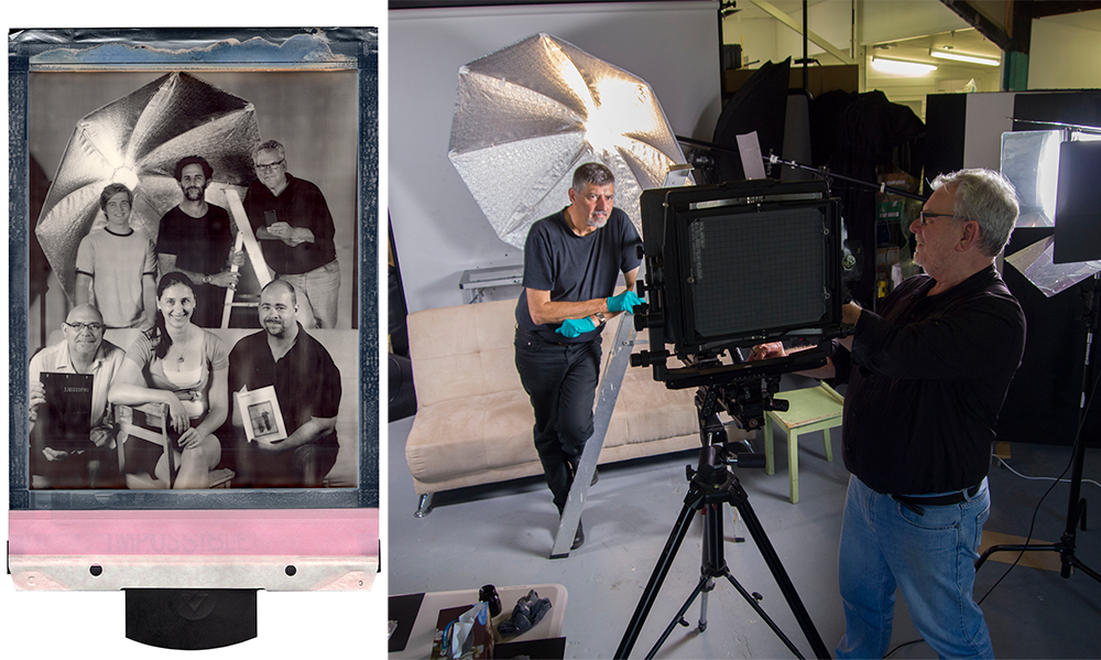
Team Foto Frenzy – an Impossible Project 10×8 Polaroid by Doug Spowart – RHS Ian photographs Doug
Foto Frenzy
When Ian formed Foto Frenzy with a small group of photography identities including Darren Jew, Tony Holden, Cam Attree and Susan Gravina from Brisbane Camera Hire I was honoured to open the enterprise. Later, Vicky and I were invited as Artists in Residence for a month in 2013. While we where at Foto Frenzy we participated in workshops, re-configured the premises into a camera obscura, made 10×8 Polaroid Impossible Project images and held an exhibition of our photobook and image work.
Ian Poole, Diane Byrne and Eric Victor at the State Library of Qld looking at prints by Richard Stringer
John Oxley Library donation
One of many things undertaken by Ian that many may not be aware of is his donation of his professional photography archive to the John Oxley Library at the State Library of Queensland. For quite a few years he has been going into the Library to unpack and catalogue the work so that it can be successfully searched and retrieved into the future. Now much of Brisbane’s cultural history from buildings to fashion, ballet and theatre, portraits of the rich and famous and those curious dated art-directed advertisements of the 1970s and 80s, are there as a document of our times.
I’ve been around professional photography for nearly 50 years and I’ve seen the disappearance of numerous professional photographers and their businesses – but what of their photographs? Lost? – Not Ian’s work, which he has given in an altruistic act for Queenslanders and their history.
In conclusion
I was always fascinated by Ian’s business name – ‘Ian Poole does photography’, we now know he did much more…
At this time I, and many others, will reflect on and remember Ian Poole
– his legacy will continue on in all of us.
Doug Spowart
NOTE: I hope that all this is correct – should their be any errors I am happy to make the corrections
What follows are some published works relating to Ian, some links and some other images…
Ian Poole’s website: https://poolefoto.wordpress.com/

Photo.Graphy Journal: Ian Poole Guest Editor
PHOTO.Graphy Journal – Ian Poole Guest Editor
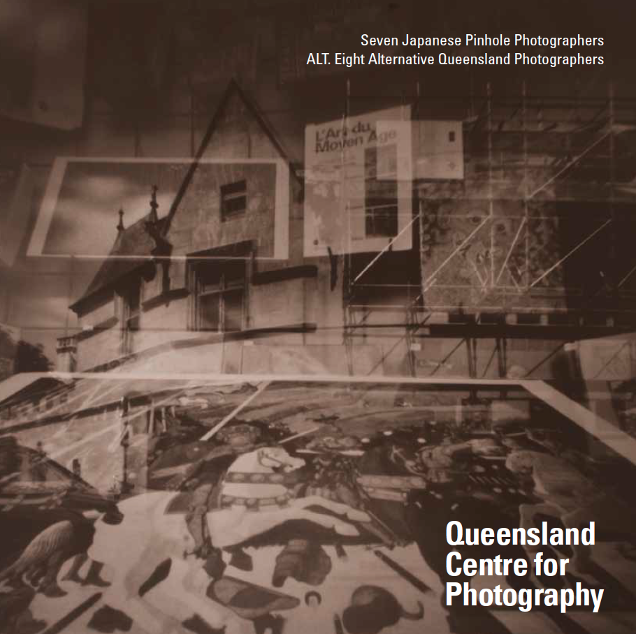
QCP ALT Catalogue — Curated by Ian Poole
Ian Poole curated show at Qld Centre for Photography

f11 Magazine Ian Poole Folio
f11 Online magazine: Ian Poole folio

Ian Poole – On the lounge
https://wotwedid.com/2012/05/17/ian-poole-aipp-on-the-lounge/
Some images by or about Ian…
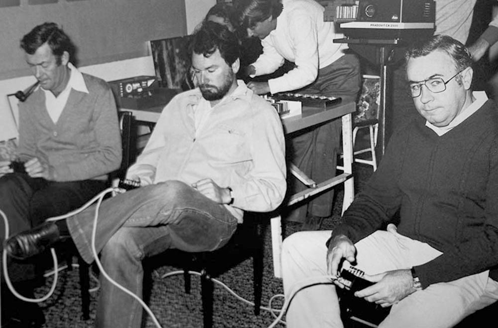
Ian Poole and Kev Hudson judging the 1982 Brisbane National Exhibition of Photography at Imagery Gallery
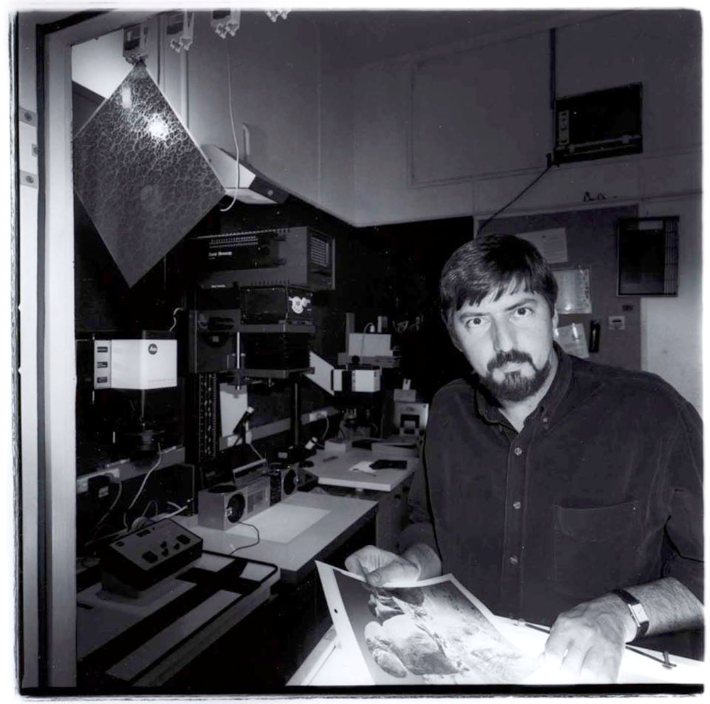
Doug Spowart in Imagery Gallery Darkroom by Ian Poole

Ian Poole moving out of Berry Street
Toula, Ian and Louise at the Photobook Club meeting at the Cobb & Co Museum Toowoomba

Ian and Doug at a Foto Frenzy opening
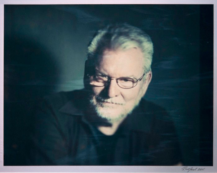
Ian Poole photographed by Wayne Radford at the exhibition End of the roid curated by Doug Spowart
Ian Poole at the opening of ICONS at the Cobb&Co Museum in Toowoomba
A Foto Frenzy opening

The opening of Foto Frenzy
An animated Ian Poole at an AIPP ‘On the lounge’
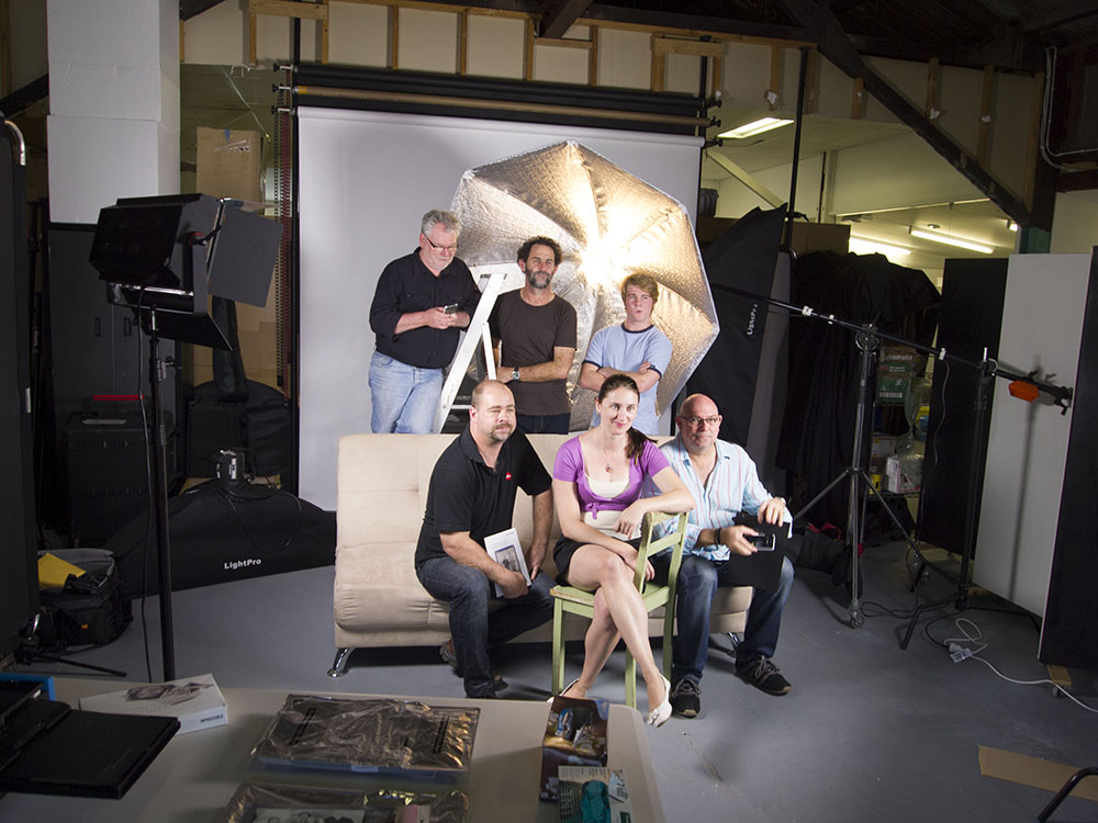
Foto Frenzy Polaroid group setup PHOTO: Victoria Cooper
.
.

Ian Poole, Glen, Asai at the opening of Floating
Farewell Ian….
.
.
.
.
OFFICIAL LAUNCH OF A PHOTOBOOK COMPENDIUM FOR AUSTRALIA & NEW ZEALAND

Cover: A Compendium of Australian & New Zealand Photobooks v.PBNZ
![]()
To celebrate PHOTOBOOK NEW ZEALAND in Wellington over March 9-11 2018, I have published an updated version of my Photobook Compendium that was first issued in October 2017 at the VOLUME ART BOOK FAIR in Sydney.
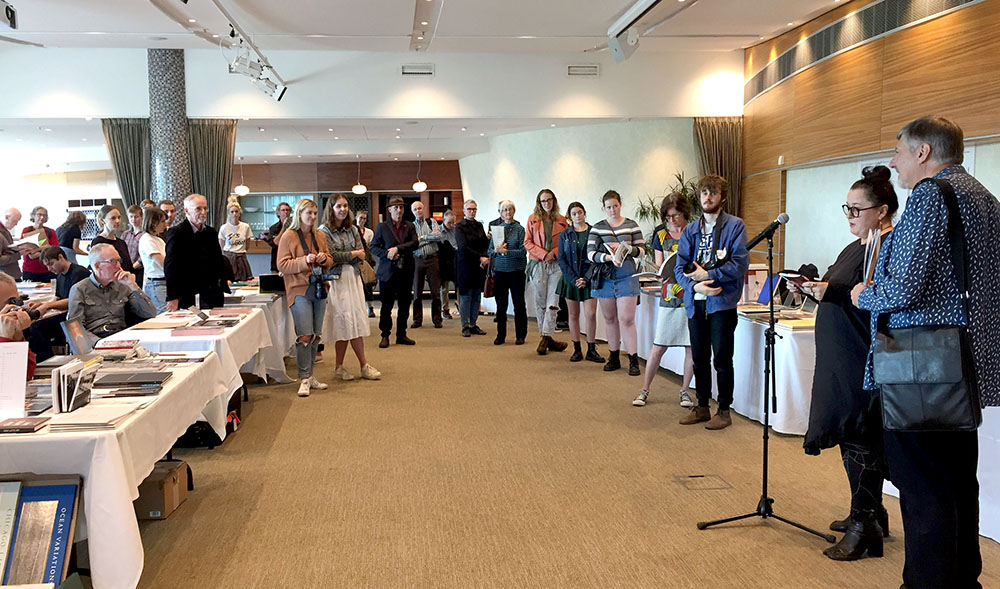
Associate Professor Ann Shelton launches the Compendium @ Te Papa PHOTO: Libby Jeffery
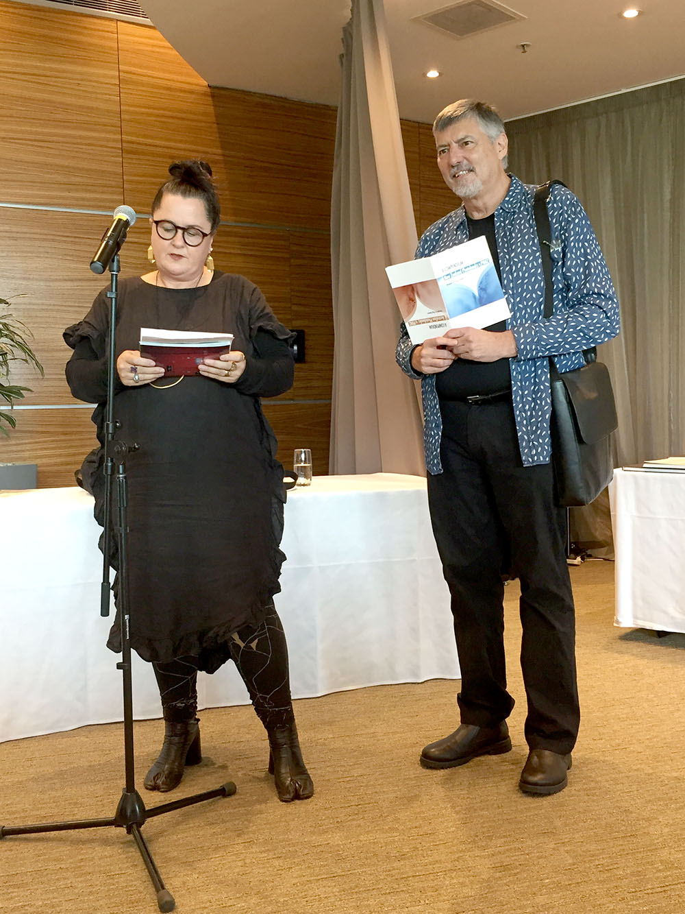
Ann Shelton launches the Photobook Compendium PHOTO: Libby Jeffery
The Compendium is a soft cover 40 page A5 booklet that lists key contributors, both contemporary and historical, to the Australian and New Zealand photobook discipline. Apart from photographer’s names and many portraits I’ve included publishers, designers and book shops.
To extend the coverage of key aspects of the genre I have included visual coverage of significant photobook events and activities as well as portraits of many practitioners. Most of the photographs come from personal documents made in Australia, New Zealand and Vienna of these events.
The book is designed with two covers so both countries have prominence. The Compendium is printed by MomentPro and is a Numbered LIMITED EDITION of 40.
The book was launched at The Museum of New Zealand Te Papa Tongarewa in Wellington by artist and photobook maker Associate Professor Ann Shelton on Saturday 10 at 2.00pm. At the event books will be available through Remote Photobooks.
WHAT’s IN THE COMPENDIUM…?
- Over 400 listings relating to the photobook
- 26 portraits of photobook people
- 50 photobook covers – exemplars of the discipline
- 60 photographs of events
- Australian and New Zealand Photobook of the Year winners list
The book is now SOLD OUT! Although REMOTE PHOTOBOOKS may still have some copies
Some of the pages

The Compendium preface
.
FOREWORD TO THE BOOK
This Compendium does not attempt a definition of the ‘photobook’ – therefore to reflect the breadth and depth of this evolving medium I have considered a range of photo-based products that may include photographically illustrated books, albums, catalogues, photobooks, zines, artists books, text-only references to photography and photo ephemera.
This data and images has been compiled over many years as a result of my interest in the photobook from the historical viewpoint as well as its contemporary phenomenon. I am particularly interested in books where the photograph acts as the principal narrative agent. Additionally I am also drawn to the haptic experience and design of the book and how it operates as a vehicle for presenting ideas and telling stories.
Listed here are names of people and organisations who have contributed (both historically and recently), to the development of photobook discipline. Although most of the listings are from New Zealand or Australian residents and establishments there are some inclusions relating to itinerant or short-lived connections with this region. Some publishing houses listed may be based offshore and have a presence in this region.
I wish to acknowledge the energy and support for Antipodean photobooks provided by Libby Jeffery and the MomentoPro company. Through their patronage and sponsorship they have played a pivotal role in the building of a strong and active photobook community.
This current Compendium is published in a limited edition of 40 on the occasion of the 2nd Photo Book New Zealand Festival in March 2018. Subsequent revised versions will contain new information arising from my ongoing research.
As much of this knowledge lies hidden in personal archives and libraries, I am most interested to receive information about New Zealand and Australian photobooks and the discipline’s community of practice.
Doug Spowart
Email: Greatdivide@a1.com.au
Mail: PO Box 3063, South Brisbane, Queensland 4101, AUSTRALIA
.
.
.
.
.
.
