Archive for the ‘Reviews’ Category
HEATHER FAULKNER’s ‘A Matter of Time’ Exhibition

In Heather Faulkner’s exhibition A Matter of Time
A Matter of Time – Heather Faulkner, Brisbane Powerhouse 26 March–28 April 2013.
Today everyone possesses a camera so by association everyone is a photographer and everyone takes photographs. Evidence of this activity is in all kinds of spaces we inhabit, but of course it is most prevalent in the pervasive and immediate space of online social media. Andy Warhol once exhorted that: ‘In the future, everyone will be world-famous for 15 minutes’, and perhaps the proliferation of photography in Facebook, Pinterest and Instagram has indeed made everyone famous, as some purport, ‘for 15 people’1. The extension of this euphemism could be that ‘everyone may be famous for 15 online photographs.’
But what has all this to do with an exhibition of documentary photographs in suburban Brisbane? Well … for me ‘photography’ in the hands of casual shooters, responding spontaneously to their lives, represents only a segment of the world’s daily dose of photography. Documentary photographers for example, use photography as visual research to inform and create understanding for others. These photographers are usually directed by passion for a particular issue, and driven by the need to tell stories of others and maybe even–of themselves. In this context the act and product of photography transcends the milieu of images and provides us with a deeper connection through the communication of the narrative. This exhibition is from one such photographer.
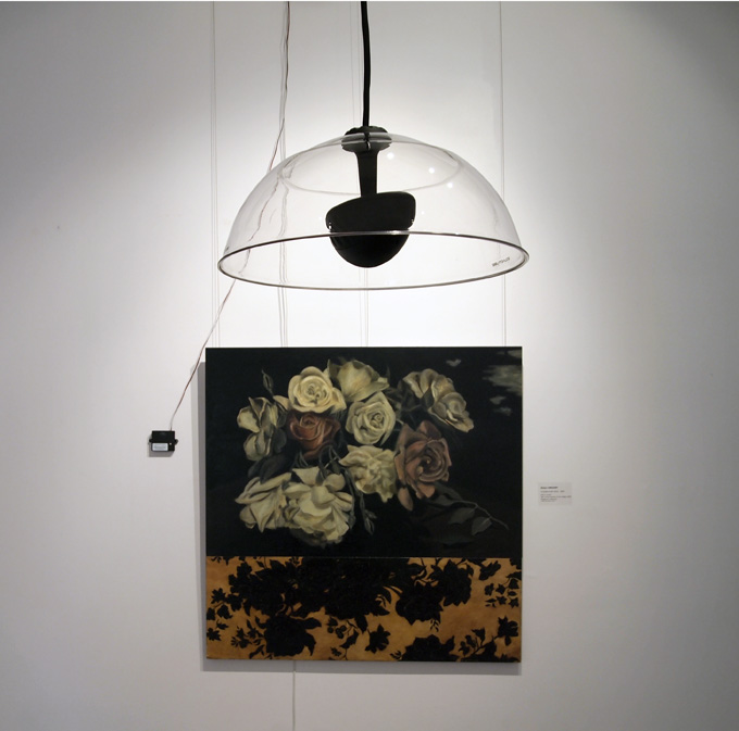
Heather Faulkner’s exhibition A Matter of Time, at the Brisbane Powerhouse, is a charged and evocative statement about the circumstances, situations and legacies of lesbian women living in the state of Queensland. Faulkner documented the lives of eight women and their significant lived experience of the political and social regimes that existed and, as claimed in the exhibition statements, still exists today.
Faulkner’s images take on two separate forms: large format black and white full frame portraits, and colour images of a more documentary nature. In the large portraits the subject’s stare is direct to camera capturing the viewer’s attention in what Faulkner describes as the ‘oppositional gaze’2. They are assertive and declare ‘this is me’. Placed alongside these portraits is the biography and backstory of each woman. For the viewer/reader in this juxtaposition the text and the image creates a silent dialogue. As in the examples of Faulkner’s presentation of Carol Lloyd’s story shown here.
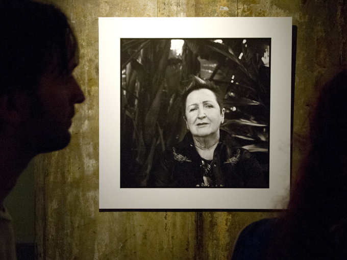
Carol Lloyd – the large portrait. Heather Faulkner’s exhibition A Matter of Time
.
The colour images are extremely intimate and distinctly banal, perhaps exhibiting the photographer’s light touch to aesthetically intervene in the narrative. The subject is imaged engaging in life’s everyday activities: cuddling a family pet, on the couch watching TV, talking with others, arranging things on a bed. The photographic treatment of these photographs is not the sensationalised grainy monochrome, extreme perspective depth and overtly dramatic composition that so often pervades the modern photojournalistic genre. There is a sense of the view being derived from ‘hanging out with friends’, and of the camera as an invisible witness. For me this approach results in authentic and genuine documents.

Carol Lloyd in a reflective moment – Heather Faulkner’s exhibition A Matter of Time

Carol Lloyd as performer – Heather Faulkner’s exhibition A Matter of Time
.
The exhibition also includes historical family snapshots that are presented alongside the recent images. A young child smiles back at the viewer, faded and colour-casted prints and wedding group photographs all add to the story of each subject. To protect the anonymity of people in these images black bands have been placed across faces to prevent recognition. The integration of these photographs extends the exhibition beyond just being about photographs and into the realm of a more complete and provocative social documentary statement.

Carol Lloyd’s personal image history in Heather Faulkner’s exhibition A Matter of Time
.
Ultimately everyone will draw their own conclusions about the women portrayed and the lives that they have lived, or should I say, endured. Faulkner states in exhibition materials that a research report suggests that: ‘Queensland is the most homophobic state in Australia’3. Facilitated through Faulkner’s photographs, exhibition strategies and other products resulting from this work, the stories told here engage with the human face of the weary struggle, of these women’s resilience, and the strength gained by the rewards of living an authentic life.
.
Dr Doug Spowart with a contribution from Victoria Cooper
More on Heather Faulkner: http://heatherfaulkner.com.au/
1 Bell Hooks (1992) The Oppositional Gaze in Black Looks: Race and Representation, Boston: South End Press.
2 http://web.archive.org/web/20061214124420/http://www.hyperorg.com/blogger/mtarchive/004264.html
3 Faulkner’s Artist’s Statement cites Roy Morgan Research (2008-2010)

Heather Faulkner @ the opening
Heather Faulkner’s exhibition A Matter of Time
All exhibition photographs © Heather Faulkner 2013.
Images of the exhibition installation and text by Doug Spowart .
![]()
This work is licensed under a Creative Commons Attribution-NonCommercial-NoDerivs 3.0 Unported License.
NICOLA POOLE’s ‘Lost Girls’ @ Gallery Frenzy, Brisbane
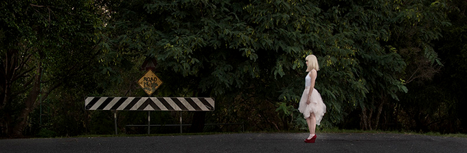
Lost Girls by Nicola Poole @ Gallery Frenzy, Brisbane.

Image from Nicola Poole’s Lost Girls exhibition
.
Excerpts from my opening address:
Doug Spowart opens Nicola Poole’s ‘Lost Girls’ exhibition
This morning on checking my Facebook news feed, there was a message from Darren Jew, of Brisbane’s Foto Frenzy Photography Centre, in which he described the ‘Oh My God’ moment at the age of 12, that inspired his life in photography. That moment was watching a black and white print develop in a tray in a darkroom. I was reminded of my same experience. From other posts there seemed to be quite a few others who were also seduced by the darkroom’s red safelight and its mysterious stinky chemicals.
I posted back to Darren posing the question: ‘how many 12 year olds are out there making digi images today and missing out on that OMG darkroom moment?’ Later, during a conversation with my partner Victoria, we made the interesting observation that in the old darkroom days we ‘MADE’ photographs in every sense of the word. Film was handled in darkness and loaded into tanks–chemicals added, agitation, water washes, hanging up to dry–negatives placed in the enlarger carrier, paper touched and slid into the easel, exposed to light, paper slipped into chemicals, trays rocked… etc. Photography was something that extended well after the shutter was fired. It took time and trouble for an image or two to emerge–made–from the process.
We thought that today with digital photography we just TAKE images–with rapidity and ease. Just click, add a filter effect or two and share. And we may take many, many images. In contemporary image taking the picture has a very transient and superficial value. Quickly taken and distributed they are even consumed faster on social media and quickly lost from view–particularly if you have lots of friends who post with the rapidity of a machine-gun. What is missing today is the time spent with an image realising it as a physical object. Digital imaging is like visual ‘fast food’. We, as consumers, end up fat, lazy and with pixelated indigestion.
What excites me about Nicola Poole’s Lost Girls exhibition is that Nicola has assembled a collection of cohesive thematic image work and formed it into a physical and tangible MADE thing. Over the last week at Foto Frenzy I have witnessed her making this show. Photographs handled, selected and compared, prints emerging line by line from the printer, matted/mounted/framed, placed in the gallery space shuffled–moved, re-ordered and hung. I know that selecting, preparing and presenting work in an exhibition is complex and demanding. The artist embeds their energy and time in it and we the viewers are rewarded in proportion to the care and effort expended in its making.
I congratulate Nicola Poole and applaud her energy, enthusiasm and vision. As a younger girl herself, it is appropriate that she should make photographs the comment on her own experiences and on her generation. As we engage with these photographs questions might emerge: are the subjects looking into memories of the past, or are they facing an uncertain future? These images evoke a sense of, or a time of, waiting–a kind of anxiety or anticipation for something or someone. As viewers we may ponder and be drawn into the narrative.
As to the Lost Girls–What I do know is that in the making of this exhibition, somehow they have all been ‘FOUND’.
And, as Nicola’s first solo exhibition, it is indeed my please to formally announce it open …
Dr Doug Spowart

Nicola Poole and Me

Image from Nicola Poole’s Lost Girls exhibition
.
![]()
This work is licensed under a Creative Commons Attribution-NonCommercial-NoDerivs 3.0 Unported License.
.
COOPER SCROLLS @ Toowoomba Regional Art Gallery
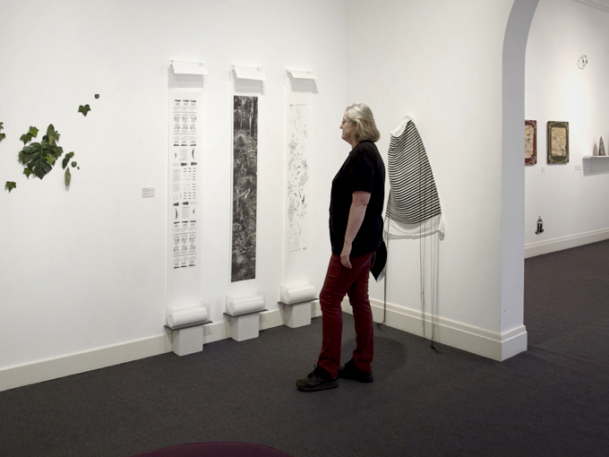
Victoria Cooper in the Off The Wall installation of three scrolls from the series of five
.
ABOUT ‘THE STORIES OF THE GORGE’ ON SHOW @ TRAG
Victoria Cooper’s digital montage Stories from the Gorge scrolls, made over ten years ago were included in Toowoomba Regional Art Gallery show. The exhibition was entitled Off the wall and was on show in Gallery 2 and Amos Gallery in May 2013.
The information about the exhibition that follows comes from the exhibition room sheet prepared at the time by Toowoomba Regional Art Gallery Exhibitions Officer, Ashleigh Bunter:
The works in the exhibition have been selected from the Toowoomba Regional Art Gallery’s City Collection. They have been placed simply together due to their three-dimensional nature and to highlight their derivation from the traditional two-dimensional picture plane.
This exhibition demonstrates the way that artists manipulate physical depth within their works which can often create a greater engagement between the object and the viewer. Interestingly, many of the works in this exhibition focus upon environment, whether it is the natural, public or the domestic environment. Materiality is also a common consideration. Throughout this exhibition one can see the influence of ‘the collector’, artists who gather images or common materials, reusing and reinterpreting them to create their art.
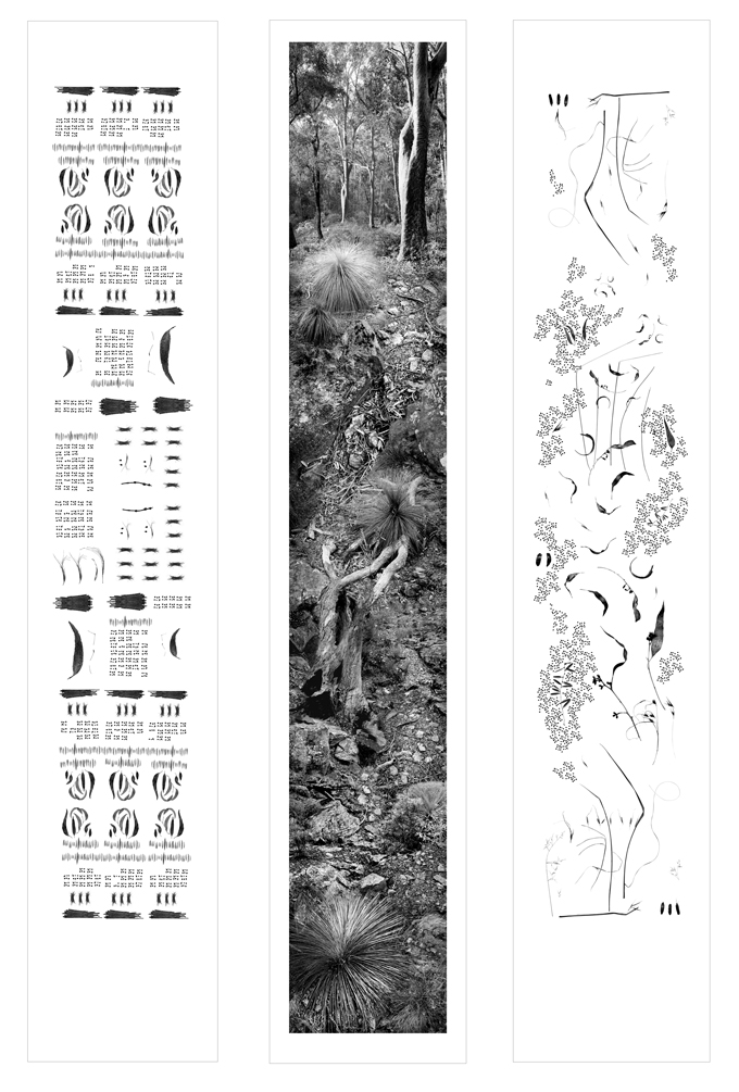
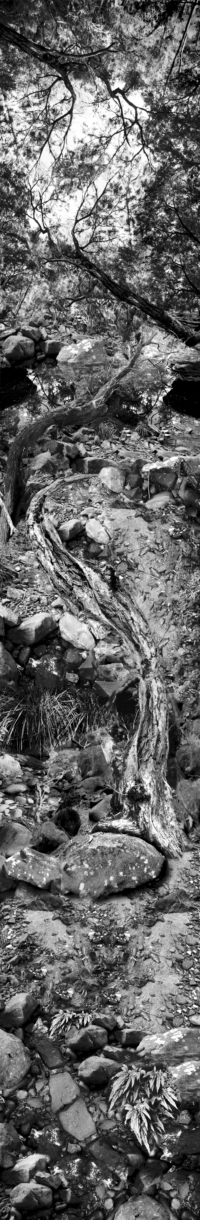
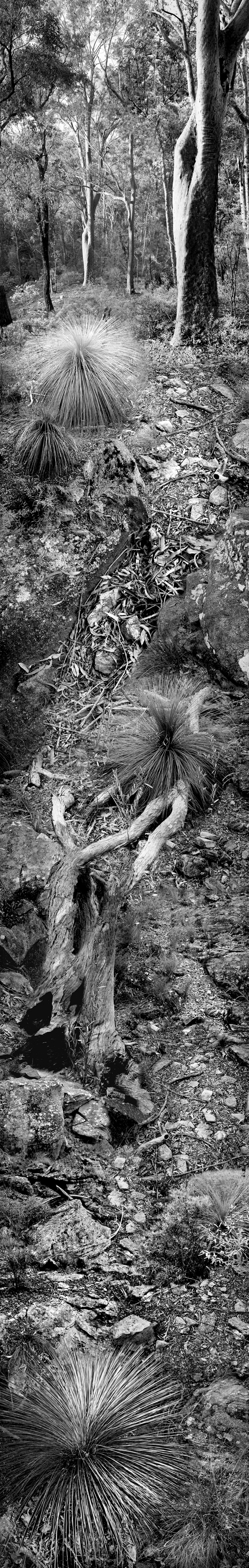
Victoria Cooper’s Stories from the Gorge: Order, chaos and the story of the hillside is a Chinese-landscape-scroll inspired series that represents “the last bastion of a natural chaos and order, an anti-culture, occurring on the fringes of agriculture.”[i] Human effects on the natural environment are central to Cooper’s practice and her prints and artists’ books in various formations lead the view from a flat two dimensional plane into the landscapes she investigates. These printed scrolls rise up from handmade acrylic boxes like the tall gum trees on their surfaces.
Other artists in the Off The Wall show include; Michael Schlitz, Marieke Dench, Tiffany Shafran, Judith Kentish, and Brigid Cole-Adams and the exhibition will be on the wall until May 26, 2013.
.
PRIZES AND AWARDS
2001 The Gorge was purchased by Australian Library of Art at the State Library of Queensland
2001 – Photographer and gallery director Sandy Edwards awarded The Gorge, First Prize in the Muswellbrook Photography Award
2001 – MCA Director Elizabeth Ann Macgregor awarded The Cliff, First Prize for Works on Paper, Martin Hanson Memorial Art Awards, Gladstone Regional Art Gallery and Museum
2002 – Five Stories from the Gorge was a Finalist in the 2002 Josephine Ulrick & Win Schubert Foundation for the Arts Photography Award at the Gold Coast City Art Gallery was selected by Isobel Crombie Curator at the National Gallery of Victoria
2002 –The triptych was acquired during its showing in the Toowoomba Biennial Acquisitive Award selected by Julie Ewington, then Curator at the Queensland Art Gallery..
.
Three images of the Stories from the Gorge triptych as presented @TRAG
.
THE BACKSTORY OF THE SCROLLS AND THE SERIES OF 5 WORKS
Cooper’s scrolls were presented for the TRAG exhibition as a triptych, however in the original exhibition, entitled Searching for the Sublime, there were five scrolls. Searching for the Sublime was a collaborative project with sculptor Jim Roberts, fellow artist Doug Spowart and curator Deborah Godfrey. The inspiration for the project was a wilderness area in the Helidon Hills a mere 20 kilometres north-east of Toowoomba. Supported by an RADF Grant, the show featured Roberts’ sculptures, Spowart’s abstract water photographs, and Cooper’s scrolls and was shown at 62 Robertson Gallery in Brisbane in August 2001.
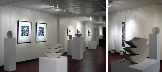
Searching for the Sublime @ Gallery 62 Robinson PHOTO: Courtesy of 62 Robertson
.
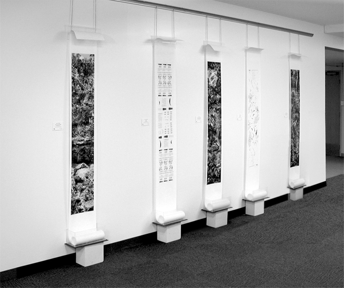
Five Stories from the Gorge installation at SQIT Gallery
.
The images were assembled as a photomontage in the tiny, by current sizes, Blueberry iMac computer. At times Victoria juggled 200 layers in one Adobe Photoshop document to create the fiction panoramas. Seeing the whole image was a problem as most of the time Cooper’s view was no bigger than the iMac screen requiring her to ‘scroll’ the image up and down–just as you will do in looking at the images in this post. Saving the files took 20-30 minutes and the system often crashed. The images were printed in pigment inks on an Ilford Novajet printer onto Hahnemühle Japan ‘rice paper’ by IMT on the Gold Coast. Victoria worked with artist Wim de Vos to design the bespoke handmade acrylic boxes. The design featured the ability for the box to not only serve as a container, but also act as a device to display the scrolls.
The complete set of scrolls, Five Stories from the Gorge, was shown in many venues and awards (see prize list at the end of this post), including Photospace at National Art School, Australian National University, Canberra. Canberra Times arts reviewer Myra McIntyre commented that Cooper’s works are:
Most elegant and fascinating photographic objects are Landscape stories, a series of five Asian-inspired scrolls. Cooper crawls, wanders and flies through the Australian landscape gathering hundreds of objects, patterns, and perspectives that she digitally intertwines, creating a continuum of almost imperceptibly diverse perspectives and a physical sense of vertigo in the viewer.
Review, Canberra Times, May 10, 2002
In 2002 the triptych was acquired during its showing in the Toowoomba Biennial Acquisitive Award selected by Julie Ewington, then Curator at the Queensland Art Gallery. Interestingly the rules of the competition at the time restricted entries to work that had not previously won an art award–as such only the three scrolls The Story of the Hillside, Chaos and Order were entered. When purchased the two other scrolls were orphaned from the set.
So here in this blog, we reunite the Five Stories from the Gorge presented in a form for you to scroll/stroll through … Enjoy.
.
By Doug Spowart
.

Story of the Cliff
.
Story of the Gorge
.
Story of the Hillside
.
![]()
This work is licensed under a Creative Commons Attribution-NonCommercial-NoDerivs 3.0 Unported License.
The regional gallery that advertises on highway billboards

Grafton Art Gallery – Highway Billboard Photo: Doug Spowart
The concept of cultural tourism is often cited as the justification for local council support of regional arts infrastructure that may include, cultural policy, gallery facility and staffing, education or interpretive or developmental officers, local arts workers, regional grant administration and auspicing. What interests us as we travel around the country is the quality of regional arts practice and the entrepreneurial activities that are taking place that tend to be lost in the white noise of the big city hype of blockbusters and art heroes.
The Grafton Regional Gallery is well known for its Jacaranda trees and the Jacaranda Acquisitive Drawing Prize. But there are other things, for example how many regional galleries participate in highway billboard advertising? —GRG does. Another aspect is the diversity of shows presented include curated exhibitions from works in their collection, shows by local artists and travelling exhibitions—recently the Archibald Prize,.
On this occasion two exhibitions attracted our interest, The Art of Sound, a GRG collaboration with the National Film and Sound Archive and Garlugun.gi by local ceramicist Bevan Skinner.
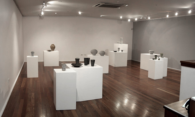
Bevan Skinner’s Garlugun.gi
Skinner’s work is informed by his indigenous heritage. A Gumbaygan man he states in the detailed catalogue accompanying the show that: ‘my work always revolves around my culture, my identity and my spirit.’ While any artist could claim the same provenance for their art Skinner’s work is a deliberate and profound blending of the earth of his country (clays, oxides and pigments), and culture (mark making, tradition and storytelling). While the dot technique of the desert artists is apparent in this work Skinner’s use of the motif is to represent stars in the sky and the meaningfulness that they have for him as a way to connect and remember loved ones passed away and now appearing as stars in the night sky. These works are part of a larger series Winda-bin Waluurrgundi – Stars of The Valley.
Bevan Skinner’s work is presented in a multi-plinthed exhibition space with groups of pots and plates resonating. Some time ago I remember a comment by David Hockney in which he said something around the idea that the time the artist takes in making a work is matched by how it will engage with the viewer. There is something of this in Skinner’s work, for me each piece is a vessel that holds in the artist’s communiqué and the viewer’s gaze activates the message.
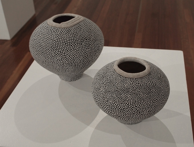
Winda-bin Waluurrgundi – Stars of The Valley Series 1 2008 (foreground)
One side issue emerging from Bevan Skinner’s biography is Associate Diploma in Ceramics training he completed at TAFE in the early 1990s with art teachers who assisted with his development as an artist. I can only exhibit trepidation about the future of artists like Skinner who early in their career ‘found themselves’ through TAFE, now that in NSW art training has been dropped from all TAFE colleges.
Robyn Sweaney A passionate affair (2003)+ Country Garden audio
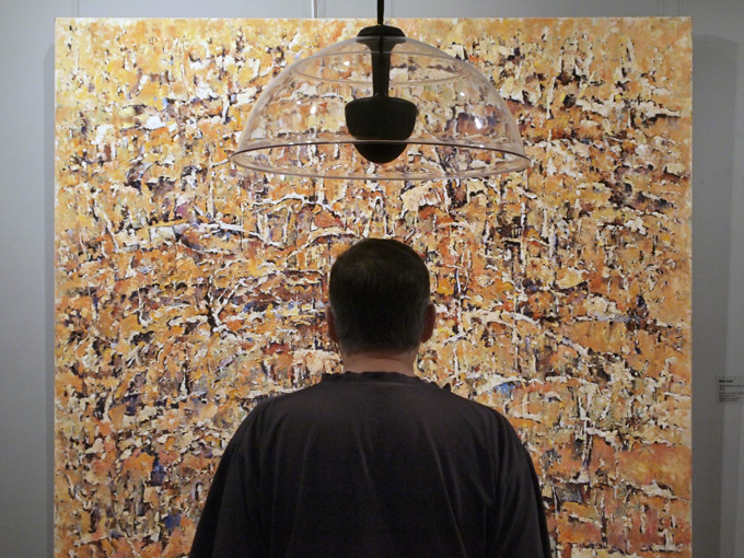
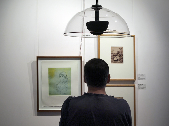
The Art of Sound offers a new way of presenting visual art in a gallery space. The concept is to pair works from the GAG collection with audio material supplied from the National Film and Sound Archive so that the viewer of an artwork has a sight and sound experience of the art. On entering the gallery space the visitor is immediately met with the usual artworks on the wall but something is different—each has some kind of parabolic Perspex dish suspended above or headphones nearby. These sonic devices deliver, in a fairly localised way, music or audio to compliment the work. Composer and sound/artist designer James Hurley undertook the installation of the audio apparatus at GAG.
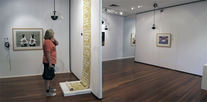
The Art of Sound installation
Gallery Director Jude McBean does not provide answers in her didactic panel statement but rather asks some provocative questions:
‘I wonder how long the effect of linking a particular sound with an artwork will last and how much will the sound determine or change perceptions of the work. These questions also apply to the linking of an artwork to a sound. How long will the participant recall the artwork when hearing that sound outside of the gallery and will the artwork determine or change the experience of the sound or not? The answers are eagerly anticipated over the duration of the project and in later years.’
Mike Riley Stock Reserve near Grafton (2010) + AMATA audio PHOTO: Victoria Cooper
What I found was that sometimes the audio triggered personal recollections of time and place and that these could be used as a kind of reference for the visual experience of the art. Music, for example, has a broad dissemination across a generation. Take for example the ‘Happy Little Vegemites’ 1954 advertisement. However the artist’s work is very limited in its distribution so the audio conjures up a familiar personal response through which the image is viewed for its concurrency. On other occasions like with Mike Riley’s Stock Reserve near Grafton (2010) and indigenous folk music by AMATA (2007) where the piece of music or audio was unknown as was the artwork a new experience was created. A profound work for me was the Judy Cassab, Mothers Love (2004), J W Lindt pair of 1870s photographs of local Aboriginal people with children synergised by the traditional Indigenous singing by BUMA (2008) a song about crying babies who will go to sleep when fed. Could it be that mine was the predictable response that the curators and their pairing of visual and audio stimulus wished to create?
Judy Cassab Mothers Love (2004), JW Lindt photographs (1870s)+BUMA audio PHOTO: Victoria Cooper
Another, perhaps subversive experiment that I undertook in the space was to attempt to activate as many sound sources as possible and listen to the montage of sounds whilst moving about the artworks—somehow it created an experience of life itself …
Thank you to the GAG and to other regional galleries around the country who through ingenuity, creativity, entrepreneurship and cunning do as much for their communities as they do for the rest of the country in presenting contemporary art.
.
Dr Doug Spowart
Photos by Doug and Victoria Cooper
2013 SABBATICAL for Doug+Victoria: A ‘Leap of Faith’
A NEW YEARS MESSAGE FROM COOPER+SPOWART
Dr Doug consulting Casper David Friedrichs re 2013 sabbatical, The Cathedral, Mt Buffalo.
In the year 2000 we began our involvement in higher academic study at Monash University in Post Graduate Diploma study. Since then, except for a small break in 2003, we continued our university research and art practice. Throughout this period we maintained both our arts practice and working at TAFE where Doug was full-time employed as a teacher and Victoria worked as a sessional teacher. All holidays and long service leave was consumed by the demands of study, research and at times a busy exhibition and private lecture programme. The hard work and study culminated last year (2012) with Doug being awarded Doctor of Philosophy at James Cook University in May, and Victoria submitting her PhD for final examination in late November.
Now, as we head into 2013, we are taking time out to pursue our post-doctorial research interests, opportunities to present and share our specialist knowledge and skills and to re-connect with our professional practice as artists and commentators on contemporary issues. It is a ‘self-funded sabbatical’. To finance this venture we intend to generate opportunities that may include ‘cloud funded projects’, artists in residencies, specialist workshops, seminars and consultancies, and sessional teaching or lecturing. We are also open to projects that may become available through our connections.
To up date you on our current interests and professional activities we include the following:
Doug: Social media and its applications within creative practice and personal communication; assembling and writing a critical commentary about Australian photobooks from 1900-2000; the narrative form of the hybrid photobook and the elevation of the print-on-demand photobook into a higher order of visual communication.
Victoria: Maintain a review of contemporary science/art interdisciplinary research as an accepted practice in academic institutions. Special interest in: the scientist, the artist and intuition; the historical use of visual art practice as information within scientific publications; Montage Thinking, as a mode for visual thinking and intellectual discourse through visual and non-visual information.
This adventure is somewhat a ‘leap of faith’ and as such we have created a blog onto which we will post sabbatical related content – we will invite to view this site when it comes online. This WOTWEDID blog will continue as our broader commentary platform – on occasion dual postings may occur. Other special research interest blogs will also emerge and you will be advised of opportunities to connect with their content.
Please contact us if you see any opportunities to support our ‘leap of faith’ sabbatical.
We wish you all an exciting 2013 New Year and look forward to perhaps connecting with you, and also connecting you with, commentaries about the issues of our shared interests.
Cheerio
Victoria and Doug
A 2013 lunch planning meeting at The Horn @ Mt Buffalo on 12.12.12
JUDGEMENT DAY @ SQIT PHOTO
 and student Aidan")
The assessment team with teacher Alison (left) and student Aidan (seated)
As the end of the teaching/learning year draws to a close the annual assessment day for student folios draws near. This year 5 Brisbane photographers joined with local professional identity Syd Owen to provide this important industry connection with the Southern Queensland Institute of TAFE’s Photoimaging department’s students. The team was (left-right) Alison Ahlhaus, Syd Owen, Andy Cross, Mark Schoeman, AIPP Queensland President Jan Ramsay, Cam Attree and Ian Poole.

The assessment team looking @ work
This year assessment consisted mainly of final folios from the Certificate IV in Photoimaging (CUV40403) and a Diploma of Photoimaging folio. The folio submission consists of 16-20 high quality 20×30.5 images from work made throughout the year as course work. Students also present a photobook for assessment. The photobook represents a major component for holistic assessment of a broad range of professional practice from image-making, optimisation and online output through print-on-demand book service providers. Importantly the photobook project necessitates the development of a conceptual body of work which the student melds into a personal narrative.

Ian providing student Aidan with some feedback
These photographs of the event provide some representation of assessment day activities. The Photoimaging Team, Alison Ahlhaus, Rachel Susa and myself greatly appreciate the special connection that this industry liaison provides for the college, the students and the ability it provides for our student work to be moderated against contemporary industry standards in photoimaging.

Cam, Jan and Ian looking @ a student photobook

Jan and Doug towards the end of the busy day PHOTO: Mark Schoeman
COOPER+SPOWART Guest Bloggers @ SLQ Artists’ Books
The State Library of Queensland has just posted commentaries that Vicky and I have prepared on the artists’ book ‘Monologues’, a book of mezzotints by Graeme Peebles and a text by Gottfried Benn. The texts and images of the book are available online – SEE …
http://blogs.slq.qld.gov.au/ala/

SLQ Blogsite
FROM TOOWOOMBA TO SPAIN AND BACK AGAIN – IN 24 HOURS!
The fastest way for a Toowoomba person to get to Spain is to visit the Portrait of Spain—Masterpieces from the Prado exhibition at the Queensland Art Gallery. 100 paintings and prints are on loan from the Museo Nacional del Prado, Madrid. The QAG walls have been re-painted red and the gallery has been converted into a little Spanish culture experience.

We visited the show last Saturday and participated in what was offered to the viewer/attendee.

Vicky and Doug @ Prado trompe l’oeil
The paintings were magnificent examples of oil painting from the 16th-19th century. Spanish aristocracy, royalty, religious iconography, decorative still-life and court-life. There were no nude or clothed Majas, no Meninas nor swirling clouded El Greco landscapes however there were a few of the famous work to stir the interest. One work of huge scale and interest was Pereda’s The Relief of Genoa.
The exhibition is extended over many rooms and is broken into eras and subject matter. Didactic panels and QR coded prompts help the visitor to discover the curator’s spin on what they are seeing.
All in all the Spanish portraits seem a pretty interesting lot. Fine clothing, porcelain skin, mustashes (even on some women), dogs, horses drawfs and aloof expressions abound. Then you enter the Goya’s Disasters of War series—It’s a reminder that for much of the duration of time that this exhibition covers the Spanish were at war with most of Europe at one time or another and were exercising colonial power and plunder in Central America, the Phillipines and other places.
The last room of the exhibition features the 19th century—some predictible landscapes, one entitled ‘Landscape with sheep’, our own QAG Picasso La Belle Hollandaise and some works which didn’t seem to add to the narrative of Spain in the context of the emerging trends in world art at the time.
We breezed through the exhibition shop and were drawn to the Tapas Bar for lunch after which we were enticed to play with the ‘DIY interactive portrait photobooths’ and the still-life drawing stations accompanied by a Spanish guitar performance.

Seeing the exhibition is one thing but now, in the contemporary manifestation of gallery, we experienced a little more; Spanish culture, the work practice of the artist and other entertainment. We went to see a art exhibition and came away with so much more …

King Victoria

Doug posing as a moustached lady

A visitor poses as the ‘Clothed Maja'(?) before the trompe l’oeil

Playing with projected images of Prado visitors

Vicky @ still-life drawing station


LIFE’S JOURNEY: Artists’ Book Exhibition, Redland Art Gallery

Life’s Journeys exhibition catalogue cover Redland Art Gallery
Judging a book by its cover a page
The artists’ book is usually sequestered away in library stacks and drawers in their neat little custom made archival cardboard boxes and plastic bags. In specialised library and private collections these are treasured objects; their owners become the custodian of the physical object of the book and the story is revealed in the site-specific act of reading within these spaces. But … sometimes they escape. On occasion artists’ books escape en-mass from their natural home of the library or private collection, and this is exactly the case with the exhibition Life’s Journey recently presented at the Redland Art Gallery, Cleveland.
Co-curated by Emma Bain Director of Redland Art Gallery and Anna Thurgood Acting Director of Artspace Mackay, the exhibition assembles books drawn from the significant, perhaps one could say—international quality, collections found in Queensland; Artspace Mackay (AM), grahame gallies + editions (gg+e), the State Library of Queensland (SLQ) and Studio West End (SWE). The exhibition’s themes, as highlighted in the catalogue essay by Louise Martin-Chew claim that they are intended to seek ‘out universal truths in individual journeys’, ‘the personal and individual’, …and ‘artist narratives with memoir-like threads’.

Life’s Journey exhibition @ Redland Art Gallery, Cleveland Photo: Doug Spowart
The viewer entering the gallery to see the Life’s Journeys books may not have read the catalogue, or have an understanding of the artists’ book discipline, but what they are to encounter in the white cube of the gallery space will be unusual. The Redland Gallery’s main room a literal forest of fourteen or more acrylic topped display cases. Inside each case resides the book, open to a page and resting on a stand or pillow. Some books don’t seem like books at all, they look more like 3D sculpture, or jewellery forms, or even things just fastened or bound together by threads. Other ‘books’ are in frames or on panels on the wall—one is even a projected image. It’s here where the viewer becomes acquainted with the ‘non-standard’ nature of the artists’ book—but there is more… The viewer can look at the narrative segment presented by the open page, or the expanded story presented in the wall-mounted works, or books that are of the concertina form. While being visually entertained by the titillating ‘sample’ view, the visitor may probably enjoy the encounter and will leave feeling a sense of discovering something interesting and unusual. But I would suggest that this is only part of the experience that the artists who made the books expected or wanted for those who see their books.
I know that this sounds like the continuing debate about the gallery exhibition of books where the sequential narrative that artists’ books require is neutered by single page views. But there is an issue, and for me a redeeming feature for shows like this, and that is that the display of artists’ books will encourage and excite people to hunt down these books in their usual library-sited storage spaces.
What I have written about before,* and what I will restate is, that these exhibitions are ‘tasters’ only. The exhibition strategy needs to include ways by which viewers can identify books of interest, understand how to access them, and then go-see, handle, read and fully encounter the artist’s communiqué. What is needed for the gallery viewer is a catalogue of the books and their source collections, how to access these collections, online references (maybe even flip-books of the works), perhaps even initiated within the exhibition space by QR codes or augmented reality clips. Using this concept the exhibition becomes an invitation for those who wish to take up the offer to handle and read the books in their site-specific habitat.
Now that’s off my chest, I have to say what an amazing collection of artists’ books the curators have pulled together. Seeing this cherry-picked selection in this context is far more interesting for me than looking through an online catalogue—here there is a sense of discovery. It’s a bit like going to a second-hand bookshop and just wandering through the stacks picking up whatever takes your fancy. Wandering through Life’s Journey was indeed an encounter with an eclectic bunch of artists’ books. Some of my favourites were there.

Adele Outteridge’s God Bless America Photo courtesy of Adele Outteridge
This included Adele Outteridge’s Teabag Book (2005) from SWE – just how many cups of tea were consumed to make this book? And another of Adele’s books, God Bless America (2003?) also from SWE, makes a political statement that can be read in different ways depending on the reader’s point of view of American society or foreign policy.

Books from the Codex Event 4 of which Naru is one (for reference only) Image courtesy of Tim Mosely
Another book Naru (2007), from the SLQ, was constructed from paper to form a 3D vessel—the book as a metaphor for a boat. The work was the result of a collaborative project entitled Codex Event 4 coordinated by Tim Mosely at Southern Cross University. Naru and the other books that were created by the team have an overtly political statement contained within their shape and the titling. These works comment on idea of the freedom that many people seek as they cross borders as refugees and how this conflicts with the Australian Government’s immigration policies.

Sheree Kinlyside’s ‘The reluctant nun” (2009) @ 2010 Libris Artist Book Awards. Photo Doug Spowart
A fine press/printmakers book is represented by Sheree Kinlyside’s The reluctant nun (2009) from AM. The book was the winner of the Regional Artists Book Award at the 2010 Libris Artist Book Awards.
A book of a different shape, five sides(!) by American book artist Philip Zimmerman High Tension (1993), from gg+e, deals with a humorous look at contemporary society. The book is intentionally over-designed, montaging graphic elements and text with image narrative to make it an immensely interesting book—you want to pick it up and read through.
In the display of another book, Judy Watson’s Under the Act (2007) from gg+e, each page is framed and the work extends across one complete wall of the gallery. The folio single-sheet form of this book enables its reconfiguration to the wall possible. The work describes a personal narrative, a life’s journey, through the impact of oppressive white bureaucracy applied to Aboriginal peoples living in Queensland not that long ago.
Peter Lyssiotis and Noga Freiburg’s collaborative book Homeland (2003) from AM presents personal narratives of the authors, one a Greek Cypriot—the other an Israeli, about the way lines are drawn across maps to divide communities. The book invokes the story concept by using texts, family photographs and photomontages all bisected by a green line that divides the two communities.
One final book that I’ve always been inspired by is Scott McCarney’s Memory Loss (1988) from AM which deals with a medical condition that afficted his sibling. McCarney was recently in Brisbane with partner Keith Smith presenting an artists’ book workshop at the State Library of Queensland. This two-sided accordion structure book is replete with information from numerous sources including medical literature, personal photographs and correspondence. For me Scott’s book had truly escaped from the cases and was presented, sans protective acrylic lid, atop a plinth where viewing of one side was unobstructed. I think in terms of Scott’s politically subversive work that he would’ve liked that…
Life’s Journeys is a significant showing of what artists’ books can be and it puts the book firmly within the art gallery display environment. But none-the-less, with all the problems of display and the expectations that this commentator may have, the books do need to get out and about. They assert by their presence in the gallery that they exist and can be encountered by a diverse range of the art-interested public. And, perhaps is the case with any gallery exhibition, the viewer experience is something that develops and is enhanced by continued reflection after the viewing. The importance of the exhibition Life’s Journey, the accompanying exhibition Mind Mapping by local artist and bookmaker Jack Oudyn, and the associated workshops is that they will create much needed interest, scholarship and activity in the artists’ book genre. …. And hopefully inspire some viewers to become readers by pursuing the fuller of the artists’ book communiqué by engaging more fully with them when the books return to their respective collection homes.
Doug Spowart June 9, 2012
Please note: The links that I’ve selected to provide a visual connection with the text have been sourced from Google images and may not be the exact book presented for display in this show. I have found it interesting to discover how so many artists’ books are poorly, if at all, represented in the online domain.
TIM MOSELY: An Eskimo climbing to a plateau

Make like an Eskimo – Invite
Tim Mosely is a PhD candidate at the Queensland College of Art. He is working through the research processes that students engage in to position their academic imprimatur on some aspect of human knowledge. Mosely over the years has developed a significant international practice in artists’ books, handmade paper and the book experience as one in which the tactile senses are evoked.

Tim Mosely – Make Like An Eskimo. POP Gallery Brisbane
Make like An Eskimo, at first appears as a mixed exhibition originating from many individual artists as each body of work teases out an idea, a gesture, a memory – blurred, or a theme. These are experiments, the research level is PhD so we do expect something that presents a challenge, or expresses a cathartic moment or even a line of questioning that leads … nowhere. This work does not leave this viewer wanting. The stones have been turned over and what has emerged are things that show Mosely’s Inuit traverse of the smooth white space where he has drawn on his intimate knowledge of printmaking medium, of his personal semiotics and his dreams.

Tim Mosely – ‘imagining mt giluwe‘ a multi-sheet linocut
One monumental piece explodes from the wall – imagining mt giluwe. It’s a multi-sheet linocut – dark and brooding with markings made by Mosely’s tools that resemble some kind of tribal scarification. The wild landscape overpowers the smooth white gallery wall and entices the viewer to move in close. There is a hidden map implied by the transecting vertical and horizontal lines of the individual printed sheets. Is it a map of the physical, the metaphysical or is it just mere tactile experience – for touching with the eyes? There is a movement through the monochrome surface and a red rectangle of paper overlays a part of the image – is this order implied over chaos? Colonial blood over Nature? Or could it hide a didactic code with its intention to perplex the viewer – or maybe it is there to just hide the fact that no code exists?

Tim Mosely – Make Like An Eskimo books
Another work, a series of books attempts to contain the big lino imagining mt giluwe. It is in fact, books made from pages of the large work. Once again there is a calling to explore and this time it is easier as the dividing and sectioning of the work into book form creates a path through the act of page turning. Some pages have been slashed and red paper shows through the jagged shapes implying similar questions as the red rectangle in the larger work. I am comfortable with this work, and perhaps Mosely is as well, as it is derivative of the language that he has employed in the past.
As I reflect on the experience of the POP Gallery I can confirm that Mosely is interrogating his practice, his experience of life and what it means to be an artist. What stands out is his haptic encounter in the making of his artworks and the profound need that he has for that vital energy to be infused into the art. And in that I think he is not alone – the materials seem to respond to his interaction. Here I am reminded of a discussion that Barbara Bolt has about a mode of thinking informed by Martin Heidegger’s techne and Paul Carter’s ‘material thinking’, where she states,
‘In the place of an instrumentalist understanding of our tools and material, this mode of thinking suggests that in the artistic process, objects have agency and it is through the establishing conjunctions with other contributing elements in the art that humans are co-responsible for letting art emerge.’ (Bolt 2007:1)

Tim Mosely in the exhibition Make Like An Eskimo
Mosely’s work and the materials in his work do emerge to present the viewer with communiqués that are enriched not only by what is embedded in them but also what they invoke in the mind of those who encounter them. We wish him well in the ascent to his academic plateau.
Doug Spowart
